Skip to content

Instantly share code, notes, and snippets.

@mkfreeman
Last active July 14, 2022 22:27
Show Gist options
  • Star 0 You must be signed in to star a gist
  • Fork 2 You must be signed in to fork a gist
  • Save mkfreeman/01c5c8464a1f837c6c137e079c9218d0 to your computer and use it in GitHub Desktop.
Save mkfreeman/01c5c8464a1f837c6c137e079c9218d0 to your computer and use it in GitHub Desktop.

Demo-1: Choosing Map Scales

This demo is from this course taught by Mike Freeman at the University of Washington. It allows you to explore the impact of using Quantile and Quartile scales for shading a map. It also allows you to view all color pallettes from ColorBrewer. Simply fork and clone this repository, then run a local server to see it in your browser.

screenshot of map and histogram from demo

Note, the code does not follow suggested reusability patterns as described in Module-10. This was largely to prevent providing students with answers to a related assignment.

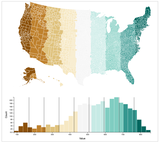
// Histogram adapted from https://bl.ocks.org/mbostock/3048450
// On load, append chart element
$(function() {
// Select SVG to work with, setting width and height (the vis <div> is defined in the index.html file)
var svg = d3.select('#vis')
.append('svg')
.attr('height', 350)
.attr('width', 900);
// Append a 'g' element in which to place the rects, shifted down and right from the top left corner
var g = svg.append('g')
.attr('transform', 'translate(' + margin.left + ',' + margin.top + ')')
.attr('height', height)
.attr('width', width);
// Append an xaxis label to your SVG, specifying the 'transform' attribute to position it (don't call the axis function yet)
var xAxisLabel = svg.append('g')
.attr('transform', 'translate(' + margin.left + ',' + (height + margin.top) + ')')
.attr('class', 'axis')
// Append a yaxis label to your SVG, specifying the 'transform' attribute to position it (don't call the axis function yet)
var yAxisLabel = svg.append('g')
.attr('class', 'axis')
.attr('transform', 'translate(' + margin.left + ',' + (margin.top) + ')')
// Append text to label the y axis (don't specify the text yet)
var xAxisText = svg.append('text')
.attr('transform', 'translate(' + (margin.left + width/2) + ',' + (height + margin.top + 40) + ')')
.attr('class', 'title')
// Append text to label the y axis (don't specify the text yet)
var yAxisText = svg.append('text')
.attr('transform', 'translate(' + (margin.left - 40) + ',' + (margin.top + height/2) + ') rotate(-90)')
.attr('class', 'title')
// Function for setting axes
var setAxes = function() {
// Define x axis using d3.svg.axis(), assigning the scale as the xScale
var xAxis = d3.svg.axis()
.scale(xScale)
.orient('bottom')
// Define y axis using d3.svg.axis(), assigning the scale as the yScale
var yAxis = d3.svg.axis()
.scale(yScale)
.orient('left')
.tickFormat(d3.format('.2s'));
// Call xAxis
xAxisLabel.transition().duration(1500).call(xAxis);
// Call yAxis
yAxisLabel.transition().duration(1500).call(yAxis);
// Update labels
xAxisText.text('Value')
yAxisText.text('Count')
}
// Store the data-join in a function: make sure to set the scales and update the axes in your function.
drawHistogram = function() {
// Set axes
setAxes()
// Select all rects and bind data
var bars = g.selectAll('rect').data(data);
// Use the .enter() method to get your entering elements, and assign initial positions
bars.enter().append('rect')
.attr('x', function(d){return xScale(d.x)})
.attr('y', height)
.attr('height', 0)
.attr('width', xScale(data[1].x) - 1)
.attr('class', 'bar');
// Use the .exit() and .remove() methods to remove elements that are no longer in the data
bars.exit().remove();
// // Transition properties of the update selection
bars.transition()
.delay(function(d, i){return i*50})
.duration(1000)
.attr('x', function(d){return xScale(d.x)})
.attr('y', function(d){return yScale(d.y)})
.attr('height', function(d) {return height - yScale(d.y)})
.attr('width', xScale(data[1].x) - 1)
.style('fill', function(d){
return settings.scale == 'quantize' ? quantizeScale(d.x) : quantileScale(d.x);
});
// Enter and append lines for quantile breaks
var lineData = settings.scale == 'quantize' ? quantizeScale.range().filter(function(d,i){return i!=0}) : quantileScale.quantiles();
if(settings.scale == 'quantize') {
// lineData.shift()
}
var lines = g.selectAll('.break').data(lineData, function(d,i){console.log(d); return i})
lines.enter().append('line').attr('y2', height).attr('class', 'break');
lines.transition().duration(1000).delay(function(d,i){return + 100*i })
.attr('x1', function(d) {
if (settings.scale == 'quantize') {
val = quantizeScale.invertExtent(d)[0];
}
else {
val = d
}
return xScale(val)
})
.attr('x2', function(d) {
if (settings.scale == 'quantize') {
val = quantizeScale.invertExtent(d)[0];
}
else {
val = d
}
return xScale(val)
})
.attr('y1', height)
.attr('y2', 0)
lines.exit().remove();
}
});
<!DOCTYPE html>
<html lang="en">
<head>
<meta charset="utf-8">
<meta name="viewport" content="width=device-width, initial-scale=1.0">
<title>Module 12: Demo 1</title>
<!-- Libraries -->
<script src="https://code.jquery.com/jquery.min.js"></script>
<link href="https://maxcdn.bootstrapcdn.com/bootstrap/3.3.5/css/bootstrap.min.css" rel="stylesheet" type="text/css" />
<script src="https://maxcdn.bootstrapcdn.com/bootstrap/3.3.5/js/bootstrap.min.js"></script>
<script src="http://d3js.org/d3.v3.min.js"></script>
<script src="http://d3js.org/colorbrewer.v1.min.js"></script>
<script src="https://cdnjs.cloudflare.com/ajax/libs/topojson/1.6.20/topojson.js"></script>
<script src="https://code.jquery.com/ui/1.11.4/jquery-ui.js"></script>
<!-- Custom files -->
<link rel="stylesheet" href="main.css"/>
<link rel="stylesheet" href="https://code.jquery.com/ui/1.11.4/themes/smoothness/jquery-ui.css"
<!-- your script files -->
<script src="Map.js"></script>
<script src="Histogram.js"></script>
<script src="Legend.js"></script>
<script src="main.js"></script>
</head>
<body class="container">
<p>The purpose of this demo is to demonstrate the consequence of choosing different breaks for color scales on maps. You can choose to set an equal distance between bins using the <code>quantize</code> scale, or breaks such that there is an equal number of observations per bin using the (<code>quantile</code>)</p>
<div class="row">
<h3 class="col-xs-4">Scale Type</h3>
<h3 id="num-colors" class="col-xs-4">Number of Colors: 4</h3>
<h3 id="num-colors" class="col-xs-4">Color Variable</h3>
</div>
<div class="row">
<div class="col-xs-4">
<div class="btn-group" data-toggle="buttons">
<label title="Equal spacing between bins" class="btn btn-primary active scale-label">
<input value="quantize" class="scale" type="radio" name="options" autocomplete="off" checked>Quantize
</label>
<label title="Equal number of observations per bin" class="btn btn-primary scale-label">
<input value="quantile" type="radio" class="scale" name="options" autocomplete="off">Quantile
</label>
</div>
</div>
<div class="col-xs-4">
<div id="slider"></div>
</div>
<div class="row">
<div class="col-xs-4">
<div class="btn-group" data-toggle="buttons">
<label class="btn btn-primary">
<input value="latitude" class="orientation" type="radio" name="options" autocomplete="off">Latitude
</label>
<label class="btn btn-primary active">
<input value="longitude" type="radio" class="orientation" name="options" autocomplete="off" checked>Longitude
</label>
</div>
</div>
</div>
</div>
<div id="vis"></div>
<div id="color-picker">
<p>click to change pallette</p>
</div>
</body>
</html>
// Function to make legend: taken from https://bl.ocks.org/mbostock/5577023
// Colorbrewer pallets
var drawLegend = function() {
d3.select("#color-picker")
.selectAll(".palette")
.data(d3.entries(colorbrewer))
.enter().append("span")
.attr("class", "palette")
.attr("title", function(d) { return d.key; })
.on("click", function(d) {
// Reset slider
var max = d3.max(d3.keys(d.value), function(d) {return +d});
$('#slider').slider({max:max});
if(settings.colorBreaks > max) settings.colorBreaks = max;
settings.colorClass = d.key;
update()
})
.selectAll(".swatch")
.data(function(d) { return d.value[d3.keys(d.value).map(Number).sort(d3.descending)[0]]; })
.enter().append("span")
.attr("class", "swatch")
.style("background-color", function(d) { return d; });
};
@import url(https://maxcdn.bootstrapcdn.com/bootstrap/3.3.5/css/bootstrap.min.css);
.axis line, .axis path {
fill: none;
stroke: #000;
}
.title {
text-anchor:middle;
}
.axis text {
font-size:10px;
}
.bar {
fill:green;
opacity:1;
}
.break {
stroke: black;
stroke-width:1px;
}
path {
fill: #d3d3d3;
stroke: white;
stroke-linejoin: round;
stroke-linecap: round;
}
.palette {
cursor: pointer;
display: inline-block;
vertical-align: bottom;
margin: 4px 0 4px 6px;
padding: 4px;
background: #fff;
border: solid 1px #aaa;
}
.swatch {
display: block;
vertical-align: middle;
width: 20px;
height: 10px;
}
#color-picker {
position:absolute;
text-align:center;
right:20px;
width:200px;
top:200px;
}
#color-picker p {
opacity:.5;
}
#slider {
width:200px;
display:inline-block;
margin-left:20px;
margin-top:10px;
}
// Main file for controlling data, passing updates
// Global namespace variables
var drawHistogram, xScale, yScale, qScale, data, values;
// Settings driven by controls
var settings = {
scale:'quantize',
orientation: 'longitude',
colorClass:'RdYlBu',
colorBreaks:4
};
// Margin: how much space to put in the SVG for axes/titles
var margin = {
left:70,
bottom:100,
top:50,
right:50,
};
// Height/width of the drawing area for data symbols
var height = 350 - margin.bottom - margin.top;
var width = 900 - margin.left - margin.right;
// Write a function for setting scales.
var setScales = function() {
// Define an ordinal xScale using rangeBands
var min = d3.min(values);
var max = d3.max(values);
xScale = d3.scale.linear()
.domain([min, max])
.range([0, width]);
// Define a quantile scale
var range = colorbrewer[settings.colorClass][settings.colorBreaks];
quantileScale = d3.scale.quantile().domain(values).range(range);
// d3.range(d3.min(values), d3.max(values), numBreaks)
var step = Math.floor((max - min)/settings.colorBreaks);
var domain = d3.range(min, max, step);
quantizeScale = d3.scale.quantize().domain(domain).range(range);
// Define the yScale: remember to draw from top to bottom!
yScale = d3.scale.linear()
.domain([0, d3.max(data, function(d) { return d.y; })])
.range([height, 0]);
}
// Make data values based on county longitude / latitudes
var makeData = function(shape) {
// Set values as longitude
values = topojson.feature(shape, shape.objects.counties).features.map(function(d){
var index = settings.orientation == 'longitude' ? 0 : 1;
return(pathGen.centroid(d)[index])
})
// Histogram layout
var histogram = d3.layout.histogram()
.bins(30);
// Set data as a histogram layout of the values
data = histogram(values);
}
// Function to update the charts / text
var update = function() {
$('#num-colors').text('Number of Colors: ' + settings.colorBreaks)
makeData(settings.data);// Generate data
setScales(); // Set scales
drawHistogram();
drawMap();
};
// On load, build charts
$(function() {
// Read in shapefile, then draw the charts
d3.json('shape.json', function(error, shape){
settings.data = shape;
drawLegend();// Draw Legend
update();
});
// Event listener on the input elements
$("input").on('change', function() {
// Get value, determine if it is the orientation (lat/long) scale type
var setting = $(this).hasClass('orientation') ? 'orientation' : 'scale'
var val = $(this).val();
settings[setting] = val;
update()
});
// Event listener on the slider
$('#slider').slider({
width:'200px',
min:3,
max:10,
value:settings.colorBreaks,
change:function(event, ui) {
settings.colorBreaks = ui.value;
update()
}
});
// Add button hover
$('label.scale-label').tooltip();
});
// Map code
var drawMap, pathGen;
$(function() {
// Path Generator
pathGen = d3.geo.path();
var svg = d3.select("#vis").append("svg")
.attr("width", 850)
.attr("height", 500);
drawMap = function() {
// Paths -- one each
var paths = svg.selectAll("path")
.data(topojson.feature(settings.data, settings.data.objects.counties).features);
paths.enter().append('path')
.attr("class", "border border--state")
.attr("d", pathGen)
paths.transition().duration(1000).delay(function(d, i) {
return xScale(pathGen.centroid(d)[0])*1.5
}).style('fill', function(d, i){
return settings.scale == 'quantize' ? quantizeScale(values[i]) : quantileScale(values[i])
})
};
});
Display the source blob
Display the rendered blob
Raw
Sorry, something went wrong. Reload?
Sorry, we cannot display this file.
Sorry, this file is invalid so it cannot be displayed.
Sign up for free to join this conversation on GitHub. Already have an account? Sign in to comment