-
-
Save CerebralMastication/582767 to your computer and use it in GitHub Desktop.
| set.seed(2) | |
| x <- 1:100 | |
| y <- 20 + 3 * x | |
| e <- rnorm(100, 0, 60) | |
| y <- 20 + 3 * x + e | |
| plot(x,y) | |
| yx.lm <- lm(y ~ x) | |
| lines(x, predict(yx.lm), col="red") | |
| xy.lm <- lm(x ~ y) | |
| lines(predict(xy.lm), y, col="blue") | |
| # so lm() depends on which variable is x and wich is y | |
| # lm minimizes y distance (the error term is y-yhat) | |
| #normalize means and cbind together | |
| xyNorm <- cbind(x=x-mean(x), y=y-mean(y)) | |
| plot(xyNorm) | |
| #covariance | |
| xyCov <- cov(xyNorm) | |
| eigenValues <- eigen(xyCov)$values | |
| eigenVectors <- eigen(xyCov)$vectors | |
| eigenValues | |
| eigenVectors | |
| plot(xyNorm, ylim=c(-200,200), xlim=c(-200,200)) | |
| lines(xyNorm[x], eigenVectors[2,1]/eigenVectors[1,1] * xyNorm[x]) | |
| lines(xyNorm[x], eigenVectors[2,2]/eigenVectors[1,2] * xyNorm[x]) | |
| # the largest eigenValue is the first one | |
| # so that's our principal component. | |
| # but the principal component is in normalized terms (mean=0) | |
| # and we want it back in real terms like our starting data | |
| # so let's denormalize it | |
| plot(x,y) | |
| lines(x, (eigenVectors[2,1]/eigenVectors[1,1] * xyNorm[x]) + mean(y)) | |
| # that looks right. line through the middle as expected | |
| # what if we bring back our other two regressions? | |
| lines(x, predict(yx.lm), col="red") | |
| lines(predict(xy.lm), y, col="blue") |
It's in the first 13 lines. Plot the lines() one at a time to recreate.
I meant the code for generating:
OLS1.png
OLS2.png
pca.png
Many thanks in advance,
Ruben
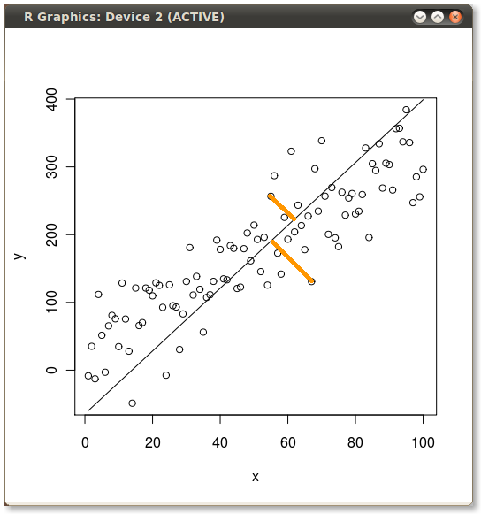
Ahh. I just had a revelation in what you were asking. The yellow lines in all 3 of those were drawn by hand. I did the base plots (which I think you can see from the code) and then I drew 2 yellow lines on each one for illustration.
Does that answer your question? Can you pick out of the code where the base plots are?
plot(x,y)
yx.lm <- lm(y ~ x)
lines(x, predict(yx.lm), col="red") # <- that's OLS1
plot(x,y)
xy.lm <- lm(x ~ y)
lines(predict(xy.lm), y, col="blue") # <- that's OLS2
Nice trick ha,ha. Very illustrative!
Now I'm curious. Would it be possible to do something like that with R?
Let's ask the hive mind:
http://stackoverflow.com/questions/3737165/drop-lines-from-actual-to-modeled-points-in-r
-JD
And Josh Ulrich provided an answer in under 20 minutes. Hive mind FTW!
-JD
Thanks a lot!
I really enjoyed the blog post and thanks for sharing the code. I have been trying to figure out how to generate the orange (drop) lines on this plot(and below). I tried the segments() function as suggested by Josh Ulrich's posts...but keep going in circles. Any help is appreciated.

Hi there,
this is a great post. I have always wondered about the intuition behind PCA...
I'm curious about two of your graphs posted in the blog illustrating the difference between errors in y
x and xy.Would it be possible to have access to the R code to generate them?
Many thanks in advance,
Ruben