
Find and open your JSFiddle link from last week - as we're going to be working on adding things to it today.
We had a brief look at hex colours in the previous worksheet - they usually something like this : #ffcc00.
Hex Colours are really easy to understand - they always start with a hash (#). Then they can either be 6 or 8 characters after the hash, from 00, to ff. Next we can split the colour up into twos e.g. ff, cc, 00. The first two characters ff represent the amount of red, the second two characters cc represent the amount of green, and the final two 00 represent the amount of blue in our colour. If you had 8 characters, the first two would represent the opacity of the colour (or how see-through it was).
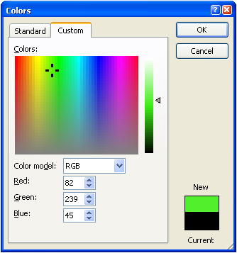
Microsoft Paint shows us this really easily using their colour picker thing:
Hexadecimal is just different way of counting - where we usually count from 1, 2, 3, etc 9, 10, 11. Hexadecimal will start at 1, 2, 3, but at 9 it'll go to a, then b, then c. Wikipedia has a "simple english" edition explaining it http://simple.wikipedia.org/wiki/Hexadecimal_numeral_system
Just in case you've lost it from last week, Google have a great list of colours and their hex codes - check it out at https://www.google.com/design/spec/style/color.html#color-ui-color-palette

We can also make our shapes transparent by changing an attribute called the fill-opacity like so:
<circle cx="400" cy="240" r="20" fill="black" fill-opacity="0.3"/>This has made one of the eyes on my emoji transparent. The lower the number the less you can see through the shape.

Now our emoji is starting to get quite a lot of code, other people looking at it might appreciate a bit of help working it all out (and maybe ourselves in the future). In programming we can do a thing called "commenting code" which is where we can write short bits of text which the computer will just ignore.
In XML we can write a comment like this:
<!-- comment -->You have to remember to put a <!-- followed by -->

We can start by introducing some gradients, where colours blend into each other. In SVG there are two types of gradients - linear, and radial. We're going to start by making a linear gradient for our background.
Firstly, we need to create a gradient to use later, we can do this like so:
<linearGradient id="linearGrad" x1="0%" y1="0%" x2="100%" y2="0%">
    <stop offset="0%" stop-color="#283593"/>
    <stop offset="100%" stop-color="#1565C0" />
</linearGradient>id= the name of the gradient - so we can use it laterx1&x2= start and stop x values = these go from 0 to 100 to make our gradienty1&y2= start and stop y values = these stay constant for our examplestop offsetoffest= how far down the gradient you want the colourstop-color= hex code for the stop point
To use it we need to edit the fill property of our background like so:
<polygon points="0,0 600,0 600,600, 0,600" fill="url(#linearGrad)"/>Note that the id of the gradient is used inside the fill - so give it something you'll remember!

The other sort of gradient we can make is a radial gradient - we can use this for our emoji face.
First, we have to create a radial gradient like so:
<radialGradient id="radialGrad" cx="50%" cy="50%" r="50%" fx="50%" fy="50%">
    <stop offset="25%" stop-color="#FFCC00"/>
    <stop offset="100%" stop-color="#E91E63" />
</radialGradient>id= used to connect with the shapes you want that colourcx&cy= represent the center coordinates for the outer circler= how far the gradient should go out from the centerfx&fy= denote the coordinates for the inner circle
Finally, we need to tell our emoji face to use this gradient:
<circle cx="300" cy="300" r="200" fill="url(#radialGrad)" />
Try and include a radial and linear gradients, using hex colours before you move onto the next worksheet where we'll start to introduce different shapes such a lines, paths, and text!
⭐ When you've finished - don't forget to save your JSFiddle and send us your link above. 🌟