###SVA-DSI ###Metrics and Data Visualiation I November 1st, 2016
Harris, J., Whale Hunt.
Harris, J., I love your work.
Find this document here:
##Outline
- Color Basics
- Intro to color thinking
-
- and + colors
- Coloring with Data
- Considerations
- Accessibility
- Matching + Standardizing
- Color Tools
- Creating Style Guides
- Resources
Color is a fairly subjective but important consideration for any visualization type, it's probably also the most fun from an art/design perspective, and probably the most challenging to get right from a communication perspective.
It's complicated, we're going to go over a few short objectives here:
- Learn to observe colors and recognize their characteristics as they complement visualizations
- Learn how colors combine and a bit about the color spectrum
- Learn some tools you can use to combine colors for the web, appropriately
#####Intro to color thinking
There are various approaches to the question of 'what is color?'. In art, color is defined as "the element of art that is produced when light striking an object is reflected back to the eye."
There are various properties that complement it, hue, intensity etc. But our approach to color is often defined by what is visible, and we will be defining it by computational considerations.

Light passed through a prism produces a range of olors, you mix them together and you get white, if you remove colors, you get black.

If you are mixing paint, and you mix all paint colors together you get black, if you mix all colors together in a programming language, you get white.
There are thus two ways to mix colors: addition and subtraction.
You might be familiar with the RYB wheel, based on Goethe's color theory, among others who have built upon it.

Colors combine here in a subtractive way, meaning that if you mix all colors together they will turn black (pignments will absorb light and reflect the remaining colors).
But computationally you might use the RGB wheel:

Colors combine here in an additive way, meaning that if you mix all colors, the result will be white.
We work in both systems for the web, because we design things in an additive way, and then often want to kill trees and print them in a subtractive way.
This issue has been solved by Adobe CS in some ways, so you can convert to a CMYK or print qual color scheme, and we're not going to totally get into it, but you might want to read up on this as you approach color choosing for newsroom stories.
We've all seen color in psychology classes and probably in art or design theory; how colors combine or complement eachother on the web is a little different than all theory, but it's useful to review the exercise.
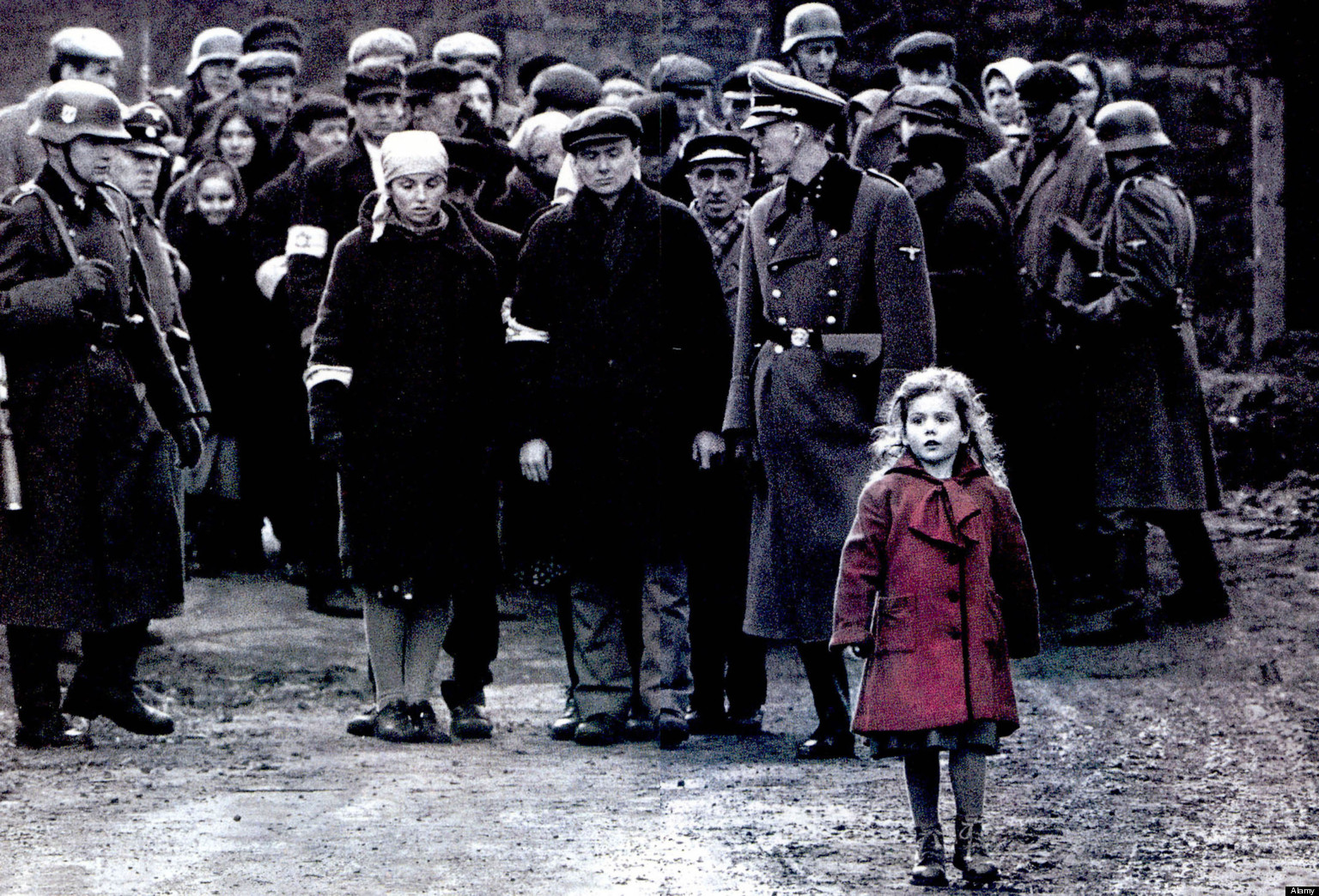
Here's an example of two images with some similar colors combined. Your eye struggles to see them, it's probably not a good comparison for diverging datasets:

The point is that the center color is actually the same, the ground on which it is based makes it look distinct.

The advantage of writing color into your code, with numbers and hex values (like #f60), is that you can make sure your color choices are authentic (numeric) and be strategic about their pairings without being weaked by your eyes' perception, and reflextive mixing.
Another example, where perception can be deceptive:


Accessibility is especially a consideration when you approach news stories. Your objective is to inform in building visualizations, so your color choices should seek to inform a maximum audience. You might try testing your color schemes for color blindness.
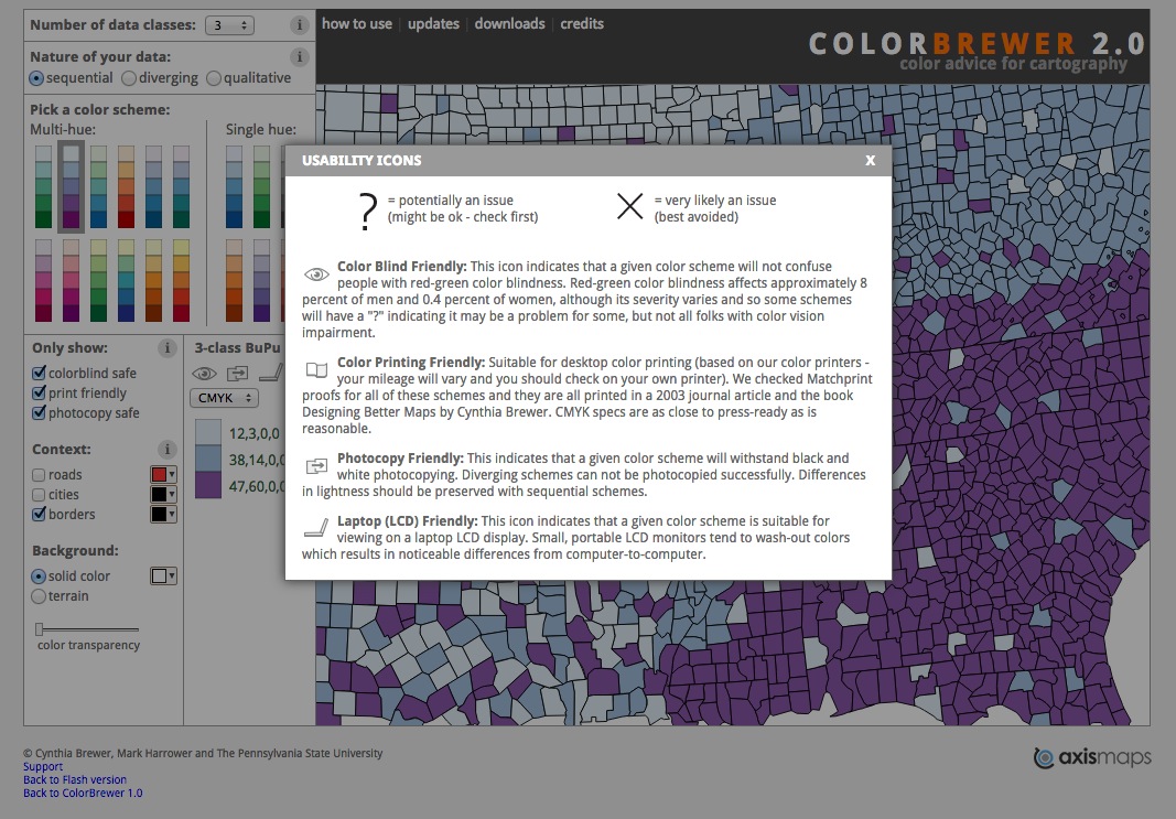
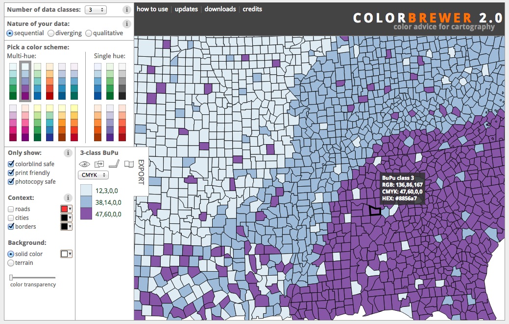
In toold like Color Brewer, you can set palette generation to preference color-blind or print-friendly colors.
Complementary colors are colors that are accross eachother on the color wheel. You can test this by staring at a color for a long time and closing your eyes to see what color is the "residue" you view in your eyelids.
You can choose one color and two subdued colorly like black/white to highlight something of pertinence.

There are ways to organize things that are trending and beautiful with an economy on color.

However, colors for visualizations have meaning, and if you are building comparisons, you can do damage in using only the same colors.

For the web, you'll often see colors in the following formats:
- RGB |
rgb(255,102,0)- proportions of red, green, blue - Hex |
#ff6600 - HSL |
hsl(24,100%,50%)- hue, saturation, lightness
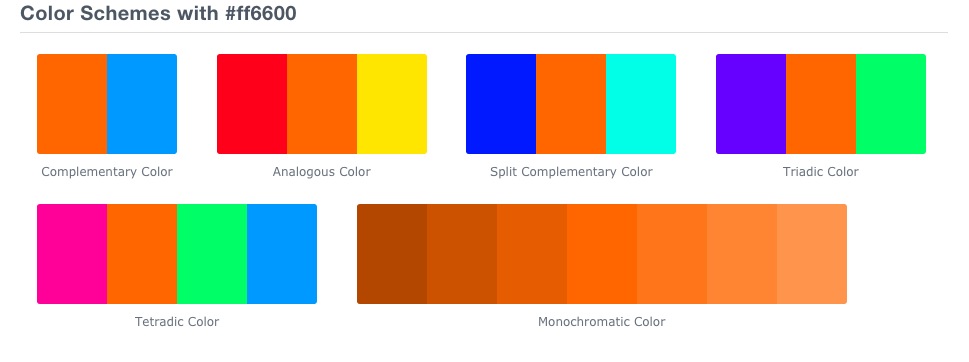
Complementary but distinct color schemes are often best for visualizations and there are a few tools that will help you generate palettes for this.
Will let you generate color-blind safe, print-worthy, map-ready palettes based on extensive research on their end.
A mega tool for generating complementary, analgous, monochromatic, tetradic and other color palettes, and they provide preview tools to see how they will display on the web.
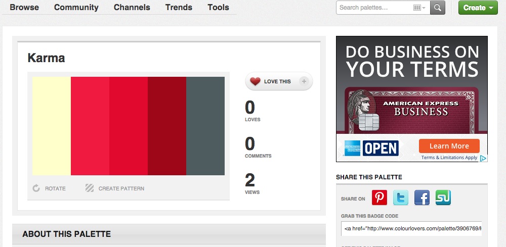
A palette-sharing social network that often pairs palettes with an inspiration image.
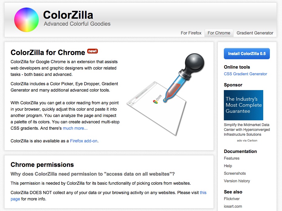
An extension for various browsers that allows you to pick colors from a page or extract them from images and gives you the hex/rgb values for those.
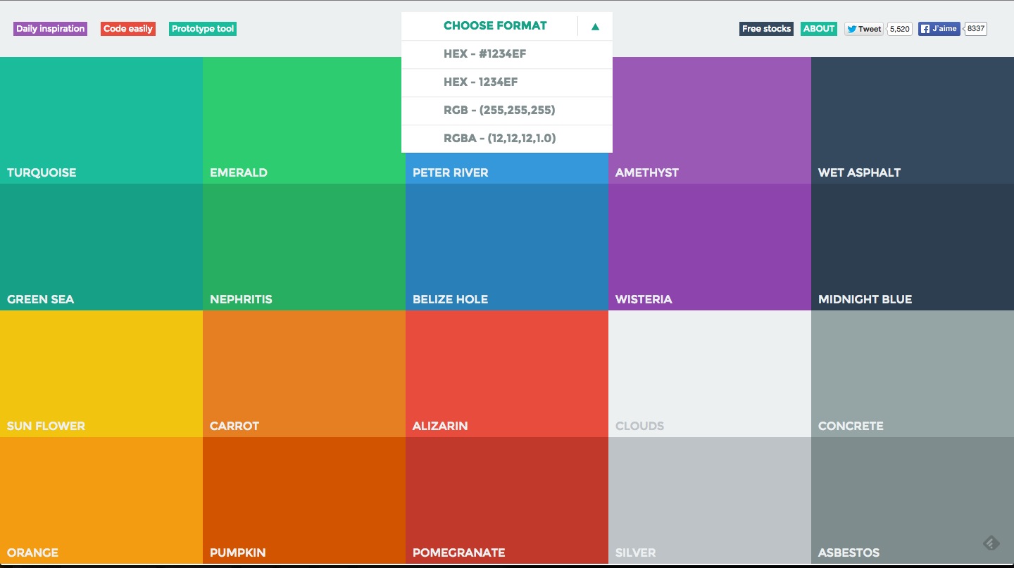
A trendy palette with color values generated in the Hex, RBG, and RGBA (for "alpha blending" often translated as "opacity") scale.
For generating a style guide (which is part of this week's assignment), consider all of these tools and come up with a color palette, fonts, and sketches that help you communicate your story agreeably, with some design program behind it.
Consider other visualizations and whether their palette complemented or distracted from the story they wanted to tell.
Here are some tools for generating style guides in code:
- Moodboard Generator
- Document CSS
- Living StyleGuide (SASS/Markdown)
- Tapestry Pattern Library
- Poor mans style guide
- Source.JS, node styleguide generator
- Styleguide.io Resources
We are not going to do anything that complicated. I just want you to have an idea of the colors and webfonts you would like to use, and a willingness to plan for this prior to working on your final projects.
- Perception Concerns
- Gestalt Theory
- Color Brewer
- Geocolor
- Color Hexa
- Flat UI Colors
- Sequential Color Theme Map for Choropleths
- Rune.js - a project developed out of the ITP program and "Printing Code", another course you should totally check out!
- Picking Color Palettes: A Guide
