Aurelia Moser, Map Scientist, CartoDB Workshop - Yale February 4, 2015
Find this document here: http://bit.ly/1At1cQQ | Gist

- Introduction to CartoDB
- Intro to the interface
- Examples
- Tour of the interface
- Mapping Workshop
- Setting up accounts!
- Data import
- Choropleth, Category, Intensity Maps
- Basic map styling
- Column data types
- Torque -- temporal maps
- Sharing visualizations
- Dealing with Data
- Getting Data
- What is geospatial data?
- Data representation in CartoDB (SQL schema)
- Geocoding
- SQL/PostGIS
- Carto.js
- CartoJS: What it looks like (HTML/CSS/JS)
- Examples!
- Odyssey.js
- Brief Intro on authoring narratives with maps
- Hands-on
- Wrap Up
- Resources
- Onward!
You can find this document in my GitHub Account.
<iframe src="http://team.cartodb.com/u/santiagoa/viz/bd69bca0-7449-11e4-88e4-0e018d66dc29/embed_map" width="600px" height="400px"></iframe>Basic Data Import
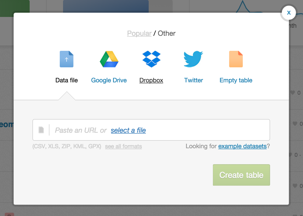 Most major formats for storing data: Excel Spreadsheets, CSV files, Shapefiles, KML (Google Earth), etc. See complete list here.
- Import by URL! Super handy when in a workshop and you don't want to overwhelm the bandwidth
- Select file from your HD
- Common Data contains useful datasets for everyday use (admin regions, USGS earthquake data, ports and their locations, and many more)
Integration with Google Drive and Dropbox.
Twitter firehose access for Enterprise accounts.
<iframe src="http://srogers.cartodb.com/viz/81916204-c392-11e3-bcbf-0e230854a1cb/embed_map" width="600px" height="400px"></iframe>Schema or column names

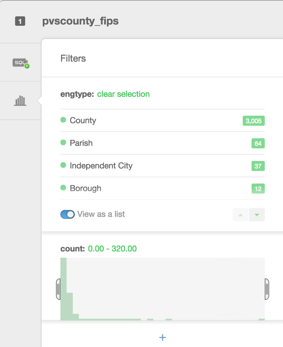 Filters are a great way to explore your data. Besides filtering your data, they allow you to see histograms of the distributions, the number of unique entries, or a search box for columns that have a large number of text entries.
- Simple -- most basic visualization
- Cluster -- counts number of points within a certain binned region
- Choropleth -- makes a histogram of your data and gives bins different colors depending on the color ramp chosen
- Category -- color data based on unique category (works best for a handful of unique types)
- Bubble -- size markers based on column values
- Intensity -- colors by density
- Density -- data aggregated by number of points within a hexagon
- Torque -- temporal visualization of data
Check out visualization documentation for more.
The visualization style simple is the default visualization for all maps.
Styles available in the wizard

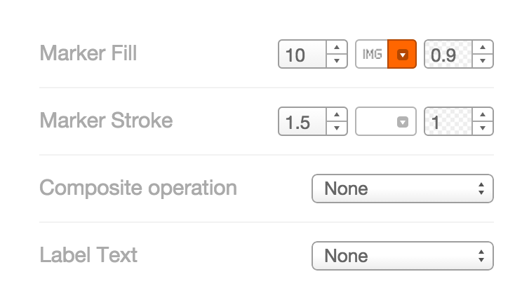
Marker Fill: change the size, color, and opacity of all markers Marker Stroke: change the width, color, and opacity of every marker's border Composite Operation: change the color of markers when they overlap Label Text: Text appearing by a marker (can be from columns)
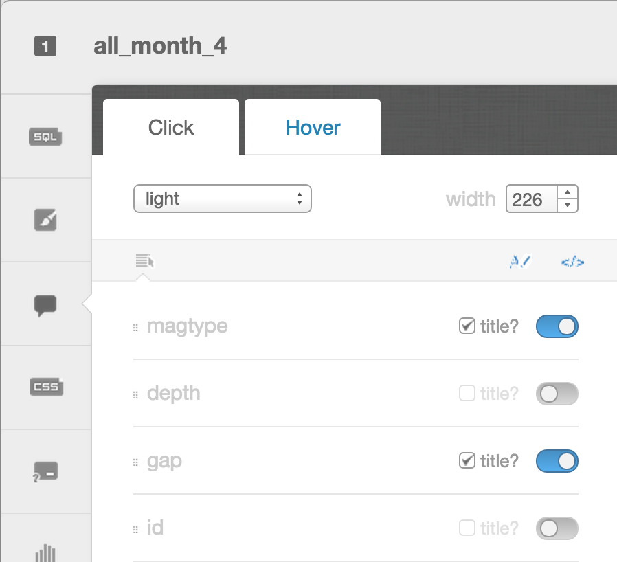
- Select which column data appear in infowindow by toggling column on
- Customize further by selecting
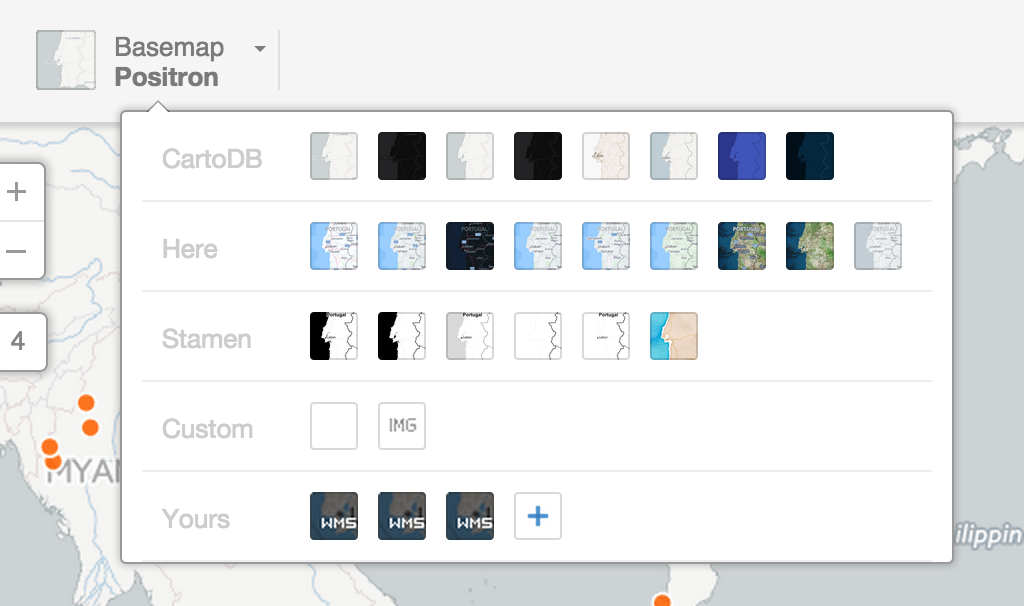
Select basemaps from different providers, use custom color, NASA data, MapBox tiles, etc.
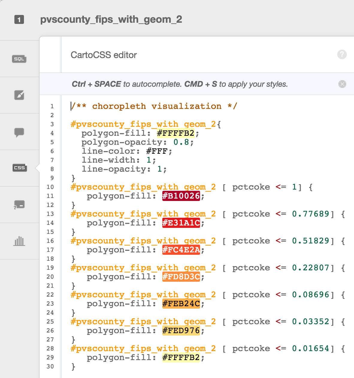
Choropleth maps show map elements colored according to where a value associated with the map element falls in a range. It's like a histogram where each bin is colored differently according to a color scale you pick. Notice the CartoCSS screenshot above.
Quantification is an option to pay attention to since it controls how the data is binned into different colors. Equal interval gives bins of equal size across the range, which means that outliers stand out. Quantile bins so that each quantile has approximately the same number of values.
CartoCSS is the styling language for our maps.
Can be easily customized
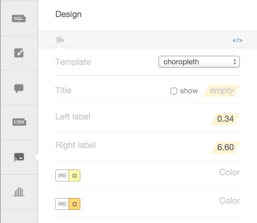
You have the option of giving it a title, and changing the text for the colors. You can also change the colors manually, or, even better, change the color ramp back in the wizard. If you want to explore other color ramps, check out Color Brewer for some very well thought out color schemes.
CartoDB created a fully zoomable map that changes over time.
Some examples
- World Cup tweets saturate this map
- Tweets that mention sunrise map
- Animal migration patterns
Click on the 90-degree arrow to get back to view your tables/visualizations
![]()

Let's make maps! Make sure you already have an account setup: https://cartodb.com/signup?plan=academy
Import a new dataset by copying the link (not downloading) and pasting it into the import window in your CartoDB account:
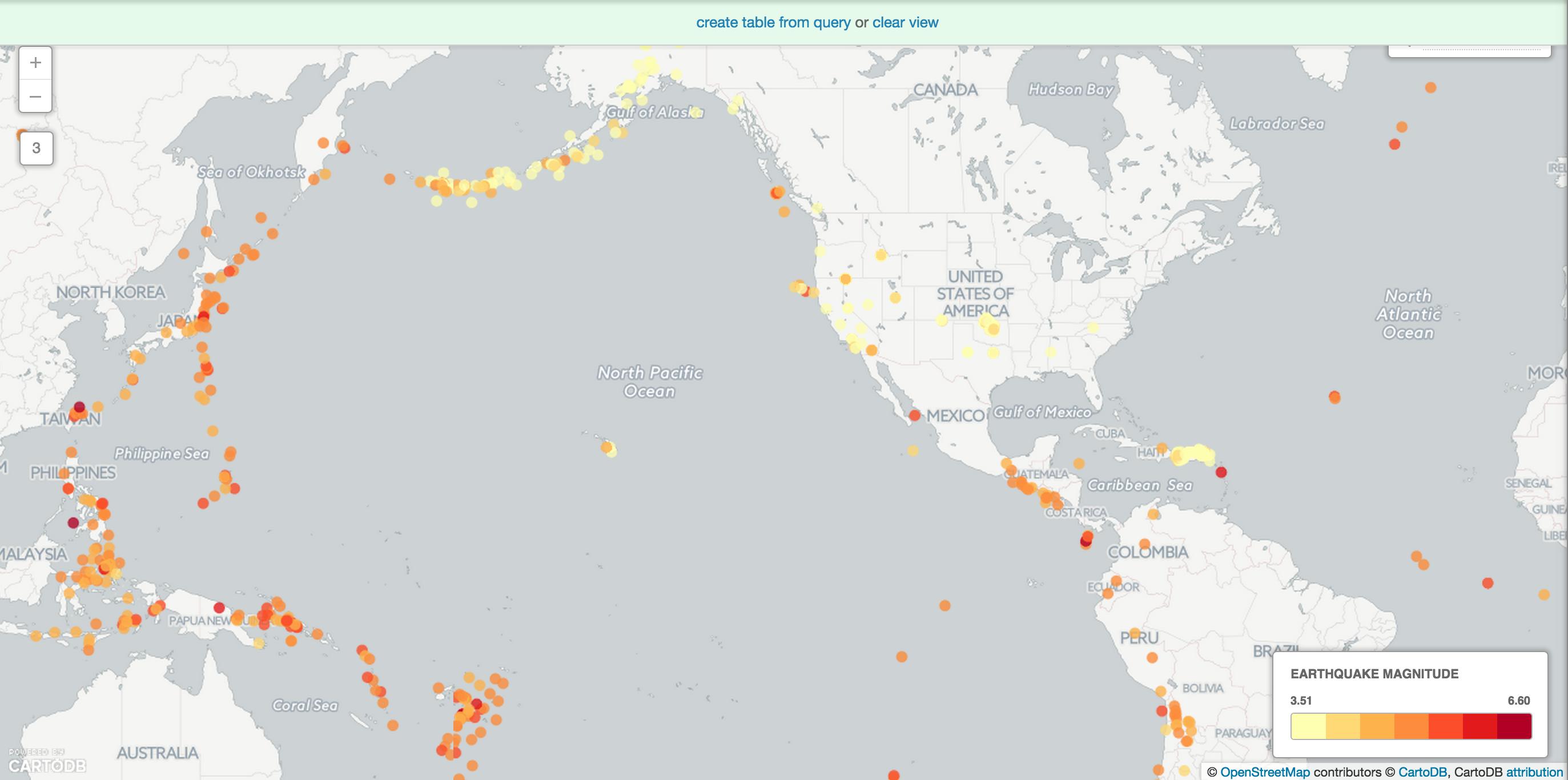
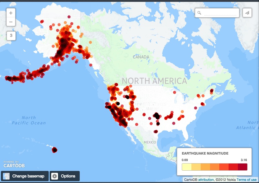
USGS reported seismic activity (earthquakes) http://earthquake.usgs.gov/earthquakes/feed/v1.0/summary/all_month.csv
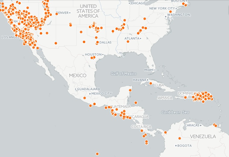
Using the styles in simple, try to recreate the visualization below. It's similar to an intensity map that shows where earthquakes are occurring in largest numbers. Play with styles to your preference.
More on quantification here.
Make a choropleth map
Next select choropleth from the Vizualization wizard. By default it will select depth. Select the mag column (which means magnitude or power of the earthquake).
Notice that there are lots of US-based earthquakes that are fairly weak -- so perhaps filtering for earthquakes above 3.0 will give a better visualization of our data.
hint: notice that a filter was used
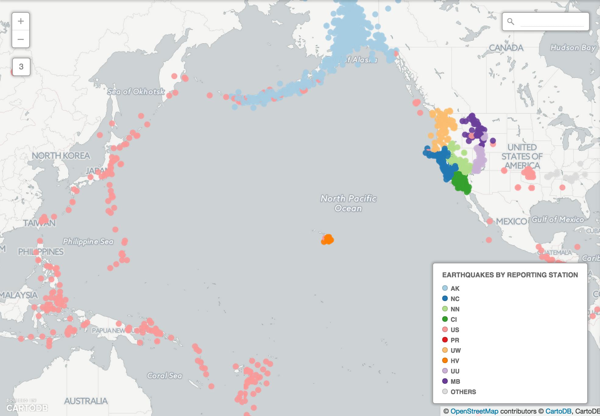
Try to recreate this map using category. net is the column to categorize by...
Three basic types of data appear on a map.
- Point data -- like we saw for the earthquakes
- Line data -- like flight paths, can be seen in this example
- Polygon data -- like the shapes of states
Go back to your dashboard and click on Common Data. Find Administrative Regions, then click on USA States.
Or download Haiti's admin districts here.
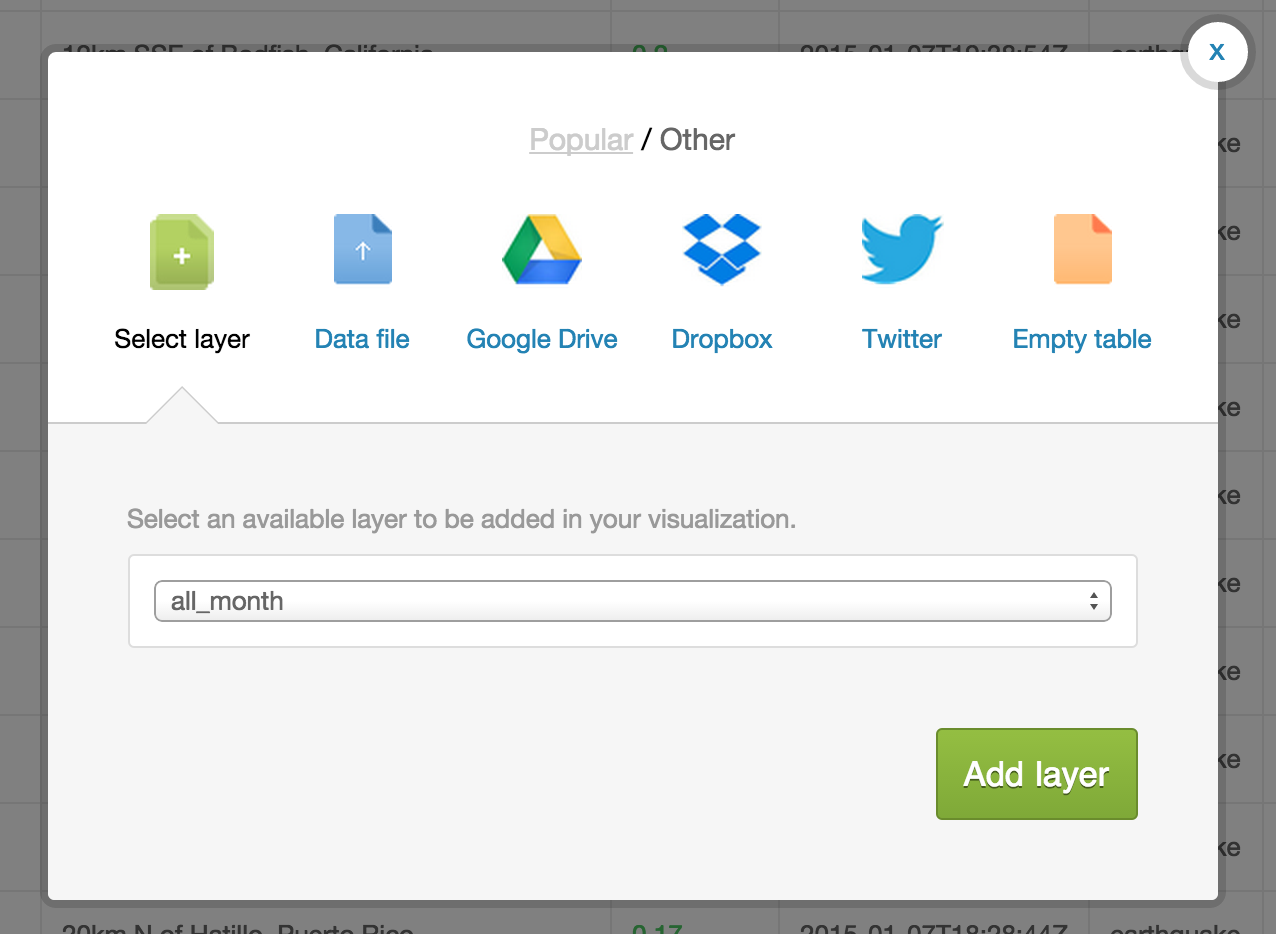
After the data imports into your account, click on the large + on the panel on the right side of the page.
Select the earthquake dataset. It's default name on import is all_month. Then hit Add layer.
Name your visualization something like "First multilayer visualization."
You can customize each layer just as you would customize a single layer.
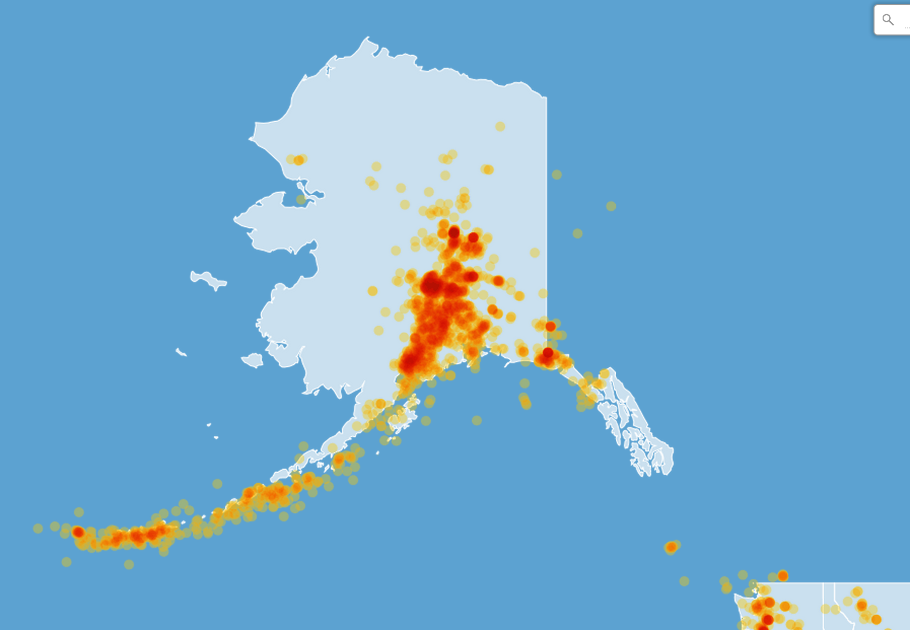
Try to create a map that looks like this:
Create a torque map and select the time column of the earthquake data
Multilayer tool developed by The Daily Beast on Abortion Clinic Access.
##Working with Data Workshop
- Comes in multiple formats
- Sources uncertain
- Contains errors
- etc.
Geospatial data is into that ids a geolocation and its characteristic features/frontiers, typically represented by points, lines, polygons, and/or complex geographic features.
Data sets we could use:
- Number of NGOs
- GDP Data for Haiti
- World Bank index data
- OECD Database of Econ Stats
- World Bank Indicators - Health
The most basic SQL statement is:
{% highlight sql %} SELECT * FROM table_name {% endhighlight %}
The * means everything. This means that all rows and columns from the table are given back once the query is run.
A more detailed query is like this:
{% highlight sql %} SELECT name, height, age FROM class_list WHERE name = 'Aure' AND ( height > 1.2 OR height < 1.9 ) {% endhighlight %}
SELECTis what you're requesting (required)FROMis where the data is located (required)WHEREis the filter on the data you're requesting (optional)GROUP BYandORDER BYare optional additions, you can read more about aggregate/other functions below
####Consider the Geom There are two special columns in CartoDB:
the_geomthe_geom_webmercator
The first of these is in the units of standard latitude/longitude, while the second is a projection based on the original Mercator projection but optimized for the web.
If you want to run SQL commands and see your map update, make sure to SELECT the the_geom_webmercator because this is the column that's used for mapping--the other is more of a convenience column since most datasets use lat/long.
- Go back to your tables view (by clicking on the little arrow in the upper lefthand corner of your browser window)
- import a new table called
usa_countiesinto your account by pasting the following link into the import box:http://andye.cartodb.com/api/v2/sql?q=SELECT%20*%20FROM%20usa_counties&filename=usa_counties&format=csv - Rename the table to
usa_countiesby clicking on table name in the upper left-hand corner of your browser window, like the image below.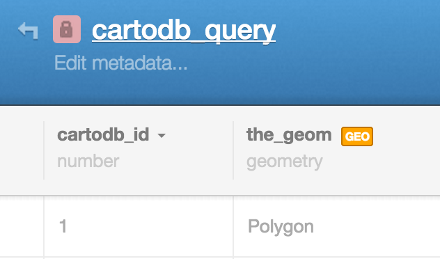
Pro tip: this is a call using our SQL API and is a great way to access your data. More at our SQL API page.
This is a SQL statement and you'll note it in your visualization tray as a way of querying and exploring your data with immediate visual output.
{% highlight sql %} SELECT * FROM earthquakes_all_month WHERE (mag >= 0.2975 AND mag < 3.17) {% highlight sql %}
You can enter queries, apply them, click on "create table from query" in the green field below the column names.
You'll also note that your sql query box populated when you filtere; the two features serve similar functions serve similar functions, but the filters give you a nice gui for manipulating data, and require less-fluency in query langs.
CartoDB.js is our JavaScript API -- a way to make maps using JavaScript.
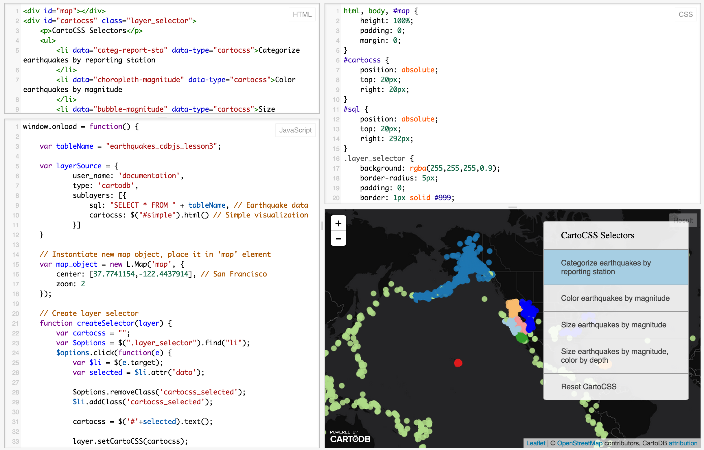
The example above use HTML, CSS, and JavaScript to make a map appear on a webpage.
Check out our Map Academy course on CartoDB.js if you want to learn more.
Use CartoDB.js with other JavaScript libraries to make powerful web map apps.
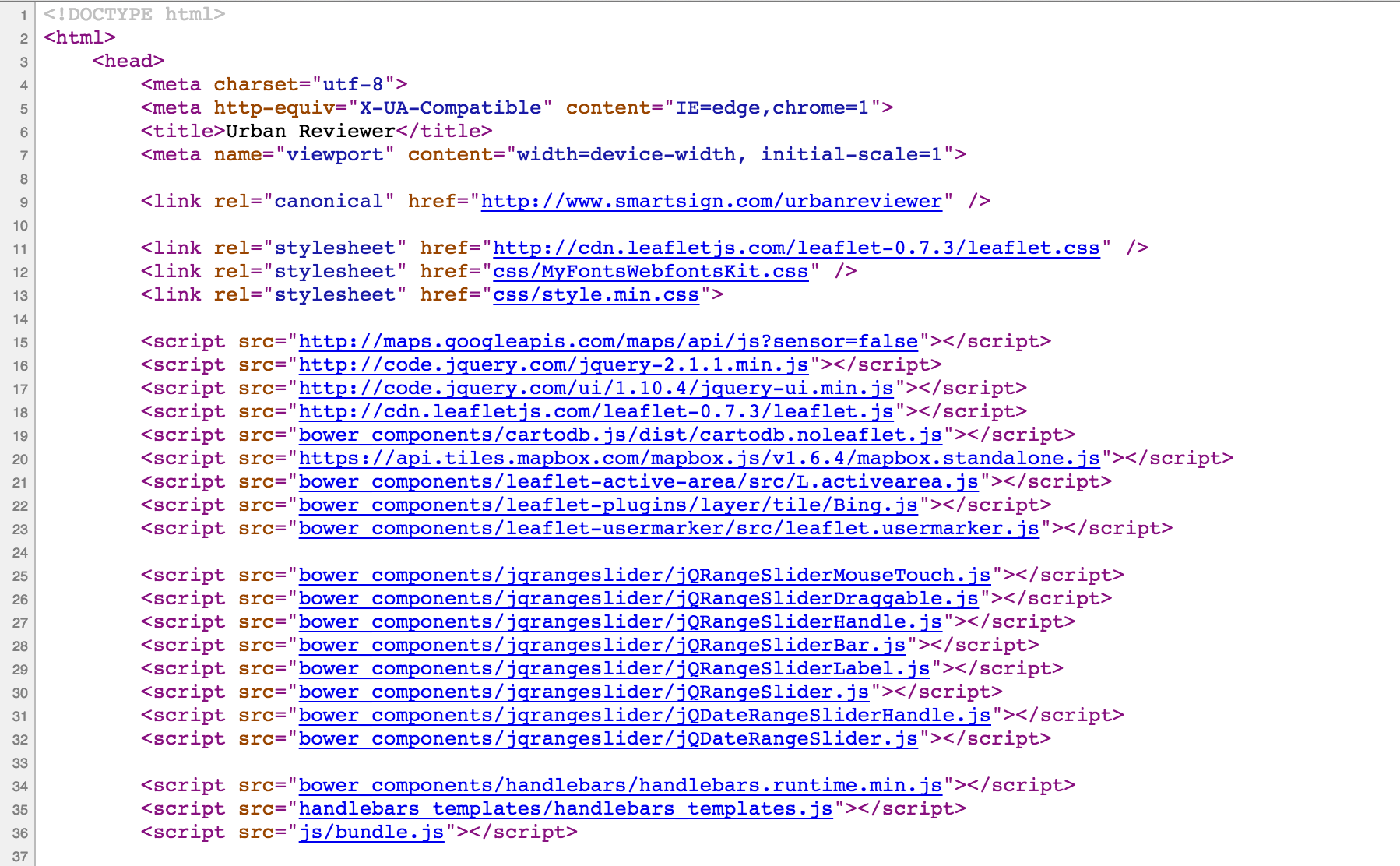
Check out Urban Reviewer.
If you take a look at the source code, there are a dozen libraries linked:
Illustreets shows standard of living information across England to amazing detail. There are millions of data points, each can be interacted with to give graphs, summaries, etc.
Metrologic weather based transport recs based on the forecast.io api
Requirements:
- Info in
the_geom - A time column (numeric or date type)
Topical Temporal Examples:
<iframe src="http://team.cartodb.com/u/andrew/viz/1e90fefa-ab11-11e4-8b14-0e4fddd5de28/embed_map" width="600px" height="400px"></iframe>Huge revamp coming next week!
Example maps:
Go to the Sandbox.
Brief tour of the interface. You follow Markdown Syntax to populate a post.
You can read more in the documentation.
We'll check out the inbrowser beta.
- Map Academy
- CartoDB.js -- build a web app to visualize your data, allowing for user interaction
- SQL and PostGIS
- CartoDB Tutorials
- CartoDB Editor Documentation
- CartoDB APIs
- Community help on StackExchange
- CartoDB Map Gallery
My contact: aurelia@cartodb.com
If you make a map you're proud of or just want to say hello, connect with me @auremoser

