VersionPress is a software project for the WordPress platform.
WordPress is the world's biggest CMS (Content Management System), powering both personal blogs and large sites like The New York Times, CNN or Forbes. It is developed as an open source project and the community aspect of it is an important part of the culture.
VersionPress provides version control for the platform which, to the end user, provides easy to use features like the Undo functionality, backup, some team workflow features etc.
-
We need distinguishable logo both for online presence and things like T-shirts and other swag. Something that catches attention is better than something neat.
-
It has to work both online and offline.
Online:
Offline:
- T-shirts and stickers for laptops are the most important ones. Stickers must be distinct on Macs (silver aluminium) and black PC laptops.
- cups, pens and other smaller items (less important, still nice to have)
Note: The current logo from versionpress.net should be thrown away, we don't need to keep anything from it (shapes, colors, anything).
It will be mostly web developers to begin with, and this is the audience we want to target the most. Later on, VersionPress should be used by all sorts of website owners like hotels, small businesses etc. but they are not our primary target group.
When we speak of a "logo" internally, all sorts of visual ideas pop into head, however, people really seem to like the name "VersionPress" as it clearly connects the principle of version control with "Press" - WordPress. So we're open to receiving logo suggestions in both of these variants:
- Visual logo like what WordPress and Git have (see below)
- Something that contains our name (text) as the main part of the logo, sort of like Amazon or the old italics Microsoft logo.
We're not partial either way.
Our website currently uses blue + green but those shouldn't be constraints - we'll happily redesign the website around the logo. The color combination is entirely up to you.
As noted above, the logo or its grayscale derivative must work well as a sticker on silver Macs and black PC notebooks.
We are about version control – keeping history of a WordPress website. These version histories are commonly drawn as directed acyclic graphs, looking a bit like rails that split and join again later. Here is an example:

This visual clue is even part of the Git logo (Git being the internal technology we use):
(Personally, I think this logo is quite nice and clever.)
Then, we build on top of WordPress platform. Its logo is:
Again, I think that this logo is pretty nice, they even have Macs where this logo is engraved into the lid instead of the famous apple.
We are kind of a combination of Git and WordPress, at least technically. Not sure if that can be some kind of design clue or not.
There's been recently a Kickstarter campaign for one WordPress projects and here is a nice page with a couple of logos from well-known WordPress companies. I'd like to comment what I like / don't like on a couple of them.
Human Made:

This logo got me thinking whether we shouldn't have a text-based logo. I don't like the style for us but it's a cleverly designed logo for them as it conveys the human side of things. If our logo could be technical and bold looking, sort of like Pagely or Pantheon below, there is something to be said for the text-based logo.
The clear disadvantage is that it's not too bold - compared to all the other logos on this page which are all 200px wide, this one looks the "tiniest".
Sort of similar to this is the Yoast logo:

I don't particularly like the style (and the colors are terrible, IMO) but I can understand if this logo works well for them, on T-shirts and other assets. It is also quite bold, unlike the Human Made one.
The last example of a logo that is text-based but I don't particularly like is this:

This, to me, almost doesn't feel like a logo. For us, I am certainly looking for something more visually interesting.
Pagely:

They use the "P" sign on T-shirts and hoodies and it's part of their name so it's easy to connect to logo with the actual company name. I don't quite like the color but the logo is generally nicely bold, I like that.
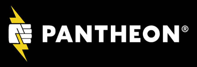
Pantheon's logo feels similar to me in that sense:
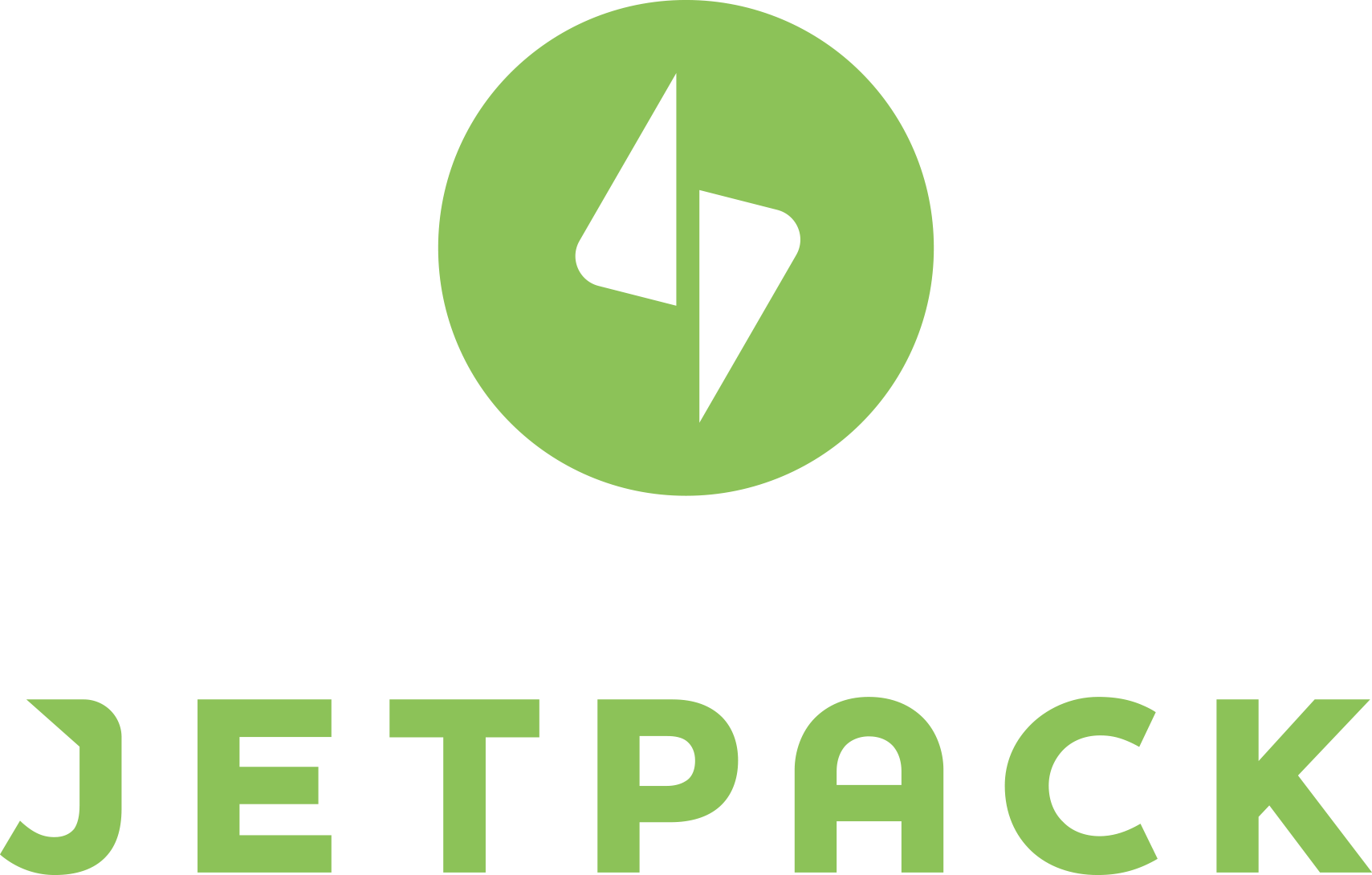
Jetpack:
In my eyes, this is an example of a "poorly" done logo, in a sense that nobody really connects Jetpack with this logo even though the product itself is extremely well-known in the WordPress community. It feels that they just wanted to have some sort of logo so they've got one. I don't understand what that logo should convey at all.
Just to repeat, here are the two main logos of the technologies that we build upon. I think both of them are great - convey a meaning, are clear etc.
Git:
WordPress: