This hit #rstats today:
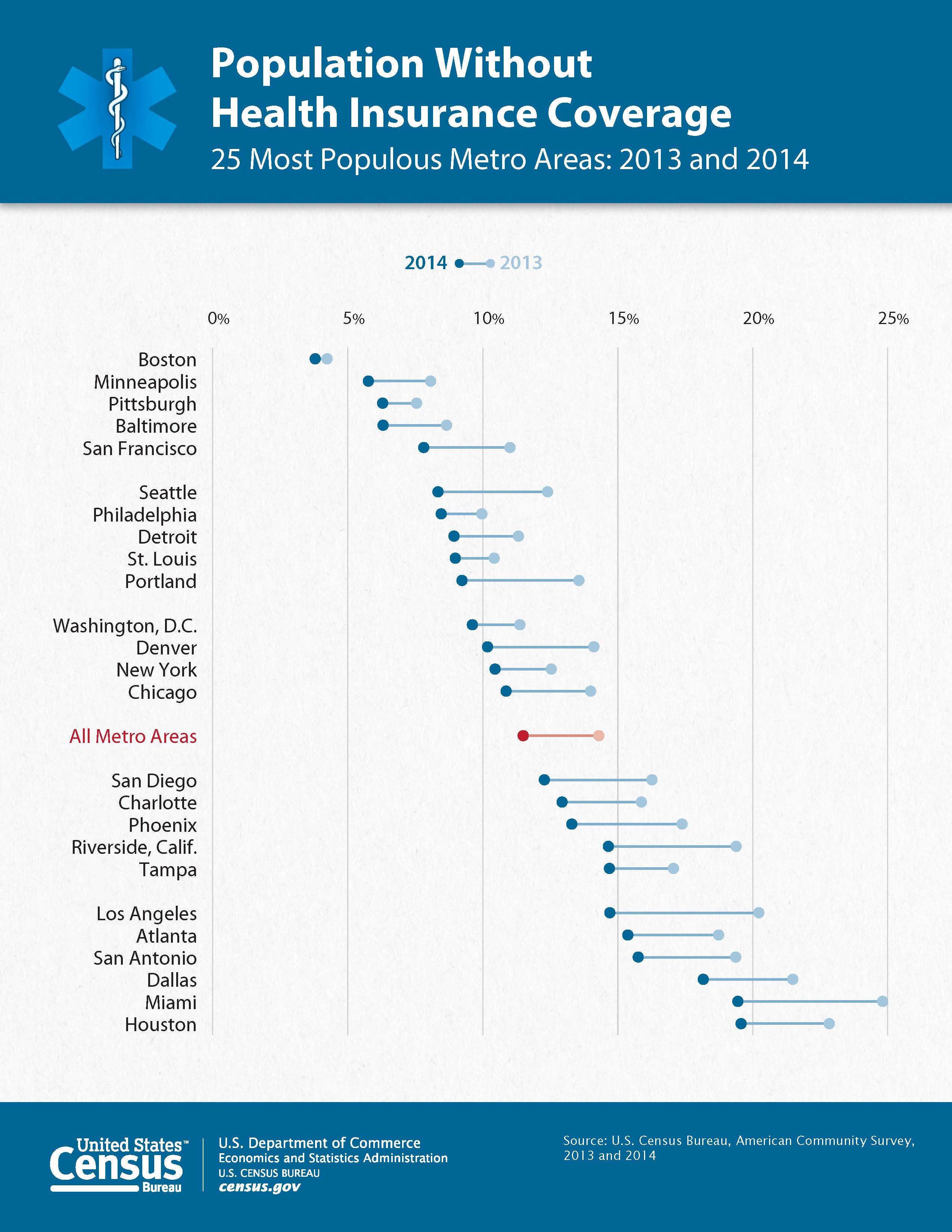
Has anyone made a dumbbell dot plot in #rstats, or better yet exported to @plotlygraphs using the API? https://t.co/rWUSpH1rRl
— Ken Davis (@ken_mke) October 23, 2015So, I figured it was worth a cpl mins to reproduce.
While the US gov did give the data behind the chart it was all the data and a pain to work with so I used WebPlotDigitizer to transcribe the points and then some data wrangling in R to clean it up and make it work well with ggplot2.
It is possible to make the top "dumbbell" legend in ggplot2 (but not by using a guide) and color the "All Metro A