This section will provide the basic guidelines to develop a consistent user interface throughout the whole application. A consistent UI has the following benefits:
-
When designing, it removes the need to make the same decision repeatedly;
-
When coding, it enables the use of templates and pre-defined snippets of code;
-
It also gives the possibility to facilitate UI development to create a scalable application.
Metrics were designed for three different screen resolutions. As the screen resolution increases, the measures change accordingly. These metrics have to be respected within the web staff client, where doing so will bring consistency, order, and a neat UI design.
All the metrics are going to be used for all the screen resolutions within each range. The base of each measure will be the typography size of the body. Metrics are expressed in "ems".
Besides the body, there are two additional sizes of typography in the UI design. The body typography will determine the UI measurements and the size of text within the majority of the web staff client. Where the two additional text sizes are used, UI metrics will still be maintained based on the typeface size of the body, and only the typeface size will change.
1366 x 768 to 1600 x 1200
From now on "Range #1". Taking 16px as the default typography size of the body, 1em is going to be equal to 16px always.
1600 x 1200 to 1920 x 1080
From now on "Range #2". Taking 18px as the default typography size of the body, 1em is going to be equal to 18px always.
1920 x 1080 to 2560 x 1440
From now on "Range #3". Taking 20px as the default typography size of the body, 1em is going to be equal to 20px always.
The UI general structure is divided into two types of user interfaces depending on the information displayed. This difference is defined by the presence or absence of context. Context is understood as an entity with a given state to which a set of actions can be applied and, in consequence, modify its state.
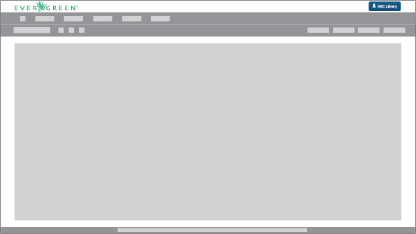
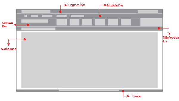
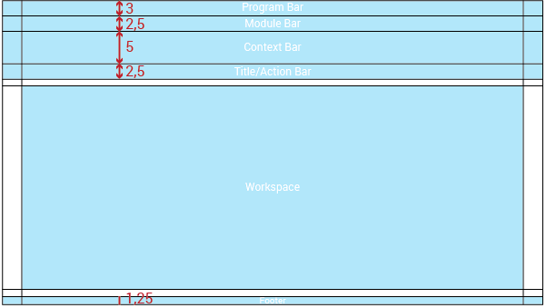
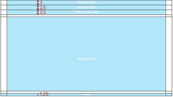
The UI without context will be composed of five main elements:
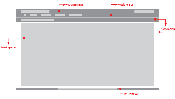
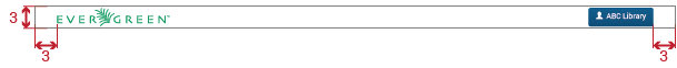
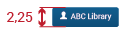
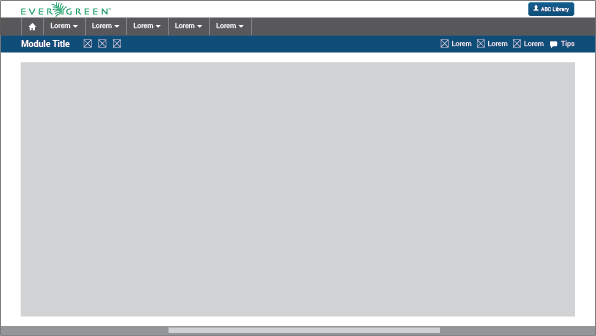
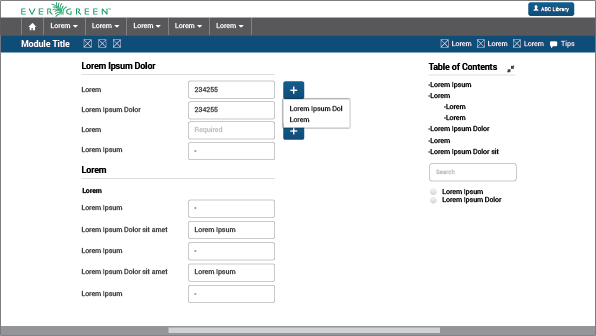
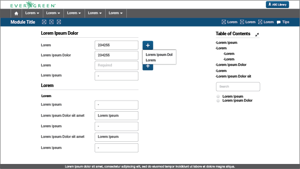
Program Bar: It is important for the project to locate its logo permanently within the web application so that users know where they are even though it is a tool used often. This section will always be located at the very top of the page. Evegreen’s logo will be located on the left side. It also shows a user/library button that will allow the user to log out, switch between different accounts, apply configuration options, or perform any other action related to the user’s account. This button is located on the right side of this header.
The program bar will have a height of 3em and its width will be adapted to the screen resolution width. Margins will be 3em.
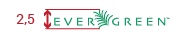
Evergreen´s logo will be:
The user/library button will be as large as the text is; also the distance between the icon and the text is measured and has to be respected (see more in "Buttons" - Visual Design):
Module Bar: All the actions that can be performed across the web application are divided and grouped into modules. Those modules are located in this bar present in all the web app screens. When clicking the modules, a dropdown menu will be displayed. The bar can contain as many modules as needed.
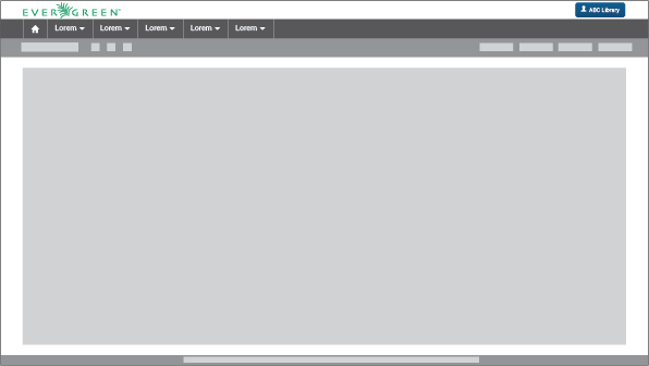
The module bar will have a height of 2.5em and its width will be adapted to the screen resolution. Margin will be 3em.
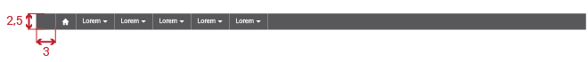
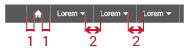
There are some metrics that are important to respect in the module bar structure like the distance between the text and the down arrow and the distance between each module title:
Each module is separated by a thin white line that will make each module work like a button.
Title/Action Bar: The user must be able to easily locate the title of the current module activity. This bar will contain the activity title in left alignment. This bar is also able to handle tabs, and sometimes contains buttons. The bar’s overall purpose is to locate the user and trigger actions that apply to the entire page. The Title/Action Bar will stick to the top of the screen as the user scrolls.
The activity title’s font size will be in Range #1: 20px bold; in Range #2: 22px bold; and in Range #3: 24px bold. Every title will be left aligned with a left margin of 3em.
Action buttons will be located on the right side (respecting the 3em margin) or next to the title.


Tabs are elements where the content is separated into different panes, and each pane is visible one at a time. The user requests content to be displayed by clicking the content’s corresponding tab control. When functioning as a tab bar, each tab’s title type will measure the same as the body’s typography size in the regular weight. Each tab will be separate by a thin white line.

Workspace: The information should be presented consistently in all the different screens of the web application. Variable content (text, forms, lists, tables, etc) will be shown only in this limited area. Margins and grids must be respected.
Some metrics that need to be respected are the distance between the workspace and the bar above it and the footer below it (1em). Also, both sides have 3em margins.
Footer: The fact of Evergreen being an open source software project should be communicated to the user. The footer will contain a brief description about the license used and also the most recent release year to show that it is regularly updated.
The text will be 14px (Range #1)/ 16px (Range #2)/ 18px (Range #3) and will be aligned to the center of the footer:

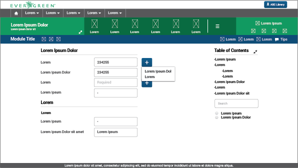
The general structure is the same with and without context, the only difference is that a new bar is displayed. The UI with context will be composed of six main elements:
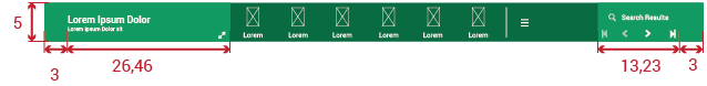
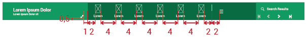
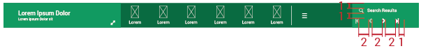
Context Bar: This bar will appear only when an action set could be applied to a specific context. The actions will be represented with icons from the FatCow icon set.
The size of typography varies with respect to the body only in the left section (where the context is mentioned). Every context will be written in 20px bold, while the subtitle type size is 14px. This subtitle will express some important details that are relevant to users.
The icon region requires some explanation:
-
The main icon set used is "FatCow", width = 2em.
-
The maximum number of icons (with their respective entries, and including the hamburger icon) is seven.
-
Icons set must be left aliged.
-
The presence of the hamburger icon (in the right side of the context bar) represents that there are more possible actions beyond the six shown.
-
If the number of actions that can be performed to the context is fewer than eight, the hamburger icon will not be displayed.
In the right portion of the context bar we can find a section called the "Results Manager". It allows the possibility of returning to the UI where the search results are, going to the next or previous context one by one, or to the first or last one directly. It also gives the option of searching a new context. It will be displayed only when the context is arrived at from a search interface.
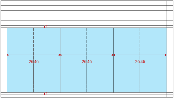
The layout template or grid will be orthogonal. This template will be adapted (scalable) to different screen resolutions. With context:
Without context:
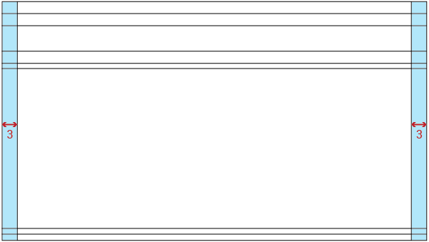
Horizontal margin will be 3em on both sides of the UI.
The general structure is divided into three main columns. These columns define the location of the content in the workspace. There are secondary baselines that create a smaller subarea if neccessary.
Depending on the presence or absence of context the workspace region will vary. With context:
Without context:
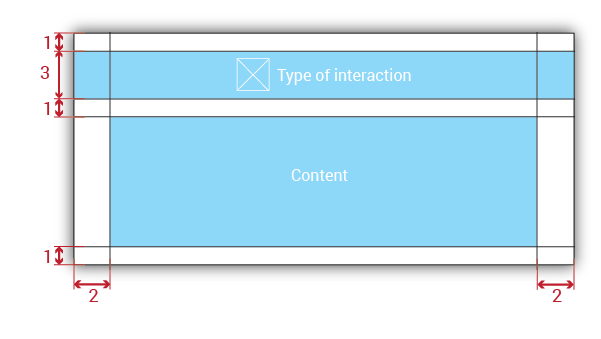
2.4 Popups metrics and structure ^^^^^^^^^^^^
Metrics apply to all types of popups. Their structure:
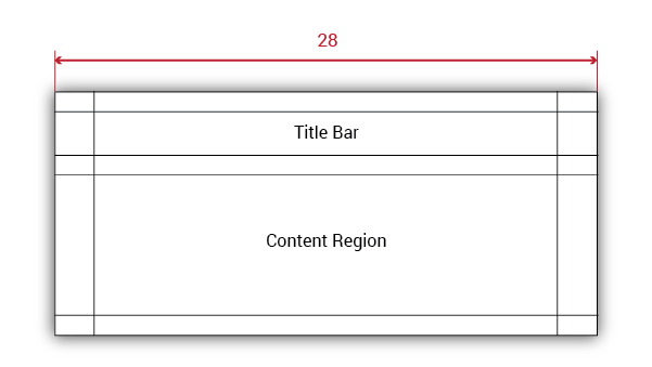
Popups will be divided into two areas:
-
Title Bar: This bar will contain an icon from the Glyphicon set (with width = 2em) illustrating the type of interaction, followed by the title of the message displayed. In addition, this bar will have different colors depending on the information it handles.
-
Content Region: The message itself will be contained in this area. The message will be expressed by text, UI elements, or both. Messages will be accompanied by buttons which will accept or cancel them.
There will be five different types. The major difference between them will be the title´s background color and its icon:
-
Error: When something isn’t going as expected, an error occurs or the information introduced is wrong, an error message popup will be displayed. The title’s background color is wrong red.

-
Information message: The only purpose of this kind of popup is to inform. Its title’s background color will be informative blue.

-
Success message: Displayed when a user-requested action has been successfully completed. Title’s background color: positive green.

-
Question message: Sometimes the system will need a confirmation or information from the user to perform a specific action or process. Title’s background color: insecure purple.

-
Action Alert: This modal alert will provide additional fuctionality to the system by displaying a popup requiring the user to perform an action. The title’s background color is active brown.