A single UI design contains a wide variety of components such as buttons, lists, forms, menus, and tables.
By giving them a guideline to follow, designers and developers will achieve consistency. These elements can be divided into three groups:
-
Input Controls: These elements involve data input, modifications, and calls to action.
-
Navigational Components: Elements that help the user to locate and understand the path between the different user interfaces of the application.
-
Informational Components: These enhance the organization and clarity of the information provided in the screens.
Users have become familiar with elements acting in a certain way, so choosing to adopt those elements when appropriate will help with task completion, efficiency, and satisfaction.
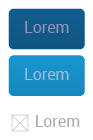
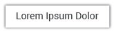
Buttons are a stylized text or image that illustrate an action and invite the user to click it. There are three types of buttons:
-
Primary Button: This button will be the most used, alone or accompanied by other types of buttons.
-
Accent Button: Used jointly with the primary button to create a noticeable difference between buttons.
-
Flat Button: This type of button is not outlined by a background. It is used mainly in structural bars.
Specs
Primary buttons will be:
-
Font
-
Roboto Regular.
-
Font size: 16px (Range #1), 18px (Range #2), 20px (Range #3).
-
Font color: white (#FFFFFF).
-
-
Background
-
Rectangle with a 5px corner radius.
-
Lineal Gradient from # 0A5D8E to # 0A5582.
-
Light will always be at the top of the button.
-

Accent buttons will be:
-
Font
-
Roboto Regular.
-
Font size: 16px (Range #1), 18px (Range #2), 20px (Range #3).
-
Font color: white (#FFFFFF).
-
-
Background
-
Rectangle with a 5px corner radius.
-
Lineal Gradient from # 1494CC to # 1588BB.
-
Light will always be at the top of the button.
-

Flat buttons will be:
-
Font
-
Roboto Regular.
-
Font size: 16px (Range #1), 18px (Range #2), 20px (Range #3).
-
Font color:
-
On a white background: Dark gray (#231F20).
-
On a color background: White (#FFFFFF).
-
-

Button Content
Buttons of any type can contain only text, only an icon (Bootstrap Glyphicon Halflings set) or both. They can also function as a dropdown menu trigger. Here are the possible combinations (for both, with background and flat buttons):

Metrics
All buttons will have fixed heights, while the width will vary according to the word or icon each button contains.
As said, text will be 16px (Range #1), 18px (Range #2), 20px (Range #3) in a center alignment. Margins will be 1em.

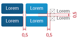
If the button is a combination of text and an icon:
If the button contains only an icon:

If the button functions as a dropdown trigger:
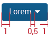
Distance between buttons:
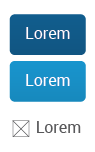
State
Not pressed:
When pressing:
Gradient will be eliminated, so the background color will change to:
-
Primary Button: #003354
-
Accent Button: #0B6A93
-
Flat Button:
-
On a dark color background will be white in both states.
-
On a light / white background will be dark gray in both states.
-
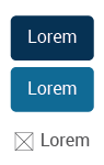
Disabled:
When a button is not available it will look like:
This is achieved by applying opacity=0.5 to the text/icon/both in primary, accent and flat buttons. In the first two the background will retain its color as established.
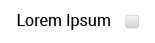
Checkboxes allow the user to select one or more options from a set. Checkboxes should be located:
-
At the right side of a word if it is the only option that the user can check
-
At the left side of a set of options if the user can perform a multiple selection

-
Alone. They will be visually separated from the text; however, they correspond to a specific option.
The default input type="checkbox" should be used to apply this element to the UI. Every checkbox will be located 1em from the word (to the left or right side) or in a center alignment.
State
Unchecked:

Checked:

When there is lack of space, or there is information that can be hidden momentarily to perform other actions yet remain easily accessible, this concept should be applied. This control is illustrated by an icon from the Bootstrap Glyphicon Halflings set:
-
glyphicon-resize-full:

-
glyphicon-resize-small:

The icon will have 1em of width. Its color will vary depending on the backgruond color: if the background color is white or a light color, use #231F20 (dark gray); if the background color is a dark color, use #FFFFFF (white).
The way in which the information is shown when expanding should vary depending on the place the icon is located.
Inside a bar:
Information will be within a white rectangle with a faint shadow around it. Notice that the content in the workspace is not covered; it was adjusted to fit in the remaining space.
In the workspace:
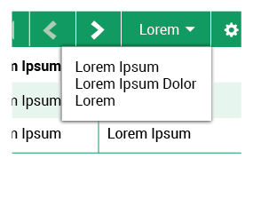
Dropdown menus allow the user to select an item at a time and perform different activities. It is also a way to save space. There are two types:
-
With selection icons: Used when the selections are primary actions. These actions will generally result in a new interface being displayed.
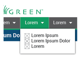
-
Without icons: Used to display secondary actions. Such actions are applied to a specific element and may therefore change the contents of the screen, but will not result in a new interface.
Specs
-
Font
-
Roboto Regular.
-
Font size: 16px (Range #1), 18px (Range #2), 20px (Range #3).
-
Font color: Dark gray (#231F20).
-
-
Background
-
White background.
-
1px Shadow around the rectangle.
-
-
Icons (if needed)
-
Width=1em.
-
Color: dark gray (#231F20).
-
Metrics
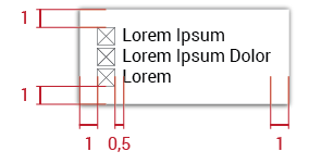
There are no specific measurements for the menu size; it will depend on the content of each dropdown menu. But metrics do determine with margins between objects:
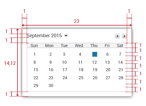
When pickers are used to select a date, the information is consistently formatted and input into the system.
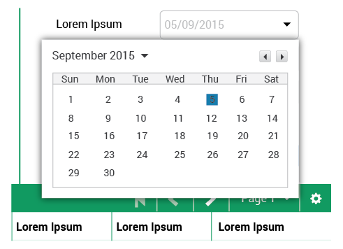
The picker will be composed of a calendar of the current month and toggles to select different months.
Metrics
The picker itself will be # 0 Blue (# 137DAB), and its measure will be 1em square:

In context:
Toggles allow the user to cycle through options one by one. The arrow pointing to the left symbolizes going backwards; the arrow pointing to the right represents going forwards. There are two different types:
-
Common toggle: Illustrated by two little buttons with a left and right arrow within each background.
-
Tips toggle: Its structure, metrics and specs are the same as flat buttons, the difference is that in a normal state means it is inactive and when it is yellow means it is active. This type of toggle is applied to a specific action: tooltips in the UI. It is located on the right side of the title/action bar.
Metrics
Common toggles will measure:

Each arrow will be center aligned. They will measure:

Tips toggles will measure:

States
Tips toggle inactive (by default):

Tips toggle active (by clicking it):

Text fields allow users to enter data. They can allow either a single line or multiple lines of text. There are different types.
Specs
-
Font
-
Roboto Regular.
-
Font size: 14px (Range #1), 16px (Range #2), 18px (Range #3).
-
Font color: Light gray (# BCBEC0).
-
-
Background
-
Rectangle with a 5px corner radius in dark gray (# 231F20).
-
No Gradient.
-
White background color.
-
-
Icon (arrow - dropdown field)
-
Width = 1em.
-
Color: dark gray (#231F20).
-
Metrics and Types
Single line:
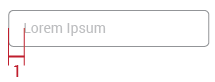
Text fields with a single line can have a help text to guide the user to enter the correct information in them. The text will be 1em from the left border:
Multiple lines:
These metrics are defined as a default. The text field would have the possibility of being manually resized according to the user needs (with the resize handle represented in the bottom right corner).
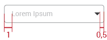
Dropdown Field:
When users can choose between a set of options, a dropdown field will be displayed.
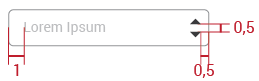
Toggle Field:
This type of text field allows users to cycle through consecutive options, giving the possibility of going backwards and forwards.
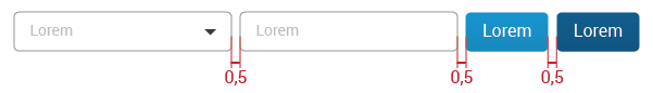
Distance between fields:
States
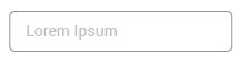
Default: When the text field is in its default state, it will look like:
Filled: Once it is completed or the option is selected (in the dropdown or toggle field types), it will look like:
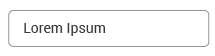
The difference is the text color: light gray (# BCBEC0) turns into dark gray (#231F20).
Clarification: In the multiple lines text field, the text will be written always in dark gray (#231F20). It doesn´t have different states.
Forms allow a user to enter data which is sent to a server for processing. They can also be used to retrieve information from a server. They are composed of labels, text fields, and buttons, though in some cases, the labels can be omitted.
Specs
-
Text Font (label)
-
Roboto Regular.
-
Font size: 16px (Range #1), 18px (Range #2), 20px (Range #3).
-
Font color: dark gray (# 231F20).
-
-
See text fields specs
Metrics and Types
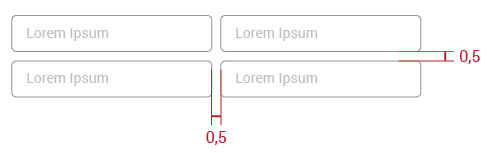
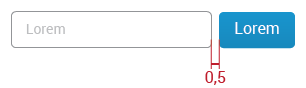
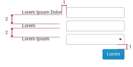
Single Row: When only one or two fields are needed to perform a specific action, they may be displayed in a single row. In such cases, help text may be placed within the field to guide the user in lieu of a label. Distance between fields and buttons will be 0.5em.
With Label: A label should be used next to each text field when the form requires three or more fields. That label will be the indication of the information to enter in the text field. Labels are left aligned to facilitate scanning for a particular field. Help text inside the text field can work as an example of what to introduce or to specify that the field is required or optional. It is not neccessary to use it in every case, but only when additional clarity is required.
In forms of three or more fields, the fields will be arranged into a single column. Buttons are located at the bottom of the form in a right alignment.
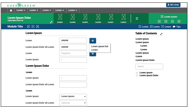
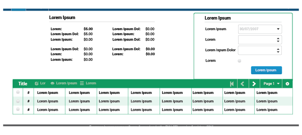
Large forms: Forms that are divided into more than one related sections are called large forms. They are composed of subheaders, lables, text fields, and sometimes buttons. (Remember: if forms or other large UI elements occupy the entire workspace, actions that are applied to it (i.e. the entire page) should be located in the title/action bar.)
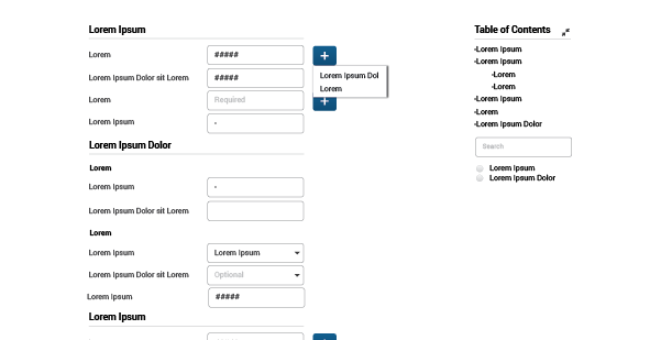
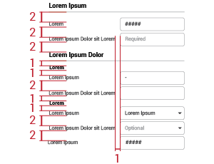
Large forms need space, so they are located in the workspace and are not accompanied by any other content due to the large number of elements involved in the page. They are presented in a single column. Metrics of fields, subheaders and labels are:
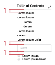
There are a table of contents, a search field, and some filters to the upper right of the large form. Those elements help users find specific fields, or manage the visualization of needed fields. It is most useful when forms are too large and exceed the height of the screen. By clicking each item in the table of contents, users can get to that specific portion of the form.
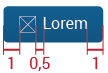
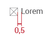
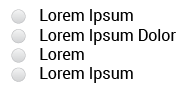
Radio buttons are used when you want to let users select one - and just one - option from a set of alternatives. Every radio button will be located 1em from the word (left or right side) or in a center alignment.
When there is only one option the radio button will be located at the right side of the text:
When there are more than one option, the radio button will be located at the left side of the text:
State
Unchecked:

Checked:

Feedback is a very important source to use in user interfaces. Users need to know what is happening with every interaction they make. A spinner will let the user know that the system is working, which avoids frustration.
The network indicator activity element will be composed of a spinner, a message, and will be shown as a popup.
Specs
-
Font
-
Roboto Regular.
-
Font size: 16px (Range #1), 18px (Range #2), 20px (Range #3).
-
Font color: Light gray (# BCBEC0).
-
-
Background
-
White color rectangle.
-
Shadow around the rectangle´s perimeter.
-
-
Spinner colors
-
Green (# 00985F).
-
Orange (# F7941E).
-
Metrics
The alert will measure:
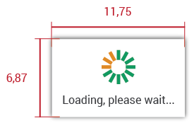
The spiner will be:
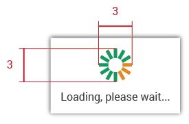
Effect
The spiner will have an effect of clockwise rotation. The three orange rectangles will be moving around the green ones until the action or activity is ready:

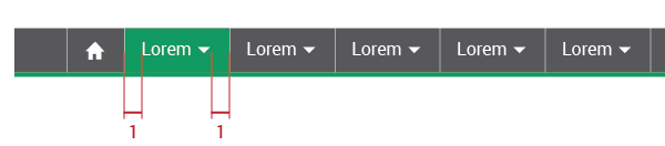
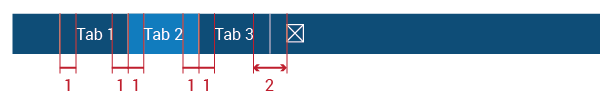
This element helps users know where they are by highlighting the pane of a menu or tab displayed on the screen. It is going to be adapted to the different sizes of menus or tabs. This UI element will also add a 4px border to the bottom of the highlighted row.
Specs
-
Colors
-
# -2 Green (# 00985F).
-
# 0 Blue (# 137DAB).
-
-
Shape
-
Rectangle.
-
Straight edges.
-
-
Size
-
4px of height, screen width.
-
Metrics
Menu selector metrics will vary according to where they are. In menus, they will have the menu´s height and margin=1em; in tabs, the tab´s height and 0.5ems of margin on both sides:
Module Bar:
Context Bar
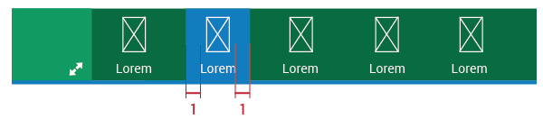
Title/Action Bar (Tabs):
States
Selected:
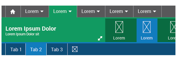
On hover over:
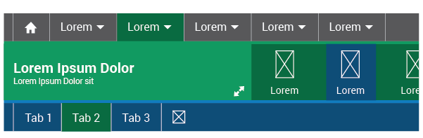
On hover over the color changes to:
-
Module Bar: # -3 Green
-
Context Bar: # -1 Blue
-
Title/Action Bar: # -3 Green.
A tooltip allows a user to see hints when they hover over an item indicating the name or purpose of the item.
Specs
-
Font
-
Roboto Regular.
-
Font size: 14px (Range #1), 16px (Range #2), 18px (Range #3).
-
Font color: Dark gray (#231F20).
-
-
Background
-
White color rectangle.
-
Shadow around the rectangle´s perimeter.
-
-
Margin
-
1em in both left and right sides, from the border to the text.
-
-
Metrics
-
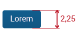
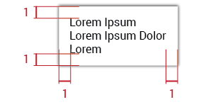
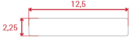
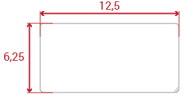
Will vary depending on the text. It can contain a single line or multiple lines. It measures can not be greater than width=12.5em and height=10em or less than height=2.25em.
-
Dividers are thin gray lines that help divide spaces or regions of the UI to organize and make the information display more clearly.
Specs
-
Line
-
1px thickness.
-
Mid gray color (#939598).
-
-
Location
-
Workspace
-
Dropdown Menu
-
Forms
-
Alerts
-
-
Usage
-
To separate different items within a set.
-
Subheaders function as subtitles within a module. They are located only in the workspace and alerts. There are two types:
-
Primary Subheader: A combination of text and divider.
-
Secondary Subheader: Bold text.
Specs
Primary Subheader:
-
Font
-
Roboto Bold.
-
Font size: 20px (Range #1), 22px (Range #2), 24px (Range #3).
-
Font color: Black.
-
-
Location
-
Workspace
-
Alerts
-
-
Usage
-
To separate different content within a UI.
-
-
See divider specs.
Secondary Subheader:
-
Font
-
Roboto Bold.
-
Font size: 16px (Range #1), 18px (Range #2), 20px (Range #3).
-
Font color: Black.
-
-
Location
-
Workspace
-
Alerts
-
-
Usage
-
To separate different content within a UI once the primary subheader is already applied.
-
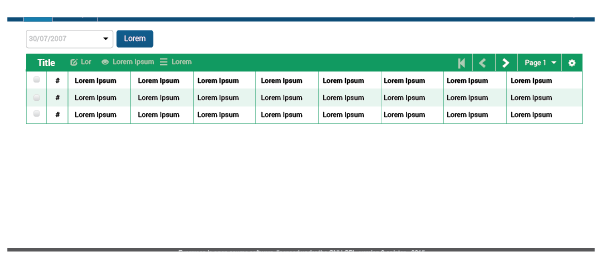
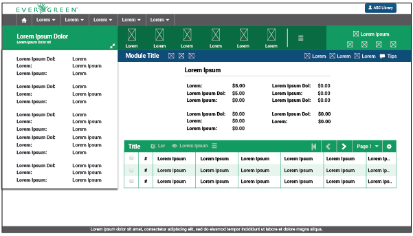
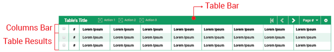
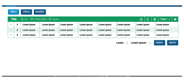
The table UI element is one of the most frequently used within the Evergreen web staff client. It retrieves required information and shows all the results in an orderly way. Tables are resizable; they adapt to the whole screen width or to the remaining space in the workspace. One can also resize the default width of individual columns.
Structure
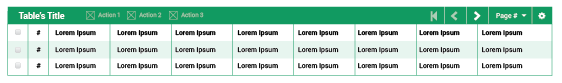
Tables are composed of three main areas:
-
Table Bar: This bar contains a wealth of information and features for every table. It will show a title to locate the user; an Action set which can be applied to the rows; a Page navigator to work through the set of information; and a Table configuration icon (cog icon) to change the default table view and other configuration options that apply to every table.
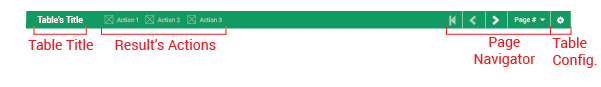
Something important to highlight is the action set. It is composed of up to three buttons; the first two will be the most common actions, and the third is a trigger button to open more actions (shown as a dropdown menu).
-
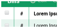
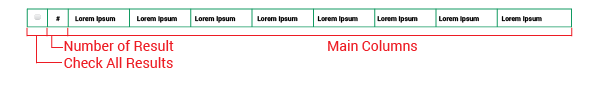
Columns Bar: This section will display the a "Check all results" checkbox to implement a specific action - or set of actions- on all the results retrieved, a "Number of result" column to facilitate the observation of information, and the column headers for each field being displayed.
-
Table Results: Where all the results retrieved are exposed. The information will be presented according to either the default configuration or options selected by the user.
Metrics
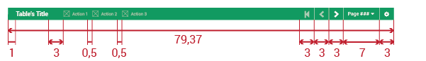
Table bar: Height of 2.25em. #-2 Green background color. Each icon used in this bar will have width=1em.
Columns Bar: Height of 2.25em.
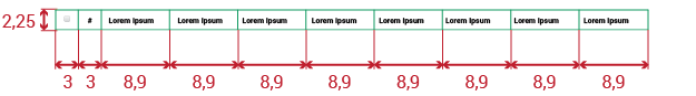
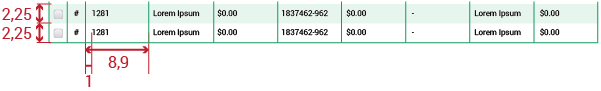
Table Results: Each row will have 2.25em of height. As a visual detail, every other row should have a #-2 Green background color with opacity=0.2 to help the visualization of the information, starting from the first row. The number of columns will always be 8 (without the number of column and the checkbox columns) as a default.
Results States
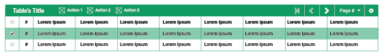
Table results have two posible states.
Default: Checkboxes are unchecked and the actions set is disabled.
Selected: One or more checkboxes will be checked and the actions set will be enabled.
Combination
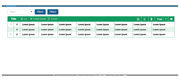
One common combination will be buttons/checkboxes/text fields + table. Buttons can work as filters to the table, as an in-page menu, as a way to change the table’s results, or as a modifier. They should be located above the table so the user can see them quickly and know the possibilities, and because options at the bottom may end up off the screen. There can be cases in which buttons or checkboxes are placed at the bottom of the table, but this should happen only when more than three options are required:
Up to three buttons:
More than three buttons:
Grouping
When a specific UI element (or combination of elements) is completely related to a table, and is displayed in conjunction with elements not directly tied to the table, the related element (or elements) should be grouped with the table by a thin line. The line will be 1px, with a 5px rounded edges only in the upper corners, in a #-2 Green color.
When there is no more information displayed on the screen than the table and the related UI element (or combination of elements), is not neccessary to group them with a line.