Hey guys, this is lesson 2 of the ZARA replica mobile app. Check out the previous lesson if you haven't done so already . So, in this one we will continue from where we left off .
Like I said, we will use in memory data for this series. There's a lot of code for the models and data that's why it's unnecessary to paste all of it here. Download the final project to check it out. I will just go over the code briefly, and later on you will understand better what it does..
Page.swift
This contains the page model, it will be used to display a single tab on the home screen which is the screen that will be presented to the user after the login screen.
Home.swift
This contains the Home data which is the screen I have just talked about.
Category.swift
This is an enum containing only 3 cases men, women, kids. This will also be used as ids for our pages.
Product.swift
This contains everything product related. This is also where we keep all of our products hard-coded data.
Tab.swift
This is also an enum containing 5 cases. It will be used with our custom tab bar view.
What is redux? If you are familiar with react (yes, the Javascript library), then chances are you are also familiar with redux. Redux is a state management container that help you centralize your application's state and logic which in turn help your app behaves in a consistent and predictable manner.
The reason redux will work well with swiftUI is state. Views being function of data state in swiftUI, it does make sense to try out redux to help manage that state. This lesson is not mainly focus on redux, so we will move a bit faster, but if you want to learn more (which I suggest you do), I will link some materials to help you out.
State in redux is the single source of truth, it will be read-only.
The state will be a simple struct containing various data used in different part of the app. The state will only mutate when an action is emitted by views. Action will be an enum where cases are operations that need to be performed and update the current state.
It is a function that takes an Action and the current State as parameters and returns a new State.
Video
Watch the video version of this section on my website.
This is where our data will reside. Add the following inside the Data folder:
Store.swift
import Foundation

class Store: ObservableObject {

			struct State {
			  var products: [Product]
			    var bookmarked: [Product]
			    var shoppingCart: [Product]
			    var isLoggedIn: Bool = false
			}

			enum Action {
			    case addProducts(_ products: [Product])
			    case bookmark(_ product: Product)
			    case removeFromBookmark(_ index: Int)
			    case addToCart(_ product: Product)
					case login
			}


    @Published private(set) var state: State = .init(products: [], bookmarked: [], shoppingCart: [])


    func dispatch(_ action: Action)  {
        reducer(state: &state, action: action)
    }

    func reducer(state: inout State, action: Action) {
        switch action {
        case .bookmark(let product):
            state.bookmarked.append(product)
        case .addToCart(let product):
            state.shoppingCart.append(product)
        case .removeFromBookmark(let index):
            state.bookmarked.remove(at: index)
        case .addProducts(let products):
            state.products = products
        case .login:
            DispatchQueue.main.asyncAfter(deadline: DispatchTime.now() + 0.3) { [weak self] in
                self?.state.isLoggedIn = true
            }
        }
    }
}
Explanation
Like I said, our state will only change when a particular action is emitted from our views, so The Action enum describes exactly the types of action our app will be dispatching. Bear with me, you will see how we use both the State and Action shortly.
The reducer takes in a state and an action, and based an the action we mutate the state accordingly. For example, when the dispatched action is .bookmark, we will add the bookmarked product in the bookmarked array. The inout keyword before the state type makes it read and write. We also use a dispatch function which, as its name implies, will send actions to the reducer. It is a simple function, as you can see, that just calls the reducer function with appropriate arguments.
Like I said before, the current state of swiftuI does not handle everything... There are some layouts that still need the power of UIkit to work properly, one such layout is a vertically scrollable paging view, like tik tok... We will build this kind of layout for the home screen using the UIKit's UICollectionView. The collection view will just be a container, and every single view will be made entirely in swift UI.
Add the following inside the UIKit folder:
Video
Watch the video version of this section on my website.
CollectionView.swift
import SwiftUI

struct CollectionView: UIViewRepresentable {

    var controllers: [UIViewController]
    @Binding var currentPage: Int
    @Binding var selectedIndex: Int?

    func makeUIView(context: Context) -> UICollectionView {
        let layout = UICollectionViewFlowLayout()
        let collectionView = UICollectionView(frame: .zero, collectionViewLayout: layout)
        collectionView.backgroundColor = .clear
        collectionView.register(CollectionCell.self, forCellWithReuseIdentifier: CollectionCell.reuseId)
        collectionView.dataSource = context.coordinator
        collectionView.delegate = context.coordinator
        collectionView.isPagingEnabled = true
        collectionView.alwaysBounceVertical = false
        collectionView.bounces = false
        collectionView.showsVerticalScrollIndicator = false
        layout.minimumLineSpacing = 0
        return collectionView
    }

    func updateUIView(_ collectionView: UICollectionView, context: Context) {

    }

    func makeCoordinator() -> CollectionView.Coordinator {
        Coordinator(self)
    }

    class Coordinator: NSObject,UICollectionViewDataSource, UICollectionViewDelegate, UICollectionViewDelegateFlowLayout {
        var parent: CollectionView

        init(_ parent: CollectionView) {
            self.parent = parent
        }

        func numberOfSections(in collectionView: UICollectionView) -> Int {
            return 1
        }

        func collectionView(_ collectionView: UICollectionView, numberOfItemsInSection section: Int) -> Int {
            return  parent.controllers.count
        }

        func collectionView(_ collectionView: UICollectionView, cellForItemAt indexPath: IndexPath) -> UICollectionViewCell {
            if let cell = collectionView.dequeueReusableCell(withReuseIdentifier: CollectionCell.reuseId, for: indexPath) as? CollectionCell {
                cell.viewController = parent.controllers[indexPath.item]
                return cell
            }
            return UICollectionViewCell()
        }

        func collectionView(_ collectionView: UICollectionView,
                            didEndDisplaying cell: UICollectionViewCell,
                            forItemAt indexPath: IndexPath) {
            guard let index = collectionView.indexPathsForVisibleItems.first?.item else {
                return
            }

            self.parent.currentPage = index
        }

        func collectionView(_ collectionView: UICollectionView, didSelectItemAt indexPath: IndexPath) {
            self.parent.selectedIndex = indexPath.item
        }

        func collectionView(_ collectionView: UICollectionView, layout collectionViewLayout: UICollectionViewLayout, sizeForItemAt indexPath: IndexPath) -> CGSize {
            return CGSize(width: UIScreen.main.bounds.width, height: UIScreen.main.bounds.height)
        }
    }
}
Explanation
- Notice that we are using the old
UICollectionViewFlawLayout, this is because we don't need the new complex layoutUICollectionViewCompositionalLayoutwhich would be too much for this simple layout. - We also set the context's coordinator to be the collectionView's
delegateanddataSource. The Coordinator is created below themakeCoordinatormethod. - In order to enable the paging, we need to set
isPagingEnabledon theUICollectionViewto true. - In the coordinator, we dequeue a reusable cell using its identifier, then set its viewController property to one of the items in the controllers array.
- In the didEndDisplaying cell, we retrieve the index of the first visible item and set it to the current page.
- In the didSelectItemAt, we set the selectedIndex property to the selected indexPath's item.
- In the last
UICollectionViewDelegateFlowLayoutmethod, we return the size we wish our cells to be, in this case we want them to fill the entire screen.
You will have an error caused by the missing CollectionCell, so let's create it now.
CollectionCell.swift
import SwiftUI

class CollectionCell: UICollectionViewCell {
    static let reuseId: String = "CollectionCell"

		// 1
    var viewController: UIViewController? {
        didSet {
            if let viewController = self.viewController {
                setupCell(viewController)
            }
        }
    }

    override init(frame: CGRect) {
        super.init(frame: frame)
        if let viewController = self.viewController {
            setupCell(viewController)
        }
    }

    required init?(coder: NSCoder) {
        super.init(coder: coder)
    }


		// 2
    private func setupCell(_ viewController: UIViewController){

        guard let view = viewController.view else {
            return
        }

        view.translatesAutoresizingMaskIntoConstraints = false
        view.backgroundColor = .clear
        self.addSubview(view)

        NSLayoutConstraint.activate([
            view.leadingAnchor.constraint(equalTo: contentView.leadingAnchor),
            view.trailingAnchor.constraint(equalTo: contentView.trailingAnchor),
            view.topAnchor.constraint(equalTo: contentView.topAnchor),
            view.bottomAnchor.constraint(equalTo: contentView.bottomAnchor),
        ])
    }

}
Explanation
- Notice that the data we are working with here is an object of type UIViewController. You will see why shortly.
- In the
setupCell, we retrieve the view from theUIViewControllerobject which we then add to the cell. This view we are retrieving is a SwiftUI View that will be passed toUIHostingControllerwhen we initialize it.
And with that, we are done with UIKit in this series. Next step is to create the PageView.
Video
Watch the video version of this section on my website.
In the Views, add the following:
PageView.swift
import SwiftUI

struct PageView: View {

    var page: Page

    var body: some View {

        VStack(spacing: 20) {
            Text(page.title)
                .multilineTextAlignment(.center)
                .font(.system(size: 50, weight: Font.Weight.black, design: Font.Design.default))
                .textColor()
                .frame(width: Sizes.screenWidth * 0.95, alignment: .center)

            Text(page.description)
                .textColor()
                .multilineTextAlignment(.center)
                .frame(width: 300, alignment: .center)

            Text("View")
                .font(.system(size: 20, weight: Font.Weight.bold, design: Font.Design.default))
                .textColor()
                .padding(.horizontal, 30)
                .padding(.vertical, 10)
                .border(Color.text, width: 1)

        }.frame(height: Sizes.screenHeight)
        .bgColor()
        .edgesIgnoringSafeArea(.all)

    }
}

struct PageView_Previews: PreviewProvider {
    static var previews: some View {
        PageView(page: Page.default)
    }
}
Explanation
This is a simple VStack containing 3 views. This is the view that will be passed in the UIHostingController in order to be added to the cell's content.
Preview

Let's create a new component view that will display the current displayed page index.
Video
Watch the video version of this section on my website.
Add the following inside the Views folder.
VerticalPageIndicator.swift
import SwiftUI
struct VerticalPageIndicator: View {
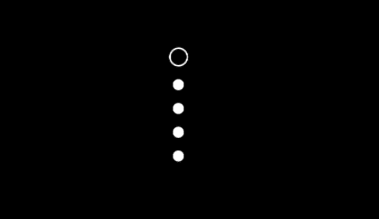
var numberOfPages: Int = 5
@Binding var selectedPageIndex: Int
var body: some View {
VStack {
ForEach(0..<numberOfPages) { i in
if i == selectedPageIndex {
Circle()
.strokeBorder(lineWidth: 1.0, antialiased: true)
.frame(width: 12, height: 12, alignment: .center)
} else {
Circle().frame(width: 7, height: 7, alignment: .center)
}
}
}.textColor()
}
}
struct VerticalPageIndicator_Previews: PreviewProvider {
static var previews: some View {
VerticalPageIndicator(selectedPageIndex: .constant(0))
.preferredColorScheme(.dark)
}
}Explanation
In the above code, we loop through from 0 to numberOfPages - 1, then check if the current index is selected and stroke the circle at that index and make it a bit larger, otherwise we keep it as a plain circle.
Preview
Video
Watch the video version of this section on my website.
Add the following inside the Views folder.
PagingController.swift
struct PagingController<T: View>: View {

    var viewControllers: [UIHostingController<T>] = []
    @State var currentPage = 0
		@Binding var selectedIndex: Int?

    var body: some View {

        return ZStack(alignment: .trailing) {
            CollectionView(controllers: viewControllers, currentPage: self.$currentPage, selectedIndex: self.$selectedIndex)
            VerticalPageIndicator(numberOfPages: viewControllers.count, selectedPageIndex: self.$currentPage)
                .padding(.trailing, 10)
        }
    }
}

struct PagingController_Previews: PreviewProvider {
    static var previews: some View {
        PagingController(viewControllers: Page.data.map({  UIHostingController(rootView: PageView(page: $0) )}))
    }
}
Explanation
This view is easier to understand. We put the collectionView and the VerticalPageIndicator inside a ZStack with alignment set to trailing to push the Vertical page indicator to the right edge of the screen
Preview

Swift ui paging view page indicator
Before creating the home screen, let first create a component that will be used there:
Video
Watch the video version of this section on my website.
In the Views folder, add the following:
TabIndicatorItem.swift
struct TabIndicatorItem: View {

    var category: Category
    var isActive: Bool


    var body: some View {

        return VStack(spacing: 0) {
            Text(category.toString().uppercased())
                .font(.system(size: 18,
                              weight: isActive ? Font.Weight.bold : Font.Weight.light,
                              design: Font.Design.default))
                .frame(maxWidth: .infinity)
                .layoutPriority(1)

            if isActive {
                Rectangle()
                    .frame(width: 50 , height: 2, alignment: .center)
            }
        }.foregroundColor(.text)
    }
}
Preview

TabIndicator.swift
struct TabIndicator: View {
    var category: Category


    var body: some View {
        HStack{
            ForEach(0..<Category.allCases.count) { i in
TabIndicatorItem(category: Category.allCases[i], isActive: Category.allCases[i] == category )            }
        }.frame(width: 250)
    }
}

struct TabIndicator_Previews: PreviewProvider {
    static var previews: some View {
        TabIndicator(category: Category.men)
    }
}
Preview

Video
Watch the video version of this section on my website.
In the Screens folder, add the following:
HomeScreen.swift
import SwiftUI

struct HomeScreen: View {

    @Binding var category: Category?

    private let data = Home.data
    @State private var selected = Home.data.first!
    @EnvironmentObject private var store: Store


    var body: some View {

        return ZStack(alignment: .top) {
            TabView(selection: self.$selected.id) {
                ForEach(data) { item in
                    createPageController(item)
												.frame(height: Sizes.screenHeight)
                        .tag(item.id)
                        .onTapGesture(count: 1, perform: { category = item.id })
                }

            }.background(Color.background)
            .tabViewStyle(PageTabViewStyle(indexDisplayMode: .never))
            TabIndicator(category: selected.id)
                .padding(.top, 50)
        }
    }

    fileprivate func createPageController(_ data: Home) -> PagingController<PageView> {
        return PagingController(
            viewControllers: data.pages.map({  UIHostingController(rootView: PageView(page: $0) )})
        )
    }
}

struct HomeScreen_Previews: PreviewProvider {
    static var previews: some View {
        HomeScreen(category: .constant(Category.kids))
    }
}
Explanation
- First we declare our properties. The
selectedstate property will be used with theTabView.the store is retrieved from theEnvironmentObjectthat will be passed down from the parent view. - The outer container is a
ZStackwith content aligned to top. - We create the
TabView, passing in theselected's id state property which is of typeCategory, we will use it to control theTabIndicator. - In the
ForEachblock, we go through each item, creating a page controller and adding a tag to it. The tag must be of the same type as theselected's id . - In the
onTapGesture, we set the category binding property that we will listen to in order to presentProductListingScreen. - Setting the
indexDisplayModeto.neverwill prevent theTabViewto display the built-in page indicator. - TabIndicator is finally created passing in the
selected's id for the category.
Preview

This is it for lesson 2. stay tuned for the third in which we will tackle LazyVGrid while the creating the product page. Subscribe if you haven't done so already. Happy coding!