Created
December 2, 2019 10:13
-
-
Save mikepyts/666961b23a7120cd45f3d6b3894caaf6 to your computer and use it in GitHub Desktop.
This file contains bidirectional Unicode text that may be interpreted or compiled differently than what appears below. To review, open the file in an editor that reveals hidden Unicode characters.
Learn more about bidirectional Unicode characters
| import 'dart:math' as math; | |
| import 'package:flutter/material.dart'; | |
| import 'package:flutter/rendering.dart'; | |
| import 'package:flutter/gestures.dart'; | |
| import 'package:flutter_issues/custom_scrollable.dart' as custom_scrollable; | |
| /// A widget that scrolls. | |
| /// | |
| /// Scrollable widgets consist of three pieces: | |
| /// | |
| /// 1. A [Scrollable] widget, which listens for various user gestures and | |
| /// implements the interaction design for scrolling. | |
| /// 2. A viewport widget, such as [Viewport] or [ShrinkWrappingViewport], which | |
| /// implements the visual design for scrolling by displaying only a portion | |
| /// of the widgets inside the scroll view. | |
| /// 3. One or more slivers, which are widgets that can be composed to created | |
| /// various scrolling effects, such as lists, grids, and expanding headers. | |
| /// | |
| /// [ScrollView] helps orchestrate these pieces by creating the [Scrollable] and | |
| /// the viewport and deferring to its subclass to create the slivers. | |
| /// | |
| /// To control the initial scroll offset of the scroll view, provide a | |
| /// [controller] with its [ScrollController.initialScrollOffset] property set. | |
| /// | |
| /// See also: | |
| /// | |
| /// * [ListView], which is a commonly used [ScrollView] that displays a | |
| /// scrolling, linear list of child widgets. | |
| /// * [PageView], which is a scrolling list of child widgets that are each the | |
| /// size of the viewport. | |
| /// * [GridView], which is a [ScrollView] that displays a scrolling, 2D array | |
| /// of child widgets. | |
| /// * [CustomScrollView], which is a [ScrollView] that creates custom scroll | |
| /// effects using slivers. | |
| /// * [ScrollNotification] and [NotificationListener], which can be used to watch | |
| /// the scroll position without using a [ScrollController]. | |
| abstract class ScrollView extends StatelessWidget { | |
| /// Creates a widget that scrolls. | |
| /// | |
| /// If the [primary] argument is true, the [controller] must be null. | |
| /// | |
| /// If the [shrinkWrap] argument is true, the [center] argument must be null. | |
| /// | |
| /// The [scrollDirection], [reverse], and [shrinkWrap] arguments must not be null. | |
| /// | |
| /// The [anchor] argument must be non-null and in the range 0.0 to 1.0. | |
| const ScrollView({ | |
| Key key, | |
| this.scrollDirection = Axis.vertical, | |
| this.reverse = false, | |
| this.controller, | |
| bool primary, | |
| ScrollPhysics physics, | |
| this.shrinkWrap = false, | |
| this.center, | |
| this.anchor = 0.0, | |
| this.cacheExtent, | |
| this.semanticChildCount, | |
| this.dragStartBehavior = DragStartBehavior.start, | |
| }) : assert(scrollDirection != null), | |
| assert(reverse != null), | |
| assert(shrinkWrap != null), | |
| assert(dragStartBehavior != null), | |
| assert(!(controller != null && primary == true), | |
| 'Primary ScrollViews obtain their ScrollController via inheritance from a PrimaryScrollController widget. ' | |
| 'You cannot both set primary to true and pass an explicit controller.' | |
| ), | |
| assert(!shrinkWrap || center == null), | |
| assert(anchor != null), | |
| assert(anchor >= 0.0 && anchor <= 1.0), | |
| assert(semanticChildCount == null || semanticChildCount >= 0), | |
| primary = primary ?? controller == null && identical(scrollDirection, Axis.vertical), | |
| physics = physics ?? (primary == true || (primary == null && controller == null && identical(scrollDirection, Axis.vertical)) ? const AlwaysScrollableScrollPhysics() : null), | |
| super(key: key); | |
| /// The axis along which the scroll view scrolls. | |
| /// | |
| /// Defaults to [Axis.vertical]. | |
| final Axis scrollDirection; | |
| /// Whether the scroll view scrolls in the reading direction. | |
| /// | |
| /// For example, if the reading direction is left-to-right and | |
| /// [scrollDirection] is [Axis.horizontal], then the scroll view scrolls from | |
| /// left to right when [reverse] is false and from right to left when | |
| /// [reverse] is true. | |
| /// | |
| /// Similarly, if [scrollDirection] is [Axis.vertical], then the scroll view | |
| /// scrolls from top to bottom when [reverse] is false and from bottom to top | |
| /// when [reverse] is true. | |
| /// | |
| /// Defaults to false. | |
| final bool reverse; | |
| /// An object that can be used to control the position to which this scroll | |
| /// view is scrolled. | |
| /// | |
| /// Must be null if [primary] is true. | |
| /// | |
| /// A [ScrollController] serves several purposes. It can be used to control | |
| /// the initial scroll position (see [ScrollController.initialScrollOffset]). | |
| /// It can be used to control whether the scroll view should automatically | |
| /// save and restore its scroll position in the [PageStorage] (see | |
| /// [ScrollController.keepScrollOffset]). It can be used to read the current | |
| /// scroll position (see [ScrollController.offset]), or change it (see | |
| /// [ScrollController.animateTo]). | |
| final ScrollController controller; | |
| /// Whether this is the primary scroll view associated with the parent | |
| /// [PrimaryScrollController]. | |
| /// | |
| /// When this is true, the scroll view is scrollable even if it does not have | |
| /// sufficient content to actually scroll. Otherwise, by default the user can | |
| /// only scroll the view if it has sufficient content. See [physics]. | |
| /// | |
| /// On iOS, this also identifies the scroll view that will scroll to top in | |
| /// response to a tap in the status bar. | |
| /// | |
| /// Defaults to true when [scrollDirection] is [Axis.vertical] and | |
| /// [controller] is null. | |
| final bool primary; | |
| /// How the scroll view should respond to user input. | |
| /// | |
| /// For example, determines how the scroll view continues to animate after the | |
| /// user stops dragging the scroll view. | |
| /// | |
| /// Defaults to matching platform conventions. Furthermore, if [primary] is | |
| /// false, then the user cannot scroll if there is insufficient content to | |
| /// scroll, while if [primary] is true, they can always attempt to scroll. | |
| /// | |
| /// To force the scroll view to always be scrollable even if there is | |
| /// insufficient content, as if [primary] was true but without necessarily | |
| /// setting it to true, provide an [AlwaysScrollableScrollPhysics] physics | |
| /// object, as in: | |
| /// | |
| /// ```dart | |
| /// physics: const AlwaysScrollableScrollPhysics(), | |
| /// ``` | |
| /// | |
| /// To force the scroll view to use the default platform conventions and not | |
| /// be scrollable if there is insufficient content, regardless of the value of | |
| /// [primary], provide an explicit [ScrollPhysics] object, as in: | |
| /// | |
| /// ```dart | |
| /// physics: const ScrollPhysics(), | |
| /// ``` | |
| /// | |
| /// The physics can be changed dynamically (by providing a new object in a | |
| /// subsequent build), but new physics will only take effect if the _class_ of | |
| /// the provided object changes. Merely constructing a new instance with a | |
| /// different configuration is insufficient to cause the physics to be | |
| /// reapplied. (This is because the final object used is generated | |
| /// dynamically, which can be relatively expensive, and it would be | |
| /// inefficient to speculatively create this object each frame to see if the | |
| /// physics should be updated.) | |
| final ScrollPhysics physics; | |
| /// Whether the extent of the scroll view in the [scrollDirection] should be | |
| /// determined by the contents being viewed. | |
| /// | |
| /// If the scroll view does not shrink wrap, then the scroll view will expand | |
| /// to the maximum allowed size in the [scrollDirection]. If the scroll view | |
| /// has unbounded constraints in the [scrollDirection], then [shrinkWrap] must | |
| /// be true. | |
| /// | |
| /// Shrink wrapping the content of the scroll view is significantly more | |
| /// expensive than expanding to the maximum allowed size because the content | |
| /// can expand and contract during scrolling, which means the size of the | |
| /// scroll view needs to be recomputed whenever the scroll position changes. | |
| /// | |
| /// Defaults to false. | |
| final bool shrinkWrap; | |
| /// The first child in the [GrowthDirection.forward] growth direction. | |
| /// | |
| /// Children after [center] will be placed in the [axisDirection] relative to | |
| /// the [center]. Children before [center] will be placed in the opposite of | |
| /// the [axisDirection] relative to the [center]. | |
| /// | |
| /// The [center] must be the key of one of the slivers built by [buildSlivers]. | |
| /// | |
| /// Of the built-in subclasses of [ScrollView], only [CustomScrollView] | |
| /// supports [center]; for that class, the given key must be the key of one of | |
| /// the slivers in the [CustomScrollView.slivers] list. | |
| /// | |
| /// See also: | |
| /// | |
| /// * [anchor], which controls where the [center] as aligned in the viewport. | |
| final Key center; | |
| /// The relative position of the zero scroll offset. | |
| /// | |
| /// For example, if [anchor] is 0.5 and the [axisDirection] is | |
| /// [AxisDirection.down] or [AxisDirection.up], then the zero scroll offset is | |
| /// vertically centered within the viewport. If the [anchor] is 1.0, and the | |
| /// [axisDirection] is [AxisDirection.right], then the zero scroll offset is | |
| /// on the left edge of the viewport. | |
| final double anchor; | |
| /// {@macro flutter.rendering.viewport.cacheExtent} | |
| final double cacheExtent; | |
| /// The number of children that will contribute semantic information. | |
| /// | |
| /// Some subtypes of [ScrollView] can infer this value automatically. For | |
| /// example [ListView] will use the number of widgets in the child list, | |
| /// while the [new ListView.separated] constructor will use half that amount. | |
| /// | |
| /// For [CustomScrollView] and other types which do not receive a builder | |
| /// or list of widgets, the child count must be explicitly provided. If the | |
| /// number is unknown or unbounded this should be left unset or set to null. | |
| /// | |
| /// See also: | |
| /// | |
| /// * [SemanticsConfiguration.scrollChildCount], the corresponding semantics property. | |
| final int semanticChildCount; | |
| /// {@macro flutter.widgets.scrollable.dragStartBehavior} | |
| final DragStartBehavior dragStartBehavior; | |
| /// Returns the [AxisDirection] in which the scroll view scrolls. | |
| /// | |
| /// Combines the [scrollDirection] with the [reverse] boolean to obtain the | |
| /// concrete [AxisDirection]. | |
| /// | |
| /// If the [scrollDirection] is [Axis.horizontal], the ambient | |
| /// [Directionality] is also considered when selecting the concrete | |
| /// [AxisDirection]. For example, if the ambient [Directionality] is | |
| /// [TextDirection.rtl], then the non-reversed [AxisDirection] is | |
| /// [AxisDirection.left] and the reversed [AxisDirection] is | |
| /// [AxisDirection.right]. | |
| @protected | |
| AxisDirection getDirection(BuildContext context) { | |
| return getAxisDirectionFromAxisReverseAndDirectionality(context, scrollDirection, reverse); | |
| } | |
| /// Build the list of widgets to place inside the viewport. | |
| /// | |
| /// Subclasses should override this method to build the slivers for the inside | |
| /// of the viewport. | |
| @protected | |
| List<Widget> buildSlivers(BuildContext context); | |
| /// Build the viewport. | |
| /// | |
| /// Subclasses may override this method to change how the viewport is built. | |
| /// The default implementation uses a [ShrinkWrappingViewport] if [shrinkWrap] | |
| /// is true, and a regular [Viewport] otherwise. | |
| /// | |
| /// The `offset` argument is the value obtained from | |
| /// [Scrollable.viewportBuilder]. | |
| /// | |
| /// The `axisDirection` argument is the value obtained from [getDirection], | |
| /// which by default uses [scrollDirection] and [reverse]. | |
| /// | |
| /// The `slivers` argument is the value obtained from [buildSlivers]. | |
| @protected | |
| Widget buildViewport( | |
| BuildContext context, | |
| ViewportOffset offset, | |
| AxisDirection axisDirection, | |
| List<Widget> slivers, | |
| ) { | |
| if (shrinkWrap) { | |
| return ShrinkWrappingViewport( | |
| axisDirection: axisDirection, | |
| offset: offset, | |
| slivers: slivers, | |
| ); | |
| } | |
| return Viewport( | |
| axisDirection: axisDirection, | |
| offset: offset, | |
| slivers: slivers, | |
| cacheExtent: cacheExtent, | |
| center: center, | |
| anchor: anchor, | |
| ); | |
| } | |
| @override | |
| Widget build(BuildContext context) { | |
| final List<Widget> slivers = buildSlivers(context); | |
| final AxisDirection axisDirection = getDirection(context); | |
| final ScrollController scrollController = primary | |
| ? PrimaryScrollController.of(context) | |
| : controller; | |
| final custom_scrollable.Scrollable scrollable = custom_scrollable.Scrollable( | |
| dragStartBehavior: dragStartBehavior, | |
| axisDirection: axisDirection, | |
| controller: scrollController, | |
| physics: physics, | |
| semanticChildCount: semanticChildCount, | |
| viewportBuilder: (BuildContext context, ViewportOffset offset) { | |
| return buildViewport(context, offset, axisDirection, slivers); | |
| }, | |
| ); | |
| return primary && scrollController != null | |
| ? PrimaryScrollController.none(child: scrollable) | |
| : scrollable; | |
| } | |
| @override | |
| void debugFillProperties(DiagnosticPropertiesBuilder properties) { | |
| super.debugFillProperties(properties); | |
| properties.add(EnumProperty<Axis>('scrollDirection', scrollDirection)); | |
| properties.add(FlagProperty('reverse', value: reverse, ifTrue: 'reversed', showName: true)); | |
| properties.add(DiagnosticsProperty<ScrollController>('controller', controller, showName: false, defaultValue: null)); | |
| properties.add(FlagProperty('primary', value: primary, ifTrue: 'using primary controller', showName: true)); | |
| properties.add(DiagnosticsProperty<ScrollPhysics>('physics', physics, showName: false, defaultValue: null)); | |
| properties.add(FlagProperty('shrinkWrap', value: shrinkWrap, ifTrue: 'shrink-wrapping', showName: true)); | |
| } | |
| } | |
| /// A [ScrollView] that creates custom scroll effects using slivers. | |
| /// | |
| /// A [CustomScrollView] lets you supply [slivers] directly to create various | |
| /// scrolling effects, such as lists, grids, and expanding headers. For example, | |
| /// to create a scroll view that contains an expanding app bar followed by a | |
| /// list and a grid, use a list of three slivers: [SliverAppBar], [SliverList], | |
| /// and [SliverGrid]. | |
| /// | |
| /// [Widget]s in these [slivers] must produce [RenderSliver] objects. | |
| /// | |
| /// To control the initial scroll offset of the scroll view, provide a | |
| /// [controller] with its [ScrollController.initialScrollOffset] property set. | |
| /// | |
| /// {@animation 400 376 https://flutter.github.io/assets-for-api-docs/assets/widgets/custom_scroll_view.mp4} | |
| /// | |
| /// {@tool sample} | |
| /// | |
| /// This sample code shows a scroll view that contains a flexible pinned app | |
| /// bar, a grid, and an infinite list. | |
| /// | |
| /// ```dart | |
| /// CustomScrollView( | |
| /// slivers: <Widget>[ | |
| /// const SliverAppBar( | |
| /// pinned: true, | |
| /// expandedHeight: 250.0, | |
| /// flexibleSpace: FlexibleSpaceBar( | |
| /// title: Text('Demo'), | |
| /// ), | |
| /// ), | |
| /// SliverGrid( | |
| /// gridDelegate: SliverGridDelegateWithMaxCrossAxisExtent( | |
| /// maxCrossAxisExtent: 200.0, | |
| /// mainAxisSpacing: 10.0, | |
| /// crossAxisSpacing: 10.0, | |
| /// childAspectRatio: 4.0, | |
| /// ), | |
| /// delegate: SliverChildBuilderDelegate( | |
| /// (BuildContext context, int index) { | |
| /// return Container( | |
| /// alignment: Alignment.center, | |
| /// color: Colors.teal[100 * (index % 9)], | |
| /// child: Text('Grid Item $index'), | |
| /// ); | |
| /// }, | |
| /// childCount: 20, | |
| /// ), | |
| /// ), | |
| /// SliverFixedExtentList( | |
| /// itemExtent: 50.0, | |
| /// delegate: SliverChildBuilderDelegate( | |
| /// (BuildContext context, int index) { | |
| /// return Container( | |
| /// alignment: Alignment.center, | |
| /// color: Colors.lightBlue[100 * (index % 9)], | |
| /// child: Text('List Item $index'), | |
| /// ); | |
| /// }, | |
| /// ), | |
| /// ), | |
| /// ], | |
| /// ) | |
| /// ``` | |
| /// {@end-tool} | |
| /// | |
| /// ## Accessibility | |
| /// | |
| /// A [CustomScrollView] can allow Talkback/VoiceOver to make announcements | |
| /// to the user when the scroll state changes. For example, on Android an | |
| /// announcement might be read as "showing items 1 to 10 of 23". To produce | |
| /// this announcement, the scroll view needs three pieces of information: | |
| /// | |
| /// * The first visible child index. | |
| /// * The total number of children. | |
| /// * The total number of visible children. | |
| /// | |
| /// The last value can be computed exactly by the framework, however the first | |
| /// two must be provided. Most of the higher-level scrollable widgets provide | |
| /// this information automatically. For example, [ListView] provides each child | |
| /// widget with a semantic index automatically and sets the semantic child | |
| /// count to the length of the list. | |
| /// | |
| /// To determine visible indexes, the scroll view needs a way to associate the | |
| /// generated semantics of each scrollable item with a semantic index. This can | |
| /// be done by wrapping the child widgets in an [IndexedSemantics]. | |
| /// | |
| /// This semantic index is not necessarily the same as the index of the widget in | |
| /// the scrollable, because some widgets may not contribute semantic | |
| /// information. Consider a [new ListView.separated()]: every other widget is a | |
| /// divider with no semantic information. In this case, only odd numbered | |
| /// widgets have a semantic index (equal to the index ~/ 2). Furthermore, the | |
| /// total number of children in this example would be half the number of | |
| /// widgets. (The [new ListView.separated()] constructor handles this | |
| /// automatically; this is only used here as an example.) | |
| /// | |
| /// The total number of visible children can be provided by the constructor | |
| /// parameter `semanticChildCount`. This should always be the same as the | |
| /// number of widgets wrapped in [IndexedSemantics]. | |
| /// | |
| /// See also: | |
| /// | |
| /// * [SliverList], which is a sliver that displays linear list of children. | |
| /// * [SliverFixedExtentList], which is a more efficient sliver that displays | |
| /// linear list of children that have the same extent along the scroll axis. | |
| /// * [SliverGrid], which is a sliver that displays a 2D array of children. | |
| /// * [SliverPadding], which is a sliver that adds blank space around another | |
| /// sliver. | |
| /// * [SliverAppBar], which is a sliver that displays a header that can expand | |
| /// and float as the scroll view scrolls. | |
| /// * [ScrollNotification] and [NotificationListener], which can be used to watch | |
| /// the scroll position without using a [ScrollController]. | |
| /// * [IndexedSemantics], which allows annotating child lists with an index | |
| /// for scroll announcements. | |
| class CustomScrollView extends ScrollView { | |
| /// Creates a [ScrollView] that creates custom scroll effects using slivers. | |
| /// | |
| /// See the [new ScrollView] constructor for more details on these arguments. | |
| const CustomScrollView({ | |
| Key key, | |
| Axis scrollDirection = Axis.vertical, | |
| bool reverse = false, | |
| ScrollController controller, | |
| bool primary, | |
| ScrollPhysics physics, | |
| bool shrinkWrap = false, | |
| Key center, | |
| double anchor = 0.0, | |
| double cacheExtent, | |
| this.slivers = const <Widget>[], | |
| int semanticChildCount, | |
| DragStartBehavior dragStartBehavior = DragStartBehavior.start, | |
| }) : super( | |
| key: key, | |
| scrollDirection: scrollDirection, | |
| reverse: reverse, | |
| controller: controller, | |
| primary: primary, | |
| physics: physics, | |
| shrinkWrap: shrinkWrap, | |
| center: center, | |
| anchor: anchor, | |
| cacheExtent: cacheExtent, | |
| semanticChildCount: semanticChildCount, | |
| dragStartBehavior: dragStartBehavior, | |
| ); | |
| /// The slivers to place inside the viewport. | |
| final List<Widget> slivers; | |
| @override | |
| List<Widget> buildSlivers(BuildContext context) => slivers; | |
| } | |
| /// A [ScrollView] that uses a single child layout model. | |
| /// | |
| /// See also: | |
| /// | |
| /// * [ListView], which is a [BoxScrollView] that uses a linear layout model. | |
| /// * [GridView], which is a [BoxScrollView] that uses a 2D layout model. | |
| /// * [CustomScrollView], which can combine multiple child layout models into a | |
| /// single scroll view. | |
| abstract class BoxScrollView extends ScrollView { | |
| /// Creates a [ScrollView] uses a single child layout model. | |
| /// | |
| /// If the [primary] argument is true, the [controller] must be null. | |
| const BoxScrollView({ | |
| Key key, | |
| Axis scrollDirection = Axis.vertical, | |
| bool reverse = false, | |
| ScrollController controller, | |
| bool primary, | |
| ScrollPhysics physics, | |
| bool shrinkWrap = false, | |
| this.padding, | |
| double cacheExtent, | |
| int semanticChildCount, | |
| DragStartBehavior dragStartBehavior = DragStartBehavior.start, | |
| }) : super( | |
| key: key, | |
| scrollDirection: scrollDirection, | |
| reverse: reverse, | |
| controller: controller, | |
| primary: primary, | |
| physics: physics, | |
| shrinkWrap: shrinkWrap, | |
| cacheExtent: cacheExtent, | |
| semanticChildCount: semanticChildCount, | |
| dragStartBehavior: dragStartBehavior, | |
| ); | |
| /// The amount of space by which to inset the children. | |
| final EdgeInsetsGeometry padding; | |
| @override | |
| List<Widget> buildSlivers(BuildContext context) { | |
| Widget sliver = buildChildLayout(context); | |
| EdgeInsetsGeometry effectivePadding = padding; | |
| if (padding == null) { | |
| final MediaQueryData mediaQuery = MediaQuery.of(context, nullOk: true); | |
| if (mediaQuery != null) { | |
| // Automatically pad sliver with padding from MediaQuery. | |
| final EdgeInsets mediaQueryHorizontalPadding = | |
| mediaQuery.padding.copyWith(top: 0.0, bottom: 0.0); | |
| final EdgeInsets mediaQueryVerticalPadding = | |
| mediaQuery.padding.copyWith(left: 0.0, right: 0.0); | |
| // Consume the main axis padding with SliverPadding. | |
| effectivePadding = scrollDirection == Axis.vertical | |
| ? mediaQueryVerticalPadding | |
| : mediaQueryHorizontalPadding; | |
| // Leave behind the cross axis padding. | |
| sliver = MediaQuery( | |
| data: mediaQuery.copyWith( | |
| padding: scrollDirection == Axis.vertical | |
| ? mediaQueryHorizontalPadding | |
| : mediaQueryVerticalPadding, | |
| ), | |
| child: sliver, | |
| ); | |
| } | |
| } | |
| if (effectivePadding != null) { | |
| sliver = SliverPadding(padding: effectivePadding, sliver: sliver); | |
| } | |
| return <Widget>[ sliver ]; | |
| } | |
| /// Subclasses should override this method to build the layout model. | |
| @protected | |
| Widget buildChildLayout(BuildContext context); | |
| @override | |
| void debugFillProperties(DiagnosticPropertiesBuilder properties) { | |
| super.debugFillProperties(properties); | |
| properties.add(DiagnosticsProperty<EdgeInsetsGeometry>('padding', padding, defaultValue: null)); | |
| } | |
| } | |
| /// A scrollable list of widgets arranged linearly. | |
| /// | |
| /// {@youtube 560 315 https://www.youtube.com/watch?v=KJpkjHGiI5A} | |
| /// | |
| /// [ListView] is the most commonly used scrolling widget. It displays its | |
| /// children one after another in the scroll direction. In the cross axis, the | |
| /// children are required to fill the [ListView]. | |
| /// | |
| /// If non-null, the [itemExtent] forces the children to have the given extent | |
| /// in the scroll direction. Specifying an [itemExtent] is more efficient than | |
| /// letting the children determine their own extent because the scrolling | |
| /// machinery can make use of the foreknowledge of the children's extent to save | |
| /// work, for example when the scroll position changes drastically. | |
| /// | |
| /// There are four options for constructing a [ListView]: | |
| /// | |
| /// 1. The default constructor takes an explicit [List<Widget>] of children. This | |
| /// constructor is appropriate for list views with a small number of | |
| /// children because constructing the [List] requires doing work for every | |
| /// child that could possibly be displayed in the list view instead of just | |
| /// those children that are actually visible. | |
| /// | |
| /// 2. The [ListView.builder] constructor takes an [IndexedWidgetBuilder], which | |
| /// builds the children on demand. This constructor is appropriate for list views | |
| /// with a large (or infinite) number of children because the builder is called | |
| /// only for those children that are actually visible. | |
| /// | |
| /// 3. The [ListView.separated] constructor takes two [IndexedWidgetBuilder]s: | |
| /// `itemBuilder` builds child items on demand, and `separatorBuilder` | |
| /// similarly builds separator children which appear in between the child items. | |
| /// This constructor is appropriate for list views with a fixed number of children. | |
| /// | |
| /// 4. The [ListView.custom] constructor takes a [SliverChildDelegate], which provides | |
| /// the ability to customize additional aspects of the child model. For example, | |
| /// a [SliverChildDelegate] can control the algorithm used to estimate the | |
| /// size of children that are not actually visible. | |
| /// | |
| /// To control the initial scroll offset of the scroll view, provide a | |
| /// [controller] with its [ScrollController.initialScrollOffset] property set. | |
| /// | |
| /// By default, [ListView] will automatically pad the list's scrollable | |
| /// extremities to avoid partial obstructions indicated by [MediaQuery]'s | |
| /// padding. To avoid this behavior, override with a zero [padding] property. | |
| /// | |
| /// {@tool sample} | |
| /// This example uses the default constructor for [ListView] which takes an | |
| /// explicit [List<Widget>] of children. This [ListView]'s children are made up | |
| /// of [Container]s with [Text]. | |
| /// | |
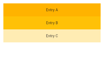
| ///  | |
| /// | |
| /// ```dart | |
| /// ListView( | |
| /// padding: const EdgeInsets.all(8), | |
| /// children: <Widget>[ | |
| /// Container( | |
| /// height: 50, | |
| /// color: Colors.amber[600], | |
| /// child: const Center(child: Text('Entry A')), | |
| /// ), | |
| /// Container( | |
| /// height: 50, | |
| /// color: Colors.amber[500], | |
| /// child: const Center(child: Text('Entry B')), | |
| /// ), | |
| /// Container( | |
| /// height: 50, | |
| /// color: Colors.amber[100], | |
| /// child: const Center(child: Text('Entry C')), | |
| /// ), | |
| /// ], | |
| /// ) | |
| /// ``` | |
| /// {@end-tool} | |
| /// | |
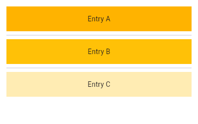
| /// {@tool sample} | |
| /// This example mirrors the previous one, creating the same list using the | |
| /// [ListView.builder] constructor. Using the [IndexedWidgetBuilder], children | |
| /// are built lazily and can be infinite in number. | |
| /// | |
| ///  | |
| /// | |
| /// ```dart | |
| /// final List<String> entries = <String>['A', 'B', 'C']; | |
| /// final List<int> colorCodes = <int>[600, 500, 100]; | |
| /// | |
| /// ListView.builder( | |
| /// padding: const EdgeInsets.all(8), | |
| /// itemCount: entries.length, | |
| /// itemBuilder: (BuildContext context, int index) { | |
| /// return Container( | |
| /// height: 50, | |
| /// color: Colors.amber[colorCodes[index]], | |
| /// child: Center(child: Text('Entry ${entries[index]}')), | |
| /// ); | |
| /// } | |
| /// ); | |
| /// ``` | |
| /// {@end-tool} | |
| /// | |
| /// {@tool sample} | |
| /// This example continues to build from our the previous ones, creating a | |
| /// similar list using [ListView.separated]. Here, a [Divider] is used as a | |
| /// separator. | |
| /// | |
| ///  | |
| /// | |
| /// ```dart | |
| /// final List<String> entries = <String>['A', 'B', 'C']; | |
| /// final List<int> colorCodes = <int>[600, 500, 100]; | |
| /// | |
| /// ListView.separated( | |
| /// padding: const EdgeInsets.all(8), | |
| /// itemCount: entries.length, | |
| /// itemBuilder: (BuildContext context, int index) { | |
| /// return Container( | |
| /// height: 50, | |
| /// color: Colors.amber[colorCodes[index]], | |
| /// child: Center(child: Text('Entry ${entries[index]}')), | |
| /// ); | |
| /// }, | |
| /// separatorBuilder: (BuildContext context, int index) => const Divider(), | |
| /// ); | |
| /// ``` | |
| /// {@end-tool} | |
| /// | |
| /// ## Child elements' lifecycle | |
| /// | |
| /// ### Creation | |
| /// | |
| /// While laying out the list, visible children's elements, states and render | |
| /// objects will be created lazily based on existing widgets (such as when using | |
| /// the default constructor) or lazily provided ones (such as when using the | |
| /// [ListView.builder] constructor). | |
| /// | |
| /// ### Destruction | |
| /// | |
| /// When a child is scrolled out of view, the associated element subtree, | |
| /// states and render objects are destroyed. A new child at the same position | |
| /// in the list will be lazily recreated along with new elements, states and | |
| /// render objects when it is scrolled back. | |
| /// | |
| /// ### Destruction mitigation | |
| /// | |
| /// In order to preserve state as child elements are scrolled in and out of | |
| /// view, the following options are possible: | |
| /// | |
| /// * Moving the ownership of non-trivial UI-state-driving business logic | |
| /// out of the list child subtree. For instance, if a list contains posts | |
| /// with their number of upvotes coming from a cached network response, store | |
| /// the list of posts and upvote number in a data model outside the list. Let | |
| /// the list child UI subtree be easily recreate-able from the | |
| /// source-of-truth model object. Use [StatefulWidget]s in the child | |
| /// widget subtree to store instantaneous UI state only. | |
| /// | |
| /// * Letting [KeepAlive] be the root widget of the list child widget subtree | |
| /// that needs to be preserved. The [KeepAlive] widget marks the child | |
| /// subtree's top render object child for keepalive. When the associated top | |
| /// render object is scrolled out of view, the list keeps the child's render | |
| /// object (and by extension, its associated elements and states) in a cache | |
| /// list instead of destroying them. When scrolled back into view, the render | |
| /// object is repainted as-is (if it wasn't marked dirty in the interim). | |
| /// | |
| /// This only works if [addAutomaticKeepAlives] and [addRepaintBoundaries] | |
| /// are false since those parameters cause the [ListView] to wrap each child | |
| /// widget subtree with other widgets. | |
| /// | |
| /// * Using [AutomaticKeepAlive] widgets (inserted by default when | |
| /// [addAutomaticKeepAlives] is true). Instead of unconditionally caching the | |
| /// child element subtree when scrolling off-screen like [KeepAlive], | |
| /// [AutomaticKeepAlive] can let whether to cache the subtree be determined | |
| /// by descendant logic in the subtree. | |
| /// | |
| /// As an example, the [EditableText] widget signals its list child element | |
| /// subtree to stay alive while its text field has input focus. If it doesn't | |
| /// have focus and no other descendants signaled for keepalive via a | |
| /// [KeepAliveNotification], the list child element subtree will be destroyed | |
| /// when scrolled away. | |
| /// | |
| /// [AutomaticKeepAlive] descendants typically signal it to be kept alive | |
| /// by using the [AutomaticKeepAliveClientMixin], then implementing the | |
| /// [wantKeepAlive] getter and calling [updateKeepAlive]. | |
| /// | |
| /// ## Transitioning to [CustomScrollView] | |
| /// | |
| /// A [ListView] is basically a [CustomScrollView] with a single [SliverList] in | |
| /// its [CustomScrollView.slivers] property. | |
| /// | |
| /// If [ListView] is no longer sufficient, for example because the scroll view | |
| /// is to have both a list and a grid, or because the list is to be combined | |
| /// with a [SliverAppBar], etc, it is straight-forward to port code from using | |
| /// [ListView] to using [CustomScrollView] directly. | |
| /// | |
| /// The [key], [scrollDirection], [reverse], [controller], [primary], [physics], | |
| /// and [shrinkWrap] properties on [ListView] map directly to the identically | |
| /// named properties on [CustomScrollView]. | |
| /// | |
| /// The [CustomScrollView.slivers] property should be a list containing either a | |
| /// [SliverList] or a [SliverFixedExtentList]; the former if [itemExtent] on the | |
| /// [ListView] was null, and the latter if [itemExtent] was not null. | |
| /// | |
| /// The [childrenDelegate] property on [ListView] corresponds to the | |
| /// [SliverList.delegate] (or [SliverFixedExtentList.delegate]) property. The | |
| /// [new ListView] constructor's `children` argument corresponds to the | |
| /// [childrenDelegate] being a [SliverChildListDelegate] with that same | |
| /// argument. The [new ListView.builder] constructor's `itemBuilder` and | |
| /// `itemCount` arguments correspond to the [childrenDelegate] being a | |
| /// [SliverChildBuilderDelegate] with the equivalent arguments. | |
| /// | |
| /// The [padding] property corresponds to having a [SliverPadding] in the | |
| /// [CustomScrollView.slivers] property instead of the list itself, and having | |
| /// the [SliverList] instead be a child of the [SliverPadding]. | |
| /// | |
| /// [CustomScrollView]s don't automatically avoid obstructions from [MediaQuery] | |
| /// like [ListView]s do. To reproduce the behavior, wrap the slivers in | |
| /// [SliverSafeArea]s. | |
| /// | |
| /// Once code has been ported to use [CustomScrollView], other slivers, such as | |
| /// [SliverGrid] or [SliverAppBar], can be put in the [CustomScrollView.slivers] | |
| /// list. | |
| /// | |
| /// {@tool sample} | |
| /// | |
| /// Here are two brief snippets showing a [ListView] and its equivalent using | |
| /// [CustomScrollView]: | |
| /// | |
| /// ```dart | |
| /// ListView( | |
| /// shrinkWrap: true, | |
| /// padding: const EdgeInsets.all(20.0), | |
| /// children: <Widget>[ | |
| /// const Text('I\'m dedicating every day to you'), | |
| /// const Text('Domestic life was never quite my style'), | |
| /// const Text('When you smile, you knock me out, I fall apart'), | |
| /// const Text('And I thought I was so smart'), | |
| /// ], | |
| /// ) | |
| /// ``` | |
| /// {@end-tool} | |
| /// {@tool sample} | |
| /// | |
| /// ```dart | |
| /// CustomScrollView( | |
| /// shrinkWrap: true, | |
| /// slivers: <Widget>[ | |
| /// SliverPadding( | |
| /// padding: const EdgeInsets.all(20.0), | |
| /// sliver: SliverList( | |
| /// delegate: SliverChildListDelegate( | |
| /// <Widget>[ | |
| /// const Text('I\'m dedicating every day to you'), | |
| /// const Text('Domestic life was never quite my style'), | |
| /// const Text('When you smile, you knock me out, I fall apart'), | |
| /// const Text('And I thought I was so smart'), | |
| /// ], | |
| /// ), | |
| /// ), | |
| /// ), | |
| /// ], | |
| /// ) | |
| /// ``` | |
| /// {@end-tool} | |
| /// | |
| /// See also: | |
| /// | |
| /// * [SingleChildScrollView], which is a scrollable widget that has a single | |
| /// child. | |
| /// * [PageView], which is a scrolling list of child widgets that are each the | |
| /// size of the viewport. | |
| /// * [GridView], which is scrollable, 2D array of widgets. | |
| /// * [CustomScrollView], which is a scrollable widget that creates custom | |
| /// scroll effects using slivers. | |
| /// * [ListBody], which arranges its children in a similar manner, but without | |
| /// scrolling. | |
| /// * [ScrollNotification] and [NotificationListener], which can be used to watch | |
| /// the scroll position without using a [ScrollController]. | |
| class ListView extends BoxScrollView { | |
| /// Creates a scrollable, linear array of widgets from an explicit [List]. | |
| /// | |
| /// This constructor is appropriate for list views with a small number of | |
| /// children because constructing the [List] requires doing work for every | |
| /// child that could possibly be displayed in the list view instead of just | |
| /// those children that are actually visible. | |
| /// | |
| /// It is usually more efficient to create children on demand using [new | |
| /// ListView.builder]. | |
| /// | |
| /// The `addAutomaticKeepAlives` argument corresponds to the | |
| /// [SliverChildListDelegate.addAutomaticKeepAlives] property. The | |
| /// `addRepaintBoundaries` argument corresponds to the | |
| /// [SliverChildListDelegate.addRepaintBoundaries] property. The | |
| /// `addSemanticIndexes` argument corresponds to the | |
| /// [SliverChildListDelegate.addSemanticIndexes] property. None | |
| /// may be null. | |
| ListView({ | |
| Key key, | |
| Axis scrollDirection = Axis.vertical, | |
| bool reverse = false, | |
| ScrollController controller, | |
| bool primary, | |
| ScrollPhysics physics, | |
| bool shrinkWrap = false, | |
| EdgeInsetsGeometry padding, | |
| this.itemExtent, | |
| bool addAutomaticKeepAlives = true, | |
| bool addRepaintBoundaries = true, | |
| bool addSemanticIndexes = true, | |
| double cacheExtent, | |
| List<Widget> children = const <Widget>[], | |
| int semanticChildCount, | |
| DragStartBehavior dragStartBehavior = DragStartBehavior.start, | |
| }) : childrenDelegate = SliverChildListDelegate( | |
| children, | |
| addAutomaticKeepAlives: addAutomaticKeepAlives, | |
| addRepaintBoundaries: addRepaintBoundaries, | |
| addSemanticIndexes: addSemanticIndexes, | |
| ), | |
| super( | |
| key: key, | |
| scrollDirection: scrollDirection, | |
| reverse: reverse, | |
| controller: controller, | |
| primary: primary, | |
| physics: physics, | |
| shrinkWrap: shrinkWrap, | |
| padding: padding, | |
| cacheExtent: cacheExtent, | |
| semanticChildCount: semanticChildCount ?? children.length, | |
| dragStartBehavior: dragStartBehavior, | |
| ); | |
| /// Creates a scrollable, linear array of widgets that are created on demand. | |
| /// | |
| /// This constructor is appropriate for list views with a large (or infinite) | |
| /// number of children because the builder is called only for those children | |
| /// that are actually visible. | |
| /// | |
| /// Providing a non-null `itemCount` improves the ability of the [ListView] to | |
| /// estimate the maximum scroll extent. | |
| /// | |
| /// The `itemBuilder` callback will be called only with indices greater than | |
| /// or equal to zero and less than `itemCount`. | |
| /// | |
| /// The `itemBuilder` should actually create the widget instances when called. | |
| /// Avoid using a builder that returns a previously-constructed widget; if the | |
| /// list view's children are created in advance, or all at once when the | |
| /// [ListView] itself is created, it is more efficient to use [new ListView]. | |
| /// Even more efficient, however, is to create the instances on demand using | |
| /// this constructor's `itemBuilder` callback. | |
| /// | |
| /// The `addAutomaticKeepAlives` argument corresponds to the | |
| /// [SliverChildBuilderDelegate.addAutomaticKeepAlives] property. The | |
| /// `addRepaintBoundaries` argument corresponds to the | |
| /// [SliverChildBuilderDelegate.addRepaintBoundaries] property. The | |
| /// `addSemanticIndexes` argument corresponds to the | |
| /// [SliverChildBuilderDelegate.addSemanticIndexes] property. None may be | |
| /// null. | |
| /// | |
| /// [ListView.builder] by default does not support child reordering. If | |
| /// you are planning to change child order at a later time, consider using | |
| /// [ListView] or [ListView.custom]. | |
| ListView.builder({ | |
| Key key, | |
| Axis scrollDirection = Axis.vertical, | |
| bool reverse = false, | |
| ScrollController controller, | |
| bool primary, | |
| ScrollPhysics physics, | |
| bool shrinkWrap = false, | |
| EdgeInsetsGeometry padding, | |
| this.itemExtent, | |
| @required IndexedWidgetBuilder itemBuilder, | |
| int itemCount, | |
| bool addAutomaticKeepAlives = true, | |
| bool addRepaintBoundaries = true, | |
| bool addSemanticIndexes = true, | |
| double cacheExtent, | |
| int semanticChildCount, | |
| DragStartBehavior dragStartBehavior = DragStartBehavior.start, | |
| }) : assert(itemCount == null || itemCount >= 0), | |
| assert(semanticChildCount == null || semanticChildCount <= itemCount), | |
| childrenDelegate = SliverChildBuilderDelegate( | |
| itemBuilder, | |
| childCount: itemCount, | |
| addAutomaticKeepAlives: addAutomaticKeepAlives, | |
| addRepaintBoundaries: addRepaintBoundaries, | |
| addSemanticIndexes: addSemanticIndexes, | |
| ), | |
| super( | |
| key: key, | |
| scrollDirection: scrollDirection, | |
| reverse: reverse, | |
| controller: controller, | |
| primary: primary, | |
| physics: physics, | |
| shrinkWrap: shrinkWrap, | |
| padding: padding, | |
| cacheExtent: cacheExtent, | |
| semanticChildCount: semanticChildCount ?? itemCount, | |
| dragStartBehavior: dragStartBehavior, | |
| ); | |
| /// Creates a fixed-length scrollable linear array of list "items" separated | |
| /// by list item "separators". | |
| /// | |
| /// This constructor is appropriate for list views with a large number of | |
| /// item and separator children because the builders are only called for | |
| /// the children that are actually visible. | |
| /// | |
| /// The `itemBuilder` callback will be called with indices greater than | |
| /// or equal to zero and less than `itemCount`. | |
| /// | |
| /// Separators only appear between list items: separator 0 appears after item | |
| /// 0 and the last separator appears before the last item. | |
| /// | |
| /// The `separatorBuilder` callback will be called with indices greater than | |
| /// or equal to zero and less than `itemCount - 1`. | |
| /// | |
| /// The `itemBuilder` and `separatorBuilder` callbacks should actually create | |
| /// widget instances when called. Avoid using a builder that returns a | |
| /// previously-constructed widget; if the list view's children are created in | |
| /// advance, or all at once when the [ListView] itself is created, it is more | |
| /// efficient to use [new ListView]. | |
| /// | |
| /// {@tool sample} | |
| /// | |
| /// This example shows how to create [ListView] whose [ListTile] list items | |
| /// are separated by [Divider]s. | |
| /// | |
| /// ```dart | |
| /// ListView.separated( | |
| /// itemCount: 25, | |
| /// separatorBuilder: (BuildContext context, int index) => Divider(), | |
| /// itemBuilder: (BuildContext context, int index) { | |
| /// return ListTile( | |
| /// title: Text('item $index'), | |
| /// ); | |
| /// }, | |
| /// ) | |
| /// ``` | |
| /// {@end-tool} | |
| /// | |
| /// The `addAutomaticKeepAlives` argument corresponds to the | |
| /// [SliverChildBuilderDelegate.addAutomaticKeepAlives] property. The | |
| /// `addRepaintBoundaries` argument corresponds to the | |
| /// [SliverChildBuilderDelegate.addRepaintBoundaries] property. The | |
| /// `addSemanticIndexes` argument corresponds to the | |
| /// [SliverChildBuilderDelegate.addSemanticIndexes] property. None may be | |
| /// null. | |
| ListView.separated({ | |
| Key key, | |
| Axis scrollDirection = Axis.vertical, | |
| bool reverse = false, | |
| ScrollController controller, | |
| bool primary, | |
| ScrollPhysics physics, | |
| bool shrinkWrap = false, | |
| EdgeInsetsGeometry padding, | |
| @required IndexedWidgetBuilder itemBuilder, | |
| @required IndexedWidgetBuilder separatorBuilder, | |
| @required int itemCount, | |
| bool addAutomaticKeepAlives = true, | |
| bool addRepaintBoundaries = true, | |
| bool addSemanticIndexes = true, | |
| double cacheExtent, | |
| }) : assert(itemBuilder != null), | |
| assert(separatorBuilder != null), | |
| assert(itemCount != null && itemCount >= 0), | |
| itemExtent = null, | |
| childrenDelegate = SliverChildBuilderDelegate( | |
| (BuildContext context, int index) { | |
| final int itemIndex = index ~/ 2; | |
| Widget widget; | |
| if (index.isEven) { | |
| widget = itemBuilder(context, itemIndex); | |
| } else { | |
| widget = separatorBuilder(context, itemIndex); | |
| assert(() { | |
| if (widget == null) { | |
| throw FlutterError('separatorBuilder cannot return null.'); | |
| } | |
| return true; | |
| }()); | |
| } | |
| return widget; | |
| }, | |
| childCount: _computeSemanticChildCount(itemCount), | |
| addAutomaticKeepAlives: addAutomaticKeepAlives, | |
| addRepaintBoundaries: addRepaintBoundaries, | |
| addSemanticIndexes: addSemanticIndexes, | |
| semanticIndexCallback: (Widget _, int index) { | |
| return index.isEven ? index ~/ 2 : null; | |
| }, | |
| ), | |
| super( | |
| key: key, | |
| scrollDirection: scrollDirection, | |
| reverse: reverse, | |
| controller: controller, | |
| primary: primary, | |
| physics: physics, | |
| shrinkWrap: shrinkWrap, | |
| padding: padding, | |
| cacheExtent: cacheExtent, | |
| semanticChildCount: _computeSemanticChildCount(itemCount), | |
| ); | |
| /// Creates a scrollable, linear array of widgets with a custom child model. | |
| /// | |
| /// For example, a custom child model can control the algorithm used to | |
| /// estimate the size of children that are not actually visible. | |
| /// | |
| /// {@tool sample} | |
| /// | |
| /// This [ListView] uses a custom [SliverChildBuilderDelegate] to support child | |
| /// reordering. | |
| /// | |
| /// ```dart | |
| /// class MyListView extends StatefulWidget { | |
| /// @override | |
| /// _MyListViewState createState() => _MyListViewState(); | |
| /// } | |
| /// | |
| /// class _MyListViewState extends State<MyListView> { | |
| /// List<String> items = <String>['1', '2', '3', '4', '5']; | |
| /// | |
| /// void _reverse() { | |
| /// setState(() { | |
| /// items = items.reversed.toList(); | |
| /// }); | |
| /// } | |
| /// | |
| /// @override | |
| /// Widget build(BuildContext context) { | |
| /// return Scaffold( | |
| /// body: SafeArea( | |
| /// child: ListView.custom( | |
| /// childrenDelegate: SliverChildBuilderDelegate( | |
| /// (BuildContext context, int index) { | |
| /// return KeepAlive( | |
| /// data: items[index], | |
| /// key: ValueKey<String>(items[index]), | |
| /// ); | |
| /// }, | |
| /// childCount: items.length, | |
| /// findChildIndexCallback: (Key key) { | |
| /// final ValueKey valueKey = key; | |
| /// final String data = valueKey.value; | |
| /// return items.indexOf(data); | |
| /// } | |
| /// ), | |
| /// ), | |
| /// ), | |
| /// bottomNavigationBar: BottomAppBar( | |
| /// child: Row( | |
| /// mainAxisAlignment: MainAxisAlignment.center, | |
| /// children: <Widget>[ | |
| /// FlatButton( | |
| /// onPressed: () => _reverse(), | |
| /// child: Text('Reverse items'), | |
| /// ), | |
| /// ], | |
| /// ), | |
| /// ), | |
| /// ); | |
| /// } | |
| /// } | |
| /// | |
| /// class KeepAlive extends StatefulWidget { | |
| /// const KeepAlive({Key key, this.data}) : super(key: key); | |
| /// | |
| /// final String data; | |
| /// | |
| /// @override | |
| /// _KeepAliveState createState() => _KeepAliveState(); | |
| /// } | |
| /// | |
| /// class _KeepAliveState extends State<KeepAlive> with AutomaticKeepAliveClientMixin{ | |
| /// @override | |
| /// bool get wantKeepAlive => true; | |
| /// | |
| /// @override | |
| /// Widget build(BuildContext context) { | |
| /// super.build(context); | |
| /// return Text(widget.data); | |
| /// } | |
| /// } | |
| /// ``` | |
| /// {@end-tool} | |
| const ListView.custom({ | |
| Key key, | |
| Axis scrollDirection = Axis.vertical, | |
| bool reverse = false, | |
| ScrollController controller, | |
| bool primary, | |
| ScrollPhysics physics, | |
| bool shrinkWrap = false, | |
| EdgeInsetsGeometry padding, | |
| this.itemExtent, | |
| @required this.childrenDelegate, | |
| double cacheExtent, | |
| int semanticChildCount, | |
| }) : assert(childrenDelegate != null), | |
| super( | |
| key: key, | |
| scrollDirection: scrollDirection, | |
| reverse: reverse, | |
| controller: controller, | |
| primary: primary, | |
| physics: physics, | |
| shrinkWrap: shrinkWrap, | |
| padding: padding, | |
| cacheExtent: cacheExtent, | |
| semanticChildCount: semanticChildCount, | |
| ); | |
| /// If non-null, forces the children to have the given extent in the scroll | |
| /// direction. | |
| /// | |
| /// Specifying an [itemExtent] is more efficient than letting the children | |
| /// determine their own extent because the scrolling machinery can make use of | |
| /// the foreknowledge of the children's extent to save work, for example when | |
| /// the scroll position changes drastically. | |
| final double itemExtent; | |
| /// A delegate that provides the children for the [ListView]. | |
| /// | |
| /// The [ListView.custom] constructor lets you specify this delegate | |
| /// explicitly. The [ListView] and [ListView.builder] constructors create a | |
| /// [childrenDelegate] that wraps the given [List] and [IndexedWidgetBuilder], | |
| /// respectively. | |
| final SliverChildDelegate childrenDelegate; | |
| @override | |
| Widget buildChildLayout(BuildContext context) { | |
| if (itemExtent != null) { | |
| return SliverFixedExtentList( | |
| delegate: childrenDelegate, | |
| itemExtent: itemExtent, | |
| ); | |
| } | |
| return SliverList(delegate: childrenDelegate); | |
| } | |
| @override | |
| void debugFillProperties(DiagnosticPropertiesBuilder properties) { | |
| super.debugFillProperties(properties); | |
| properties.add(DoubleProperty('itemExtent', itemExtent, defaultValue: null)); | |
| } | |
| // Helper method to compute the semantic child count for the separated constructor. | |
| static int _computeSemanticChildCount(int itemCount) { | |
| return math.max(0, itemCount * 2 - 1); | |
| } | |
| } | |
| /// A scrollable, 2D array of widgets. | |
| /// | |
| /// The main axis direction of a grid is the direction in which it scrolls (the | |
| /// [scrollDirection]). | |
| /// | |
| /// The most commonly used grid layouts are [GridView.count], which creates a | |
| /// layout with a fixed number of tiles in the cross axis, and | |
| /// [GridView.extent], which creates a layout with tiles that have a maximum | |
| /// cross-axis extent. A custom [SliverGridDelegate] can produce an arbitrary 2D | |
| /// arrangement of children, including arrangements that are unaligned or | |
| /// overlapping. | |
| /// | |
| /// To create a grid with a large (or infinite) number of children, use the | |
| /// [GridView.builder] constructor with either a | |
| /// [SliverGridDelegateWithFixedCrossAxisCount] or a | |
| /// [SliverGridDelegateWithMaxCrossAxisExtent] for the [gridDelegate]. | |
| /// | |
| /// To use a custom [SliverChildDelegate], use [GridView.custom]. | |
| /// | |
| /// To create a linear array of children, use a [ListView]. | |
| /// | |
| /// To control the initial scroll offset of the scroll view, provide a | |
| /// [controller] with its [ScrollController.initialScrollOffset] property set. | |
| /// | |
| /// ## Transitioning to [CustomScrollView] | |
| /// | |
| /// A [GridView] is basically a [CustomScrollView] with a single [SliverGrid] in | |
| /// its [CustomScrollView.slivers] property. | |
| /// | |
| /// If [GridView] is no longer sufficient, for example because the scroll view | |
| /// is to have both a grid and a list, or because the grid is to be combined | |
| /// with a [SliverAppBar], etc, it is straight-forward to port code from using | |
| /// [GridView] to using [CustomScrollView] directly. | |
| /// | |
| /// The [key], [scrollDirection], [reverse], [controller], [primary], [physics], | |
| /// and [shrinkWrap] properties on [GridView] map directly to the identically | |
| /// named properties on [CustomScrollView]. | |
| /// | |
| /// The [CustomScrollView.slivers] property should be a list containing just a | |
| /// [SliverGrid]. | |
| /// | |
| /// The [childrenDelegate] property on [GridView] corresponds to the | |
| /// [SliverGrid.delegate] property, and the [gridDelegate] property on the | |
| /// [GridView] corresponds to the [SliverGrid.gridDelegate] property. | |
| /// | |
| /// The [new GridView], [new GridView.count], and [new GridView.extent] | |
| /// constructors' `children` arguments correspond to the [childrenDelegate] | |
| /// being a [SliverChildListDelegate] with that same argument. The [new | |
| /// GridView.builder] constructor's `itemBuilder` and `childCount` arguments | |
| /// correspond to the [childrenDelegate] being a [SliverChildBuilderDelegate] | |
| /// with the matching arguments. | |
| /// | |
| /// The [new GridView.count] and [new GridView.extent] constructors create | |
| /// custom grid delegates, and have equivalently named constructors on | |
| /// [SliverGrid] to ease the transition: [new SliverGrid.count] and [new | |
| /// SliverGrid.extent] respectively. | |
| /// | |
| /// The [padding] property corresponds to having a [SliverPadding] in the | |
| /// [CustomScrollView.slivers] property instead of the grid itself, and having | |
| /// the [SliverGrid] instead be a child of the [SliverPadding]. | |
| /// | |
| /// By default, [ListView] will automatically pad the list's scrollable | |
| /// extremities to avoid partial obstructions indicated by [MediaQuery]'s | |
| /// padding. To avoid this behavior, override with a zero [padding] property. | |
| /// | |
| /// Once code has been ported to use [CustomScrollView], other slivers, such as | |
| /// [SliverList] or [SliverAppBar], can be put in the [CustomScrollView.slivers] | |
| /// list. | |
| /// | |
| /// {@tool sample} | |
| /// This example demonstrates how to create a [GridView] with two columns. The | |
| /// children are spaced apart using the [crossAxisSpacing] and [mainAxisSpacing] | |
| /// properties. | |
| /// | |
| /// 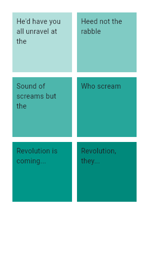 | |
| /// | |
| /// ```dart | |
| /// GridView.count( | |
| /// primary: false, | |
| /// padding: const EdgeInsets.all(20), | |
| /// crossAxisSpacing: 10, | |
| /// mainAxisSpacing: 10, | |
| /// crossAxisCount: 2, | |
| /// children: <Widget>[ | |
| /// Container( | |
| /// padding: const EdgeInsets.all(8), | |
| /// child: const Text('He\'d have you all unravel at the'), | |
| /// color: Colors.teal[100], | |
| /// ), | |
| /// Container( | |
| /// padding: const EdgeInsets.all(8), | |
| /// child: const Text('Heed not the rabble'), | |
| /// color: Colors.teal[200], | |
| /// ), | |
| /// Container( | |
| /// padding: const EdgeInsets.all(8), | |
| /// child: const Text('Sound of screams but the'), | |
| /// color: Colors.teal[300], | |
| /// ), | |
| /// Container( | |
| /// padding: const EdgeInsets.all(8), | |
| /// child: const Text('Who scream'), | |
| /// color: Colors.teal[400], | |
| /// ), | |
| /// Container( | |
| /// padding: const EdgeInsets.all(8), | |
| /// child: const Text('Revolution is coming...'), | |
| /// color: Colors.teal[500], | |
| /// ), | |
| /// Container( | |
| /// padding: const EdgeInsets.all(8), | |
| /// child: const Text('Revolution, they...'), | |
| /// color: Colors.teal[600], | |
| /// ), | |
| /// ], | |
| /// ) | |
| /// ``` | |
| /// {@end-tool} | |
| /// | |
| /// {@tool sample} | |
| /// This example shows how to create the same grid as the previous example | |
| /// using a [CustomScrollView] and a [SliverGrid]. | |
| /// | |
| /// 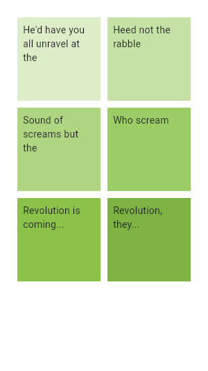 | |
| /// | |
| /// ```dart | |
| /// CustomScrollView( | |
| /// primary: false, | |
| /// slivers: <Widget>[ | |
| /// SliverPadding( | |
| /// padding: const EdgeInsets.all(20), | |
| /// sliver: SliverGrid.count( | |
| /// crossAxisSpacing: 10, | |
| /// mainAxisSpacing: 10, | |
| /// crossAxisCount: 2, | |
| /// children: <Widget>[ | |
| /// Container( | |
| /// padding: const EdgeInsets.all(8), | |
| /// child: const Text('He\'d have you all unravel at the'), | |
| /// color: Colors.green[100], | |
| /// ), | |
| /// Container( | |
| /// padding: const EdgeInsets.all(8), | |
| /// child: const Text('Heed not the rabble'), | |
| /// color: Colors.green[200], | |
| /// ), | |
| /// Container( | |
| /// padding: const EdgeInsets.all(8), | |
| /// child: const Text('Sound of screams but the'), | |
| /// color: Colors.green[300], | |
| /// ), | |
| /// Container( | |
| /// padding: const EdgeInsets.all(8), | |
| /// child: const Text('Who scream'), | |
| /// color: Colors.green[400], | |
| /// ), | |
| /// Container( | |
| /// padding: const EdgeInsets.all(8), | |
| /// child: const Text('Revolution is coming...'), | |
| /// color: Colors.green[500], | |
| /// ), | |
| /// Container( | |
| /// padding: const EdgeInsets.all(8), | |
| /// child: const Text('Revolution, they...'), | |
| /// color: Colors.green[600], | |
| /// ), | |
| /// ], | |
| /// ), | |
| /// ), | |
| /// ], | |
| /// ) | |
| /// ``` | |
| /// {@end-tool} | |
| /// | |
| /// See also: | |
| /// | |
| /// * [SingleChildScrollView], which is a scrollable widget that has a single | |
| /// child. | |
| /// * [ListView], which is scrollable, linear list of widgets. | |
| /// * [PageView], which is a scrolling list of child widgets that are each the | |
| /// size of the viewport. | |
| /// * [CustomScrollView], which is a scrollable widget that creates custom | |
| /// scroll effects using slivers. | |
| /// * [SliverGridDelegateWithFixedCrossAxisCount], which creates a layout with | |
| /// a fixed number of tiles in the cross axis. | |
| /// * [SliverGridDelegateWithMaxCrossAxisExtent], which creates a layout with | |
| /// tiles that have a maximum cross-axis extent. | |
| /// * [ScrollNotification] and [NotificationListener], which can be used to watch | |
| /// the scroll position without using a [ScrollController]. | |
| class GridView extends BoxScrollView { | |
| /// Creates a scrollable, 2D array of widgets with a custom | |
| /// [SliverGridDelegate]. | |
| /// | |
| /// The [gridDelegate] argument must not be null. | |
| /// | |
| /// The `addAutomaticKeepAlives` argument corresponds to the | |
| /// [SliverChildListDelegate.addAutomaticKeepAlives] property. The | |
| /// `addRepaintBoundaries` argument corresponds to the | |
| /// [SliverChildListDelegate.addRepaintBoundaries] property. Both must not be | |
| /// null. | |
| GridView({ | |
| Key key, | |
| Axis scrollDirection = Axis.vertical, | |
| bool reverse = false, | |
| ScrollController controller, | |
| bool primary, | |
| ScrollPhysics physics, | |
| bool shrinkWrap = false, | |
| EdgeInsetsGeometry padding, | |
| @required this.gridDelegate, | |
| bool addAutomaticKeepAlives = true, | |
| bool addRepaintBoundaries = true, | |
| bool addSemanticIndexes = true, | |
| double cacheExtent, | |
| List<Widget> children = const <Widget>[], | |
| int semanticChildCount, | |
| }) : assert(gridDelegate != null), | |
| childrenDelegate = SliverChildListDelegate( | |
| children, | |
| addAutomaticKeepAlives: addAutomaticKeepAlives, | |
| addRepaintBoundaries: addRepaintBoundaries, | |
| addSemanticIndexes: addSemanticIndexes, | |
| ), | |
| super( | |
| key: key, | |
| scrollDirection: scrollDirection, | |
| reverse: reverse, | |
| controller: controller, | |
| primary: primary, | |
| physics: physics, | |
| shrinkWrap: shrinkWrap, | |
| padding: padding, | |
| cacheExtent: cacheExtent, | |
| semanticChildCount: semanticChildCount ?? children.length, | |
| ); | |
| /// Creates a scrollable, 2D array of widgets that are created on demand. | |
| /// | |
| /// This constructor is appropriate for grid views with a large (or infinite) | |
| /// number of children because the builder is called only for those children | |
| /// that are actually visible. | |
| /// | |
| /// Providing a non-null `itemCount` improves the ability of the [GridView] to | |
| /// estimate the maximum scroll extent. | |
| /// | |
| /// `itemBuilder` will be called only with indices greater than or equal to | |
| /// zero and less than `itemCount`. | |
| /// | |
| /// The [gridDelegate] argument must not be null. | |
| /// | |
| /// The `addAutomaticKeepAlives` argument corresponds to the | |
| /// [SliverChildBuilderDelegate.addAutomaticKeepAlives] property. The | |
| /// `addRepaintBoundaries` argument corresponds to the | |
| /// [SliverChildBuilderDelegate.addRepaintBoundaries] property. Both must not | |
| /// be null. | |
| GridView.builder({ | |
| Key key, | |
| Axis scrollDirection = Axis.vertical, | |
| bool reverse = false, | |
| ScrollController controller, | |
| bool primary, | |
| ScrollPhysics physics, | |
| bool shrinkWrap = false, | |
| EdgeInsetsGeometry padding, | |
| @required this.gridDelegate, | |
| @required IndexedWidgetBuilder itemBuilder, | |
| int itemCount, | |
| bool addAutomaticKeepAlives = true, | |
| bool addRepaintBoundaries = true, | |
| bool addSemanticIndexes = true, | |
| double cacheExtent, | |
| int semanticChildCount, | |
| }) : assert(gridDelegate != null), | |
| childrenDelegate = SliverChildBuilderDelegate( | |
| itemBuilder, | |
| childCount: itemCount, | |
| addAutomaticKeepAlives: addAutomaticKeepAlives, | |
| addRepaintBoundaries: addRepaintBoundaries, | |
| addSemanticIndexes: addSemanticIndexes, | |
| ), | |
| super( | |
| key: key, | |
| scrollDirection: scrollDirection, | |
| reverse: reverse, | |
| controller: controller, | |
| primary: primary, | |
| physics: physics, | |
| shrinkWrap: shrinkWrap, | |
| padding: padding, | |
| cacheExtent: cacheExtent, | |
| semanticChildCount: semanticChildCount ?? itemCount, | |
| ); | |
| /// Creates a scrollable, 2D array of widgets with both a custom | |
| /// [SliverGridDelegate] and a custom [SliverChildDelegate]. | |
| /// | |
| /// To use an [IndexedWidgetBuilder] callback to build children, either use | |
| /// a [SliverChildBuilderDelegate] or use the [GridView.builder] constructor. | |
| /// | |
| /// The [gridDelegate] and [childrenDelegate] arguments must not be null. | |
| const GridView.custom({ | |
| Key key, | |
| Axis scrollDirection = Axis.vertical, | |
| bool reverse = false, | |
| ScrollController controller, | |
| bool primary, | |
| ScrollPhysics physics, | |
| bool shrinkWrap = false, | |
| EdgeInsetsGeometry padding, | |
| @required this.gridDelegate, | |
| @required this.childrenDelegate, | |
| double cacheExtent, | |
| int semanticChildCount, | |
| DragStartBehavior dragStartBehavior = DragStartBehavior.start, | |
| }) : assert(gridDelegate != null), | |
| assert(childrenDelegate != null), | |
| super( | |
| key: key, | |
| scrollDirection: scrollDirection, | |
| reverse: reverse, | |
| controller: controller, | |
| primary: primary, | |
| physics: physics, | |
| shrinkWrap: shrinkWrap, | |
| padding: padding, | |
| cacheExtent: cacheExtent, | |
| semanticChildCount: semanticChildCount, | |
| dragStartBehavior: dragStartBehavior, | |
| ); | |
| /// Creates a scrollable, 2D array of widgets with a fixed number of tiles in | |
| /// the cross axis. | |
| /// | |
| /// Uses a [SliverGridDelegateWithFixedCrossAxisCount] as the [gridDelegate]. | |
| /// | |
| /// The `addAutomaticKeepAlives` argument corresponds to the | |
| /// [SliverChildListDelegate.addAutomaticKeepAlives] property. The | |
| /// `addRepaintBoundaries` argument corresponds to the | |
| /// [SliverChildListDelegate.addRepaintBoundaries] property. Both must not be | |
| /// null. | |
| /// | |
| /// See also: | |
| /// | |
| /// * [new SliverGrid.count], the equivalent constructor for [SliverGrid]. | |
| GridView.count({ | |
| Key key, | |
| Axis scrollDirection = Axis.vertical, | |
| bool reverse = false, | |
| ScrollController controller, | |
| bool primary, | |
| ScrollPhysics physics, | |
| bool shrinkWrap = false, | |
| EdgeInsetsGeometry padding, | |
| @required int crossAxisCount, | |
| double mainAxisSpacing = 0.0, | |
| double crossAxisSpacing = 0.0, | |
| double childAspectRatio = 1.0, | |
| bool addAutomaticKeepAlives = true, | |
| bool addRepaintBoundaries = true, | |
| bool addSemanticIndexes = true, | |
| double cacheExtent, | |
| List<Widget> children = const <Widget>[], | |
| int semanticChildCount, | |
| DragStartBehavior dragStartBehavior = DragStartBehavior.start, | |
| }) : gridDelegate = SliverGridDelegateWithFixedCrossAxisCount( | |
| crossAxisCount: crossAxisCount, | |
| mainAxisSpacing: mainAxisSpacing, | |
| crossAxisSpacing: crossAxisSpacing, | |
| childAspectRatio: childAspectRatio, | |
| ), | |
| childrenDelegate = SliverChildListDelegate( | |
| children, | |
| addAutomaticKeepAlives: addAutomaticKeepAlives, | |
| addRepaintBoundaries: addRepaintBoundaries, | |
| addSemanticIndexes: addSemanticIndexes, | |
| ), | |
| super( | |
| key: key, | |
| scrollDirection: scrollDirection, | |
| reverse: reverse, | |
| controller: controller, | |
| primary: primary, | |
| physics: physics, | |
| shrinkWrap: shrinkWrap, | |
| padding: padding, | |
| cacheExtent: cacheExtent, | |
| semanticChildCount: semanticChildCount ?? children.length, | |
| dragStartBehavior: dragStartBehavior, | |
| ); | |
| /// Creates a scrollable, 2D array of widgets with tiles that each have a | |
| /// maximum cross-axis extent. | |
| /// | |
| /// Uses a [SliverGridDelegateWithMaxCrossAxisExtent] as the [gridDelegate]. | |
| /// | |
| /// The `addAutomaticKeepAlives` argument corresponds to the | |
| /// [SliverChildListDelegate.addAutomaticKeepAlives] property. The | |
| /// `addRepaintBoundaries` argument corresponds to the | |
| /// [SliverChildListDelegate.addRepaintBoundaries] property. Both must not be | |
| /// null. | |
| /// | |
| /// See also: | |
| /// | |
| /// * [new SliverGrid.extent], the equivalent constructor for [SliverGrid]. | |
| GridView.extent({ | |
| Key key, | |
| Axis scrollDirection = Axis.vertical, | |
| bool reverse = false, | |
| ScrollController controller, | |
| bool primary, | |
| ScrollPhysics physics, | |
| bool shrinkWrap = false, | |
| EdgeInsetsGeometry padding, | |
| @required double maxCrossAxisExtent, | |
| double mainAxisSpacing = 0.0, | |
| double crossAxisSpacing = 0.0, | |
| double childAspectRatio = 1.0, | |
| bool addAutomaticKeepAlives = true, | |
| bool addRepaintBoundaries = true, | |
| bool addSemanticIndexes = true, | |
| List<Widget> children = const <Widget>[], | |
| int semanticChildCount, | |
| DragStartBehavior dragStartBehavior = DragStartBehavior.start, | |
| }) : gridDelegate = SliverGridDelegateWithMaxCrossAxisExtent( | |
| maxCrossAxisExtent: maxCrossAxisExtent, | |
| mainAxisSpacing: mainAxisSpacing, | |
| crossAxisSpacing: crossAxisSpacing, | |
| childAspectRatio: childAspectRatio, | |
| ), | |
| childrenDelegate = SliverChildListDelegate( | |
| children, | |
| addAutomaticKeepAlives: addAutomaticKeepAlives, | |
| addRepaintBoundaries: addRepaintBoundaries, | |
| addSemanticIndexes: addSemanticIndexes, | |
| ), | |
| super( | |
| key: key, | |
| scrollDirection: scrollDirection, | |
| reverse: reverse, | |
| controller: controller, | |
| primary: primary, | |
| physics: physics, | |
| shrinkWrap: shrinkWrap, | |
| padding: padding, | |
| semanticChildCount: semanticChildCount ?? children.length, | |
| dragStartBehavior: dragStartBehavior, | |
| ); | |
| /// A delegate that controls the layout of the children within the [GridView]. | |
| /// | |
| /// The [GridView], [GridView.builder], and [GridView.custom] constructors let you specify this | |
| /// delegate explicitly. The other constructors create a [gridDelegate] | |
| /// implicitly. | |
| final SliverGridDelegate gridDelegate; | |
| /// A delegate that provides the children for the [GridView]. | |
| /// | |
| /// The [GridView.custom] constructor lets you specify this delegate | |
| /// explicitly. The other constructors create a [childrenDelegate] that wraps | |
| /// the given child list. | |
| final SliverChildDelegate childrenDelegate; | |
| @override | |
| Widget buildChildLayout(BuildContext context) { | |
| return SliverGrid( | |
| delegate: childrenDelegate, | |
| gridDelegate: gridDelegate, | |
| ); | |
| } | |
| } |
Sign up for free
to join this conversation on GitHub.
Already have an account?
Sign in to comment