Last active
August 7, 2021 18:00
-
-
Save rydmike/145828269bd8d24ee9c44a9df26ec7fb to your computer and use it in GitHub Desktop.
Demo code for Flutter Elevation Issue, the issue is only visible on SKIA builds, not on Web DomCanvas. https://github.com/flutter/flutter/issues/51237
This file contains bidirectional Unicode text that may be interpreted or compiled differently than what appears below. To review, open the file in an editor that reveals hidden Unicode characters.
Learn more about bidirectional Unicode characters
| import 'package:flutter/material.dart'; | |
| import 'package:flutter/services.dart'; | |
| const double kEdgePadding = 35.0; | |
| const double kMaxContentWidth = 800.0; | |
| const double kMaxExtraSpace = 1500.0; | |
| const double kMaxElevation = 20.0; | |
| const int kMaxCards = 20; | |
| void main() { | |
| runApp(MyApp()); | |
| } | |
| class MyApp extends StatelessWidget { | |
| @override | |
| Widget build(BuildContext context) { | |
| SystemChrome.setSystemUIOverlayStyle( | |
| SystemUiOverlayStyle( | |
| systemNavigationBarColor: Colors.grey[100], | |
| statusBarColor: Colors.transparent, | |
| statusBarIconBrightness: Brightness.light, | |
| systemNavigationBarIconBrightness: Brightness.dark, | |
| ), | |
| ); | |
| return MaterialApp( | |
| title: 'Flutter Elevation Issue', | |
| debugShowCheckedModeBanner: false, | |
| theme: ThemeData( | |
| primarySwatch: Colors.indigo, | |
| scaffoldBackgroundColor: Colors.grey[100], | |
| buttonTheme: ButtonThemeData( | |
| colorScheme: ColorScheme.fromSwatch(primarySwatch: Colors.indigo), | |
| textTheme: ButtonTextTheme.primary, | |
| ), | |
| ), | |
| // home: SliverGridExtPage(title: 'Flutter Elevation Issue'), | |
| home: const ElevationIssueDemoPage(title: 'Flutter Elevation Issue'), | |
| ); | |
| } | |
| } | |
| class ElevationIssueDemoPage extends StatefulWidget { | |
| const ElevationIssueDemoPage({Key? key, required this.title}) | |
| : super(key: key); | |
| final String title; | |
| @override | |
| _ElevationIssueDemoPageState createState() => _ElevationIssueDemoPageState(); | |
| } | |
| class _ElevationIssueDemoPageState extends State<ElevationIssueDemoPage> { | |
| late double elevation; | |
| late double spaceBefore; | |
| late bool wrapInColumn; | |
| @override | |
| void initState() { | |
| elevation = 6; | |
| spaceBefore = 0; | |
| wrapInColumn = false; | |
| super.initState(); | |
| } | |
| @override | |
| Widget build(BuildContext context) { | |
| final double topPadding = MediaQuery.of(context).padding.top; | |
| final double bottomPadding = MediaQuery.of(context).padding.bottom; | |
| final TextStyle headline6 = Theme.of(context).textTheme.headline6!; | |
| final Size size = MediaQuery.of(context).size; | |
| return Scaffold( | |
| extendBodyBehindAppBar: true, | |
| extendBody: true, | |
| appBar: AppBar( | |
| title: Row( | |
| children: <Widget>[ | |
| Text(widget.title), | |
| // Show canvas size in tha app bar | |
| Expanded( | |
| child: Text( | |
| " W:${size.width.round()} H:${size.height.round()}", | |
| style: const TextStyle(fontSize: 11, color: Colors.white), | |
| textAlign: TextAlign.right, | |
| ), | |
| ), | |
| ], | |
| ), | |
| centerTitle: true, | |
| elevation: 0, | |
| backgroundColor: Colors.transparent, | |
| // Gradient partially transparent AppBar | |
| flexibleSpace: Container( | |
| decoration: BoxDecoration( | |
| gradient: LinearGradient( | |
| begin: Alignment.topLeft, | |
| end: Alignment.topRight, | |
| colors: <Color>[ | |
| Colors.indigo, | |
| Colors.indigo.withOpacity(0.7), | |
| ], | |
| ), | |
| ), | |
| child: null, | |
| ), | |
| ), | |
| body: Scrollbar( | |
| child: Center( | |
| child: ConstrainedBox( | |
| constraints: const BoxConstraints(maxWidth: kMaxContentWidth), | |
| child: ListView( | |
| padding: EdgeInsets.fromLTRB( | |
| kEdgePadding, | |
| topPadding + kToolbarHeight, | |
| kEdgePadding, | |
| kEdgePadding + bottomPadding, | |
| ), | |
| children: <Widget>[ | |
| Text( | |
| 'Strange elevations', | |
| style: Theme.of(context).textTheme.headline4, | |
| ), | |
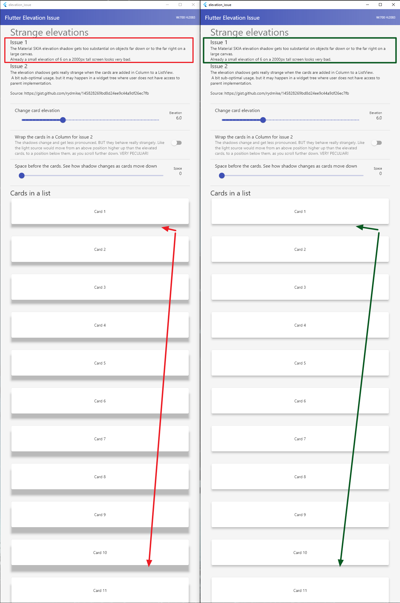
| Text('Issue 1', style: headline6), | |
| const Text( | |
| 'The Material SKIA elevation shadow gets too substantial on ' | |
| 'objects far down or to the far right on a large canvas.\n' | |
| 'Already a small elevation of 6 on a 2000px tall screen ' | |
| 'looks very bad.'), | |
| Text('Issue 2', style: headline6), | |
| const Text( | |
| 'The elevation shadows gets really strange when the cards ' | |
| 'are added in Column to a ListView. \n ' | |
| 'A bit sub-optimal usage, but it may happen in a widget tree ' | |
| 'where user does not have access to parent implementation.'), | |
| const SizedBox(height: 16), | |
| const SelectableText( | |
| 'Source: https://gist.github.com/rydmike/145828269bd8d24ee9c44a9df26ec7fb'), | |
| const SizedBox(height: 20), | |
| // | |
| // Adjust card elevation | |
| // | |
| const Divider(), | |
| ListTile( | |
| title: const Text('Change card elevation'), | |
| subtitle: Slider.adaptive( | |
| min: 0.0, | |
| max: kMaxElevation, | |
| divisions: (kMaxElevation * 2).floor(), | |
| label: elevation.toStringAsFixed(1), | |
| value: elevation, | |
| onChanged: (double value) { | |
| setState(() { | |
| elevation = value; | |
| }); | |
| }, | |
| ), | |
| trailing: Padding( | |
| padding: const EdgeInsets.only(right: 12.0), | |
| child: Column( | |
| crossAxisAlignment: CrossAxisAlignment.end, | |
| children: <Widget>[ | |
| const Text( | |
| 'Elevation', | |
| style: TextStyle(fontSize: 11), | |
| ), | |
| Text( | |
| elevation.toStringAsFixed(1), | |
| style: const TextStyle(fontSize: 15), | |
| ), | |
| ], | |
| ), | |
| ), | |
| ), | |
| // | |
| // Wrap the card inside a column | |
| // | |
| const Divider(), | |
| SwitchListTile.adaptive( | |
| title: const Text( | |
| 'Wrap the cards in a Column for issue 2', | |
| ), | |
| subtitle: const Text( | |
| 'The shadows change and get less pronounced, BUT ' | |
| 'they behave really strangely. Like the light ' | |
| 'source would move from an above position higher up than ' | |
| 'the elevated cards, to a position below them, as you scroll ' | |
| 'further down. VERY PECULIAR!', | |
| ), | |
| value: wrapInColumn, | |
| onChanged: (bool value) { | |
| setState(() { | |
| wrapInColumn = value; | |
| }); | |
| }, | |
| ), | |
| // | |
| // Adjust space before cards | |
| // | |
| const Divider(), | |
| ListTile( | |
| title: const Text( | |
| 'Space before the cards. See how shadow changes as cards move down'), | |
| subtitle: Slider.adaptive( | |
| min: 0.0, | |
| max: kMaxExtraSpace, | |
| divisions: kMaxExtraSpace.floor(), | |
| label: spaceBefore.floor().toString(), | |
| value: spaceBefore, | |
| onChanged: (double value) { | |
| setState(() { | |
| spaceBefore = value; | |
| }); | |
| }, | |
| ), | |
| trailing: Padding( | |
| padding: const EdgeInsets.only(right: 12.0), | |
| child: Column( | |
| crossAxisAlignment: CrossAxisAlignment.end, | |
| children: <Widget>[ | |
| const Text( | |
| 'Space', | |
| style: TextStyle(fontSize: 11), | |
| ), | |
| Text( | |
| spaceBefore.floor().toString(), | |
| style: const TextStyle(fontSize: 15), | |
| ), | |
| ], | |
| ), | |
| ), | |
| ), | |
| // | |
| // Extra spacing before cards | |
| SizedBox(height: spaceBefore), | |
| const Divider(), | |
| if (!wrapInColumn) | |
| Text('Cards in a list', | |
| style: Theme.of(context).textTheme.headline5), | |
| // | |
| // Plain cards with elevation, added to this list inside a column | |
| if (wrapInColumn) | |
| Column( | |
| crossAxisAlignment: CrossAxisAlignment.start, | |
| children: <Widget>[ | |
| Text('Cards in a list, wrapped in a column', | |
| style: Theme.of(context).textTheme.headline5), | |
| for (int i = 0; i < kMaxCards; i++) | |
| Padding( | |
| padding: const EdgeInsets.only(bottom: kEdgePadding), | |
| child: Card( | |
| elevation: elevation, | |
| child: SizedBox( | |
| height: 90, | |
| child: Center(child: Text('Card ${i + 1}')), | |
| ), | |
| ), | |
| ), | |
| const Text( | |
| 'Anything elevated inside the column is affected, ' | |
| 'also this raised button.'), | |
| ElevatedButton( | |
| onPressed: () {}, | |
| child: const Text('RAISED BUTTON'), | |
| ), | |
| ], | |
| ) | |
| // Plain cards with elevation, added directly to the list view | |
| else | |
| for (int i = 0; i < kMaxCards; i++) | |
| Padding( | |
| padding: const EdgeInsets.only(bottom: kEdgePadding), | |
| child: Card( | |
| elevation: elevation, | |
| child: SizedBox( | |
| height: 90, | |
| child: Center( | |
| child: Text('Card ${i + 1}'), | |
| ), | |
| ), | |
| ), | |
| ), | |
| // | |
| // Let's add a grid with card below the Card in a list | |
| // to see how they look. | |
| const SizedBox(height: kEdgePadding), | |
| Text('Colorful cards in a GridView', | |
| style: Theme.of(context).textTheme.headline5), | |
| if (wrapInColumn) | |
| const Text( | |
| 'Items outside the column are unaffected when they appear ' | |
| 'below the items in the column. They do however always ' | |
| 'get too pronounced shadows far down and right on the ' | |
| 'canvas, as everything always do. Notice ' | |
| 'how strange it looks with these cards illuminated from ' | |
| 'above and the cards and button above them from below!'), | |
| GridView.builder( | |
| padding: const EdgeInsets.all(kEdgePadding), | |
| shrinkWrap: true, | |
| primary: false, | |
| gridDelegate: const SliverGridDelegateWithFixedCrossAxisCount( | |
| crossAxisCount: 2, | |
| mainAxisSpacing: kEdgePadding, | |
| crossAxisSpacing: kEdgePadding, | |
| childAspectRatio: 2, | |
| ), | |
| itemCount: kMaxCards, | |
| itemBuilder: (_, int index) => Card( | |
| elevation: elevation, | |
| child: GridItem( | |
| title: 'Card ${index + 1}', | |
| color: Colors.primaries[index % Colors.primaries.length] | |
| [800]!), | |
| ), | |
| ) | |
| ], | |
| ), | |
| ), | |
| ), | |
| ), | |
| ); | |
| } | |
| } | |
| class GridItem extends StatelessWidget { | |
| const GridItem({Key? key, required this.title, required this.color}) | |
| : super(key: key); | |
| final String title; | |
| final Color color; | |
| @override | |
| Widget build(BuildContext context) { | |
| return Container( | |
| color: color, | |
| padding: const EdgeInsets.all(10), | |
| child: Column( | |
| mainAxisAlignment: MainAxisAlignment.center, | |
| children: <Widget>[ | |
| Text( | |
| title, | |
| style: const TextStyle( | |
| color: Colors.white, | |
| fontSize: 18, | |
| ), | |
| ), | |
| const Icon(Icons.apps, color: Colors.white), | |
| ], | |
| ), | |
| ); | |
| } | |
| } |
On the left build on BETA version mention above and on the right a build on MASTER, both issues demonstrated in this app have been solved!
Hooray!
Issue 1 A
Issue 1B

Issue 2

Sign up for free
to join this conversation on GitHub.
Already have an account?
Sign in to comment
Updated to Null safe version, to test and compare the fixed elevations on master channel (Channel master, 2.5.0-6.0.pre.28,) to beta where it is still not fixed.(Channel beta, 2.4.0-4.2.pre).