-
-
Save yogain123/9e30a0be7b7c7520e0866000e11db5be to your computer and use it in GitHub Desktop.
| hola |
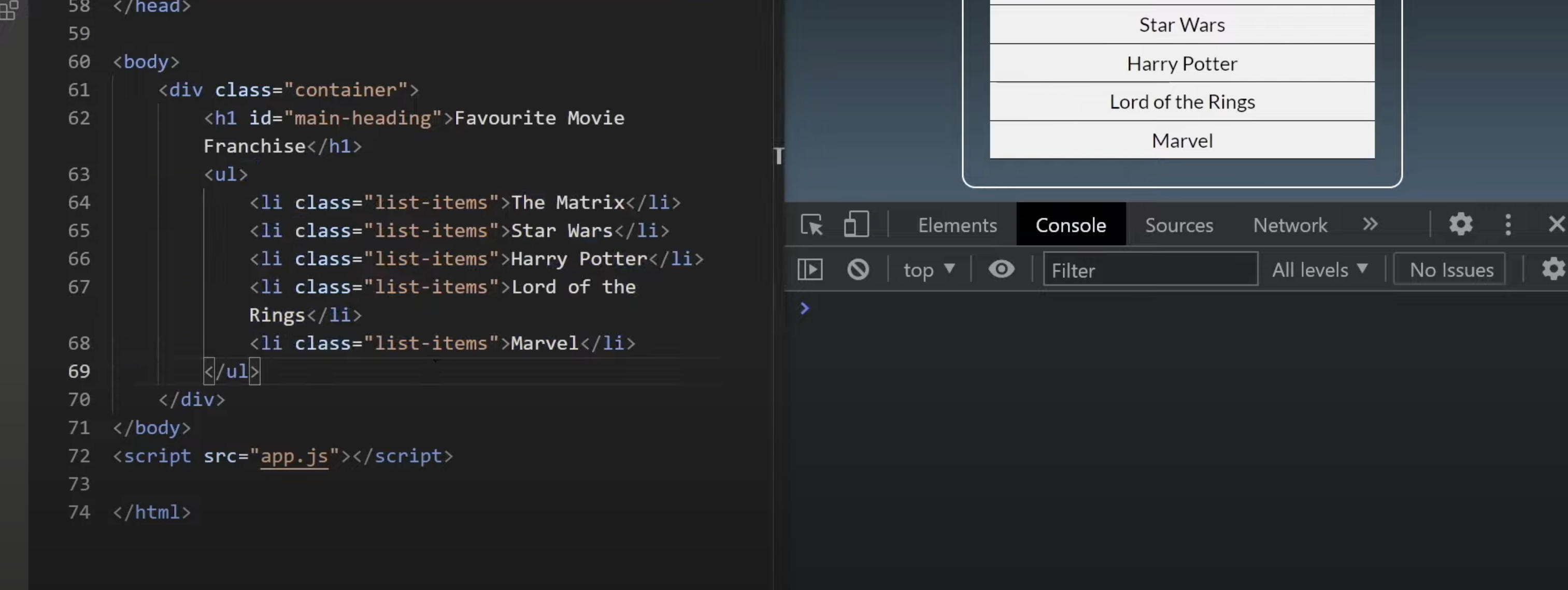
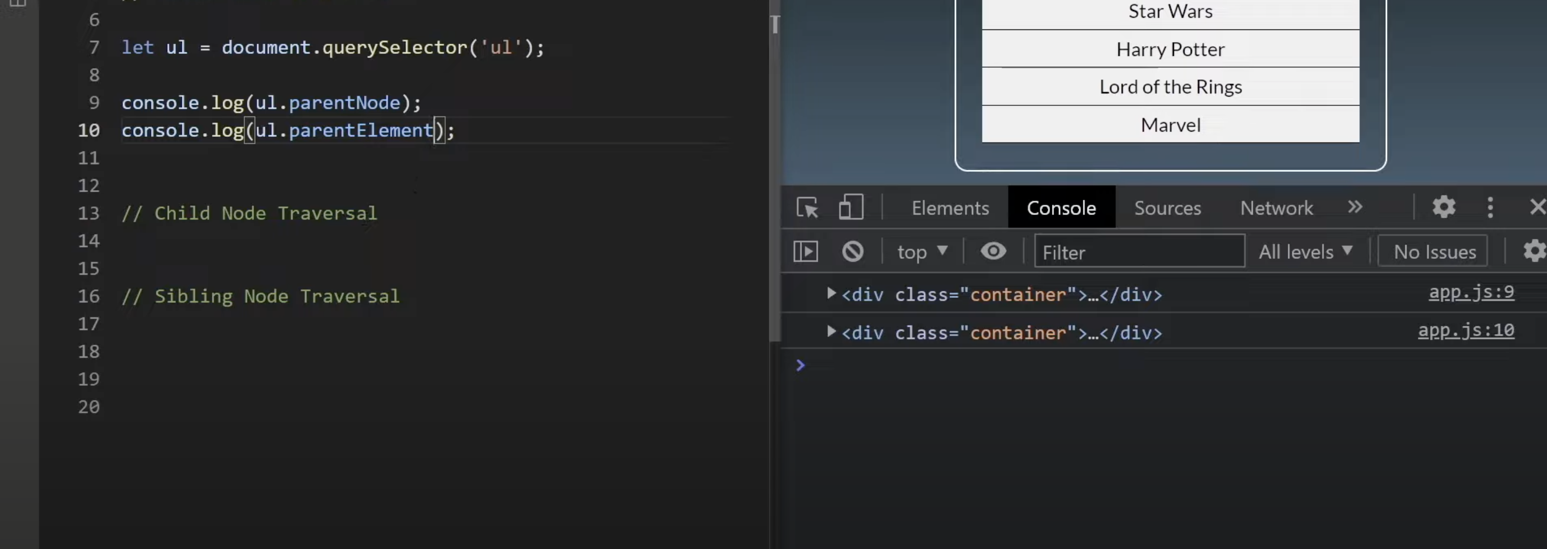
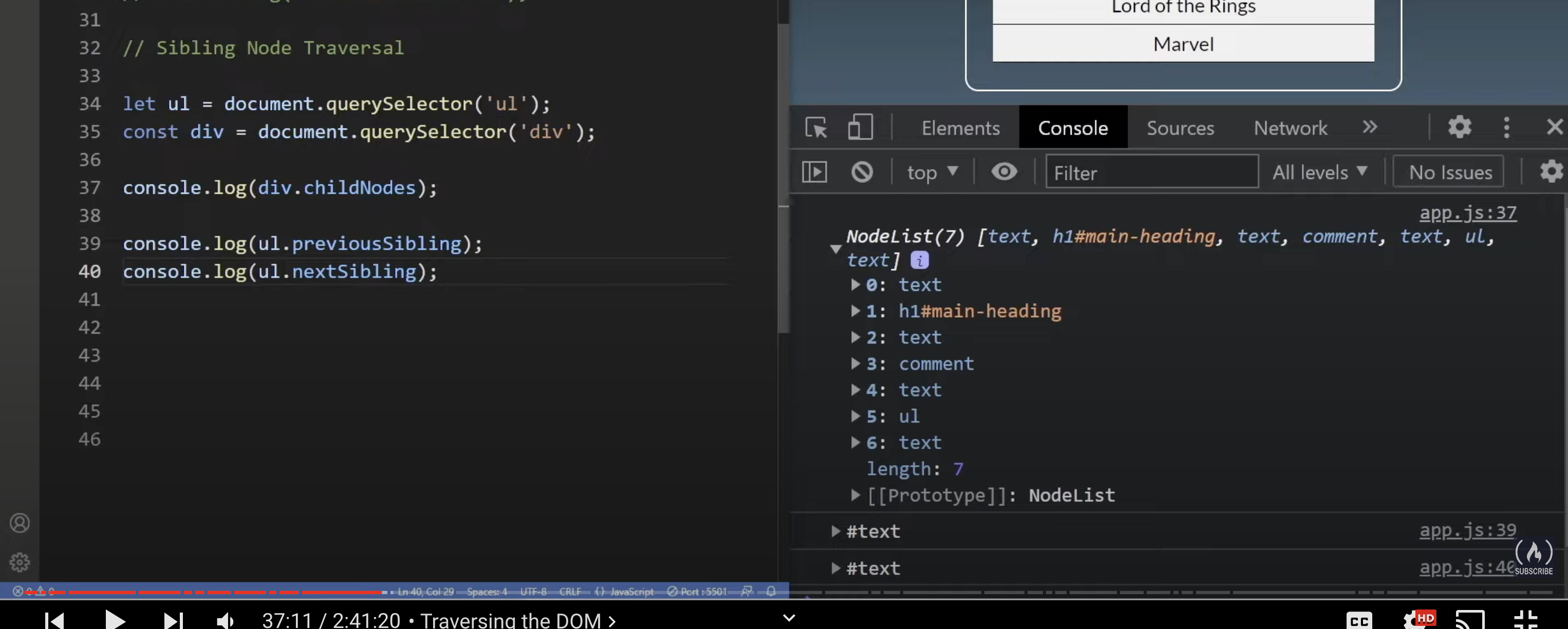
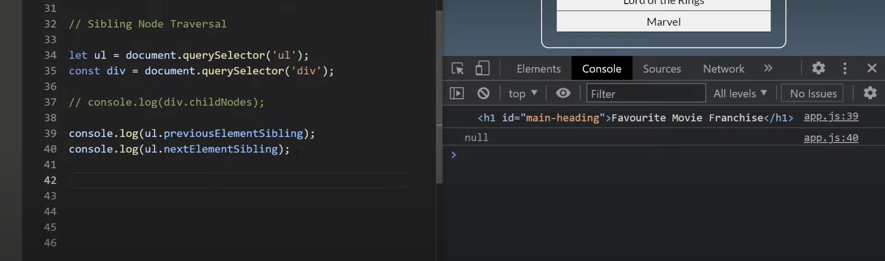
Node VS Elements


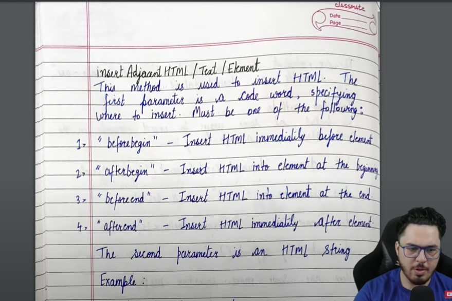
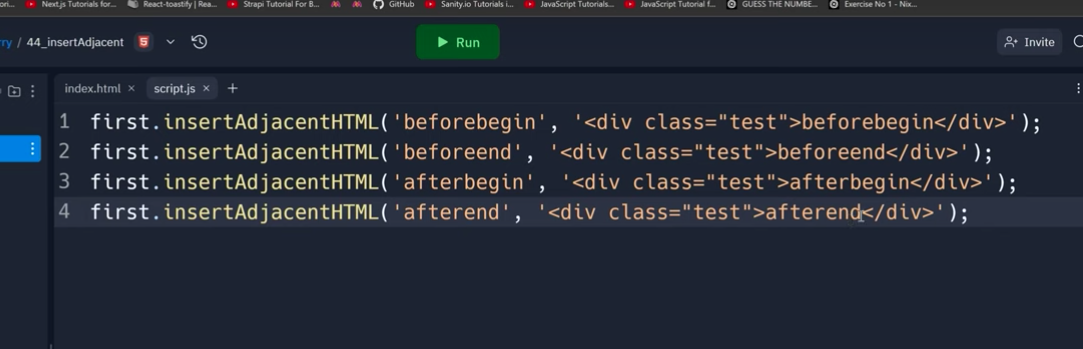
Insert Adjacent Elem
handle image content
object-fit: "cover"
CSS layers
CSS layers are used to define the priority order of styles from different sources (e.g., browser defaults, user styles, and external CSS files). CSS layers allow better control over which styles should override others by explicitly setting priorities.
Basics of CSS Layers
CSS layers work using the @layer rule. They allow you to group styles into layers and define the order of those layers. Styles from layers higher in the hierarchy (later layers) take precedence over styles in lower layers.
Syntax
- Define Layers: Use
@layerto define a layer. - Assign Rules to Layers: Associate styles with specific layers.
- Order Layers: Define the order of the layers to control their priority.
Example
<!DOCTYPE html>
<html lang="en">
<head>
  <meta charset="UTF-8">
  <meta name="viewport" content="width=device-width, initial-scale=1.0">
  <title>CSS Layers Example</title>
  <style>
    /* Define layers */
    @layer reset, theme, utilities;

    /* Layer: reset (lowest priority) */
    @layer reset {
      body {
        margin: 0;
        padding: 0;
      }
    }

    /* Layer: theme (middle priority) */
    @layer theme {
      body {
        font-family: Arial, sans-serif;
        background-color: lightblue;
      }
    }

    /* Layer: utilities (highest priority) */
    @layer utilities {
      body {
        background-color: pink;
      }
    }
  </style>
</head>
<body>
  <h1>Hello, CSS Layers!</h1>
</body>
</html>
Output
- The
resetlayer removes margins and padding. - The
themelayer applies a font-family and a light blue background. - The
utilitieslayer overrides the background color to pink because it has higher priority.
Overall Order of Precedence
- User-Agent Stylesheet (browser defaults)
- Author Stylesheets (your CSS code in layers or external stylesheets)
- Inline Styles (directly in the HTML element via
style="") !importantStyles (highest priority)
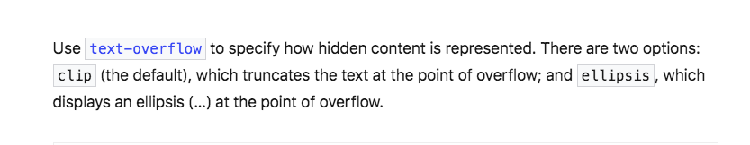
text overflow
picture Elem
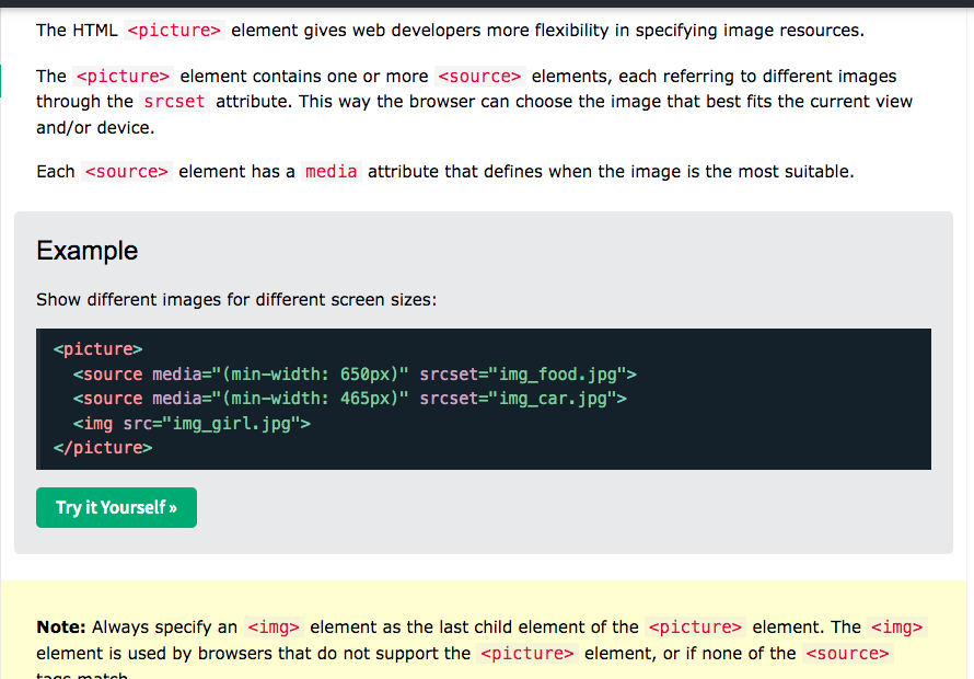
WebP is a modern image format developed by Google that provides superior compression for images on the web
It helps in performance optimisation for images
<picture>
  <source srcset="image.webp" type="image/webp">
  <img src="image.jpg" alt="Fallback image">
</picture>
data-*
In HTML, data-something attributes are custom attributes that allow you to store extra information on an element. This data can be easily accessed using JavaScript.
Example:
<div data-id="123" data-category="fruit">Apple</div>Access in JavaScript:
const element = document.querySelector('div');
console.log(element.dataset.id);        // "123"
console.log(element.dataset.category);  // "fruit"
Use Case: data- attributes are useful for embedding custom data in HTML that JavaScript can later retrieve and use.
z-index -> For z-index to work, the element (or pseudo-element) must be positioned—meaning it should have position: relative, position: absolute, position: fixed, or position: sticky. By default, ::before and ::after are inline, so you will need to set their position.
React way of setting innnerHTML
const App = () => {
  const data = `lorem <b onmouseover="alert('mouseover');">ipsum</b>`;

  return (
    <div dangerouslySetInnerHTML={{__html: data}} />
  );
}

export default App;
decodeURI(): It takes encodeURI(url) string as parameter and returns the decoded string.
decodeURIComponent(): It takes encodeURIComponent(url) string as parameter and returns the decoded string.
The atob() method decodes a string that has been encoded by the btoa() method.
const name = "yogendra";
const encoded = atob(name);
const decoded = btoa(encoded);
Selector
No, .box .active will not work the same way as .box.active. The difference lies in how these selectors operate:
.box.active
- Targets elements that have both classes (
boxandactive) applied to the same element. - Example:
<div class="box active"></div> <!-- Matches -->
.box .active
- Targets
.activeelements that are descendants (children, grandchildren, etc.) of a.boxelement. - Example:
<div class="box">
  <div class="active"></div> <!-- Matches .box .active -->
</div>
Key Difference:
.box.active: Both classes are applied to one element..box .active: Looks for an.activeelement inside (descendant of) a.boxelement.
CSS Transitions:
CSS transitions enable smooth changes between two states of an element over a specified duration. They are triggered by a change in the element's state (e.g., hover, focus, or class change). Transitions are useful for simple, state-driven effects.
Key Points:
- Require a trigger (e.g.,
:hoveror JavaScript). - Limited to transitioning between defined start and end states.
- Use the
transitionproperty to specify properties, duration, timing function, and delay.
Example:
.button {
  background-color: blue;
  transition: background-color 0.3s ease; /* Applies transition */
}
.button:hover {

background-color: green; /* Trigger state */

}
CSS Animations:
CSS animations define keyframe-based, timeline-driven effects that can run automatically or in a loop. They are more flexible and allow for complex multi-step animations without requiring user interaction.
Key Points:
- Do not need a trigger; can start automatically.
- Support keyframes (
@keyframes) for defining intermediate states. - Can loop infinitely or stop after a set number of iterations.
Example:
@keyframes move {
  0% { transform: translateX(0); }
  50% { transform: translateX(50px); }
  100% { transform: translateX(0); }
}
.box {

animation: move 2s infinite ease-in-out; /* Runs the animation */

}
Differences:
| Aspect | CSS Transitions | CSS Animations |
|---|---|---|
| Trigger | Requires state change (hover, focus, etc.) | Runs automatically or on command |
| Complexity | Single start and end states | Supports multiple steps (keyframes) |
| Flexibility | Limited to property changes | Can loop, reverse, or use complex sequences |
| Code | Simpler to implement | Slightly more verbose (keyframes required) |
Use Case:
- Transitions: Simple effects (e.g., button hover, opacity changes).
- Animations: Advanced, multi-step effects (e.g., spinners, loaders).
box-sizing: border-box
The box-sizing: border-box CSS property makes an element's total width and height include its padding and border, not just its content.
Without it (default content-box):
.element {
  width: 100px;
  padding: 10px;
  border: 5px solid black;
  /* Total width = 130px (100 + 20 + 10) */
}
With border-box:
.element {
  box-sizing: border-box;
  width: 100px;
  padding: 10px;
  border: 5px solid black;
  /* Total width = 100px */
}
This makes layouts more predictable since the element's specified width/height becomes its actual visible size. It's why many developers use a universal reset:
* {
  box-sizing: border-box;
}
Main approaches to implementing Micro Frontends (MFEs) in a simple way with examples.
- Build-time Integration
This is the simplest approach where each MFE is a separate npm package.
// Team A's package: @team-a/header
export const Header = () => {
  return <header>Company Header</header>;
}

// Team B's package: @team-b/products
export const ProductList = () => {
  return <div>Product Listings</div>;
}

// Main App
import { Header } from '@team-a/header';
import { ProductList } from '@team-b/products';

const App = () => {
  return (
    <div>
      <Header />
      <ProductList />
    </div>
  );
}- Runtime Integration via iframes
Each MFE runs in its own iframe:
<!-- Main Application -->
<html>
  <body>
    <h1>Main App</h1>
    <iframe src="http://team-a.company.com/header"></iframe>
    <iframe src="http://team-b.company.com/products"></iframe>
  </body>
</html>- JavaScript Runtime Integration (Module Federation)
Using Webpack 5's Module Federation:
// Team A's webpack config (header)
module.exports = {
  plugins: [
    new ModuleFederationPlugin({
      name: 'header',
      filename: 'remoteEntry.js',
      exposes: {
        './Header': './src/Header'
      }
    })
  ]
};

// Team B's app that consumes the header
const Header = React.lazy(() => import('header/Header'));

const App = () => {
  return (
    <div>
      <Suspense fallback="Loading header...">
        <Header />
      </Suspense>
      <ProductList />
    </div>
  );
}- Web Components
Each team builds their MFE as a web component:
// Team A's header component
class AppHeader extends HTMLElement {
  connectedCallback() {
    this.innerHTML = `<header>Company Header</header>`;
  }
}
customElements.define('app-header', AppHeader);

// Team B's product component
class ProductList extends HTMLElement {
  connectedCallback() {
    this.innerHTML = `<div>Product List</div>`;
  }
}
customElements.define('product-list', ProductList);

// Using them in the main app
<html>
  <body>
    <app-header></app-header>
    <product-list></product-list>
  </body>
</html>- Server-Side Fragment Composition
Using a reverse proxy (like Nginx) to compose fragments:
# nginx.conf
location / {
  # Fetch header from Team A's server
  proxy_pass http://team-a/header;
}

location /products {
  # Fetch products from Team B's server
  proxy_pass http://team-b/products;
}
Key Considerations for Each Approach:
- Build-time Integration
- Pros: Simple to implement, great developer experience
- Cons: All teams need to deploy together
- iframes
- Pros: Perfect isolation, independent deployment
- Cons: Poor user experience, difficult communication between MFEs
- Module Federation
- Pros: Runtime integration, independent deployment
- Cons: More complex setup, needs careful version management
- Web Components
- Pros: Framework agnostic, good browser support
- Cons: May need polyfills, less rich ecosystem
- Server-Side Composition
- Pros: Good performance, SEO friendly
- Cons: More complex infrastructure, potential single point of failure
For beginners, I recommend starting with either:
- Build-time integration (npm packages) for smaller teams
- Module Federation for larger organizations that need independent deployment
- Web Components if you need framework independence
Would you like me to elaborate on any of these approaches or provide more specific examples for any particular method?
Web components
Web components are like LEGO blocks for websites - they're reusable pieces of code that you can use across different web pages and even different projects. They let you create your own custom HTML elements with their own styling and behavior.
Let me break it down with a simple example. Imagine you want to create a custom rating element that shows stars:
<!-- Using the custom element -->
    <create-div name="yogendra"></create-div>
Here's how you would create this web component:
class CreateDiv extends HTMLElement{
    constructor(){
        super();

       // Create a shadow DOM to keep the styling isolated - optional, only if you want to keep styling isolated
        const shadow = this.attachShadow({mode:"open"});

        const name = this.getAttribute("name");
        const elem = document.createElement("div");
        elem.style.height = "100px";
        elem.style.width = "100px";
        elem.style.border = "1px solid black";
        elem.innerText = name;
        shadow.appendChild(elem);        // document.body.appendChild(elem) , if shadow is not used
    }
}

customElements.define("create-div",CreateDiv);
The main benefits of web components are:
- Reusability - Write once, use anywhere in your website
- Encapsulation - The styling and behavior are contained within the component
- Standard - They work in any modern browser and with any framework
- Maintainability - Each component is self-contained and easier to update
You can think of web components like creating your own HTML tags. Just like how <video> is a built-in tag that gives you a video player, you can create your own tags like <create-div> or <user-profile> that have exactly the features you need.
HTML input types
Let me explain the key differences between these HTML input types:
type="text":
- Default input type for single-line text
- Accepts any text characters
- No built-in validation
<input type="text" name="username">type="url":
- Specifically for web addresses
- Built-in validation for URL format
- On mobile, often shows a keyboard with
.comand/keys - Requires
http://orhttps://protocol
<input type="url" name="website">type="search":
- Functionally similar to text, but with search-specific features
- Usually displays an 'X' (clear) button when text is entered
- Often has rounded corners (browser-dependent)
- May trigger search-related keyboard on mobile devices
<input type="search" name="query">type="number":
- Only accepts numerical input
- Shows up/down spinners (browser-dependent)
- On mobile, displays numeric keyboard
- Can use attributes like min, max, and step
<input type="number" name="quantity" min="0" max="100">type="reset":
- Creates a button that resets all form fields to default values
- Not an input field itself
- Usually appears as a button
<input type="reset" value="Clear Form">Key behavioral differences:
- Validation: URL has built-in format validation, number only accepts digits
- Mobile keyboards: Each type can trigger different keyboard layouts
- Browser features: Search shows clear button, number shows spinners
- Data entry: Text accepts anything, URL requires protocol, number only takes digits
Not exactly - while both type="reset" and type="button" appear as buttons visually, they have different functionalities:
type="reset":
- Automatically resets ALL form elements to their initial/default values when clicked
- Works without any JavaScript
- Is specifically tied to form functionality
<form>
  <input type="text" value="default text">
  <input type="reset" value="Reset Form">  <!-- Clicking this will clear the text input -->
</form>type="button":
- Just a standard clickable button
- Has no default behavior
- Requires JavaScript to perform any action
- More generic, can be used for any purpose
<form>
  <input type="text" value="default text">
  <input type="button" value="Do Something" onclick="someFunction()">  <!-- Won't affect form without JS -->
</form>
So while they may look similar, reset has a built-in form-clearing functionality that button doesn't have. Would you like me to explain any other differences between input types?
Infinite Scroll - Intersection Observer
Steps to Achieve Infinite Scroll:
-
Set up your HTML structure:
- Create a container for your content.
- Add a "sentinel" element at the bottom of the content. This is the element the Intersection Observer will watch to know when to load more data.
<div id="content">
    <!-- Existing content will be here -->
</div>
<div id="sentinel"></div>
-
Write JavaScript to observe the sentinel element:
Here's how it works step-by-step:
- Create an Intersection Observer.
- Watch the sentinel element.
- When the sentinel becomes visible, load more content and move the sentinel down.
Code Example:
// Step 1: Reference the container and sentinel
const senitalElem = document.getElementById("sentinel");
const contentElem = document.getElementById("content");

// Step 2: Function to load more content
function loadMoreContent() {
  let count = 1;
  for (const item of Array(20).fill(1)) {
    const elem = document.createElement("div");
    elem.style.height = "100px";
    elem.style.width = "100px";
    elem.style.border = "1px solid black";
    elem.textContent = count;
    count++;
    contentElem.appendChild(elem);
  }
}


// Step 3: Set up the Intersection Observer
function callMeOnIntersection(entries) {
  const entry = entries[0];
  if (entry.isIntersecting) {
    loadMoreContent();
  }
}

const intersectionObserver = new IntersectionObserver(callMeOnIntersection);
intersectionObserver.observe(senitalElem);


// Step 5: Load initial content
loadMoreContent();
Virtualization
What is Virtualization?
Virtualization is a technique to render only the elements visible in the viewport, rather than rendering the entire list of items. This is especially useful when working with large datasets, as it significantly improves DOM performance by keeping the DOM tree small and manageable.
Why is Virtualization Important?
In a standard infinite scroll implementation, all items are added to the DOM, even if they are not visible. As the list grows:
- The DOM size increases.
- Browser rendering becomes slower.
- Memory usage spikes.
Virtualization solves this by only rendering what's visible on the screen.
Virtualization in React
React makes virtualization easier with libraries like react-window or react-virtualized, which are efficient and widely used.
Using react-window
Install the library:
npm install react-windowExample:
import React from 'react';
import { FixedSizeList as List } from 'react-window';

const MyVirtualizedList = () => {
  const totalItems = 10000;

  const Row = ({ index, style }) => (
    <div style={style}>Item {index + 1}</div>
  );

  return (
    <List
      height={300} // Height of the viewport
      itemCount={totalItems} // Total number of items
      itemSize={30} // Height of each item
      width="100%" // Width of the list
    >
      {Row}
    </List>
  );
};

export default MyVirtualizedList;
With virtualization, React ensures an optimized and smooth rendering experience, avoiding expensive DOM operations for off-screen items!
Pagination
Pagination is a technique used to divide large datasets into smaller, manageable chunks, allowing for efficient data retrieval and display. Two common pagination methods are offset-based pagination and cursor-based pagination. Here's an explanation of each:
1. Offset-Based Pagination
Concept:
- The dataset is divided into pages, and each page is identified by a starting point (offset) and a limit.
- The
offsetspecifies the number of records to skip, while thelimitspecifies how many records to return.
How It Works:
- Query Example (SQL):
SELECT * FROM products ORDER BY id LIMIT 10 OFFSET 20;- This retrieves 10 records starting from the 21st record (skip the first 20).
2. Cursor-Based Pagination
Concept:
- Instead of skipping a certain number of rows, the next page of data is retrieved using a unique identifier (cursor) that marks the last record from the previous page.
How It Works:
- A cursor (e.g., an ID, timestamp, or unique key) is used to fetch the next set of records.
All mostly used API's
- Canvas APIs
- Document APIs
- Media APIs
- Network APIs
- Storage APIs
Creating complex HTML using javascript
function createComplexElem() {
    const elem = document.createElement("div");
    elem.innerHTML =   `<ul>
      <li>s</li>
      <div>sd</div>
    </ul>
    <span>sdasd</span>`;
    document.body.appendChild(elem);
  }

createComplexElem();
nth-child, nth-of-type
-
:nth-child(n)- Selects the element that is the n-th child of its parent, regardless of its type.
- Syntax:
p:nth-child(2)selects the 2nd child of the parent, if p is not 2nd child of parent then nothing will eventually be selected
-
:nth-of-type(n)- Selects the element that is the n-th child of its type (e.g., 2nd
<p>, 3rd<div>). - Syntax:
p:nth-of-type(2)selects the 2nd<p>within its parent.
- Selects the element that is the n-th child of its type (e.g., 2nd
Both can use patterns like n, odd, even, or formulas like 2n+1 for more complex selections.
CSS Box Model
The CSS Box Model is a fundamental concept in web development that explains how elements are structured and spaced on a webpage. Every HTML element is treated as a box, and the box model consists of four main parts:
- Content – The actual content inside the box (like text, an image, or other elements).
- Padding – The space between the content and the border. It increases the size of the box but does not affect surrounding elements.
- Border – The boundary around the padding and content. It has width, style, and color.
- Margin – The space outside the border that separates the element from other elements.
Visual Representation:
+---------------------+  <-- Margin (space outside)
|     ( Border )      |
|  +-------------+   |  <-- Padding (space inside)
|  |  Content    |   |
|  +-------------+   |
|                   |
+-------------------+
Example in CSS:
.box {
  width: 200px;
  height: 100px;
  padding: 20px;
  border: 5px solid black;
  margin: 10px;
}- Width & Height: The actual content size.
- Padding (20px): Adds space inside the border.
- Border (5px): Visible edge of the element.
- Margin (10px): Creates space between this box and others.
Box-Sizing Property:
By default, width and height only apply to the content, but you can use:
box-sizing: border-box;This makes layouts more predictable since the element's specified width/height becomes its actual visible size. It's why many developers use a universal reset:
This makes sure width and height include content + padding + border, preventing unwanted size expansion.
In JavaScript event handling, event.target and event.currentTarget serve different purposes:
1. event.target
- Refers to the element that actually triggered the event.
- This can be the deepest (most specific) element that was clicked inside a parent with an event listener.
2. event.currentTarget
- Refers to the element to which the event handler is attached.
- It remains constant and does not change as the event propagates.
Example:
<div id="parent">
  <button id="child">Click Me</button>
</div>
<script>
document.getElementById("parent").addEventListener("click", function (event) {
console.log("event.target:", event.target); // Element that was clicked (button)
console.log("event.currentTarget:", event.currentTarget); // Element with listener (div)
});
</script>
Case Study:
- If you click on the button,
event.targetwill be the<button>because it was directly clicked. event.currentTargetwill always be the<div id="parent">, because that’s where the event listener is attached.
Pseudo-Element vs. Pseudo-Class in CSS
1. Pseudo-Classes (:)
- A pseudo-class selects elements based on their state, position, or interaction.
- It does not create new elements but applies styles to an existing one.
- Uses a single colon (
:).
Examples of Pseudo-Classes
button:hover {
  background-color: blue;
  color: white;
}

/* Selects every even child */
li:nth-child(even) {
  background-color: lightgray;
}

/* Selects only checked checkboxes */
input:checked {
  border: 2px solid green;
}
2. Pseudo-Elements (::)
- A pseudo-element is used to style a specific part of an element or insert content.
- It creates a virtual element inside the selected element.
- Uses a double colon (
::) (CSS3 standard, though older browsers still support:).
Examples of Pseudo-Elements
p::before {
  content: "👉 ";
  color: red;
}

/* Add content after an element */
p::after {
  content: " ✨";
  color: blue;
}

/* Style only the first letter */
p::first-letter {
  font-size: 2em;
  font-weight: bold;
}

/* Style only the first line */
p::first-line {
  color: purple;
}
text-align
The text-align property is used to align text horizontally inside an element.
Values:
text-align: left;→ Aligns text to the left (default).text-align: right;→ Aligns text to the right.text-align: center;→ Centers text horizontally.text-align: justify;→ Stretches text to fill the width.
.text-container {
  text-align: center;
}<div class="text-container">This text is centered.</div>text-align only affects inline elements (text, span, a, etc.), not block elements.
DOMContentLoaded vs load
Timing: DOMContentLoaded fires earlier than load. DOMContentLoaded occurs after the HTML is fully parsed, while load waits for all resources to be loaded.
Use cases: Use DOMContentLoaded for tasks that only require the DOM to be ready, such as attaching event listeners or manipulating the DOM. Use load for tasks that depend on all resources being fully loaded, such as image-dependent layout calculations.
document.addEventListener('DOMContentLoaded', function () {
  console.log('DOM fully loaded and parsed');
});window.addEventListener('load', function () {
console.log('Page fully loaded');
});
HTML5, CSS3
What is HTML5 and CSS3?
- HTML5 (HyperText Markup Language 5) is the latest version of HTML, used for structuring web content. It introduces new elements, attributes, and APIs to make web development more powerful and efficient.
- CSS3 (Cascading Style Sheets 3) is the latest version of CSS, providing more styling capabilities, animations, and responsive design features.
New Features of HTML5
-
New Semantic Elements
<article>,<section>,<header>,<footer>,<nav>,<aside>,<figure>, etc.- Improves accessibility and SEO.
-
Multimedia Support
<audio>and<video>elements for embedding media without plugins like Flash.- Example:
<video controls>
  <source src="video.mp4" type="video/mp4">
</video>
-
Canvas API
<canvas>element for drawing graphics, animations, and game development.- Example:
<canvas id="myCanvas" width="200" height="100"></canvas>
-
SVG (Scalable Vector Graphics) Support
- Allows embedding vector graphics directly in HTML.
- Example:
<svg width="100" height="100">
  <circle cx="50" cy="50" r="40" stroke="black" fill="red" />
</svg>
-
Geolocation API
- Allows web apps to access the user’s location.
- Example:
navigator.geolocation.getCurrentPosition(position => {
  console.log(position.coords.latitude, position.coords.longitude);
});
-
Web Storage API (LocalStorage & SessionStorage)
- Stores data in the browser without using cookies.
- Example:
localStorage.setItem("username", "JohnDoe");
console.log(localStorage.getItem("username"));
-
WebSockets
- Enables real-time communication between the client and server.
- Example:
let socket = new WebSocket("ws://example.com/socket");
socket.onmessage = event => console.log(event.data);
-
Form Enhancements
- New input types:
<input type="date">,<input type="email">,<input type="range">, etc. - Example:
<input type="email" placeholder="Enter your email">
- New input types:
-
Drag and Drop API
- Allows elements to be dragged and dropped.
- Example:
<div draggable="true">Drag me!</div>
New Features of CSS3
-
Flexbox & Grid Layout
- Helps create responsive and flexible layouts.
- Example (Flexbox):
.container {
  display: flex;
  justify-content: center;
  align-items: center;
}
- Example (Grid):
.container {
  display: grid;
  grid-template-columns: 1fr 1fr;
}
-
Media Queries (Responsive Design)
- Adjusts layout based on screen size.
- Example:
@media (max-width: 600px) {
  body {
    background-color: lightblue;
  }
}
-
Animations & Transitions
- Example (Animation):
@keyframes bounce {
  0% { transform: translateY(0); }
  50% { transform: translateY(-20px); }
  100% { transform: translateY(0); }
}
.box {
  animation: bounce 2s infinite;
}
- Example (Transition):
button {
  transition: background-color 0.3s;
}
button:hover {
  background-color: red;
}
- Example (Animation):
-
Custom Fonts (Web Fonts)
- Allows using custom fonts via
@font-faceor Google Fonts. - Example:
@font-face {
  font-family: 'MyFont';
  src: url('myfont.woff2') format('woff2');
}
body {
  font-family: 'MyFont', sans-serif;
}
- Allows using custom fonts via
-
Variables in CSS (Custom Properties)
- Example:
:root {
  --primary-color: blue;
}
h1 {
  color: var(--primary-color);
}
- Example:
-
Box Shadow & Text Shadow
- Example:
.box {
  box-shadow: 5px 5px 10px gray;
}
.text {
  text-shadow: 2px 2px 4px rgba(0, 0, 0, 0.5);
}
- Example:
-
Multi-Column Layout
- Example:
.text {
  column-count: 3;
  column-gap: 20px;
}
- Example:
-
Blend Modes & Filters
- Example:
img {
  filter: grayscale(100%);
}
- Example:
CSS Transform
Its bsically transfrom the elemet from its original position without effecting other elems in layout
Once all elems are rendered on screen , then whatever is Transform it will be applied on that elems, but rest elems with stays as it is
#div {
  height: 100px;
  width: 100px;
  border: 1px solid black;
  transform: translate(10px, 20px);   // moves 10px to right(x-axis), moves 20px down(y-axis), with negative value it goes left, up
}#div {
height: 100px;
width: 100px;
border: 1px solid black;
transform: translateX(10px); // moves 10px to right(x-axis), with negative value it goes left
}#div {
height: 100px;
width: 100px;
border: 1px solid black;
transform: translateY(20px); // moves 20px to down(y-axis), with negative value it goes up
}Rotate - Rotate an elem
#div {
  height: 100px;
  width: 100px;
  border: 1px solid black;
  transform: rotate(45deg);   // rotate elem to 45deg
}
Scale Resizes an element along different axes.
transform: scale(1.5);
Some CSS Properties
calc()
Performs calculations dynamically.
width: calc(100% - 50px);min(), max()
width: min(50vw, 400px);
width: max(30vw, 200px);
Applies a blur effect.
filter: blur(5px);Adjusts brightness.
filter: brightness(150%);attr
Fetches an attribute value.
Note: it will always used with content only
content: attr(data-label);Fetches a URL value.
background-image: url('image.jpg');var()
uses a css variable
:root{
--primary-color : red
}

div{
color: var(--primary-color);
}
Gradient
background: linear-gradient(red, blue);

object-fit
object-fit: fill | contain | cover;aspect-ratio
aspect-ratio: width / height;aspect-ratio: 16 / 9; /* Standard widescreen aspect ratio */How aspect-ratio Works with width and height
- If width is defined and height is not, the browser calculates the height using the aspect ratio.
- If height is defined and width is not, the browser calculates the width using the aspect ratio.
- If both width and height are defined, the aspect ratio is ignored.
DOM Elements