I’ve been playing with new CSS declaration text-wrap: balance, part of the CSS Text Module Level 4 standard. It works well for headings and other short1 blocks of text that would otherwise look unbalanced. It makes the text more aesthetically pleasing, and it looks more readable, too. This is best described with an example.
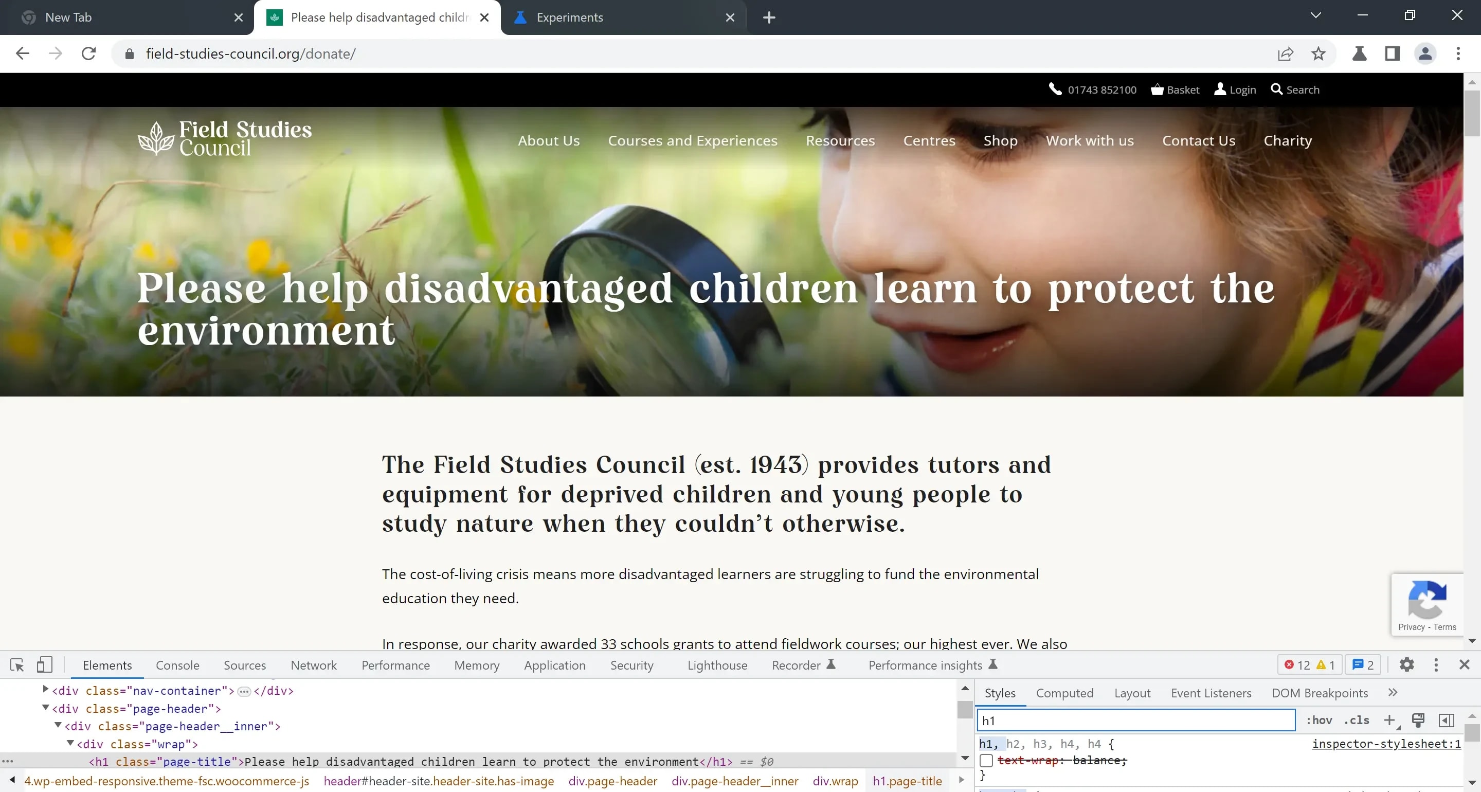
Here’s an example as it looks now:
And here’s the same with text-wrap: balance turned on:
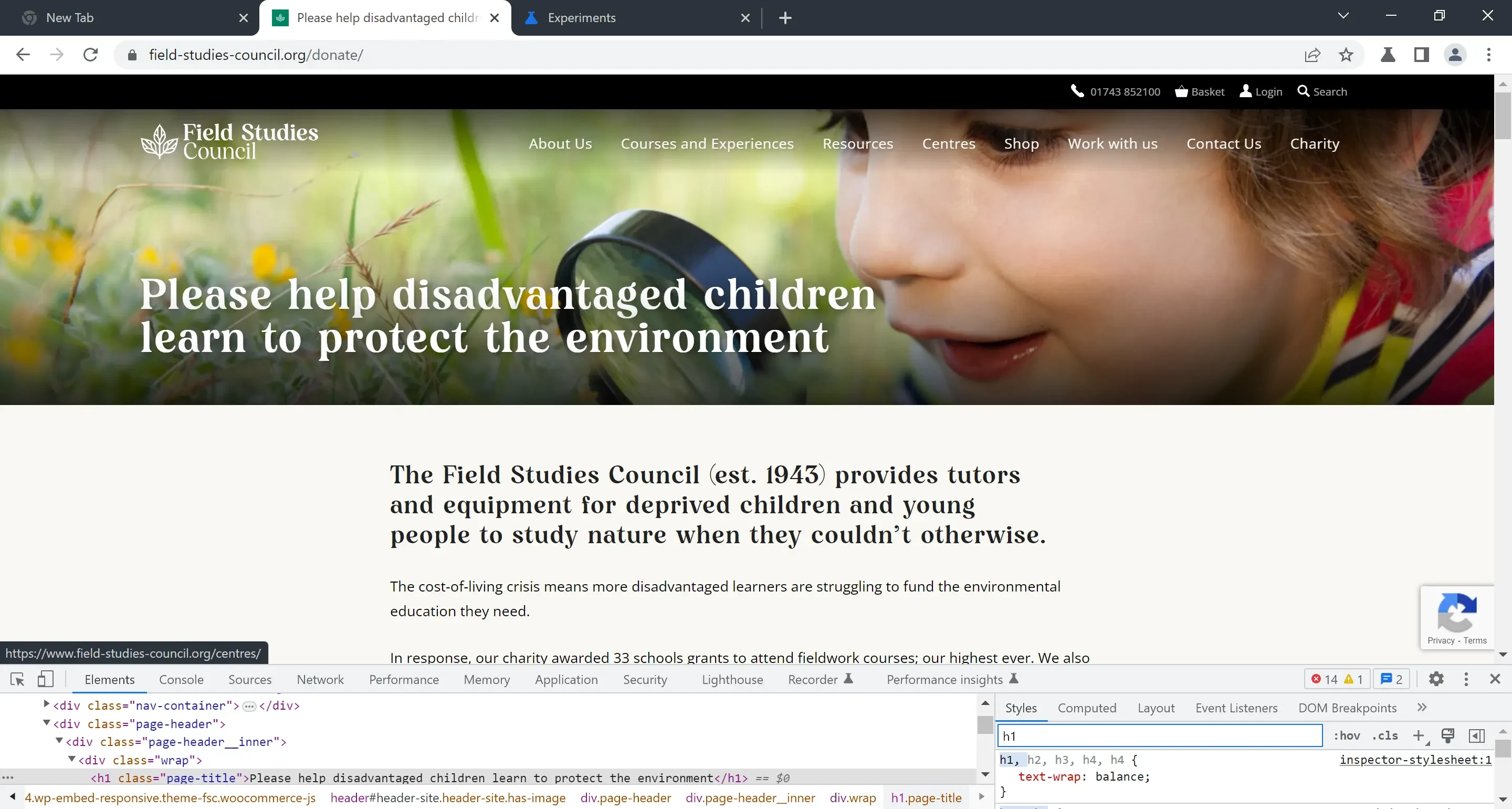
The effect on the main headline is pronounced. The balancing algorithm has removed the widow2; the long headline now feels more compact, sturdy, and, to my eyes, easier to read. It also works better with the background image, but that is more a coincidence than anything.
The effect on the secondary header is more subtle, but the outcome is still good. The block in the original is top-heavy. It looks like it is leaning to the right, while the balanced version look more, well, balanced.
A good way to think about the relative balance of these blocks of text is to imagine they are a pile of bricks, with each word being a brick, and the whitesapce in and around the mortar. Given a pile of these word-bricks, would the structure stand? Try out this visual thought-experiment with the examples above.
I’m talking about the subtleties of aesthetics here, and of feelings such as balance. You might think these things somewhat trivial in the context of web design where content is king. But I would argue we are a species that have evolved to appreciate balance, harmony, and other aesthetic concerns. Unbalanced things can look unsettling to us; subconsciously troubling. A building, a tree, a path, an environment that looks out-of-kilter with its surroundings could trigger a deep sense of anxiety and alertness to danger. Our intuition at work. The flip side of this idea: harmony and balance look beautiful to us because they signal a sense of safety, calm, and dependability. Beauty, for complex reasons, makes us feel good. I am of course speculating here, but it’s interesting to think about.
To get text-wrap: balance working in Chrome Canary, you need to go to chrome://flags and enable Experimental Web Platform features. It is due to land in Chromium 113, which has a target stable release date of early May 2023. No plans as far as I know for Firefox, but it doesn't matter as this declaration with gracefully fail (i.e. have no effect) in unsupported browsers, making it an excellent progressive enhancement.
Some references and further reading:
An end to typographic widows on the web | Clagnut by Richard Rutter
Text-wrap balancing lands in Chrome Canary - YouTube
Una's announcement thread on Front-End Social
Microsoft Edge release schedule
Footnotes
-
Although the spec says passages of up to ten lines should be balanced, Chrome's implementation works on passages up to four lines only. According to Una in her announcement thread, this is for performance reasons – balancing more than four lines gets slow. ↩
-
A widow is a single word dangling at the end of a passage of text. They are generally considered aesthetically unpleasing. You can also get orphans, which are single lines left at the bottom of a (printed) page, section or column. ↩