Skip to content

Instantly share code, notes, and snippets.

@phloe
Last active July 27, 2020 07:23
Show Gist options
  • Save phloe/4008294 to your computer and use it in GitHub Desktop.
Save phloe/4008294 to your computer and use it in GitHub Desktop.
combine-layout - float/inline-block layout technique

combine-layout

The following outlines a technique combining floating blocks and inline-blocks allowing for fairly interesting layouts without the need to use nested rows and avoids some problems when using pure floats.

The technique itself only uses three classnames:

  • combine-layout - defines the containing element.
  • break - starts a new row when in floating block context.
  • divide - starts off the inline-block context.

A combine-layout element will have two different layout contexts (or pseudo columns if you will); a floating context and an inline-block context. By default all child elements of the combine-layout element will belong to the floating context. Using the divide classname will trigger the rest of the elements to belong to the inline-block context.

The technique doesn't however include any specific concept for block widths on purpose. There's a vast number of different frameworks out there offering those. For example purposes a 12 column grid is used below with span-* classnames for handling block width.

Example a:

A simple 6-6 column layout showing how the divide classname triggers the inline-block context. Using pure floats would have caused trouble if block 3 was taller than block 4 because block 5 would get caught on the corner created by 3 and 4. But this is all painless using floats together with inline-block.

figure-a

<div class="combine-layout">
	<div class="span-6"><!-- content --></div>
	<div class="span-2 divide"><!-- content --></div>
	<div class="span-2"><!-- content --></div>
	<div class="span-2"><!-- content --></div>
	<div class="span-2"><!-- content --></div>
	<div class="span-2"><!-- content --></div>
	<div class="span-2"><!-- content --></div>
</div>

Example b:

This shows a 8-4 column combination in an ordered list. Divvy up your blocks in the first pseudo column by adding the break classname on the first block in each new pseudo row that makes up 8 columns. To start off the next pseudo column of 4 columns width (inline block context) you only need to add the divide classname to the first block in it.

figure-b

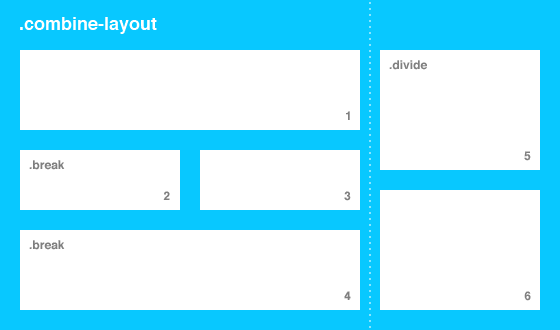
<ol class="combine-layout">
	<li class="span-8"><!-- content --></li>
	<li class="span-4 break"><!-- content --></li>
	<li class="span-4"><!-- content --></li>
	<li class="span-8 break"><!-- content --></li>
	<li class="span-4 divide"><!-- content --></li>
	<li class="span-4"><!-- content --></li>
</ol>

Pros:

  • Use semantic markup interchangeably; div-div, ol-li or ul-li.
  • Avoid excessive nesting row markup to make layouts (and the hairy mess of css thats needed).
  • Change layouts very fast; just change some classnames.
  • Layouts won't compromise source order.
  • Works in IE8 and better.

Cons:

  • Only two pseudo columns.
  • In extreme cases the inline-block context may wrap under floating block context.

You can see a demo on dabblet

/*
Start of .combine-layout css - this is the clever bit
*/
.combine-layout {
text-align: right; /* align inline-blocks right */
font-size: 0; /* make sure whitespace between inline-blocks doesn't ruin the layout */
}
.combine-layout:after {
/* clear those floats */
display: table;
clear: both;
content: " ";
}
.combine-layout > * {
float: left; /* float blocks by default */
text-align: left; /* reset text-align right */
font-size: 16px; /* reset font-size to something sane */
}
.combine-layout > .break {
clear: left; /* make sure floated blocks start new row with .break */
}
.combine-layout > .divide,
.combine-layout > .divide ~ * {
/* start new pseudo column by switching from floated blocks to inline-blocks */
display: inline-block; /* duh */
vertical-align: top; /* make sure blocks align at top */
float: none; /* reset float */
}
.combine-layout > .divide.break,
.combine-layout > .divide ~ .break {
clear: none; /* reset .break occurring after .divide */
}
/*
End of .combine-layout css
*/
/*
Define span-* classes for a 12 column grid.
This is basically the same as any other grid/framework uses.
*/
.span-2,
.span-3,
.span-4,
.span-5,
.span-6,
.span-7,
.span-8,
.span-9,
.span-10,
.span-12 {
box-sizing: border-box; /* good old border-box */
padding: 0 10px;
}
.span-2 {
width: 16.6666666666%;
}
.span-3 {
width: 25%;
}
.span-4 {
width: 33.3333333333%;
}
.span-5 {
width: 41.6666666666%;
}
.span-6 {
width: 50%;
}
.span-7 {
width: 58.3333333333%;
}
.span-8 {
width: 66.6666666666%;
}
.span-9 {
width: 75%;
}
.span-10 {
width: 83.3333333333%;
}
.span-12 {
width: 100%;
}
/* .combine-layout can even simplify responsive breakpoints */
@media only screen and (max-width: 768px) and (min-width: 481px) {
.combine-layout > .span-4 {
width: 50%;
}
.combine-layout > .span-6,
.combine-layout > .span-8 {
width: 100%;
}
.combine-layout > .span-6 ~ .divide.span-2,
.combine-layout > .span-6 ~ .divide ~ .span-2 {
width: 33.3333333333%;
}
.combine-layout > .span-6 ~ .divide.span-3,
.combine-layout > .span-6 ~ .divide ~ .span-3 {
width: 50%;
}
.combine-layout > .span-6 ~ .divide.span-4,
.combine-layout > .span-6 ~ .divide ~ .span-4 {
width: 66.6666666666%;
}
}
@media only screen and (max-width: 480px) {
.combine-layout > * {
float: none;
width: 100%;
}
}
/*
Below is basic styling of the rest of the page.
Not really related to the combine-layout technique.
*/
* {
margin: 0;
padding: 0;
}
html, body {
height: 100%;
}
.site-wrapper {
overflow: hidden;
}
.site-content {
margin: 0 auto;
padding: 20px 0;
width: 960px;
background-color: #FFF;
box-shadow: 0 0 5px rgba(0, 0, 0, 0.25);
}
@media only screen {
.site-content {
width: auto;
max-width: 960px;
}
}
/* IMAGES */
.image-1, .image-2, .image-3 {
float: left;
margin-right: 20px;
}
img {
display: block;
width: 100%;
}
.span-3 .image-1 {
width: 33.3333333333%;
}
.span-4 .image-1 {
width: 25%;
}
.span-4 .image-2 {
width: 50%;
}
.span-5 .image-2 {
width: 40%;
}
.span-6 .image-2 {
width: 33.3333333333%;
}
.span-7 .image-2 {
width: 28.5714285714%;
}
.span-8 .image-2 {
width: 25%;
}
.span-5 .image-3 {
width: 60%;
}
.span-6 .image-3 {
width: 50%;
}
.span-7 .image-3 {
width: 42.8571428571%;
}
.span-8 .image-3 {
width: 37.5%;
}
.span-9 .image-3 {
width: 33.3333333333%;
}
.span-10 .image-3 {
width: 30%;
}
.span-12 .image-3 {
width: 25%;
}
/* content boxes */
.box {
margin: 10px 0;
}
.box:after {
display: table;
clear: both;
content: " ";
}
.box p {
font: 14px/1.2 helvetica,​arial,​freesans,​clean,​sans-serif;
}
.box [class*="heading-"] + p {
margin-top: 5px;
}
[class*="heading-"] {
display: block;
color: #333;
text-decoration: none;
text-transform: uppercase;
font: normal 30px/0.9 helvetica,​arial,​freesans,​clean,​sans-serif;
}
[class*="heading-"][class*="-bold"] {
font-weight: bold;
}
[class*="heading-small"] {
font-size: 20px;
}
[class*="heading-large"] {
font-size: 42px;
}
[class*="heading-xlarge"] {
font-size: 54px;
}
.image-wrap + [class*="heading-"] {
margin-top: 10px;
}
.image-1 + [class*="heading-"],
.image-2 + [class*="heading-"],
.image-3 + [class*="heading-"] {
margin-top: 0;
}
.skin-1 {
padding: 20px;
background-color: #08c8ff;
color: #FFF;
}
.skin-1 [class*="heading-"] {
color: #FFF;
}
.skin-2 {
padding: 20px;
background-color: #EEE;
}
<div class="site-wrapper">
<div class="site-content">
<!-- start off a .combine-layout box -->
<div class="combine-layout">
<!-- blocks will float left by default -->
<div class="span-6">
<div class="box skin-1">
<span class="image-wrap ratio-16-9"><img src="http://placekitten.com/420/267"/></span>
<a class="heading-xlarge-bold" href="#">Lorem ipsum dolor sit amet</a>
<p>Class aptent taciti sociosqu ad litora torquent per conubia nostra, per inceptos himenaeos. Aliquam in dolor vel diam fringilla viverra nec sed orci. Phasellus sagittis erat vel turpis hendrerit eget placerat dui adipiscing. Donec tincidunt eleifend lorem, id auctor purus dictum dignissim. Nullam eget posuere dolor.</p>
</div>
</div>
<!-- use .divide to switch to inline-block from here on -->
<div class="span-2 divide">
<div class="box">
<span class="image-wrap ratio-1-1"><img src="http://placekitten.com/140/140"/></span>
<a class="heading-small" href="#">Duis vel ipsum ac dolor</a>
<p>Pellentesque vulputate, neque eget rutrum rhoncus, enim tortor tincidunt lacus, sit amet sollicitudin enim quam ac dui.</p>
</div>
</div>
<div class="span-4">
<div class="box">
<span class="image-wrap ratio-16-9"><img src="http://placekitten.com/300/169"/></span>
<a class="heading-medium" href="#">Etiam et mauris ut ante vestibulum ultricies</a>
</div>
</div>
<div class="span-3">
<div class="box">
<span class="image-wrap ratio-16-9"><img src="http://placekitten.com/220/124"/></span>
<a class="heading-medium" href="#">Phasellus hendrerit</a>
</div>
</div>
<div class="span-3">
<div class="box skin-2">
<span class="image-wrap ratio-16-9"><img src="http://placekitten.com/180/101"/></span>
<a class="heading-medium-bold" href="#">Aenean vel nisl ut</a>
</div>
</div>
</div>
<!-- start a new .combine-layout -->
<div class="combine-layout">
<div class="span-8">
<div class="box">
<a class="heading-xlarge-bold" href="#">Nullam vel dui ante vitae</a>
<p>Aenean suscipit massa at nibh lobortis quis dapibus tortor egestas. Cras volutpat ante elit, sed elementum est.</p>
</div>
</div>
<!-- .break starts a new row -->
<div class="span-4 break">
<div class="box">
<span class="image-wrap ratio-16-9"><img src="http://placekitten.com/400/225"/></span>
<a class="heading-small-bold" href="#">Cras lacus lacus</a>
<p>Nam lobortis mattis felis, non semper quam dictum ut. Cras tellus ante, blandit quis elementum at, interdum in mi.</p>
</div>
</div>
<div class="span-4">
<div class="box">
<span class="image-wrap ratio-16-9"><img src="http://placekitten.com/600/338"/></span>
<a class="heading-medium" href="#">Nam vulputate commodo dolor</a>
</div>
</div>
<!-- .break starts a new row -->
<div class="span-8 break">
<div class="box">
<span class="image-wrap image-3 ratio-16-9"><img src="http://placekitten.com/232/131"/></span>
<a class="heading-large-bold" href="#">Etiam et mauris ut ante</a>
</div>
</div>
<!-- .divide switches to inline-block mode -->
<div class="span-4 divide">
<div class="box">
<span class="image-wrap ratio-16-9"><img src="http://placekitten.com/200/113"/></span>
<a class="heading-small" href="#">Suspendisse ut ipsum pharetra velit</a>
</div>
</div>
<div class="span-4">
<div class="box skin-2">
<span class="image-wrap ratio-16-9"><img src="http://placekitten.com/260/146"/></span>
<a class="heading-small" href="#">Fusce cursus gravida suscipit</a>
</div>
</div>
<div class="span-4">
<div class="box">
<span class="image-wrap image-2 ratio-16-9"><img src="http://placekitten.com/200/113"/></span>
<a class="heading-small" href="#">Suspendisse ut ipsum pharetra velit</a>
</div>
</div>
<div class="span-4">
<div class="box skin-1">
<span class="image-wrap image-2 ratio-16-9"><img src="http://placekitten.com/260/146"/></span>
<a class="heading-small" href="#">Fusce cursus gravida suscipit</a>
</div>
</div>
</div>
</div>
</div>
{"view":"split","fontsize":"100","seethrough":"","prefixfree":"1","page":"css"}
Sign up for free to join this conversation on GitHub. Already have an account? Sign in to comment