If visible, show:
---
const isVisible = false;
---

{
    isVisible &&
 {obj.favorites[1].toUpperCase()}
If visible, show:
---
const isVisible = false;
---
{
isVisible &&
{obj.favorites[1].toUpperCase()}
---
const obj = {
    name: str,
    number: num,
    favorites: ["astro", "css", "js"]
}
---
<h1>{obj.favorites[1].toUpperCase()}</h1>
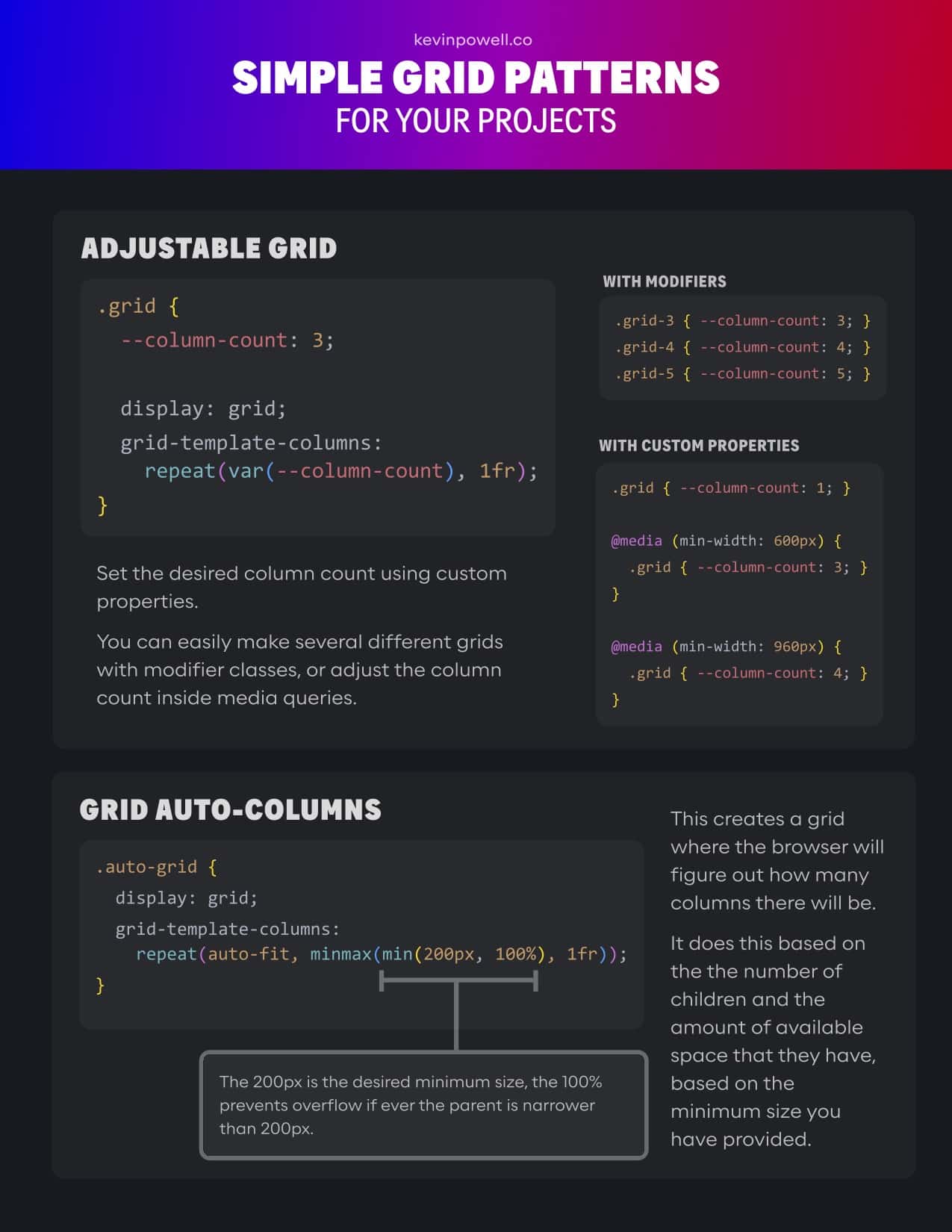
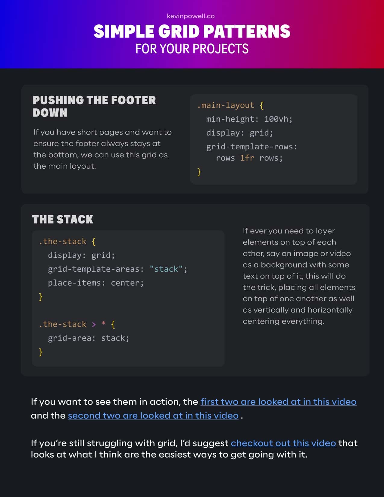
If you want to see them in action, the first two are looked at in this video and the second two are looked at in this video.
If you’re still struggling with grid, I’d suggest checkout out this video that looks at what I think are the easiest ways to get going with it.
h1 {
   max-inline-size: var(--size-header-3);
   margin-inline: auto;
}
Kevin Powell: A better image reset for your CSS
img {
   font-style: italic;

   background-repeat: no-repeat;
   background-size: cover;

 shape-margin: 1rem;
The solution is named lines.
.content-grid {
   display: grid;
 grid-template-columns: 1fr [content-start] 1fr [content-end] 1fr;
Modern CSS can make a lot of impossible things possible, but it also simplifies some things as well.
One use case that I have on pretty much every project these days is setting up a container/wrapper width with min() and margin-inline.
.old-container {
    width: 100%;
    max-width: 70rem;
    padding: 2rem;
 margin: 0 auto;
| { | |
| "extends": "astro/tsconfigs/base", | |
| "compilerOptions": { | |
| "baseUrl": ".", | |
| "paths": { | |
| "@/*": ["src/*"], | |
| "@components/*": ["src/components/*"], | |
| "@data/*": ["src/data/*"], | |
| "@images/*": ["src/images/*"], | |
| "@layouts/*": ["src/layouts/*"], |
| /* | |
| * Kevin Powell | |
| * https://youtu.be/cCAtD_BAHNw | |
| */ | |
| *, *::before, *::after { | |
| box-sizing: border-box; | |
| } | |
| * { |
| /* Antiflesh */ | |
| #FAFAFA | |
| /* OFF White */ | |
| #FBFBFB | |
| /* Alice Blue */ | |
| #F0F8FF | |
| /* Ivory */ |