My coding this year started on an utterly slow note, I finally started my Bachelor’s degree in ICT after several trials. Truth be told, combining schooling with the personal learning of how to code has been anything but easy. But do I really need a degree in IT to become a better programmer? Well, that’s an argument for another day because I can think of a thousand and one reasons to both support and oppose the notion.
For some time now, I have paid little or no attention to CSS Grids and Flexbox; positioning, floating, clearing and the likes were the order of the day for me when it came to making layouts. But with the amount of buzz these two CSS concepts have been generating, I couldn’t help seeing for myself. I read several tutorials and articles about CSS Grids and Flexbox (W3Schools, this article by Ire Aderinokun and this article as well, and a host of others) and of course made several layouts with them.
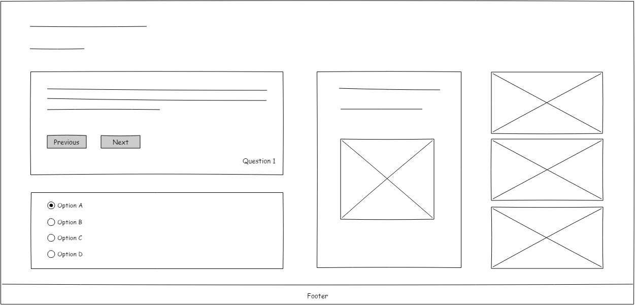
I was so code-rusty at this point that I was beginning to forget some basic syntaxes. Fortunately, I came across a post online about a person who needed the layout of a webpage done using CSS Grid, I knew what I had to do. So, to get myself back in the coding mood and rekindle the fire, I reached out to the person and was pretty honest about my CSS Grid knowledge which was still in development stage. He eventually agreed to work with me as he was a Back-End Developer who was still honing his skills as well. He made a rough sketch of what the layout should look like and he also wanted it to be responsive and simple.
NB: This is not a CSS Grid tutorial, in fact, I barely scratched the surface of what it entails. You can check those ones above and many other good tutorials online.
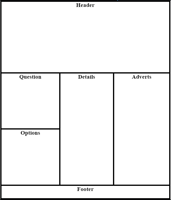
Writing redundant codes was something I was bent on improving on, so I decided to write the entire HTML first before styling it. I made a sketch of the grid layout to make things easier.
It is obvious from the sketch that the layout has four rows and three columns.
Making use of appropriately named divs, this was what the basic HTML looked like:
https://gist.github.com/c2003e17dbb72c3f95fa8c07b0afedf4
To get the Grid up and running, the display of the .grid-container is set at grid. Having drawn the sketch of the grid, I went on to create three columns using the grid-template-columns property, giving it the value auto auto auto and giving the grid-template-rows property the value 45vh auto auto auto, thereby creating four rows. I tried as much as possible to use more relative CSS units throughout. 45vh meant that the first row will take up 45% of the viewport (browser window), and the auto value will make the content determine the height and width of the rows and columns. Lastly, I set the values of one of my favourite features of CSS Grid which is grid-template-areas as “header header header” “question details adverts” “options details adverts” “footer footer footer”. This property makes it much easier to arrange our rows and columns using the grid-area value which will later be assigned to the respective grid children.
The grid-area property of the divs: .header, .question, .options, .details, .adverts and .footer are named accordingly. My stylesheet at this point looked like this:
https://gist.github.com/ae8df65467c835b3c1efd0cde1825058
With the addition of some other things like background image to the header, previous and next buttons and the absolute-ly positioned question number to the question div; radio buttons to the options div, icons and an image to the details div and dummy images in the ad containers, this was what the desktop view looked like:
For the mobile view, I employed CSS Queries with little modifications to the CSS code to collapse the grid into one column: https://gist.github.com/beb8fb5ad727735637b60f886b99d97d
The modifications to the CSS code for the tablet view were minimal as well: https://gist.github.com/b18f6002c1e8fe083fb037640c4e969a
I had finished working on the layout before finding out that IE 10 to Edge 15 have an older Grid specification which made my grid layout to be rendered wrongly in them as against Chrome, Firefox and Opera. I had to search online to read about the older Grid specification and I also found this page on Stack Overflow and this page on MDN helpful.
So, that was how my first collaborative project went using CSS Grids and I enjoyed every single bit of it. I had a slow start to this year but I’m trying as much as possible to make out more time for learning and practice. Although I’m disappointed with my progress so far, I’m in no way discouraged. I look forward to being much more productive in the remaining part of the year and I’m positive that my consequent write-ups will ooze the excitement of progress.
PS: I was curious to know how to include actual code blocks in articles and not just screenshots. So, I decided to be a little bit adventurous and ended up learning Markdown in the process, in fact, this article was written in Markdown and imported to Medium via Jacob Bennet’s MarkdownToMedium.


