Welcome to the Widget of the Week series, where I take gifs or videos of awesome UI/UX components, and bring them to life with code.
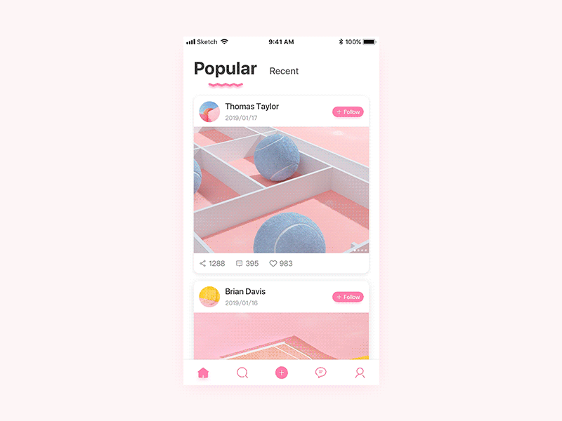
Today we are going to create a swipe gallery that works with both touch or mouse controls. The inspiration comes from this submission created by RONGYU and looks like this:
This tutorial is aimed at front-end developers that want to level up their skills. It is recommended that you have some prior knowledge of HTML, CSS, JS. I'll be using Vue.js to make the widget, if you're not familiar to this framework these awesome posts can help you get up to speed:
For today's widget, we will be using Vue.js, and for some animations, we'll use TweenMax. Also, I'll be using the newly released TailwindCSS v1.0.1. If you want to follow along you can fork this codepen template that already has the dependencies.
First what I want to do is constrain the area of our widget container to match the size of a mobile device. For that I'll first write some CSS rules:
https://gist.github.com/7e26521fe87ff64f8581a8e59094229d
This will be the only CSS class we will need for the whole widget... that's right the rest of styling will be done using TailwindCSS.
Now to see it working we need to add some mark up to our widget, let's start by making our app container:
https://gist.github.com/0a52e23bce7d8b2c69878f4cbbc01e47
Those are a bunch of TailwindCSS classes, most of them are self-explanatory if you are used to writing CSS rules. From left to right they match to the following CSS rules:
https://gist.github.com/56e4f81bbb325dbcbe9953f65e6867a9
As you can see we wrote less code and also we are able to make any changes without having to jump between the CSS file and the HTML one.
For the rest of the tutorial I won't be "translating" each TailwindCSS class, but I'll surely highlight the ones that matter the most. For the rest you can visit TailwindCSS documentation.
Now let's make use of the .mobile-container class that we created:
https://gist.github.com/bacd6b18a51aca1222637d91df7c7d4f
We are making the container relative to be able to move the gallery images relatively to it, also overflow-hidden should help us to hide any content that gets outside of the container's box.
Now we should have something like this:
To start making our gallery we need a couple of images to work with, you can use the following array of images I hosted for this widget:
https://gist.github.com/d18e28e5841ec7da22f0a73a616a108b
As usual in this series, we need to setup Vue.js to bind our js data to the HTML template and make our widget interactive:
https://gist.github.com/391d814538b81a7451cb430336262e9b
Not much is happening right now, I'm only declaring a property in my data object that holds the index of the current item in our gallery.
Before going forward I need to show you a couple of diagrams that should help explain the real behavior of the gallery.
Our gallery should loop over all images in the array, but instead of creating all of the images we will only need to have 3 images at the same time: Previous, Current and Next
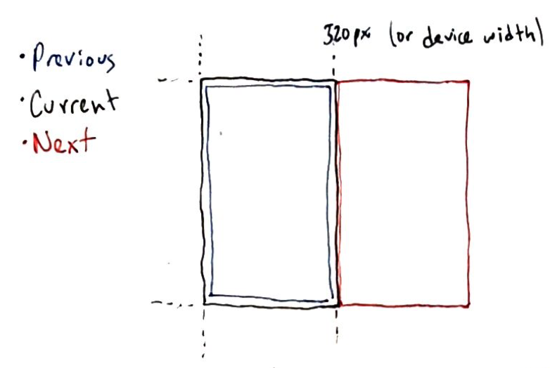
Whenever we swipe through the images, we can only see at most those three images so we will be doing a couple of "magic tricks" for them to look like if the gallery was infinite.
When swiping there are two outcomes, you drag the current image to the right and show the previous one or drag the next image on top of the current one:
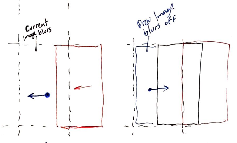
After releasing the dragged image to either side we need to decide if the image stays in the center, or leaves the viewport:
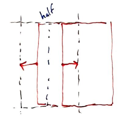
For that we will take the image position if more than half of it is inside the viewport it stays, if not it leaves. Also to keep working with the same three images we should swap them accordingly.
We now know that three images are going to be rendered, we have the currentImageIndex already but we need the previous and the next one too. Also, it would be awesome if the image URL could be stored in a variable, or even better, computed properties:
https://gist.github.com/d347be6aea51edae9785469a97ee00df
Instead of using methods, computed properties help us to both simplify our component and improve its performance, computed properties are cached based on their reactive dependencies.
We have everything to start rendering the images, so let's get back to the HTML part:
https://gist.github.com/fe1f03dda558ff7707cc48f200c49091
All three images need to be stacked above the previous ones, that's why we are using z-0, z-10, z-20 and absolute position. The h-full class ensures that the images fill vertically the space of the container.
We have a small problem, the nextImage as shown in the first diagram should be outside (on the right side) of the viewport. We will eventually also animate it so I will bind the style attribute to a computed property called nextImageStyle.
https://gist.github.com/91610c87bc5de3eed6f489f2b0269598
Then we need to create that computed property, but it needs a constant referencing the device width:
https://gist.github.com/abdf04cd6bd8b7da027df438436946bc
For this widget it is a hardcoded constant, but in a real-world scenario we should be able to get the device width and set that constant accordingly.
https://gist.github.com/134bc765b99ee40eb9c708da800e3898
We created a couple of computed properties for the styling, this seems like overkill but they will be useful when animating the images. After this, you should be seeing the first image, the waterfall, instead of some green leaves.
The user will interact with our gallery by touching or clicking the current image, then it will start moving the cursor or finger and after that, they should release the image.
Those are three events we need to listen:
- start
- move
- end
The start event will always be triggered by the current image, but the other two events can happen either inside the image or outside the gallery container. The next step is to listen to those events and to be able to make it work both in mobile and desktop devices, we need to listen not only touch events but mouse events too:
https://gist.github.com/54b0cb5a2178944e21da29aaf5556fb6
https://gist.github.com/2bc7840aa5e00e470f251cf816d6fa23
Notice the
preventmodifier, this helps to prevent the regular drag and drop behavior that browsers add to images.
We have three different methods that need to be declared inside our Vue instance, but first, let's create a helper function to extract the position of either the mouse or the finger touching the screen:
https://gist.github.com/83e42e21d3be2ee00aa36d3194c059a4
We should be able to use this function to update accordingly the cursor movement, but we will also need to keep track of the initial click position and if the user is currently dragging the image:
https://gist.github.com/9e0316b3c8bbbe9243bcdb2cd77973ab
To see if all of this is working correctly, you can add this widget to see how the properties change:
https://gist.github.com/dfcab8f6efb2da3f9671c98d1fcd09d3
Here comes the interesting part, for the next steps we will first declare some constants that we will be using:
https://gist.github.com/80fdc896b42132dda9d506b7082c0ac2
After we finish you can play with these values to see how things change.
Like I mentioned above there are two cases when dragging an image, either it is being dragged to the left or to the right. let's create a couple of computed props for that:
https://gist.github.com/275a37bb0925dea0878ef743da66caf4
Basically we are getting the difference between where the user started to drag and where the cursor is currently. If that difference is greater than
0it means that the user is dragging the image to the left.
Before deep diving into moving the images, I'll create another helper function that should give us a hand when it comes to keeping the images inside the container
https://gist.github.com/26b5f98e82508145448f5534cb605f38
And now we can replace the nextImagePosition computed prop with this new one:
https://gist.github.com/2adae90659129c0f70fb55d519881ac7
Try it out!
The nextImage should come out when you press and drag to the left.
Whenever the user is not dragging or if the user is swiping right, we want the next image to be in the same spot outside the viewport. In the other case, the image should get closer to the center of the container depending on the dragging speed.
In the same way, we can do something similar for the currentImage when the user swipes right, first bind the style attribute:
https://gist.github.com/faaaa77bc5d36f8423de850c5c64de48
Then create the computed methods for that:
https://gist.github.com/5d2543a679948aadaa2cd4dabe76bc29
In the reference, when the current image is being covered by the next one it gradually blurs to create an effect of being sent to the bottom. Let's create the last helper function:
https://gist.github.com/45d2566592d1ad18da182cab874d588c
This function should give us a value between 0 and the
MAX_BLURdepending on the position of an image. When the image is closer to being outside the viewport there is less blur, when it is closer to being centered there's a bigger blur value.
Also our previous image will need a style attribute:
https://gist.github.com/2cd499e029a2d4f4a07d948441dcdd09
The previousImage blur depends on the currentImage position, and the currentImage blur depends on the nextImage position:
https://gist.github.com/1ff9712bc3da3042d144363aedd5018e
So far, so good. Images are moving and blurring accordingly, but after we release them they just go back. We need a way to make them go where we want after we swiped.
Like we said before, depending if half of the image is showing or hiding we will animate it in or out.
Let's add some data props that we will need for this:
https://gist.github.com/06d0a70801747c984efa649638a60763
The animating property will let us know whenever we are moving an image and prevent any other action. currentImageAnimatedX and nextImageAnimatedX will hold the position when animating the corresponding images.
In order for those two properties to work correctly we need to update both images positioning computed props:
https://gist.github.com/0746d9f8d208dd2c0ff19210dbbe0941
Then we need to change the stopDrag method to trigger the animation:
https://gist.github.com/d8998337b90448b54d9f88ab93e84815
We are using
TweenLiteto tween the Vue instance data, this will reactively update the images styles computed properties.
You may have noticed that we need to define the createReleaseAnimation, this is the method that will hold the logic to know where should images go after being released. This is some kind of decision tree, so I'll explain it with comments inline:
https://gist.github.com/a6e34dffb8ff1d372f3050dd1477f1db
What we are doing is defining each of the four cases:
- Swiped left but the image should get back offscreen
- Swiped left and the image should get to the center of the container
- Swiped right and the image should get back to the center
- Swiped right and the previous image should become the new current image
On each of those cases, we define an object that will be used by TweenLite to change the corresponding animatedX property to the target destination.
And now the final result!
{% codepen https://codepen.io/ederdiaz/pen/bJmdOd default-tab=result %}
I left a <pre> tag showing all of the properties as they update but feel free to remove it if you just want to see the gallery without it.
And that’s it for this Widget of the Week.
If you're hungry for more you can check other WotW:
{% link https://dev.to/ederchrono/minimalistic-nav-menu-with-vue-js-and-gsap-wotw-1m3k %} {% link https://dev.to/ederchrono/making-an-interactive-password-validator---wotw-1md0 %} {% link https://dev.to/ederchrono/making-an-animated-slider---wotw-mkj %}