Skip to content

Instantly share code, notes, and snippets.

View robcrock's full-sized avatar

Robert Crocker robcrock

View GitHub Profile
@robcrock
robcrock / data.csv
Last active January 4, 2018 05:34
mmw01_poultry_consumption
year poultry beef pork
1965 44 74.7 51.5
1966 43.7 78.1 50.3
1967 45.3 79.8 55
1968 44.9 82 56.2
1969 46.8 82.5 54.3
1970 48.2 84.4 55.4
1971 48.5 83.9 60.6
1972 50.4 85.3 54.7
1973 48.2 80.5 48.7
@robcrock
robcrock / .block
Last active January 1, 2020 11:06
Calories from...
license: mit
@robcrock
robcrock / README.md
Last active January 1, 2020 11:05
Love Interests

MakeoverMonday W2 2018

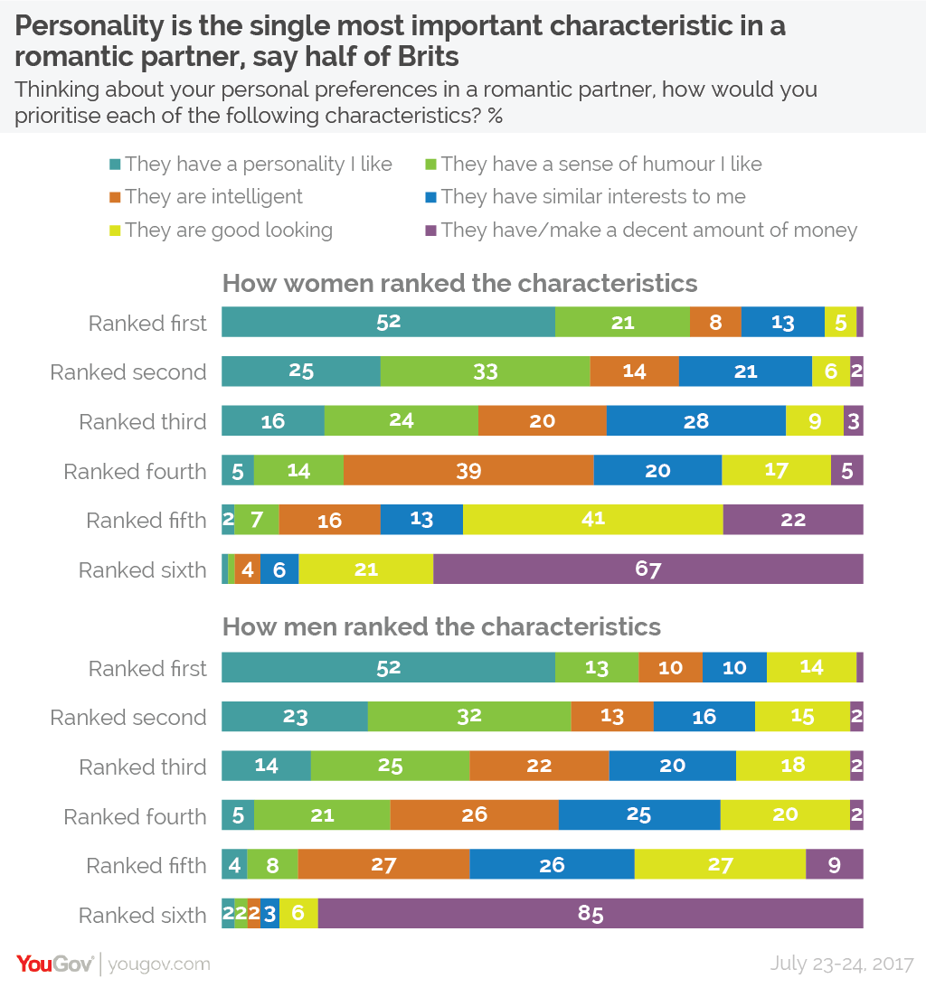
This weeks viz was largely inspired by Elijah Meek's book D3 in Action. Chapter 7 of that book shares some ways we can create less conventional charts types. I used code from that chapter to begin building an adjacency matrix in an attempt to show the relationship between the characteristic women voted on and their rank.

The data set this week was provide by Matthew Smith from YouGov

@robcrock
robcrock / data.csv
Last active January 11, 2018 07:34
Makeover Monday Boilerplate
column1 column2 column3
category1 $13.01 blue
category2 $15.60 orange
category3 $20.01 grey
@robcrock
robcrock / README.md
Last active January 1, 2020 11:01
Love Interest v2

Makeover Monday - Week 2

Original visualization

Original visualization

This week YouGov gave us a visualization to work with on the subject of British love interests.

What works well

  • It is easy to see how personality ranks
  • It isn't as easy, but you can also see how unimportant money is to Brits
@robcrock
robcrock / .block
Last active January 13, 2018 09:08
Data Table Summary
license: mit
@robcrock
robcrock / README.md
Last active January 1, 2020 11:02
US Household Income Distribution

Makeover Monday - Week 3

Original visualization

Original visualization

This week the Visual Capitalist has shared a visualization from Reddit displaying the percentage of households that fall into certain income ranges for every State in the US.

What works well

  • The color really gets your attention
We can't make this file beautiful and searchable because it's too large.
event_id,timestamp,tag_id,animal_id,animal_comments,animal_life_stage,animal_mass,study_timezone,longitude,latitude
283203879,2003-11-14T16:00:00,42500,Butterball,migratory,adult,2372,Pacific Standard Time,-75.39717,40.48933
283203880,2003-11-14T17:00:00,42500,Butterball,migratory,adult,2372,Pacific Standard Time,-75.39717,40.48933
283203889,2003-11-15T02:00:00,42500,Butterball,migratory,adult,2372,Pacific Standard Time,-75.41167,40.29583
283203979,2003-11-26T21:00:00,42500,Butterball,migratory,adult,2372,Pacific Standard Time,-77.47567,38.46833
283204879,2004-02-14T19:00:00,42500,Butterball,migratory,adult,2372,Pacific Standard Time,-81.00667,28.797
283040073,2005-04-12T23:00:00,52067,Irma,non-migratory,adult,2012,Pacific Standard Time,-75.2035,40.615
283129835,2006-09-10T14:00:00,57956,Rosalie,migratory,adult,1975,Pacific Standard Time,-123.45917,46.2925
283129836,2006-09-10T15:00:00,57956,Rosalie,migratory,adult,1975,Pacific Standard Time,-123.45917,46.2925
283129837,2006-09-10T16:00:00,57956,Rosalie,migra
@robcrock
robcrock / .DS_Store
Last active January 1, 2020 11:02
Turkey Migration
@robcrock
robcrock / README.md
Last active February 7, 2018 11:46
Baseball Demographics

Makeover Monday - Week 6

Original visualization

Original visualization

The Society for American Baseball created a 100% area chart displaying the pecent share between four ethnicities: White, African American, Asian, and Latino from 1947 to 2016. In honor of Black History month the #MakeoverMonday community is taking a stab at presenting this data differently to explore a few more ways one might looks at this data. The data source can be found here.

Instead of doing a pure makeover of the original visualization this week I want to remake Ann Jackson's visualization in D3.js. Why recreate the wheel, when Ann's done such a good job of making a beautiful display of the data already 😍