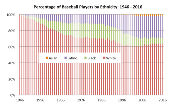
The Society for American Baseball created a 100% area chart displaying the pecent share between four ethnicities: White, African American, Asian, and Latino from 1947 to 2016. In honor of Black History month the #MakeoverMonday community is taking a stab at presenting this data differently to explore a few more ways one might looks at this data. The data source can be found here.
Instead of doing a pure makeover of the original visualization this week I want to remake Ann Jackson's visualization in D3.js. Why recreate the wheel, when Ann's done such a good job of making a beautiful display of the data already 😍
