This is my version of the updating line chart from the book, Fullstack D3.
Robert Crocker robcrock
robcrock
/ Sample - Superstore.csv
Created
December 12, 2020 13:10
The data set use in the React Date Picker blog post.
We can't make this file beautiful and searchable because it's too large.
This file contains bidirectional Unicode text that may be interpreted or compiled differently than what appears below. To review, open the file in an editor that reveals hidden Unicode characters.
Learn more about bidirectional Unicode characters
| Category,City,Country,Customer Name,Date,Date Filter,Manufacturer,Order ID,Postal Code,Product Name,Region,Segment,Ship Date,Ship Mode,State,Sub-Category,Discount,Number of Records,Profit,Profit Ratio,Quantity,Sales | |
| Furniture,Henderson,United States,Claire Gute,11/8/18,TRUE,Bush,CA-2018-152156,42420,Bush Somerset Collection Bookcase,South,Consumer,11/11/18,Second Class,Kentucky,Bookcases,0%,1,$42 ,16%,2,$262 | |
| Furniture,Henderson,United States,Claire Gute,11/8/18,TRUE,Hon,CA-2018-152156,42420,"Hon Deluxe Fabric Upholstered Stacking Chairs, Rounded Back",South,Consumer,11/11/18,Second Class,Kentucky,Chairs,0%,1,$220 ,30%,3,$732 | |
| Office Supplies,Los Angeles,United States,Darrin Van Huff,6/12/18,TRUE,Universal,CA-2018-138688,90036,Self-Adhesive Address Labels for Typewriters by Universal,West,Corporate,6/16/18,Second Class,California,Labels,0%,1,$7 ,47%,2,$15 | |
| Furniture,Fort Lauderdale,United States,Sean O'Donnell,10/11/17,TRUE,Bretford,US-2017-108966,33311,Bretford CR4500 Series Slim Rectangular Table,South,Cons |
robcrock
/ dataCleaning.js
Created
May 21, 2020 23:16
This file contains bidirectional Unicode text that may be interpreted or compiled differently than what appears below. To review, open the file in an editor that reveals hidden Unicode characters.
Learn more about bidirectional Unicode characters
| // Extension Debugging | |
| // open /Applications/Tableau\ Desktop\ 2019.4.app --args --remote-debugging-port=8696 | |
| // Chromium link | |
| // http://localhost:8696 | |
| // Wrap everything in an anonymous function to avoid polluting the global namespace | |
| (function () { | |
| // Use the jQuery document ready signal to know when everything has been initialized | |
| $(document).ready(function () { |
This file contains bidirectional Unicode text that may be interpreted or compiled differently than what appears below. To review, open the file in an editor that reveals hidden Unicode characters.
Learn more about bidirectional Unicode characters
| license: mit |
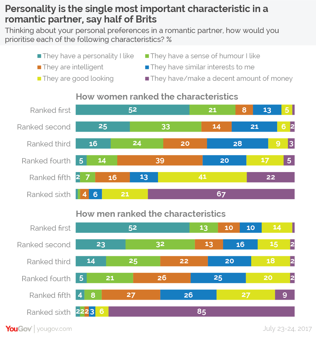
This weeks viz was largely inspired by Elijah Meek's book D3 in Action. Chapter 7 of that book shares some ways we can create less conventional charts types. I used code from that chapter to begin building an adjacency matrix in an attempt to show the relationship between the characteristic women voted on and their rank.
The data set this week was provide by Matthew Smith from YouGov
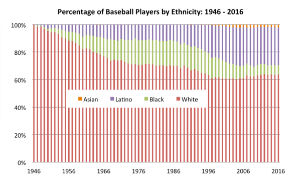
The Society for American Baseball created a 100% area chart displaying the pecent share between four ethnicities: White, African American, Asian, and Latino from 1947 to 2016. In honor of Black History month the #MakeoverMonday community is taking a stab at presenting this data differently to explore a few more ways one might looks at this data.
Instead of doing a pure makeover of the original visualization this week I want to remake Ann Jackson's visualization in D3.js. Why recreate the wheel, when Ann's done such a good job of making a beautiful display of the data already 😍

This week the Visual Capitalist has shared a visualization from Reddit displaying the percentage of households that fall into certain income ranges for every State in the US.
- The color really gets your attention
This file contains bidirectional Unicode text that may be interpreted or compiled differently than what appears below. To review, open the file in an editor that reveals hidden Unicode characters.
Learn more about bidirectional Unicode characters
| <!DOCTYPE html> | |
| <html lang="en"> | |
| <head> | |
| <meta charset="UTF-8"> | |
| <meta name="viewport" content="width=device-width, initial-scale=1.0"> | |
| <meta http-equiv="X-UA-Compatible" content="ie=edge"> | |
| <title>My First Extension</title> | |
| </head> | |
| <body> | |
| Hello World! |
NewerOlder