
- The colors are fun
- Who doesn't like bubbles?
- I immediately know who makes the most money off medicine
Robert Crocker robcrock
This file contains bidirectional Unicode text that may be interpreted or compiled differently than what appears below. To review, open the file in an editor that reveals hidden Unicode characters.
Learn more about bidirectional Unicode characters
| rank_number | They have a personality I like | They are intelligent | They have a sense of humour I like | They are good looking | They have similar interests to me | They have/make a decent amount of money | |
|---|---|---|---|---|---|---|---|
| 1 | 0.52 | 0.08 | 0.21 | 0.05 | 0.13 | 0.01 | |
| 2 | 0.25 | 0.14 | 0.33 | 0.06 | 0.21 | 0.02 | |
| 3 | 0.16 | 0.2 | 0.24 | 0.09 | 0.28 | 0.03 | |
| 4 | 0.05 | 0.39 | 0.14 | 0.17 | 0.2 | 0.05 | |
| 5 | 0.02 | 0.16 | 0.07 | 0.41 | 0.13 | 0.22 | |
| 6 | 0.01 | 0.04 | 0.01 | 0.21 | 0.06 | 0.67 |
This file contains bidirectional Unicode text that may be interpreted or compiled differently than what appears below. To review, open the file in an editor that reveals hidden Unicode characters.
Learn more about bidirectional Unicode characters
| rank_number | They have a personality I like | They are intelligent | They have a sense of humour I like | They are good looking | They have similar interests to me | They have/make a decent amount of money | |
|---|---|---|---|---|---|---|---|
| 1 | 18.48 | 4.63 | 4.50 | 6.74 | 4.73 | 0.89 | |
| 2 | 8.82 | 7.60 | 9.70 | 5.10 | 7.03 | 1.80 | |
| 3 | 5.44 | 9.44 | 9.22 | 5.84 | 7.24 | 2.81 | |
| 4 | 3.52 | 9.89 | 7.97 | 6.57 | 8.20 | 3.77 | |
| 5 | 2.41 | 6.36 | 5.71 | 9.89 | 8.12 | 7.55 | |
| 6 | 1.37 | 2.03 | 2.87 | 5.91 | 4.69 | 23.13 |
This file contains bidirectional Unicode text that may be interpreted or compiled differently than what appears below. To review, open the file in an editor that reveals hidden Unicode characters.
Learn more about bidirectional Unicode characters
| exporter | exports | |
|---|---|---|
| Germany | 48602880000 | |
| Switzerland | 39949885000 | |
| Belgium | 26469018000 | |
| France | 22778385000 | |
| United States of America | 22533094000 | |
| United Kingdom | 21755868000 | |
| Ireland | 19765022000 | |
| Italy | 16642589000 | |
| Netherlands | 13581949000 |
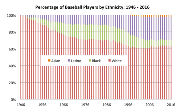
The Society for American Baseball created a 100% area chart displaying the pecent share between four ethnicities: White, African American, Asian, and Latino from 1947 to 2016. In honor of Black History month the #MakeoverMonday community is taking a stab at presenting this data differently to explore a few more ways one might looks at this data.
Instead of doing a pure makeover of the original visualization this week I want to remake Ann Jackson's visualization in D3.js. Why recreate the wheel, when Ann's done such a good job of making a beautiful display of the data already 😍
The Society for American Baseball created a 100% area chart displaying the pecent share between four ethnicities: White, African American, Asian, and Latino from 1947 to 2016. In honor of Black History month the #MakeoverMonday community is taking a stab at presenting this data differently to explore a few more ways one might looks at this data. The data source can be found here.
Instead of doing a pure makeover of the original visualization this week I want to remake Ann Jackson's visualization in D3.js. Why recreate the wheel, when Ann's done such a good job of making a beautiful display of the data already 😍
robcrock
/ data_slim.csv
Created
January 23, 2018 05:16
We can't make this file beautiful and searchable because it's too large.
This file contains bidirectional Unicode text that may be interpreted or compiled differently than what appears below. To review, open the file in an editor that reveals hidden Unicode characters.
Learn more about bidirectional Unicode characters
| event_id,timestamp,tag_id,animal_id,animal_comments,animal_life_stage,animal_mass,study_timezone,longitude,latitude | |
| 283203879,2003-11-14T16:00:00,42500,Butterball,migratory,adult,2372,Pacific Standard Time,-75.39717,40.48933 | |
| 283203880,2003-11-14T17:00:00,42500,Butterball,migratory,adult,2372,Pacific Standard Time,-75.39717,40.48933 | |
| 283203889,2003-11-15T02:00:00,42500,Butterball,migratory,adult,2372,Pacific Standard Time,-75.41167,40.29583 | |
| 283203979,2003-11-26T21:00:00,42500,Butterball,migratory,adult,2372,Pacific Standard Time,-77.47567,38.46833 | |
| 283204879,2004-02-14T19:00:00,42500,Butterball,migratory,adult,2372,Pacific Standard Time,-81.00667,28.797 | |
| 283040073,2005-04-12T23:00:00,52067,Irma,non-migratory,adult,2012,Pacific Standard Time,-75.2035,40.615 | |
| 283129835,2006-09-10T14:00:00,57956,Rosalie,migratory,adult,1975,Pacific Standard Time,-123.45917,46.2925 | |
| 283129836,2006-09-10T15:00:00,57956,Rosalie,migratory,adult,1975,Pacific Standard Time,-123.45917,46.2925 | |
| 283129837,2006-09-10T16:00:00,57956,Rosalie,migra |

This week the Visual Capitalist has shared a visualization from Reddit displaying the percentage of households that fall into certain income ranges for every State in the US.
- The color really gets your attention
This file contains bidirectional Unicode text that may be interpreted or compiled differently than what appears below. To review, open the file in an editor that reveals hidden Unicode characters.
Learn more about bidirectional Unicode characters
| license: mit |