Pages started with books
Great metaphor to help layman understand the web
The page metaphor runs deep with respect to how to scope and execute web projects
- "looking to launch a five-pge website"
- "how long will the homepage take to build?"
- "university website redesign scope is 30,000 pages"
Project's level of effort is better determined by the functionality of components contained within those pages rather than on the quantity of pages themselves.
Scott Jehl - Grade components, not browsers
- grading browser support is an ineffective way of determining what experience a particular device/browser should get.
- Instead, the Filament Group grades components based on their level of intricacy, which results in a more granular way of enhancing experiences to better reflect the capabilities of a device/browser/configuration.
-- A project’s level of effort depends entirely on what the interface is made of.
In order to better scope projects, it’s essential to look at what the interface is comprised of rather than looking at the quantity/type of pages.
Question led to the creation of:
Interface Inventory: A comprehensive collection of the bits and pieces that make up your interface.
- better gauge the level of effort for each piece of functionality (especially factoring all the variables discussed in Scott’s article)
- discover potential hang-ups
- better communicate the project scope to the client.
Getting granular and scoping a project by components/features rather than pages leads to a more realistic scope.
Modularity
- predates the web by a long shot
- Industrial Revolution brought about interchangable parts
- Ford's assembly line transformed the manufacturing process
- Results:
- more uniform
- more reliable
- safer cars rolled out of the factory
- quicker manufacturing time
Tim Berners Lee wrote about Modular Design in his Principles of Design in 1998 && Modularity
Industry is drowning in sea of devices, viewport sizes, and online environments
multi-device universide is our reality
Bulldozing entire website and replacing it every 3-8 years is not and never was an optimal solution
"Magic Escalator of Acquired Knowledge" by Jared M. Spool
Magic Escalator of Acquired Knowledge (MEAK) - represents all the knowledge the user can have about the design
At the bottom: user knows very little about the design At the top: user knows everything there is to know
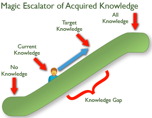
Current Knowledge (CK): represents eveything the user knows about the design before they start using the design
Target Knowledge (TK): where the user needs to get to so they can accomplish their goal
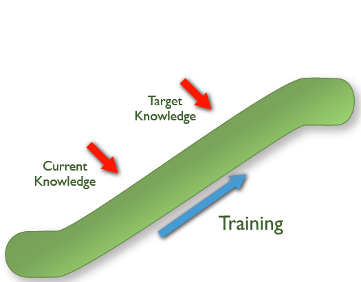
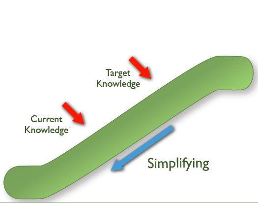
Two ways to bridge the gap between CK and TK:
- Training -- moves user current knowledge up escalator
- Simplyifying -- moves target knowledge down escalator
Huge redesigns are a jolt to the system, users must spend time relearning
What's "new-and-shiny" today becomes "old-and-crusty" tomorrow
agile is a loaded term
Agile: specific methodology for software development agile: informal desire to create an efficient process
Find the process that works best for you, your organizational contraints and opportunities.
Desktop was originally the only game in town
Today, web is consumed by smartphones, dumbphones, smart watches, smart tvs, game consoles, digital signage, car dashboards, ...etc
Must overhaul perception of content and tools used to manage it
Organizations are recognizing the need to create modularized content to better reach their audience wherever they may be
Contnet management systems are evoling beyond web publishing platform roots into tools that can elegantly create and maintain modular content
e.g. NPR COPE - Create Once, Publish Everywhere
JavaScript has grown since its creation in 1995, proved by development of sophisticated JS patterns and architecture
untenable to produce static markups of every page of a web experience
Stephen Hay: "presenting fully baked PS comps is the most effective way to show your clients what their website will never look like"
Static design tools excel at providing a playground to establish "design atmosphere"
Establishing design atmosphere early is critical to a project's success
Designer Samantha Warren - Style Tiles
Designer Dan Mall - Element Collages
Breaking visual explorations into smaller chunk:
- Saves time and avoides presenting unrealistic premature layouts to clients
- shifts stakeholders away from reacting to a pretty picture
- Facilitates crucial conversations about overall design direction and how they relate to a project's goals
"Not Designing pages, we're desigining systems of components" -- Stephen Hay
- What is an interface made of?
- What are our LEGO bricks?
- What are our Subway sandwhich pieces that we combine into millions of delicious combinations?
Ethan Marcotte - Responsive Web Design (May 2010)
3 core tenants:
- fluid grids
- flexible media
- CSS media queries
provided a much-needed foundation for designers to create flexible layouts that smartly adapt to screen size
Leads to questions:
- How can we present primary navigation in a thoughtful way on smaller screens?
- How do lightboxes, breadcrumbs, and carousels translate to smaller viewports and alternative input types?
These questions led to Brad Frost's creation of This is Responsive, a showcase of responsive patterns that demonstrates the various ways a particular component could be executed in a responsive environment
Need to address growing device diversity while still sanely gettings projects out the door has given rise to front-end frameworks like Foundation and Bootstrap
Most attractive aspect is speed
- allow for designs to get off the ground quicker
- devs can spend time on stuff other than design compatibility
- large userbase allows for possiblity of outside help
Defines the assets and the materials tha tmake a company unique
Includes:
- Logos
- Typography
- Color palettes
- Messaging
- Collateral (business cards, PPT slides) ...etc
Essential for brand to present itself in a cohesive manner across an increasing number of media, channels, and touchpoints.
Brand identity provide answers to fundamental questions in one centralized hub.
Articulate a general design direction, philosphy, and approach to specifiic projects or products.
Can incorporate aspects of other style guide categories to make high-level concepts more tangible.
Aren't set it stone.
E.g. material design for Google exists now but probably won't exist as it does today in 5 or 10 years.
Speaking in a unified, consistent manner accross many varied touchpoints is crucial to brand success.
Provide every author some guidelines and guardrails for contributing content.
Provide conventions, patterns, and examples for how teams should approach their code.
- Linter
- Prettier
A pattern library communicates the design language in a very tangible way, which helps stakeholders understand that an underlying system is determing the final interface.
becoming a cornerstone of modern interface design
Help prevent chaos, from design & dev but also from organization perspective.
Web style guides promote consistency and cohesion across UI
Consitency benefits both the creators and end users
Style guides establish a consitent, shared vocabulary between everyone involved in a project and reduces communicaiton breakdowns.
Education is as important as documentation. A style guide can show clients that websites are systems rather than a collection of pages.
Can help eliminate "special snowflake syndrome" - certain departments in an org think they have unique problems and therefore demand unique solutions.
Exposing the design system in the form of a style guide, these snowflakes can better appreciate consitency and understand why their requests for custom designs receive pushback.
Designers and devs are forced to think about how their decisions affect the broader design system
Harder to go rogue and easier to think of the greater good.
Ability to pull an interface apart into componoent pieces makes testing easier.
Developing own system, you can reap the same rewards as out-of-the-box UI tool kits
Style guides increase in value over the long term
Style guides can and should be modified, extended, and refined for extended periods
Requires effort upfront but provides foundation for future iteration and refinement
Lessons learned from analytics, user testing, A/B testing, and experience should be incorporated into the style guide, making it a hub for truth, knowledge, and best practices.
Even if major redesign is required, no need to throw baby out with the bathwater
Orgs must appropriate the necessary time and budget to make style guide happen.
Org must overcome the short-term mentality that all too often creeps into company culture.
Style guides are time-consuming to create.
Style guides are often treated as side projects rather than as the component parts of the final product, a "nice-to-have".
Good idea to bake into workflow whether or not the project plan explicitly calls for them.
Must be given the focus they need to reach true potential. Will die on the vine without maintainenance or enforcement.
can be misunderstood as tools useful only to designers or developers which leads to a lack of visibility that immediately limits effectiveness.
should clearly convey what they are and why they matter
should be attractive, inviting, visible, clear, and easy to use
should be aware that a whole host of audiences will be viewing them therefore should aim to be welcoming and useful for as many people as possible
Context is key to understanding a design system.
Without providing context, devs and designers don't know how global a particular pattern is, and as a result, wouldn't know which pages of their app would need to be revisited, QA'd, and tested if changes were made.
Should NOT be loosely arranged sprays of modules
Must evolve beyond the page metaphor that's been with us since the birth of the web.
As numberof places web content is consumed increases, the need to create thoughtful, deliberate interface design systems is becoming more apparent than ever.
Enter Atomic Design.