- Explain the CSS Box Model
- Adjust element spacing using padding and margin
- Describe the difference between block, inline, and inline-block elements
- Explain the difference between and use cases of: static, relative, fixed, & absolute positioning
- Create floating elements to position content removed from the standard document flow
- Explain what Flexbox is and how to use it
- Classes vs id's
- CSS selectors
- p.className
- p .className
- p, .className
- What makes up a CSS property? (key:value)
- 3 ways to include CSS in a document
- inline
- head
- external
- How are CSS rules applied? What's the order of precedence?
One of the tricky things about CSS at first is the Box Model. But it's actually really simple. Let's break it down.
All HTML elements can be considered boxes. Even if you see a circle, it's living within a box. This box model describes the amount of space taken up by the element in the document, and so the box model applies to all HTML elements.
When you give an element a height and width, the content itself will be that height and width.
What the size doesn't include:
- padding
- border
- margin
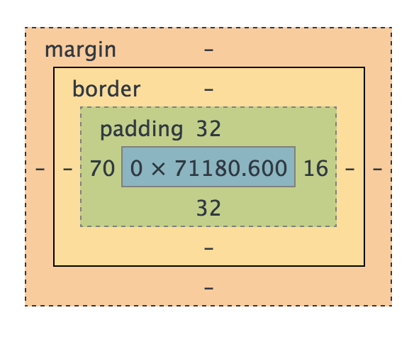
I like to think of the Box Model like a house where the furniture is the content, the space from the couch to the walls is the padding, the walls around the house is the border, and the yard from house to house is the margin.
- Margin - clears an area around the border; the margin does not have a background color, it is completely transparent (yard)
- Border - a border that goes around the padding and content; the border is affected by the background color of the box (house walls)
- Padding - clears an area around the content; the space between the content and the border; the padding is affected by the background color of the box (space between walls and furniture)
- Content - The content of the box, where text and images appear (furniture)
####Box Model Codealong
Let's write some HTML we can come back to and use to visualize what we're talking about.
- mkdir
box-model - touch
index.htmlwith an externally linked css stylesheet calledstyle.cssLet's go into our existingindex.htmlandstyles.cssand add some stuff to illustrate what I mean. Inindex.html:
<!DOCTYPE html>
<html>
  <head>
    <title>Box Model Squares</title>
    <link rel="stylesheet" type="text/css" href="styles.css">
  </head>
  <body>
	<p>This is a paragraph</p>
	<p class="padding">This is a paragraph</p>
  </body>
In styles.css:
p {
  background: red;
  height: 100px;
  width: 20%;
}
Lets check this out in our chrome browser with the developer tools. As you can see, everything is identical. Which makes sense. Let's go ahead and add some padding to the html element with class "padding". In styles.css:
p {
  background: red;
  height: 100px;
  width: 20%;
}

p.padding {
  padding:10px;
}
Well that's certainly interesting. Even though the dimensions are the same. The element with padding is larger.
Let go ahead and add margin: 10px; and border: 10px solid black; to the padding class as well. Let's inspect that element in the browser and you can see Chrome's clear depiction of content, padding, border and margin.
All these different sizings can be confusing. This can especially be frustrating when you think something's 20 % when in actuality it isn't. Enter box-sizing.
At the top of our styles.css:
* {
  box-sizing: border-box;
}
Now when we refresh, all of our 20% widths are the same regardless of padding. It also includes border! However, it does not include the margin.
- Now go add four divs with separate id's into the html
- Inside our CSS page, make the squares 100px and the following colors: orange, blue, green, and purple
<!DOCTYPE html>
<html>
  <head>
    <title>Box Model Squares</title>
    <link rel="stylesheet" type="text/css" href="css/main.css">
  </head>
  <body>
    <div id="square1">square1</div>
    <div id="square2">square2</div>
    <div id="square3">square3</div>
    <div id="square4">square4</div>
  </body>
</html>#square1 {
background-color: orange;
height: 100px;
width: 100px;
}
#square2 {
background-color: blue;
height: 100px;
width: 100px;
}
#square3 {
background-color: green;
height: 100px;
width: 100px;
}
#square4 {
background-color: purple;
height: 100px;
width: 100px;
}In Chrome, inspect elements on existing web pages and view the box model under the "computed" tab
####Property: Border Borders can be set in two ways: all at once or individually
WE DO: Let's add some thick borders to our divs
div {
	border: 5px solid black;
}
####Property: Margin There are three ways to set margin with CSS:
 div {
	 margin-top: /*some value*/;
	 margin-right: /*some value*/;
	 margin-bottom: /*some value*/;
	 margin-left: /*some-value*/;
 }
You can set them all at once:
div{
	margin: 1px 2px 3px 4px;
}
You can do top-bottom and right-left:
div{
	margin: 0 auto;
}
What if value is auto? This tells the document to automatically put equal left and right margins on our element, centering it on the page, as long as it has a specific width.
YOU DO: add margin around your squares
####Property: Padding Padding can be set in two ways (all at once or individually)
div {
	padding: 25px
}box-sizing is a CSS3 property that helps to make building layouts more intuitive for developers.
- content-box: Default. The width and height of an element does not include padding or borders
- border-box: The width of an element includes the padding and borders (not margin)
WE DO: Add
box-sizing: border-boxproperty to thediv
- An inline element
- respect left & right margins and padding, but not top & bottom
- cannot have a width and height set
- allow other elements to sit to their left and right
- HTML elements inline by default:
- span
- a
- img
- A block element
- respect all marign and padding
- force a line break after the block element
- HTML elements inline by default:
- div
- h1
- p
- header, footer, nav
- An inline-block element
- allow other elements to sit to their left and right
- respect top & bottom margins and padding
- respect height and width
- If you assign none as the value of the display, the element and its content disappear from the page entirely! Mention "visibility: hidden" property and how it's different from display: none
You Do (15 min)
-
Static is the default value. An element positioned with "position: static" is not positioned in any special way. Follows the natural flow of the document.
-
Relative behaves just like "static" unless you add "top", "bottom", "left", or "right". A page element with relative positioning gives you control to absolutely position children elements inside of it.
 <style type="text/css">

 ul {
 	position: relative;
 	top: 400px;
 	left: 50px;
 }

 </style>
-
Fixed elements are always positioned in the same location, even if the user scrolls. An element with fixed position is positioned relative to the browser window.
 <!DOCTYPE html>
 <html>
 <head>
 <title>CSS Positioning</title>
 <style type="text/css">

 body {
 	background: #ccc;
 }
 img {
 	position: fixed;
 	right: 0;
 	bottom: 0;
 }

 </style>
 </head>
 <body>
 <ul>
 	<li>Austin</li>
 	<li>Dallas</li>
 	<li>Houston</li>
 	<li>Amarillo</li>
 </ul>
 <img src="https://ga-core.s3.amazonaws.com/production/uploads/program/default_image/3677/thumb_thumb_thumb_Partner-Happy-Hours-General.jpg" alt="">
 </body>
 </html>
-
Absolute elements are removed from the normal flow and can overlap other elements. They are positioned relative to the browser window unless a parent element is position: relative.
<!DOCTYPE html> <html> <head> <title>CSS Positioning</title> <style type="text/css"> body { background: #ccc; } ul { position: relative; } li { height: 100px; } img { position: fixed; right: 0; bottom: 0; } .relative { position: relative; left: 150px; } .absolute { position: absolute; left: 150px; } </style> </head> <body> <ul> <li>Austin</li> <li>Dallas</li> <li class="absolute">Houston</li> <li>Amarillo</li> </ul> <img src="https://ga-core-production-herokuapp-com.global.ssl.fastly.net/assets/ga-lockup-1788582934ade008a8ea6068b784b8ee.png" alt=""> <footer>© 2015 General Assembly</footer> </body> </html>
| Unit | Description |
|---|---|
px |
Relative to the viewing device. For screen display, typically one device pixel (dot) of the display. For printers and very high resolution screens one CSS pixel implies multiple device pixels, so that the number of pixel per inch stays around 96. Set size no matter how the viewport or fonts are resized |
% |
Relative to the containing block - Resized as the viewport is changed |
em |
Relative to the font-size of the element (2em means 2 times the size of the current font). If you assign a font to 12pt, each "em" unit would be 12pt; thus, 2em would be 24pt. |
rem |
Relative to font-size of the root element, not any parent element. Thus compounding does not occur as it does with em units. |
vw |
Relative to 1% of the width of the viewport |
vh |
Relative to 1% of the height of the viewport |
More reading: http://webdesign.tutsplus.com/articles/7-css-units-you-might-not-know-about--cms-22573
WE DO: Let's add a section with class of container around our squares and give it a width of 400px and a background-color. How can we get the squares to be 2x2?
<!DOCTYPE html>
<html>
  <head>
    <title>Box Model Squares</title>
    <link rel="stylesheet" type="text/css" href="css/main.css">
  </head>
  <body>
    <section class="container">
      <div id="square1">square1</div>
      <div id="square2">square2</div>
      <div id="square3">square3</div>
      <div id="square4">square4</div>
    </section>
  </body>
</html>.container{
width: 400px;
background-color: aqua;
}display: inline-blockbut that puts 3 on the first line- adjust their widths to 50%
- remove
margin:0since margin is on the outside - to remove that gap, remove spaces in your html
<div id="square1">square1</div><div id="square2">square2</div>
Fighting the space between inline block elements
Using the "float" property, elements can be pushed to the left or right, allowing other elements to wrap around it. Floated elements are also removed from the normal flow. It's like a float toy in a pool - you float left and it will go until it hits a wall or something else. You cannot float a toy to the middle.
WE DO: add the following styles to your favorite cities. What is the float doing?
<style type="text/css">
body {
	background: #ccc;
}
li {
	background: black;
	color: white;
	width: 250px;
	margin-right: 2px;
	float: left;
	list-style-type: none;
}
img{
	display: block;
}
</style>Elements that come after an element that has been floated will flow around it. To get out, use "clear".
img {
  clear: left;
  display: block;
}The "clearfix" workaround is used on parent containers with floating elements inside of them. Without it, the parent container would not get any height. Add .clearfix to the ul
.clearfix {
	overflow: auto;
}
###The Future: Flexbox