Another popular pattern starts with a multi-column layout and ends up with a single column layout, dropping columns along the way as screen sizes get narrower. Unlike the Mostly Fluid pattern, the overall size of elements in this layout tend to stay consistent.
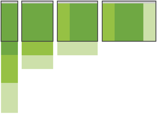
Column drop behaviour illustration Adapting to various screen sizes relies on stacking columns. When and how each column is stacked for each resolution breakpoint will depend on the web design itself.
.container {
  display: flex;
  flex-wrap: wrap;
}

.box {
  width: 100%;
}

@media screen and (min-width: 450px) {
  .dark_blue {
    width: 25%;
    }
  .light_blue {
    width: 75%;
    }
  }

  @media screen and (min-width: 550px) {
  .dark_blue, .green {
    width: 25%;
    }
  .light_blue {
    width: 50%;
    }
}The most popular pattern was perhaps surprisingly simple: a multi-column layout that introduces larger margins on big screens, relies on fluid grids and images to scale from large screens down to small screen sizes, and stacks columns vertically in its narrowest incarnations.
<div class="container">
  <div class="box dark_blue"></div>
  <div class="box light_blue"></div>
  <div class="box green"></div>
  <div class="box red"></div>
  <div class="box orange"></div>
</div>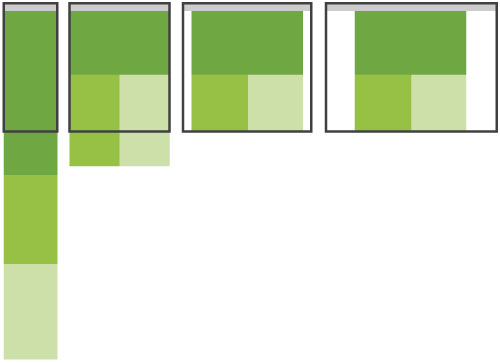
Mostly fluid behaviour illustration The core structure of the layout really doesn't change until the smallest screen width. Instead, the design mostly relies on fluid grids to adapt to a variety of screen sizes.
.container {
  display: flex;
  flex-wrap: wrap;
}

.box {
  width: 100%;
}

@media screen and (min-width: 450px) {
  .light_blue, .green {
    width: 50%;
    }
  }

  @media screen and (min-width: 550px) {
  .dark_blue, .light_blue {
    width: 50%;
    }
  .green, .red, .orange {
    width: 33.333333%;
    }
  }

@media screen and (min-width: 700px) {
  .container {
    width: 700px;
    margin-left: auto;
    margin-right: auto;
  }
 }
Macro layouts descrbe the larger, page-wide organization of your interface.

<body>
  <header>…</header>
  <main>
    <article>…</article>
    <aside>…</aside>
  </main>
  <footer>…</footer>
</body>
When you arrange these individual page-level components, you're designing a macro layout: a high-level view of your page. Using media queries, you can supply rules in CSS describing how this view should adjust to different screen sizes.
CSS grid is an excellent tool for applying a layout to your page. In the example above, say you want a two-column layout once there's enough screen width available. To apply this two-column layout once the browser is wide enough, use a media query to define the grid styles above a specified breakpoint.
@media (min-width: 45em) {
  main {
    display: grid;
    grid-template-columns: 2fr 1fr;
  }
}
Flexbox could be used instead!
@media (min-width: 45em) {
  main {
    display: flex;
    flex-direction: row;
  }

  main article {
    flex: 2;
  }

  main aside {
    flex: 1;
  }
}
Instead, you can apply rules so that the cards themselves automatically take up the right amount of space.
.cards {
  display: grid;
  grid-template-columns: repeat(auto-fill, minmax(15em, 1fr));
  grid-gap: 1em;
}
You can achieve a similar layout with flexbox. In this case, if there are not enough cards to fill the final row, the remaining cards will stretch to fill the available space rather than lining up in columns. If you want to line up rows and columns, then use grid.
.cards {
  display: flex;
  flex-direction: row;
  flex-wrap: wrap;
  gap: 1em;
}
.cards .card {
  flex-basis: 15em;
  flex-grow: 1;
}When we think of layouts, we often think of page-level designs. But smaller components within the page can have their own self-contained layouts.
Ideally, these component-level layouts will adjust themselves automatically, regardless of their position on the page. There may be situations where you don't know if a component will be placed into the main content column or the sidebar or both. Without knowing for sure where a component will end up, you need to make sure that the component can adjust itself to its container.
CSS grid isn't just for page-level layouts. It also works well for the components that live within them.
In this example, the ::before and ::after pseudo-elements create decorative lines on either side of a heading. The heading itself is a grid container. The individual elements are laid out so that the lines always fill the available space.
h1 {
  display: grid;
  grid-template-columns: 1fr auto 1fr;
  gap: 1em;
}
h1::before,
h1::after {
  content: "";
  border-top: 0.1em double black;
  align-self: center;
}Flexbox allows you to design from the content out. You can specify the parameters of your elements (how narrow they should get, how wide they should get) and let the browser figure out the final implementation.
But the component itself has no awareness of its context. It doesn't know if it's being used in the main content or in a sidebar. This can make component layouts trickier than page layouts. To be able to apply contextually relevant styles, your components need to know more than the size of the viewport they are inside.
With page layouts, you do know the width of the container because the container is the browser viewport; media queries report the dimensions of the page-level container.
To start, define which elements will act as containers.
main,
aside {
  container-type: inline-size;
}
If a component is inside one of those containers, you can apply styles in a way that's quite similar to media queries.
.media-illustration {
  max-width: 200px;
  margin: auto;
}

@container (min-width: 25em) {
  .media {
    display: flex;
    align-items: center;
    gap: 1em;
  }

  .media-illustration {
    flex: 1;
  }

  .media-content {
    flex: 3;
  }
}
Combining queries You can use media queries for the page layout, and container queries for the components within the page.
Here the overall structure of the page has a main element and an aside element. There are media objects within both elements.
<body>
  <main>
     <div class="media">…</div>
     <div class="media">…</div>
  </main>
  <aside>
     <div class="media">…</div>
  </aside>
</body>
A media query applies a grid layout to the main and aside elements when the viewport is wider than 45em.
@media (min-width: 45em) {
  body {
    display: grid;
    grid-template-columns: 3fr 1fr;
  }
}Give your visitors the most appropriate images for their devices and screens.
You can apply the same rule to other kinds of embedded content too, like videos and iframes.
img {
  max-inline-size: 100%;
  block-size: auto;
}
Adding a block-size value of auto means that the aspect-ratio of the images will remain constant.
img {
  max-inline-size: 100%;
  block-size: auto;
  aspect-ratio: 2/1;
}
But then the browser might squash or stretch the image to make it fit your preferred aspect ratio.
To prevent that happening, use the object-fit property.
An object-fit value of contain tells the browser to preserve the image's aspect ratio, even if that means leaving empty space above and below.
img {
  max-inline-size: 100%;
  block-size: auto;
  aspect-ratio: 2/1;
  object-fit: contain;
}
An object-fit value of cover tells the browser to preserve the image's aspect ratio, even if that means cropping the image at the top and bottom.
img {
  max-inline-size: 100%;
  block-size: auto;
  aspect-ratio: 2/1;
  object-fit: cover;
}Use the loading attribute to tell the browser whether to delay loading the image until it is in or near the viewport. For images below the fold, use a value of lazy. The browser won't load lazy images until the user has scrolled far down enough that the image is about to come into view. If the user never scrolls, the image never loads.
<img
 src="image.png"
 alt="A description of the image."
 width="300"
 height="200"
 loading="lazy"
>