August 2021: This serves as the first refresh of this guide. My hope is that this guide is a constant work in progress, receiving updates as I receive requests and discover new things myself. This update features more data visualization examples and a more detailed filtering section. I've also posted all relevant code in the guide to github in a Jupyter Notebook, found here.
This guide serves as an update to my original nflscrapR Python Guide. As of 2020, nflscrapR is defunct and nflfastR has taken its place. As the name implies, the library has made the process of scraping new play by play data much faster.
Using Jupyter Notebooks or Jupyter Lab, which come pre-installed with Anaconda is typically the best way to work with data in Python. This guide assumes you are using the Ananconda distribution and therefore already have the required packages installed. If you are not using the Anaconda distribution, install the required libraries mentioned throughout the guide. Once Anaconda has been downloaded and installed, open the Anaconda Navigator. Click launch on the Jupyter Notebook or Jupyter Lab section which will open in your browser.
Additionally, relevant code from this guide, including plotting examples, is available here.
Since the nflfastR data is largely the same as nflscrapR, the process to analyze and plot it is nearly identical. This guide will use much of the same code from the original nflscrapR guide.
One season of play by play data is around 80 megabytes of data when stored as a CSV, which can make reading in multiple seasons a slow process. Luckily, nflfastR now includes compressed CSVs in their repository which speeds up the process of reading data into Python/pandas and it only requires an extra parameter to work.
First on the to do list is to import pandas, type the following into the first cell. Then press Shift+Enter, this will execute the code and provide a new empty cell.
import pandas as pdPandas is now known as pd so instead typing out pandas for every commnad, pd can be typed instead to save time.
The data repository for nflfastR can be found here.
To read in a year of data declare a variable with the value of the desired year, like the following.
YEAR = 2020Next the data will be read in using pandas .read_csv() method.
data = pd.read_csv('https://github.com/nflverse/nflverse-data/releases/download/pbp/' \
                   'play_by_play_' + str(YEAR) + '.csv.gz',
                   compression= 'gzip', low_memory= False)
The url is the location of the data and str(YEAR) fills in the desired year of data.
The two extra parameters compression='gzip' tells pandas the file is compressed as a gzip and low_memory=False eliminates a warning that pops up when reading in large CSV files.
To read in multiple years of data, a for loop can be used, which will iterate through a list of years, putting all the data into a single dataframe. First, specify the desired years of data in a list.
YEARS = [2018,2019,2020]Alternatively, the range() function can be used for brevity. When working with more than a couple years, this can save time and make code more readable.
YEARS = range(2018, 2021)Note that range follows the (inclusive, exclusive) logic, where the number after the comma is not included. In this case, 2021 is not included in the range so YEARS will only contain 2018, 2019, and 2020.
Next, declare an empty pandas dataframe that data will be added to and write the for loop. The for loop will read in a year of data, add it to the dataframe, then go to the next year, and repeat.
data = pd.DataFrame()

for i in YEARS:
    i_data = pd.read_csv('https://github.com/nflverse/nflverse-data/releases/download/pbp/' \
                   'play_by_play_' + str(YEAR) + '.csv.gz',
                   compression= 'gzip', low_memory= False)

    data = data.append(i_data, sort=True)
The .append() method adds the data to the existing dataframe, sort=True sorts the columns alphabetically.
When reading in multiple seasons, the indexes will be replicated in each season, meaning there will be several 0 indexes, 1 indexes, 2 indexes, etc. (if this doesn't make sense don't worry). The following line will reset the index to ensure each row has a unique identifier.
data.reset_index(drop=True, inplace=True)drop=True drops the existing index, replacing it with the new one.
inplace=True makes the change in place, meaning it changes the existing dataframe. Without that, the reset_index() function would return a dataframe with the change made, but not change the existing dataframe. Many pandas functions work this way so inplace=True will be used throughout.
Saving data locally is a good idea so that reading in data doesn't require an internet connection and a fresh download for each analysis. The data can be outputed in a compressed CSV to save space (only ~15 megabytes per season) so the quick reading in process is maintained.
The .to_csv() method in pandas makes it easy to turn a dataframe into a CSV file.
data.to_csv('filename.csv.gz', compression='gzip', index=False)A full file path can also be specified to save in a specific location, such as C:/Users/Name/Documents/filename.csv.gz, otherwise it will be exported to wherever the Jupyter Notebook is stored.
The process to read in the saved data is the same as above, but instead of using the url, specify the full filepath of the file.
data = pd.read_csv('C:/Users/Name/Documents/Football/play_by_play_2020.csv.gz', compression='gzip', low_memory=False)Or if the data is in the same folder as the Jupyter Notebook, only the filename (with the extension .csv.gz) needs to be specified.
data = pd.read_csv('play_by_play_2020.csv.gz', compression='gzip', low_memory=False)Here's a good place to mention a warning pandas will give when making changes to data. The warning is SettingWithCopyWarning, which is explained in detail here. The tldr is that pandas creates a warning when making changes to a slice of a dataframe that may not have the intended behavior. As shown in the link above, when creating a new dataframe from a portion of another dataframe, calling .copy() can avoid the SettingWithCopyWarning.
For example, pretend there's a dataframe named A containing every play from a season. Then dataframe B is created but only with 1st down plays. Making a change to dataframe B's values will result in a SettingWithCopyWarning because the change will not affect dataframe A even if that might be the intention.
#Full season
A = pd.read_csv('play_by_play_2019.csv.gz', compression='gzip', low_memory=False)

#First downs only
B = A.loc[A.down==1]

#Making a change to B will raise the warning
B.epa.loc[B.fumble==1] = 0
The code above would result in a warning. The simple change would be to add .copy() to the creation of B.
B = A.loc[A.down==1].copy()The following is not a recommended practice. This line of code can be ran that will surpress the warning, but runs the risk of changes to dataframes not having the intended consequence.
pd.options.mode.chained_assignment = NoneThe next two lines have nothing to do with warnings but simply making viewing data easier. Play by play data has nearly 300 columns so being able to scroll horizontally is important. Adding some extra scrolling ability vertically is also a good idea for working with smaller portions of data.
pd.set_option('display.max_rows', 100)
pd.set_option('display.max_columns', 400)
Now that the data has been read in, some optional cleaning will be outlined below.
The good news continues here, nflfastR's data repository includes cleaned data by default, eliminating most of the work necessary to clean the data.
The compressed CSVs in the data repository also include postseason data by default, so this next step is completely up to the user if they want to include playoff data or not. To remove postseason data, use the following code.
data = data.loc[data.season_type=='REG']Another optional change would be to remove plays that aren't typically used for analysis such as kickoffs, field goals, kneel downs, etc. Those can be removed if desired.
data = data.loc[(data.play_type.isin(['no_play','pass','run'])) & (data.epa.isna()==False)]This will limit plays to passes, runs, and plays with penalties.
One last cleaning step is to change the play_type to match the play call. For example, QB scrambles are labeled as run plays but in reality they are pass plays. The data already contains binary value columns for pass or rush. This method of reassignment, with the column play_type being specified in the brackets will avoid the SettingWithCopyWarning.
data.loc[data['pass']==1, 'play_type'] = 'pass'
data.loc[data.rush==1, 'play_type'] = 'run'
Note how in the first line data['pass'] is used with the brackets and column name in quotes, the second line data.rush features a dot and no quotes for the column name. pass is a special word in Python so the interpreter gets confused when using the dot method and therefore requires quotes so it knows the word is referencing the column.
That finishes up the cleaning portion, with plays being removed in that process it may be a good idea to reset the index once again, ensuring there's no missing numbers.
data.reset_index(drop=True, inplace=True)This would also be a good place to save the data so that the cleaning process doesn't need to be repeated every time data is used. See Saving Data section above for how to save the data as a compressed CSV file.
Note that some of the above cleaning will result in SettingWithCopyWarning so make sure to either surpress it or use the .copy() method and create separate dataframes.
Now to the fun part of actually working with the data. The two most important processes will be selecting the data needed for an analysis, and grouping data, those are both described below.
To understand what the dataframe looks like, enter the name of the dataframe ('data' in this case) into a cell and execute. The dataframe will be displayed. All 250+ columns can be scrolled through, on the left there is an unnamed column with a number. This is the index and a play or range of plays can be specified using the .loc[] function.
In Python, counters start at 0 so the first row is actually index 0, not 1. To get just the first row enter
data.loc[0]To get a range of index use a colon (:) to specify the range. When using .loc[] Pandas follows the rules of [inclusive:inclusive] meaning both the first and last number index is included in the range. For example data.loc[0:5] would return the first six rows (index 0,1,2,3,4,5).
This is not the case for other Python lists or arrays. Even the Pandas function .iloc[] uses the more traditional [inclusive:exclusive] syntax. Meaning data.iloc[0:5] would return only five rows (index 0,1,2,3,4). Since the play by play data's index is already numerical, using .loc makes sense. If the key were a word or not in a numerical order, .iloc[] would be used to return specific rows.
To clarify, if the index was a random number and the first rows' index was 245, data.loc[245] or data.iloc[0] would be used to return the first row. Using just data.loc[0] would search for the row where the index is 0. Again, the dataframe setup here already has a numerical index, beginning with 0 and incrementing each row by 1.
The .loc[] method is not just limited to indexing with numbers, it's also used for filtering by column values.
There are many filters available to use:
- Greater than
>or greater than equal to>= - Less than
<or less than equal to<= - Equal to
== - String contains
.str.contains('word')
Multiple filters can also be chained together using paranthesis () around each filter and an & for AND to make all conditions necessary or a | for OR to make only one condition required.
Each filter needs to state the name of the dataframe and the field/column to condition on. Fields can be specified using data.field_name or data['field_name'] they work the same way. Just note that if a field shares the same name with a word already used in standard Python (such as pass) then the data['field_name'] method must be used.
Here's an example to filter to just first and second down, with run plays only.
#Run plays on 1st or 2nd down
data.loc[(data.down<3) & (data.rush==1)]
That will return a filtered dataframe with plays matching those criteria. You can save that smaller dataframe to a new variable like this early_down_runs = data.loc[(data.down<3) & (data.rush==1)]
A couple more filtering examples:
#Plays where the Seahawks are on offense
data.loc[data.posteam=='SEA']

#Completed passes that gained a first down
data.loc[(data.complete_pass==1) & (data.first_down_pass==1)]
One more example with two ways to achieve the same thing.
#Plays where the targeted receivers were Amari Cooper or Ceedee Lamb

#Using | as OR
data.loc[(data.receiver=='A.Cooper') | (data.receiver=='C.Lamb')]

#Using .isin() method
data.loc[data.receiver.isin(['A.Cooper', 'C.Lamb'])]
The second method here avoids the need to use the | and can also accept a pre-defined list, such as the following.
#Create a list variable with the two receiver names
wrs = ['A.Cooper', 'C.Lamb']

data.loc[data.receiver.isin(wrs)]
One thing to note here when trying to recreate official stats for things like targets and carries, it is recommended to use the receiver_player_name or rusher_player_name fields, instead of receiver and rusher.
The & and | can be chained together for complex filtering as well. Note that an additional set of paranthesis will be required for the OR conditions.
#Plays where the Falcons are on defense and the ball is intercepted or the quarterback is sacked
data.loc[(data.defteam=='ATL') & ((data.interception==1) | (data.sack==1))]Data can be grouped by any category such as a player, team, game, down, etc. and can also have multiple groupings. Use the .groupby() function to do this. The columns that should be grouped are then specified in double brackets and a function applied such as .mean(),.sum(),.count()
The visuals and data in the next couple sections will use 2020 regular season data, following the cleaning procedures outlined above.
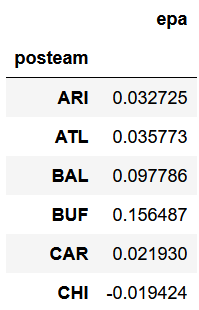
Here's an example of finding the average expected points added (EPA) per play by offense (posteam).
data.groupby('posteam')[['epa']].mean()This will return the following dataframe (this is cropped to save space).
Values can be sorted with the sort_values() method. This would return the same dataframe as above but sorted high to low.
data.groupby('posteam')[['epa']].mean().sort_values('epa', ascending=False)Note that the index is now the team names and no longer a number. To query this table, it could be saved to a new dataframe and the .loc[] method could be used to find a specific team's EPA per play.
#Create table
team_epa = data.groupby('posteam')[['epa']].mean()

#Get Cardinals EPA per play
team_epa.loc[team_epa.index=='ARI']
Since the index is the team abbreviations, team_epa.index is used to find the teams. To have the table contain a numerical index instead, with posteam as a column, the code would be data.groupby('posteam', as_index=False)[['epa']].mean().
Groupby can also have multiple values to groupby, for example, receiver targets. Naming convention in nflfastR is FirstInitial.LastName, this becomes an issue when two players in the league have the same first initial and last name. For this reason it is best to use a secondary groupby to eliminate most conflicts. Additionally, there are player id columns (such as receiver_id) that can be used to completely eliminate the chance of conflicts.
data.groupby(['receiver','posteam'])[['play_id']].count()When using multiple groupby conditions they need to be put in brackets and separated by commas. Again, the index is now players and teams, not a numerical index. This can make further filtering an issue so it can be fixed in two ways. First, the original groupby can be changed to not be an index.
data.groupby(['receiver','posteam'], as_index=False)[['play_id']].count()The as_index=False means do not make the name and team the index, instead, it will create a simple numerical index and make the names and teams separate columns. The other way is to reset the index after the data is grouped by simply calling .reset_index(inplace=True).
There may be times where multiple types of calculations are needed in a dataframe. For example, a table containing running back yards per carry, number of carries, and total EPA on rushes would require an average, a count, and a sum. Using the group by method above only allows for one type of aggregation (min, max, median, mean, count, sum).
Luckily, pandas has this scenario convered with the .agg() function.
data.groupby(['rusher','posteam'], as_index=False).agg({'rushing_yards':'mean',
                                                        'play_id':'count',
                                                        'epa':'sum'})
Each calculated column goes into the braces (curly brackets) in quotes with the type of aggregation, also in quotes, following the colon. Note, number of carries and yards per carry may not match official stats due to penalties, two-point conversions, etc. Two-point converstions have a null down, so that can be filtered out easily.
A list of all nflfastR columnscan be found here.
Below is an incomplete list of frquently used columns:
- posteam - the offensive team (possesion team)
- defteam - the defensive team
- game_id - a unique id given to each NFL game
- epa - expected points added
- wp - current win probability of the posteam
- def_wp - current win probability of the defteam
- yardline_100 - number of yards from the opponent's endzone
- passer - the player that passed the ball (on QB scramble plays, the QB is marked as a passer, not rusher)
- rusher - the player that ran the ball
- receiver - the player that was targeted on a pass
- passer_id, rusher_id, receiver_id - the player ID for the passer, rusher, or receiver on a play (useful for joining roster data)
- cpoe - completion percentage over expected on a given pass
- down - down of the play
- play_type - either run, pass, or no_play
- series_success - marked as a 1 if the series becomes successful (first down or a touchdown)
There are a couple ways to find specific games. The most straight forward is using the home and away team.
data.loc[(data.home_team=='ARI') & (data.away_team=='SEA')]The above would return all plays from the Seattle @ Arizona game. If there are multiple seasons of data in the dataframe just add the season.
data.loc[(data.home_team=='ARI') & (data.away_team=='SEA') & (data.season==2019)]nflfastR game IDs are formated as season_week_away_home. The above game would be '2019_04_SEA_ARI'.
This example will look at QB performance in 2020. This utilizes the qb_epa column which is a slight modification of epa in that it does not punish QBs for wide receiver fumbles.
qbs = data.groupby(['passer','posteam'], as_index=False).agg({'qb_epa':'mean',
                                                              'cpoe':'mean',
                                                              'play_id':'count'})
This groups the data by the passer and the team, averaging the expected points added (epa), the completion percentage over expected, and the number of dropbacks they had. To filter out players with only a few plays, a filter on play_id can be used.
#Filter to players with 200 or more dropbacks
qbs = qbs.loc[qbs.play_id>199]
Next, sort by EPA, round the values off, and rename the columns.
#Sort in descending order by EPA
qbs.sort_values('qb_epa', ascending=False, inplace=True)

#Round to two decimal places where appropriate
qbs = qbs.round(2)

#Rename columns
qbs.columns = ['Player','Team','EPA per Dropback','CPOE','Dropbacks']
To view the dataframe, simply enter the dataframe name (qbs in this case) into an empty cell, then execute.
Note that dropbacks are specified because this does not include designed running plays for the QB (scrambles are counted). This leaves a pretty good looking table.

The most popular library for plotting data is Matplotlib.
import matplotlib.pyplot as plt
Like with pandas the name is abbreviated to plt so there's no need to type out matplotlib.pyplot every time. There's a couple ways to plot in matplotlib, both are outlined below.
The first plot will be a couple histograms, showing the distribution of EPA based on play type. First, create the necessary series. A single column of a pandas dataframe is known as a series. By selecting just the epa column in each of the above statements, two series have been created.
rush_epa = data.epa.loc[data.play_type=='run']
pass_epa = data.epa.loc[data.play_type=='pass']
The following lines are commented along the way to explain what's happening.
#Create figure and enter in a figsize
plt.figure(figsize=(12,8))

#Place a histogram on the figure with the EPA of all pass plays
#Bins are how many groupings or buckets the data will be split into
#Assign a label for the legend and choose a color
plt.hist(pass_epa, bins=25, label='Pass', color='slategrey')

#Place a second histogram this time for rush plays,
#The alpha < 1 will make this somewhat transparent
plt.hist(rush_epa, bins=25, label='Run', alpha=.7, color='lime')

#Add labels and title
plt.xlabel('Expected Points Added',fontsize=12)
plt.ylabel('Number of Plays',fontsize=12)
plt.title('EPA Distribution Based on Play Type',fontsize=14)

#Add source, the first two numbers are x and y
#coordinates as a decimal of the whole image
plt.figtext(.8,.04,'Data: nflfastR', fontsize=10)

#Add a legend
plt.legend()

#Save the figure as a png
plt.savefig('epa_dist.png', dpi=400)
The next visualization will be a scatter plot of neutral situation passing rates and EPA per dropback, with each dot being a team game in 2020. Neutral situation is typically defined as 1st and 2nd down, with win probability between 20-80%, outside of the last two minutes of each half.
#Create dataframe of just plays in neutral situations
neutral_situation = data.loc[(data.down<3) & (data.half_seconds_remaining>120) &
                             (data.wp>=.2) & (data.wp<=.8)]

#Groupby team game, taking the average of the 'pass' column
#Pass column = 1 when the play call is a pass and 0 when the play call is a run
pass_rates = neutral_situation.groupby(['game_id','posteam'])[['pass']].mean()

#Add a new column to pass rates dataframe for the EPA per dropback
#Filter to pass plays and groupby the same game_id and posteam
pass_rates['epa'] = neutral_situation.loc[neutral_situation['pass']==1].groupby(
    ['game_id','posteam'])[['epa']].mean()

pass_rates.reset_index(inplace=True)
The resulting pass_rates dataframe will contain two rows for each game (one for each team), with the team's passing rate and EPA per dropback in neutral situations.
Declaring the x and y data series before creating the graph can help reduce clutter.
x = pass_rates['pass']
y = pass_rates.epa
To create a line of best fit, another Python library numpy will be needed.
import numpy as npNow to create the plot.
#Create figure and enter in a figsize
plt.figure(figsize=(10,10))

#Make a scatter plot with neutral situation pass rate on the x-axis, EPA per dropback on the y
plt.scatter(x, y, alpha=.7, color='turquoise')

#Create line of best fit
#Linestyle gives a dashed line
plt.plot(np.unique(x), np.poly1d(np.polyfit(x, y, 1))(np.unique(x)),
         color='grey', linestyle='--')

#Add grid lines
plt.grid(zorder=0, alpha=.4)

#Add labels and title
plt.xlabel('Neutral Situation Pass Rate', fontsize=12)
plt.ylabel('EPA per Dropback', fontsize=12)
plt.title('Neutral Situation Pass Rate and EPA per Dropback \n' \
          '1st & 2nd Down, WP between 20-80%, Outside of Two Minute Warnings',fontsize=14)

#Add source, the first two numbers are x and y
#coordinates as a decimal of the whole image
plt.figtext(.79, .05, 'Data: nflfastR', fontsize=10)

#Save the figure as a png
plt.savefig('ns_rates.png', dpi=400)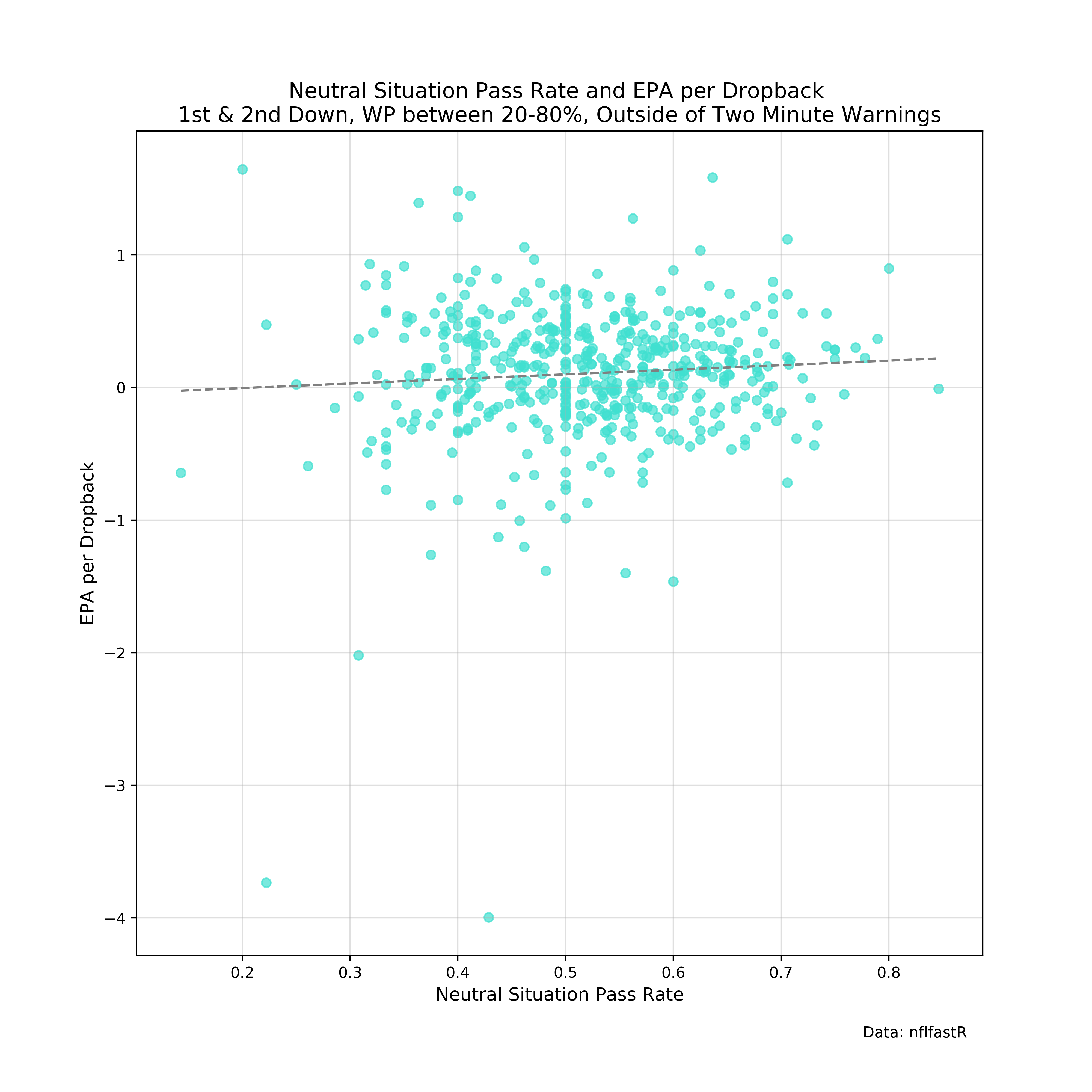
Before going any further, a few more imports are required for gathering and using team logos:
import os
import urllib.request
from matplotlib.offsetbox import OffsetImage, AnnotationBbox
os comes with Python, but urllib may need to be installed. Open the terminal/command prompt and enter:
pip install urllib or conda install urllib if using Anaconda.
Now to download the logos.
Note where it says FOLDER in the last line, make a new folder in the same folder as the jupyter notebook is with a name such as logos and replace FOLDER with the logos.
urls = pd.read_csv('https://raw.githubusercontent.com/statsbylopez/BlogPosts/master/nfl_teamlogos.csv')

for i in range(0,len(urls)):
    urllib.request.urlretrieve(urls['url'].iloc[i], os.getcwd() + '/FOLDER/' + urls['team_code'].iloc[i] + '.png')
Some logos are significantly bigger than others. A program like paint.net can be used to manually scale down the large logos.
Python doesn't easily allow for images to be used on charts as you'll see below, but luckily jezlax found a solution.
Create this function to be able to put images onto a chart.
def getImage(path):
    return OffsetImage(plt.imread(path), zoom=.5)
Next, a list will be created to store the required information to use the logos, again replace FOLDER with the name the folder with the logos in it.
logos = os.listdir(os.getcwd() + '/FOLDER')

logo_paths = []

for i in logos:
logo_paths.append(os.getcwd() + '/FOLDER/' + str(i))This will show you the second way to build charts in Matplotlib, it takes some getting used to but ultimately allows for more flexibility.
This will plot EPA per rush and EPA per dropback for each team in 2019.
#Filter to pass plays and groupby offensive team
team_epa = data.loc[data['pass']==1].groupby('posteam')[['epa']].mean()

#Do the same but for rushing plays
team_epa['rush_epa'] = data.loc[data.rush==1].groupby('posteam')[['epa']].mean()

#Define x and y
x = team_epa.rush_epa
y = team_epa.epa

#Create a figure with size 12x12
fig, ax = plt.subplots(figsize=(15,15))

#Adding logos to the chart
for x0, y0, path in zip(x, y, logo_paths):
    ab = AnnotationBbox(getImage(path), (x0, y0), frameon=False, fontsize=4)
    ax.add_artist(ab)

#Add a grid
ax.grid(zorder=0,alpha=.4)
ax.set_axisbelow(True)

#Adding labels and text
ax.set_xlabel('EPA per Rush', fontsize=16)
ax.set_ylabel('EPA per Dropback', fontsize=16)
ax.set_title('Avg. EPA by Team & Play Type - 2020', fontsize=20)
plt.figtext(.81, .07, 'Data: nflfastR', fontsize=12)

#Save the figure as a png
plt.savefig('team_epas.png', dpi=400)
The above image uses manually resized logos so the output with the unadjusted logos will look different.
Another example will show using logos and team colors on a bar chart. For team colors, click here (or scroll down) to find the dictionary of team colors, copy and paste it into a cell, then execute.
This will be a bar chart showing neutral situation passing rates. First up, creating a dataframe containing only neutral situation plays. For this definition of neutral situation, it will include 1st and 2nd down, win probabilities between 20% and 80%, and not include the last two minutes of each half.
neutral_plays = data.loc[(data.home_wp<=.8) &
                         (data.away_wp<=.8) &
                         (data.half_seconds_remaining>120) &
                         (data.down<3)]
Next group by team, add their color, and the file path to their team logo.
neutral_teams = neutral_plays.groupby('posteam')[['pass']].mean()

neutral_teams['color'] = COLORS.values()

neutral_teams['path'] = logo_paths

#Sort highest to lowest so bar chart is left to right - high to low
neutral_teams.sort_values('pass',ascending=False,inplace=True)
Finally the plot, which will also include an average line.
fig, ax = plt.subplots(figsize=(30,10))

#Create league average line
ax.axhline(y=neutral_plays['pass'].mean(), linestyle='--', color='black')

#Add team logos
for x0, y0, path in zip(np.arange(0,32), neutral_teams['pass']+.005, neutral_teams['path']):
    ab = AnnotationBbox(getImage(path), (x0, y0), frameon=False, fontsize=4)
    ax.add_artist(ab)

#Add bar chart, x axis is an array from 0-31 (length of 32, one per team)
ax.bar(np.arange(0,32), neutral_teams['pass'], color=neutral_teams.color, width=.5)

#Add a grid across the y-axis
ax.grid(zorder=0,alpha=.6,axis='y')
ax.set_axisbelow(True)
ax.set_xticks(np.arange(0,32))
#Add team abbreviations as x tick labels
ax.set_xticklabels(neutral_teams.index,fontsize=16)

#Start y-axis at .3 (30%) to eliminate wasted space
ax.set_ylim(.3,.7)
ax.set_yticks([.3,.4,.5,.6,.7])
ax.set_yticklabels([0.3,0.4,0.5,0.6,0.7],fontsize=16)

ax.set_ylabel('Pass Rate', fontsize=20, labelpad=20)
ax.set_title('Neutral Situation Pass Rates - 2020', fontsize=26, pad=20)
plt.figtext(.845, .04, 'Data: nflfastR', fontsize=14)
plt.text(31, neutral_plays['pass'].mean()+.005, 'NFL Average', fontsize=12)

plt.savefig('neutral_pass_rates.png',dpi=300)
The next example will show how to create an annotated scatter plot. This also requires a library to be installed, called AdjustText.
Open the terminal/command prompt again and enter pip install adjustText or conda install -c conda-forge adjusttext.
Then in the jupyter notebook, import the library.
from adjustText import adjust_textThis will be a plot with CPOE on the x-axis and EPA per dropback on the y-axis. Once again, this will use the COLORS dictionary (see bottom of this guide).
#Create QBs dataframe with avg epa, avg cpoe, and number of plays
qbs = data.groupby(['passer','posteam'], as_index=False).agg({'qb_epa':'mean',
                                                              'cpoe':'mean',
                                                              'play_id':'count'})

#Set minimum limit of 200 dropbacks
qbs = qbs.loc[qbs.play_id>200]

qbs['color'] = qbs.posteam.map(COLORS)

fig, ax = plt.subplots(figsize=(15,15))

#Create vertical and horizontal lines for averages of each metric
ax.axvline(x=qbs.cpoe.mean(), linestyle='--', alpha=.5, color='black')
ax.axhline(y=qbs.qb_epa.mean(), linestyle='--', alpha=.5, color='black')

#Create scatter plot
#s stands for size, the dot size is proportional to the QBs number of plays
ax.scatter(qbs.cpoe, qbs.qb_epa,
           s=qbs.play_id,
           alpha=.7,
           color=qbs.color)

#Add text to each dot
texts = [plt.text(x0,y0,name,ha='right',va='bottom') for x0,y0,name in zip(
    qbs.cpoe, qbs.qb_epa, qbs.passer)]

adjust_text(texts)

#Add grid
ax.grid(zorder=0,alpha=.4)
ax.set_axisbelow(True)

#Remove top and right boundary lines
ax.spines['right'].set_visible(False)
ax.spines['top'].set_visible(False)

#Add title, labels, and source
ax.set_title('CPOE & EPA - 2020',fontsize=20,pad=15)
ax.set_xlabel('Completion % Over Expected (CPOE)',fontsize=16,labelpad=15)
ax.set_ylabel('EPA per Attempt',fontsize=16,labelpad=15)
plt.figtext(.8,.06,'Data: nflfastR',fontsize=12)

#Save figure
plt.savefig('CPOEepa.png',dpi=400)
The following didn't fit well into any section but is helpful nonetheless.
- A list of named matplotlib colors can be found here
- The
.astype()method can be used to change column types, helpful for turning numbers into strings - Tutorial for matplotlib
- Another popular visualization library is seaborn and is based on matplotlib
nflfastR recently added a feature to create and update a database containing play by play data. That feature only works in R however, so I created a python script to do essentially the same thing. The script, found here contains two functions, one for creating the database and one for updating. Make sure to install SQLite before proceeding.
If you're more experienced with python you can simply start python from the command line, import the script, and execute the function create_db(). If you're newer to python, you can simply copy and paste the code into a jupyter notebook and work from there. See below if you're choosing the latter route.
Once the code is copied and pasted into the jupyter notebook, execute the cell(s) and there will be a few things that happen. First, a database connection is created, if the database provided in con = sqlite3.connect(name) already exists, it will establish a connection to that database. If the database does not exist (first time use), the code will create a database for you.
Now that the connection is established and/or the database is created, you can run the create_db function by typing create_db() into a cell and executing it. This will take a few minutes as it's downloading CSVs from the nflfastR data repository, cleaning them, and putting them into a database. Note, the cleaning process is the same as described above, but you can remove any cleaning you don't want (i.e. removing post season games).
The second function is called update_db and similarly can be executed by entering update_db() in a cell and executing. This function also takes a parameter called current_season that you can specify by typing update_db(2020) and that will tell the function to look for games in the 2020 season. Specifying a season that is already in the database will not result in any games being added to the database.
Below are a couple simply SQL queries to get data from the database into a usable pandas dataframe.
To get a single season of data (2019)
query = 'SELECT * FROM plays WHERE season=2019'

data = pd.read_sql(query, con)
To get a few specific columns of data
query = 'SELECT passer, posteam, epa FROM plays WHERE pass=1'

data = pd.read_sql(query, con)
Team colors can be useful for bar graphs and other plots. This is a dictionary of team abbreviations and colors. To get a color, specify a team abbreviation and the color is returned. Typing in COLORS['ARI'] and executing the cell would return #97233F which can be used as a color in a plot.
COLORS = {'ARI':'#97233F','ATL':'#A71930','BAL':'#241773','BUF':'#00338D','CAR':'#0085CA','CHI':'#00143F',
          'CIN':'#FB4F14','CLE':'#FB4F14','DAL':'#B0B7BC','DEN':'#002244','DET':'#046EB4','GB':'#24423C',
          'HOU':'#C9243F','IND':'#003D79','JAX':'#136677','KC':'#CA2430','LA':'#002147','LAC':'#2072BA',
          'LV':'#C4C9CC','MIA':'#0091A0','MIN':'#4F2E84','NE':'#0A2342','NO':'#A08A58','NYG':'#192E6C',
          'NYJ':'#203731','PHI':'#014A53','PIT':'#FFC20E','SEA':'#7AC142','SF':'#C9243F','TB':'#D40909',
          'TEN':'#4095D1','WAS':'#FFC20F'}
Thanks for reading, please leave feedback, and follow me on twitter @DeryckG_.
This is amazing, thanks again Deryck