
Student : Fikri Yurcel Milano
Project : Create Custom Styles in SDC Gallery
Organization : Google FHIR SDK
Mentors : Simon Njoroge, Ronald Kudoyi

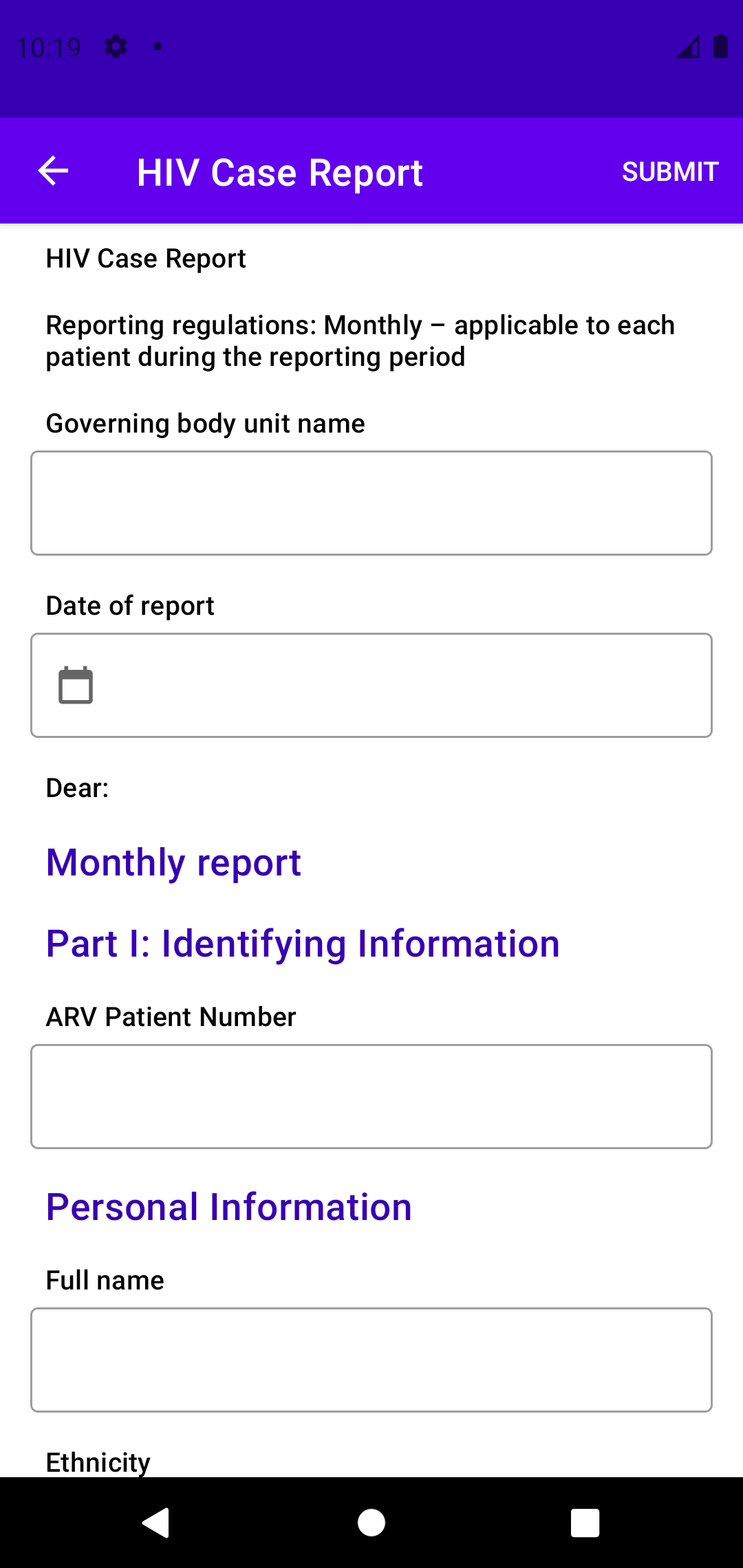
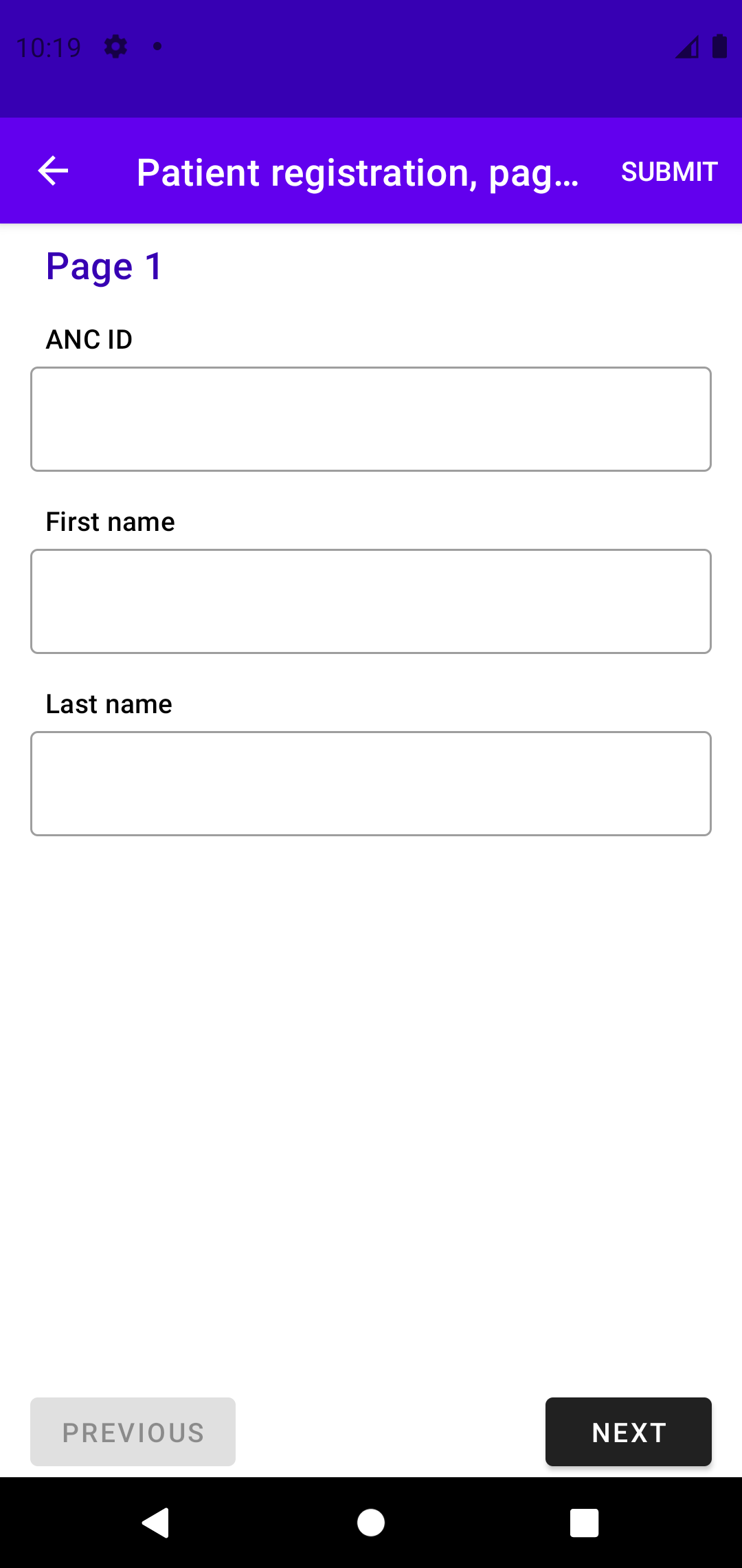
The SDC Library helps implementers to render their questionnaires. When implementers use the SDC Library on their application, they may want to customize their questionnaires on how they will look. But the current version of SDC Library doesn't support questionnaire customization. Implementers also needs an example and documentation on how to customize their questionnaire.
By working on this project, the SDC Library will be able to support questionnaire customization so that implementers can change their questionnaire color/style/text appearance to match their application. This project also provides the SDC Gallery App as an example and documentation as a guide on how to customize the questionnaire.
Issue : #501: Create examples of custom style in the sdc gallery application
Pull Request : #633: Create examples of custom style in SDC Gallery
Commits : Custom Styles in SDC Gallery
- In SDC Library
- Create attributes for views in each questionnaire
- Assign default style for each attribute
- In SDC Gallery App
- Create custom style
- Re-assign each attribute with the custom style
- Merge the PR (Currently waiting for review)
The principle to customize is simple, just override the available attributes in your app styles.xml and assign them with your own custom style.
| Attributes | Default Style |
|---|---|
| groupHeaderTextAppearance | TextAppearance.MaterialComponents.Headline6 |
| headerTextAppearance | TextAppearance.MaterialComponents.Subtitle2 |
| checkBoxStyle | Widget.AppCompat.CompoundButton.CheckBox |
| radioButtonStyle | Widget.AppCompat.CompoundButton.RadioButton |
| dropDownTextAppearance | TextAppearance.MaterialComponents.Subtitle1 |
| dropDownSelectedTextAppearance | TextAppearance.MaterialComponents.Subtitle1 |
| dropDownStyle | Widget.MaterialComponents.TextInputLayout.OutlinedBox.ExposedDropdownMenu |
| editTextInputTextAppearance | TextAppearance.MaterialComponents.Subtitle1 |
| editTextLayoutStyle | Widget.MaterialComponents.TextInputLayout.OutlinedBox |
| chipStyle | Widget.MaterialComponents.Chip.Entry |
Do this in your app styles.xml.
- Group Header

<resources>
    <style name="Theme.MyQuestionnaire" parent="Theme.Questionnaire">
        <item
            name="groupHeaderTextAppearance"
        >@style/TextAppearance.MyQuestionnaire.GroupHeader</item>
    </style>

    // Custom style
    <style
        name="TextAppearance.MyQuestionnaire.GroupHeader"
        parent="TextAppearance.MaterialComponents.Headline6"
    >
        <item name="android:textColor">@color/purple_700</item>
    </style>
</resources>
- Header

<resources>
    <style name="Theme.MyQuestionnaire" parent="Theme.Questionnaire">
        <item
            name="headerTextAppearance"
        >@style/TextAppearance.MyQuestionnaire.Header</item>
    </style>

    // Custom style
    <style
        name="TextAppearance.MyQuestionnaire.Header"
        parent="TextAppearance.MaterialComponents.Subtitle2"
    >
        <item name="android:textColor">?attr/colorOnSurface</item>
    </style>
</resources>
- Checkbox

<resources>
    <style name="Theme.MyQuestionnaire" parent="Theme.Questionnaire">
        <item name="checkBoxStyle">@style/Widget.MyQuestionnaire.CheckBox</item>
    </style>

    // Custom style
    <style
        name="Widget.MyQuestionnaire.CheckBox"
        parent="Widget.AppCompat.CompoundButton.CheckBox"
    >
        <item name="android:buttonTint">@color/check_box_tint</item>
        <item name="android:textColor">?attr/colorOnSurface</item>
        <item
            name="android:textAppearance"
        >@style/TextAppearance.AppCompat</item>
    </style>
</resources>
- Radio Button

<resources>
    <style name="Theme.MyQuestionnaire" parent="Theme.Questionnaire">
        <item
            name="radioButtonStyle"
        >@style/Widget.MyQuestionnaire.RadioButton</item>
    </style>

    // Custom style
    <style
        name="Widget.MyQuestionnaire.RadioButton"
        parent="Widget.AppCompat.CompoundButton.RadioButton"
    >
        <item name="android:buttonTint">@color/radio_button_tint</item>
        <item name="android:textColor">?attr/colorOnSurface</item>
        <item
            name="android:textAppearance"
        >@style/TextAppearance.AppCompat</item>
    </style>
</resources>
- Drop Down

<resources>
    <style name="Theme.MyQuestionnaire" parent="Theme.Questionnaire">
        <item
            name="dropDownTextAppearance"
        >@style/TextAppearance.MyQuestionnaire.DropDown</item>
        <item
            name="dropDownSelectedTextAppearance"
        >@style/TextAppearance.MyQuestionnaire.DropDownSelected</item>
        <item name="dropDownStyle">@style/Widget.MyQuestionnaire.DropDown</item>
    </style>

    // Custom style
    <style
        name="TextAppearance.MyQuestionnaire.DropDown"
        parent="TextAppearance.MaterialComponents.Subtitle1"
    >
        <item name="android:textColor">?attr/colorOnSurface</item>
    </style>

    <style
        name="TextAppearance.MyQuestionnaire.DropDownSelected"
        parent="TextAppearance.MaterialComponents.Subtitle1"
    >
        <item name="android:textColor">?attr/colorOnSurface</item>
    </style>

    <style
        name="Widget.MyQuestionnaire.DropDown"
        parent="Widget.MaterialComponents.TextInputLayout.OutlinedBox.ExposedDropdownMenu"
    />
</resources>
- Edit Text

<resources>
    <style name="Theme.MyQuestionnaire" parent="Theme.Questionnaire">
        <item
            name="editTextInputTextAppearance"
        >@style/TextAppearance.MyQuestionnaire.EditTextInput</item>
        <item
            name="editTextLayoutStyle"
        >@style/Widget.MyQuestionnaire.EditText</item>
    </style>

    // Custom style
    <style
        name="TextAppearance.MyQuestionnaire.EditTextInput"
        parent="TextAppearance.MaterialComponents.Subtitle1"
    >
        <item name="android:textColor">?attr/colorOnSurface</item>
    </style>

    <style
        name="Widget.MyQuestionnaire.EditText"
        parent="Widget.MaterialComponents.TextInputLayout.OutlinedBox"
    />
</resources>
- Chip
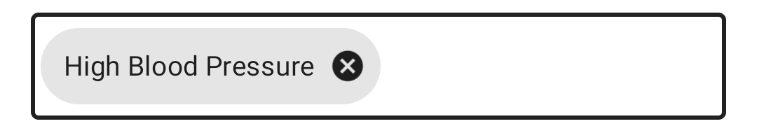
<resources>
    <style name="Theme.MyQuestionnaire" parent="Theme.Questionnaire">
        <item name="chipStyle">@style/Widget.MyQuestionnaire.Chip</item>
    </style>

    // Custom style
    <style
        name="Widget.MyQuestionnaire.Chip"
        parent="Widget.MaterialComponents.Chip.Entry"
    >
        <item name="chipIconTint">@color/mtrl_chip_close_icon_tint</item>
        <item
            name="chipBackgroundColor"
        >@color/mtrl_chip_background_color</item>
        <item name="chipStrokeWidth">0dp</item>
        <item name="chipStrokeColor">?attr/colorOnSurface</item>
        <item name="android:textAppearance">?attr/textAppearanceBody2</item>
    </style>
</resources>
Before this project, the questionnaires could only use it's own view default style with no customization. After the project, implementers could custom each view of the questionnaire through attributes provided by the SDC Library.