Last active
March 12, 2022 14:27
-
-
Save HakamRaza/79bdb9afa78c6a9f1ca60bdd7dc28788 to your computer and use it in GitHub Desktop.
Reusable Modal with Pagination - Recommended For Tutorials
This file contains bidirectional Unicode text that may be interpreted or compiled differently than what appears below. To review, open the file in an editor that reveals hidden Unicode characters.
Learn more about bidirectional Unicode characters
| import React from "react"; | |
| import { | |
| SafeAreaView, | |
| ScrollView, | |
| Text, | |
| StyleSheet, | |
| View, | |
| Image, | |
| Modal, | |
| ImageSourcePropType, | |
| ImageResizeMode, | |
| } from "react-native"; | |
| import { Button } from 'native-base'; | |
| import { facebookBlue, green, hotPink, iOSDarkGrey, white } from "../../constants/Colors"; | |
| import { WIDTH_WINDOW } from "../../constants/Values"; | |
| type dimensionObject = { | |
| containerSize: string, | |
| imageSize: string, | |
| bodySize: string, | |
| } | |
| type imageProps = { | |
| source: ImageSourcePropType, | |
| resize: ImageResizeMode | |
| } | |
| type buttonProps = { | |
| buttonPrimaryText: string, | |
| buttonPrimaryFunction: ()=> void | |
| buttonPrimaryColor?: string, | |
| buttonSecondaryText?: string, | |
| buttonSecondaryColor?: string, | |
| buttonSecondaryFunction?: ()=> void | |
| } | |
| type dataProp = | |
| { | |
| imgProp?: imageProps | |
| title: string; | |
| bodyText: string; | |
| buttonProps?: buttonProps; | |
| designType: 'small' | 'medium' | 'full'; | |
| } | |
| export interface dataProps extends Array<dataProp>{}; | |
| interface modalProps { | |
| openModal: boolean, | |
| dataArray: dataProps | |
| } | |
| const DIMENSION_SMALL: dimensionObject = { | |
| containerSize: '35%', | |
| imageSize: '0%', | |
| bodySize: "100%", | |
| }; | |
| const DIMENSION_MED: dimensionObject = { | |
| containerSize: '60%', | |
| imageSize: '55%', | |
| bodySize: "45%", | |
| }; | |
| const DIMENSION_FULL: dimensionObject = { | |
| containerSize: '90%', | |
| imageSize: '60%', | |
| bodySize: "40%", | |
| }; | |
| function _onSuccessButton(){ | |
| console.log('success clicked !'); | |
| } | |
| function _onCancelButton(){ | |
| console.log('cancel clicked !'); | |
| } | |
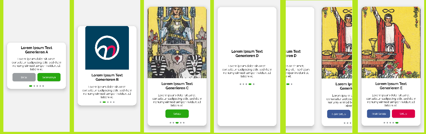
| const sampleData: modalProps = { | |
| openModal:true, | |
| dataArray:[ | |
| { | |
| imgProp: { | |
| source: {uri: "https://images.unsplash.com/photo-1582561833407-b95380302a43?ixid=MnwxMjA3fDB8MHxwaG90by1wYWdlfHx8fGVufDB8fHx8&ixlib=rb-1.2.1&auto=format&fit=crop&w=1000&q=80"}, | |
| resize : 'cover' | |
| }, | |
| title: "Lorem Ipsum Text Generieren A", | |
| bodyText: "Lorem ipsum dolor sit amet, consetetur sadipscing elitr, sed diam nonumy eirmod tempor invidunt ut labore et.", | |
| buttonProps: { | |
| buttonPrimaryText: "Seterusnya", | |
| buttonPrimaryFunction: _onSuccessButton, | |
| buttonSecondaryText: "Batal", | |
| buttonSecondaryFunction: _onCancelButton, | |
| }, | |
| designType: 'small' | |
| }, | |
| { | |
| imgProp: { | |
| source: require('../../assets/photos/AppIcon-Alpha.png'), | |
| resize : 'contain' | |
| }, | |
| title: "Lorem Ipsum Text Generieren B", | |
| bodyText: "Lorem ipsum dolor sit amet, consetetur sadipscing elitr, sed diam nonumy eirmod tempor invidunt ut labore et.", | |
| buttonProps: { | |
| buttonPrimaryText: "Setuju", | |
| buttonPrimaryFunction: _onSuccessButton, | |
| buttonPrimaryColor: hotPink, | |
| buttonSecondaryText: "Tidak Setuju", | |
| buttonSecondaryColor: facebookBlue, | |
| buttonSecondaryFunction: _onCancelButton, | |
| }, | |
| designType: 'medium' | |
| }, | |
| { | |
| imgProp: { | |
| source: {uri:"https://upload.wikimedia.org/wikipedia/en/9/9b/RWS_Tarot_07_Chariot.jpg"}, | |
| resize : 'cover' | |
| }, | |
| title: "Lorem Ipsum Text Generieren C", | |
| bodyText: "Lorem ipsum dolor sit amet, consetetur sadipscing elitr, sed diam nonumy eirmod tempor invidunt ut labore et.", | |
| buttonProps: { | |
| buttonPrimaryText: "Setuju", | |
| buttonPrimaryFunction: _onSuccessButton, | |
| }, | |
| designType: 'full' | |
| }, | |
| { | |
| title: "Lorem Ipsum Text Generieren D", | |
| bodyText: "Lorem ipsum dolor sit amet, consetetur sadipscing elitr, sed diam nonumy eirmod tempor invidunt ut labore et.", | |
| designType: 'full' | |
| }, | |
| { | |
| imgProp: { | |
| source: {uri:"https://upload.wikimedia.org/wikipedia/en/d/de/RWS_Tarot_01_Magician.jpg"}, | |
| resize : 'cover' | |
| }, | |
| title: "Lorem Ipsum Text Generieren E", | |
| bodyText: "Lorem ipsum dolor sit amet, consetetur sadipscing elitr, sed diam nonumy eirmod tempor invidunt ut labore et.", | |
| designType: 'full' | |
| }, | |
| ] | |
| } | |
| const ReusableModal = (props:modalProps) => { | |
| const { openModal, dataArray } = props; | |
| const _setDimension = (designType:string)=>{ | |
| return designType == 'small' | |
| ? DIMENSION_SMALL | |
| : designType == 'medium' | |
| ? DIMENSION_MED | |
| : DIMENSION_FULL | |
| } | |
| const _setImgRender = (imageProps:imageProps, imageSize: string)=>{ | |
| return ( | |
| <Image | |
| style={[ | |
| reusableModalStyle.imageContainer, | |
| { height: imageSize} | |
| ]} | |
| resizeMode={imageProps.resize} | |
| source={imageProps.source} | |
| /> | |
| ) | |
| } | |
| const _renderButton = (buttonProps: buttonProps) => { | |
| const { buttonPrimaryFunction, buttonPrimaryText, buttonPrimaryColor, buttonSecondaryColor, buttonSecondaryFunction, buttonSecondaryText } = buttonProps; | |
| return( | |
| (buttonSecondaryText && buttonSecondaryFunction) | |
| ? ( | |
| <View style={reusableModalStyle.buttonContainer}> | |
| <Button | |
| block | |
| style={{ | |
| ...reusableModalStyle.button, | |
| backgroundColor: buttonSecondaryColor | |
| ? buttonSecondaryColor | |
| : iOSDarkGrey | |
| }} | |
| onPressOut={buttonSecondaryFunction} | |
| ><Text style={reusableModalStyle.buttonText}>{buttonSecondaryText}</Text> | |
| </Button> | |
| <Button | |
| block | |
| style={{ | |
| ...reusableModalStyle.button, | |
| backgroundColor: buttonPrimaryColor | |
| ? buttonPrimaryColor | |
| : green | |
| }} | |
| onPressOut={buttonPrimaryFunction} | |
| ><Text style={{...reusableModalStyle.buttonText}}>{buttonPrimaryText}</Text> | |
| </Button> | |
| </View> | |
| ):( | |
| <View style={reusableModalStyle.buttonContainer}> | |
| <Button | |
| block | |
| style={{ | |
| ...reusableModalStyle.button, | |
| backgroundColor: buttonSecondaryColor | |
| ? buttonSecondaryColor | |
| : green | |
| }} | |
| onPressOut={buttonPrimaryFunction} | |
| ><Text style={reusableModalStyle.buttonText}>{buttonPrimaryText}</Text> | |
| </Button> | |
| </View> | |
| ) | |
| ) | |
| } | |
| return ( | |
| <SafeAreaView > | |
| <Modal | |
| visible={openModal} | |
| animationType={'fade'} | |
| transparent={true} | |
| > | |
| <View style={reusableModalStyle.scrollContainer}> | |
| <ScrollView | |
| horizontal={true} | |
| pagingEnabled | |
| showsHorizontalScrollIndicator={false} | |
| scrollEventThrottle={1} | |
| > | |
| {dataArray.map((item, i) => { | |
| const { imgProp, buttonProps, designType } = item; | |
| const { containerSize, imageSize, bodySize } = _setDimension(designType); | |
| return ( | |
| <View key={i} style={reusableModalStyle.pageContainer} > | |
| <View style={[ | |
| reusableModalStyle.cardContainer, | |
| { height: containerSize } | |
| ]}> | |
| { imgProp ? _setImgRender(imgProp, imageSize ) : null } | |
| <View style={[ | |
| reusableModalStyle.contentContainer, | |
| {height: bodySize} | |
| ]}> | |
| <Text style={reusableModalStyle.textTitle}>{item.title}</Text> | |
| <Text style={reusableModalStyle.textBody}>{item.bodyText}</Text> | |
| { buttonProps ? _renderButton(buttonProps) : null} | |
| <View style={reusableModalStyle.indicatorContainer}> | |
| {dataArray.map((_, index) => { | |
| return ( | |
| <View | |
| key={index} | |
| style={[ | |
| reusableModalStyle.normalDot, | |
| {width: index == i ? 16: 8}, | |
| {backgroundColor: | |
| index == i | |
| ? green | |
| : iOSDarkGrey | |
| } | |
| ]} | |
| /> | |
| ); | |
| })} | |
| </View> | |
| </View> | |
| </View> | |
| </View> | |
| ); | |
| })} | |
| </ScrollView> | |
| </View> | |
| </Modal> | |
| </SafeAreaView> | |
| ); | |
| } | |
| const reusableModalStyle = StyleSheet.create({ | |
| scrollContainer: { | |
| flex: 1, | |
| alignItems: "center", | |
| justifyContent: "center", | |
| }, | |
| pageContainer:{ | |
| width: WIDTH_WINDOW, | |
| paddingHorizontal: 20, | |
| alignContent:'center', | |
| justifyContent:'center', | |
| }, | |
| cardContainer : { | |
| borderRadius: 20, | |
| backgroundColor: 'white', | |
| justifyContent:'center', | |
| alignItems:'center', | |
| shadowColor: "#000", | |
| shadowOffset: { | |
| width: 0, | |
| height: 7, | |
| }, | |
| shadowOpacity: 0.41, | |
| shadowRadius: 9.11, | |
| elevation: 14, | |
| }, | |
| imageContainer :{ | |
| borderTopLeftRadius: 20, | |
| borderTopRightRadius: 20, | |
| width: '100%', | |
| }, | |
| contentContainer:{ | |
| paddingHorizontal: 20, | |
| flexDirection:'column', | |
| justifyContent:'space-evenly', | |
| }, | |
| indicatorContainer: { | |
| flexDirection: "row", | |
| alignItems: "center", | |
| justifyContent: "center", | |
| margin: 10, | |
| }, | |
| normalDot: { | |
| height: 8, | |
| width: 8, | |
| borderRadius: 4, | |
| backgroundColor: "silver", | |
| marginHorizontal: 4 | |
| }, | |
| buttonContainer: { | |
| marginVertical: 10, | |
| flexDirection:'row', | |
| justifyContent:'space-evenly', | |
| }, | |
| button: { | |
| borderRadius: 10, | |
| maxWidth:'50%', | |
| minWidth:'45%', | |
| justifyContent:'center', | |
| }, | |
| buttonText:{ | |
| fontFamily:'Raleway', | |
| color: white, | |
| }, | |
| textTitle:{ | |
| fontFamily:'Raleway-Bold', | |
| textAlign:'center', | |
| fontSize: 20, | |
| paddingVertical: 15, | |
| }, | |
| textBody:{ | |
| fontFamily:'Raleway', | |
| textAlign:'center', | |
| fontSize: 16, | |
| } | |
| }); | |
| export default ReusableModal; |
Sign up for free
to join this conversation on GitHub.
Already have an account?
Sign in to comment
Sample: