Currently YETI exists mostly as a thought experiment attempting to answer the question of "how could web developers and designers move away from traditional row & column based design?" and "do we need to?"
YETI attempts to answer this question by defining semantic templates using css grid-template and dynamic properties to responsively diff the templates definitions.
P.S. More than likely this is just a dumb, overly complex way to think about layouts... You be the judge.
- Radically rethink layout composition and markup
- Provide a library of "curated templates" and utilities for creating complex layouts using grid-template
- Give sections or "blocks" in a layout the ability to be independently scrollable.
- Provide components not typically found in frameworks such as:
<ScrollSpy>,<StickyContent>,<ScrollReveal>,<DatePicker>,<TimePicker>,
- Write all components in a way that is either framework agnostic or easily swappable between react, react-native and next.js.
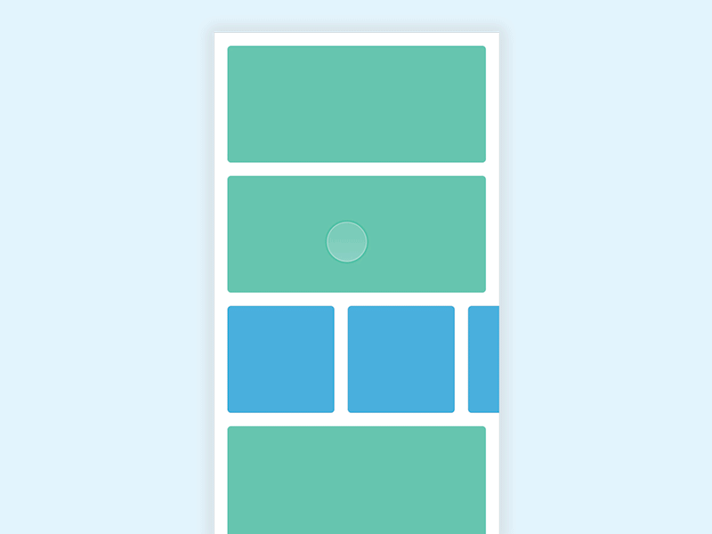
The Layout compontent does exactly what you'd expect, it defines the layout you want to use on a given "view" or "page" using grid-template-areas.
<Layout template="hero" template-sm="single" template-md="sidebar">
  ...
<Layout/>The Block component(s) are children of <Layout> and are is used to define a named grid-area.
<Layout template="sidebar">
  <Block area={nav}>...</Block>
  <Block area={main}>...</Block>
  <Block area={sidebar}>...</Block>
  <Block area={footer}>...</Block>
<Layout/>There are two ways to make a section scrollable.
You can either use components like <HorizontalScroll/> / <VerticalScroll/>.
Or you can use props like: <Block scrollable={horizontal || vertical}>...</Block>
Example:
You can define a new layout at any time by simply creating a new variable.
const single = [
  "... nav ...",
  "... sidebar ...",
  "... sidebar2 ...",
  "... content ...",
  "... footer ..."
 ]
Or
const sidebar = [
  "sidebar nav ...",
  "... content ...",
  "... content ...",
  "... footer ..."
 ]
The layout component allows us to RADICALY change the layout based on the size, or maybe even the device.
<Layout template="hero" template-sm="single" template-md="sidebar" template-phone="offcanvas">
  <Block area={nav}>...</Block>
  <Block area={main}>...</Block>
  <Block area={sidebar}>...</Block>
  <Block area={footer}>...</Block>
<Layout/>Define your template:
const single = [
    "... header ..."
    "... sidebar ..."
    "... content ..."
    "... footer ..."
  ]
The parsing engine should create a new array: (You can try this without a parsing engine and it would work now)
const template = [
    ['...', 'header',   '...'],
    ['...', 'sidebar',  '...'],
    ['...', 'content',  '...'],
    ['...', 'footer',   '...']
];
Then is will apply create the
<style jsx>{`
  Row {
    grid-template-areas:
    "${single[0][0]} ${single[0][1]} ${single[0][2]} "
    "${single[0][0]} ${single[0][1]} ${single[0][2]} "
    "${single[0][0]} ${single[0][1]} ${single[0][2]} "
}
`}</style>

// becomes:

<style jsx>{`
  Row {
    grid-template-areas:
    "... header ..."
    "... sidebar ..."
    "... content ..."
    "... footer ...";
  }
`}</style>