Can be defined in hexadecimal #RRGGBBAA or #RRGGBB formats.
Contrast colors are typically only set for high contrast themes. If set, they add an additional border around items across the UI to increase the contrast:
contrastActiveBorder: An extra border around active elements to separate them from others for greater contrast.contrastBorder: An extra border around elements to separate them from others for greater contrast.
focusBorder: Overall border color for focused elements. This color is only used if not overridden by a component.foreground: Overall foreground. This color is only used if not overridden by a component.widget.shadow: Shadow color of widgets such as Find/Replace inside the editor.selection.background: Background color of text selections in the workbench (for input fields or text areas, does not apply to selections within the editor and the terminal).descriptionForeground: Foreground color for description text providing additional information, for example for a label.errorForeground: Overall foreground color for error messages. This color is only used if not overridden by a component.
Colors inside a text document, such as the welcome page.
textBlockQuote.background: Background color for block quotes in text.textBlockQuote.border: Border color for block-quotes in text.textCodeBlock.background: Background color for code blocks in text.textLink.activeForeground: Foreground color for links in text when clicked on and on mouse hover.textLink.foreground: Foreground color for links in text.textPreformat.foreground: Foreground color for preformatted text segments.textSeparator.foreground: Color for text separators.
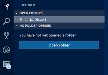
A set of colors for button widgets such as Open Folder button in the Explorer of a new window.
button.background: Button background color.button.foreground: Button foreground color.button.hoverBackground: Button background color when hovering.checkbox.background: Background color of checkbox widget.checkbox.foreground: Foreground color of checkbox widget.checkbox.border: Border color of checkbox widget.
A set of colors for all Dropdown widgets such as in the Integrated Terminal or the Output panel. Dropdown control is not used on macOS currently.

dropdown.background: Dropdown background.dropdown.listBackground: Dropdown list background.dropdown.border: Dropdown border.dropdown.foreground: Dropdown foreground.
Colors for input controls such as in the Search view or the Find/Replace dialog.

input.background: Input box background.input.border: Input box border.input.foreground: Input box foreground.input.placeholderForeground: Input box foreground color for placeholder text.inputOption.activeBackground: Background color of activated options in input fields.inputOption.activeBorder: Border color of activated options in input fields.inputValidation.errorBackground: Input validation background color for error severity.inputValidation.errorForeground: Input validation foreground color for error severity.inputValidation.errorBorder: Input validation border color for error severity.inputValidation.infoBackground: Input validation background color for information severity.inputValidation.infoForeground: Input validation foreground color for information severity.inputValidation.infoBorder: Input validation border color for information severity.inputValidation.warningBackground: Input validation background color for warning severity.inputValidation.warningForeground: Input validation foreground color for warning severity.inputValidation.warningBorder: Input validation border color for warning severity.
scrollbar.shadow: Scrollbar slider shadow to indicate that the view is scrolled.scrollbarSlider.activeBackground: Scrollbar slider background color when clicked on.scrollbarSlider.background: Scrollbar slider background color.scrollbarSlider.hoverBackground: Scrollbar slider background color when hovering.
Badges are small information labels, for example, search results count.
badge.foreground: Badge foreground color.badge.background: Badge background color.
progressBar.background: Background color of the progress bar shown for long running operations.
Colors for list and trees like the File Explorer. An active list/tree has keyboard focus, and inactive does not.
list.activeSelectionBackground: List / Tree background color for the selected item when the list / tree is active.list.activeSelectionForeground: List / Tree foreground color for the selected item when the list / tree is active.list.dropBackground: List / Tree drag and drop background when moving items around using the mouse.list.focusBackground: List / Tree background color for the focused item when the list / tree is active.list.focusForeground: List / Tree foreground color for the focused item when the list / tree is active. An active list / tree has keyboard focus, an inactive does not.list.highlightForeground: List / Tree foreground color of the match highlights when searching inside the list / tree.list.hoverBackground: List / Tree background when hovering over items using the mouse.list.hoverForeground: List / Tree foreground when hovering over items using the mouse.list.inactiveSelectionBackground: List / Tree background color for the selected item when the list / tree is inactive.list.inactiveSelectionForeground: List / Tree foreground color for the selected item when the list / tree is inactive. An active list / tree has keyboard focus, an inactive does not.list.inactiveFocusBackground: List background color for the focused item when the list is inactive. An active list has keyboard focus, and inactive does not. Currently only supported in lists.list.invalidItemForeground: List / Tree foreground color for invalid items, for example an unresoved root in explorer.list.errorForeground: Foreground color of list items containing errors.list.warningForeground: Foreground color of list items containing warnings.listFilterWidget.background: List / Tree Filter background color of typed text when searching inside the list / tree.listFilterWidget.outline: List / Tree Widget's outline color of typed text when searching inside the list / tree.listFilterWidget.noMatchesOutline: List / Tree Filter Widget's outline color when no match is found of typed text when searching inside the list / tree.tree.indentGuidesStroke: Tree Widget's stroke color for indent guides.
The Activity Bar is displayed either on the far left or right of the workbench and allows fast switching between views of the Side Bar.
activityBar.background: Activity Bar background color.activityBar.dropBackground: Drag and drop feedback color for the Activity Bar items.activityBar.foreground: Activity bar foreground color (for example used for the icons).activityBar.inactiveForeground: Activity bar item foreground color when it is inactive.activityBar.border: Activity bar border color with the Side Bar.activityBarBadge.background: Activity notification badge background color.activityBarBadge.foreground: Activity notification badge foreground color.
The Side Bar contains views like the Explorer and Search.
sideBar.background: Side Bar background color.sideBar.foreground: Side Bar foreground color.sideBar.border: Side Bar border color on the side separating the editor.sideBar.dropBackground: Drag and drop feedback color for the side bar sections. The color should have transparency so that the side bar sections can still shine through.sideBarTitle.foreground: Side Bar title foreground color.sideBarSectionHeader.background: Side Bar section header background color.sideBarSectionHeader.foreground: Side Bar section header foreground color.sideBarSectionHeader.border: Side Bar section header border color.
The Minimap shows a minified version of the current file.
minimap.findMatchHighlight: Highlight color for matches from search within files.
Editor Groups are the containers of editors. There can be many editor groups. A Tab is the container of an editor. Multiple Tabs can be opened in one editor group.
editorGroup.border: Color to separate multiple editor groups from each other.

editorGroup.dropBackground: Background color when dragging editors around.

editorGroupHeader.noTabsBackground: Background color of the editor group title header when Tabs are disabled (set "workbench.editor.showTabs": false).

editorGroupHeader.tabsBackground: Background color of the Tabs container.

editorGroupHeader.tabsBorder: Border color of the editor group title header when tabs are enabled.

editorGroup.emptyBackground: Background color of an empty editor group.editorGroup.focusedEmptyBorder: Border color of an empty editor group that is focused.tab.activeBackground: Active Tab background color in an active group.tabUnfocusedActiveBackground: Active Tab background color in an inactive editor group.tab.activeForeground: Active Tab foreground color in an active group.tab.border: Border to separate Tabs from each other.tab.activeBorder: Bottom border for the active tab.tab.unfocusedActiveBorder: Bottom border for the active tab in an inactive editor group.tab.activeBorderTop: Top border for the active tab.tab.unfocusedActiveBorderTop: Top border for the active tab in an inactive editor group.tab.inactiveBackground: Inactive Tab background color.tab.inactiveForeground: Inactive Tab foreground color in an active group.tab.unfocusedActiveForeground: Active tab foreground color in an inactive editor group.tab.unfocusedInactiveForeground: Inactive tab foreground color in an inactive editor group.tab.hoverBackground: Tab background color when hoveringtab.unfocusedHoverBackground: Tab background color in an unfocused group when hovering.tab.hoverBorder: Border to highlight tabs when hovering.tab.unfocusedHoverBorder: Border to highlight tabs in an unfocused group when hovering.tab.activeModifiedBorder: Border on the top of modified (dirty) active tabs in an active group.tab.unfocusedActiveModifiedBorder: Border on the top of modified (dirty) active tabs in an unfocused group.tab.unfocusedInactiveModifiedBorder: Border on the top of modified (dirty) inactive tabs in an unfocused group.editorPane.background: Background color of the editor pane visible on the left and right side of the centered editor layout.
The most prominent editor colors are the token colors used for syntax highlighting and are based on the language grammar installed. These colors are defined by the Color Theme but can also be customized with the editor.tokenColorCustomizations setting. See Customizing a Color Theme for details on updating a Color Theme and the available token types.
All other editor colors are listed here:
editor.background: Editor background color.editor.foreground: Editor default foreground color.editorLineNumber.foreground: Color of editor line numbers.editorLineNumber.activeForeground: Color of the active editor line number.editorCursor.background: The background color of the editor cursor. Allows customizing the color of a character overlapped by a block cursor.editorCursor.foreground: Color of the editor cursor.
Selection colors are visible when selecting one or more characters. In addition to the selection, all regions with the same content are highlighted.
editor.selectionBackground: Color of the editor selection.editor.selectionForeground: Color of the selected text for high contrast.editor.inactiveSelectionBackground: Color of the selection in an inactive editor. The color must not be opaque so as not to hide underlying decorations.editor.selectionHighlightBackground: Color for regions with the same content as the selection. The color must not be opaque so as not to hide underlying decorations.editor.selectionHighlightBorder: Border color for regions with the same content as the selection.
Word highlight colors are visible when the cursor is inside a symbol or a word. Depending on the language support available for the file type, all matching references and declarations are highlighted and read and write accesses get diferent colors. If document symbol language support is not available, this falls back to word highlighting.

editor.wordHighlightBackground: Background color of a symbol during read-access, for example when reading a variable. The color must not be opaque so as not to hide underlying decorations.editor.wordHighlightBorder: Border color of a symbol during read-access, for example when reading a variable.editor.wordHighlightStrongBackground: Background color of a symbol during write-access, for example when writing a variable. The colors must not be opaque so as not to hide underlying decorations.editor.wordHighlightStrongBorder: Border color of a symbol during write-access, for example when writing to a variable.
Find colors depending on the current find string in the Find / Replace dialog.

editor.findMatchBackground: Color of the current search match.editor.findMatchHighlightBackground: Color of the other search matches. The color must not be opaque so as not to hide underlying decorations.editor.findRangeHighlightBackground: Color the range limiting the search (Enable 'Find in Selection' in the find widget). The color must not be opaque so as not to hide underlying decorations.editor.findMatchBorder: Border color of the current search match.editor.findMatchHighlightBorder: Border color of the other search matches.editor.findRangeHighlightBorder: Border color the range limiting the search (Enable 'Find in Selection' in the find widget).
The hover highlight is shown behind the symbol for which a hover is shown.
editor.hoverHighlightBackground: Highlight below the word for which a hover is shown. The color must not be opaque so as not to hide underlying decorations.
The current line is typically shown as either background highlight or a border (not both).

editor.lineHighlightBackground: Background color for the highlight of line at the cursor position.editor.lineHighlightBorder: Background color for the border around the line at the cursor position.
The link color is visible when clicking on a link.

editorLink.activeForeground: Color of active links.
The range highlight is visible when selecting a search result.

editor.rangeHighlightBackground: Background color of highlighted ranges, used by Quick Open, Symbol in File and Find features. The color must not be opaque so as not to hide underlying decorations.editor.rangeHighlightBorder: Background color of the border around highlighted ranges.
To see the editor white spaces, enable Toggle Render Whitespace.
editorWhitespace.foreground: Color of whitespace characters in the editor.
To see the editor indent guides, set editor.renderIndentGuides: true.
editorIndentGuide.background: Color of the editor indentation guides.editorIndentGuide.activeBackground: Color of the active editor indentation guide.
To see editor rulers, define their location with editor.rulers.
editorRuler.foreground: Color of the editor rulers.
CodeLens:

editorCodeLens.foreground: Foreground color of an editor CodeLens.
Bracket matches:
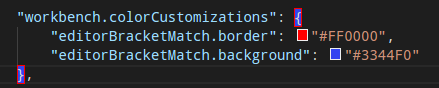
editorBracketMatch.background: Background color behind matching brackets.editorBracketMatch.border: Color for matching brackets boxes.
Overview ruler:
This ruler is located beneath the scroll bar on the right edge of the editor and gives an overview of the decorations in the editor.
editorOverviewRuler.border: Color of the overview ruler border.editorOverviewRuler.findMatchForeground: Overview ruler marker color to find matches. The color must not be opaque so as not to hide underlying decorations.editOverviewRuler.rangeHighlightForeground: Overview ruler marker color for highlighted ranges, like by the Quick Open, Symbol in File and Find features. The color must not be opaque so as not to hide underyling decorations.editorOverviewRuler.selectionHighlightForeground: Overview ruler marker color for selection highlights. The color must not be opaque so as not to hide underlying decorations.editorOverviewRuler.wordHighlightForeground: Overview ruler marker color for symbol highlights. The color must not be opaque so as not to hide underlying decorations.editorOverviewRuler.wordHighlightStrongForeground: Overview ruler marker color for write-access symbol highlights. The color must not be opaque so as not to hide underlying decorations.editorOverviewRuler.modifiedForeground: Overview ruler marker color for modified content.editorOverviewRuler.addedForeground: Overview ruler marker color for added content.editorOverviewRuler.deletedForeground: Overview ruler marker color for deleted content.editorOverviewRuler.errorForeground: Overview ruler marker color for errors.editorOverviewRuler.warningForeground: Overview ruler marker color for warnings.editorOverviewRuler.infoForeground: Overview ruler marker color for infos.editorOverviewRuler.bracketMatchForeground: Overview ruler marker color for matching brackets.
Errors and warnings:
editorError.foreground: Foreground color of error squiggles in the editor.editorError.border: Border color of error boxes in the editor.editorWarning.foreground: Foreground color of warning squiggles in the editor.editorWarning.border: Border color of warning boxes in the editor.editorInfo.foreground: Foreground color of info squiggles in the editor.editorInfo.border: Border color of info boxes in the editor.editorHint.foreground: Foreground color of hints in the editor.editorHint.border: Border color of hint boxes in the editor.
Unused source code:
editorUnnecessaryCode.border: Border color of unnecessary (unused) source code in the editor.editorUnnecessaryCode.opacity: Opacity of unnecessary (unused) source code in the editor. For example, #000000c0 will render the code with 75% opacity. For high contrast themes, use the editorUnnecessaryCode.border theme color to underline unnecessary code instead of fading it out.
The gutter contains the glyph margins and the line numbers:
editorGutter.background: Background color of the editor gutter.editorGutter.modifiedBackground: Editor gutter background color for lines that are added.editorGutter.addedBackground: Editor gutter background color for lines that are added.editorGutter.deletedBackground: Editor gutter background color for lines that are deleted.editorGutter.commentRangeForeground: Editor gutter decoration color for commenting ranges.
For coloring inserted and removed text, use either a background or a border color but not both.
diffEditor.insertedTextBackground: Background color for text that got inserted. The color must not be opaque so as not to hide underlying decorations.diffEditor.insertedTextBorder: Outline color for the text that got inserted.diffEditor.removedTextBackground: Background color for text that got removed. The color must not be opaque so as not to hide underlying decorations.diffEditor.removedTextBorder: Outline color for text that got removed.diffEditor.border: Border color between the two text editors.
The Editor widget is shown in front of the editor content. Examples are the Find / Replace dialog, the suggestion widget, and the editor hover.
editorWidget.foreground: Foreground color of editor widgets, such as find / replace.editorWidget.background: Background color of editor widgets, such as find / replace.editorWidget.border: Border color of the editor widget unless the widget does not contain a border or defines its own border color.editorWidget.resizeBorder: Border color of the resize bar of editor widgets The color is only used if the widget chooses to have a resize border and if the color is not overridden by a widget.editorSuggestWidget.background: Background color of the suggestion widget.editorSuggestWidget.border: Border color of the suggestion widget.editorSuggestWidget.foreground: Foreground color of the suggestion widget.editorSuggestWidget.highlightForeground: Color of the match highlights in the suggestion widget.editorSuggestWidget.selectedBackground: Background color of the selected entry in the suggestion widget.editorHoverWidget.background: Background color of the editor hover.editorHoverWidget.border: Border color of the editor hover.editorHoverWidget.statusBarBackground: Background color of the editor hover status bar.
The Debug Exception widget is a peek view that shows in the editor when debug stops at an exception.
debugExceptionWidget.background: Exception widget background color.debugExceptionWidget.border: Exception widget border color.
The editor marker view shows when navigating to errors and warnings in the editor (Go to Next Error or Warning command).
editorMarkerNavigation.background: Editor marker navigation widget background.editorMarkerNavigationError.background: Editor marker navigation widget error color.editorMarkerNavigationWarning.background: Editor marker navigation widget warning color.editorMarkerNavigationInfo.background: Editor marker navigation widget info color.