You need to find the repl.it link for the solar system that you made last week - if for whatever reason you can't or you have lost it I have made you a starting jsfiddle - you will need to copy it into your repl.it before you start!
There are many ways to represent colours with computers - we've been telling our svg shapes to be "red" or "yellow" or "green" - this isn't great if you want a specific colour green!
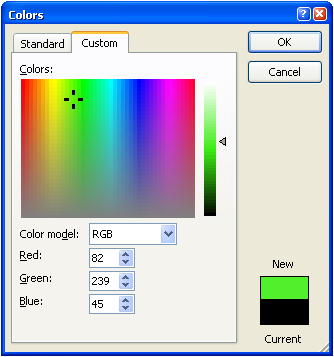
Microsoft Word likes to use this - if you ever try to change the colour to a custom colour you get a colour wheel:
This gets you three values (Red, Green, Blue) - 0 means you've got none of that colour, 255 means a lot of that colour. So:
- red would be 255,0,0
- green would be 0,255,0
- purple would be 153,51,204
this is what most people use now
Basically a more efficient way of representing a rgb value - Instead of going from 0 to 255, you go from 00 to FF
- red would be #FF0000
- green is #00FF00
- purple would be #9933CC
Try making each of your planets a more accurate colour in your solar system. There are some links at the bottom of the page to get some hex color codes quickly!
  <linearGradient id="grad1" x1="0%" y1="0%" x2="100%" y2="0%">
      <stop offset="0%" stop-color="#1AD6FD"/>
      <stop offset="100%" stop-color="#1D62F0" />
  </linearGradient>

<circle cx="100" cy="100" r="100" fill="url(#grad1)" />- id = the name of the gradient - needed to give to the circle's fill attribute
- x1 & x2 = start and stop x values = these go from 0 to 100 to make our gradient
- y1 & y2 = start and stop y values = these stay constant for our example
- stop offset
- offest = how far down the gradient you want the colour
- stop-color = hex code for the stop point
  <radialGradient id="grad2" cx="50%" cy="50%" r="50%" fx="50%" fy="50%">
      <stop offset="0%" stop-color="#ffcc00" />
      <stop offset="100%" stop-color="#cc0000" />
  </radialGradient>

<circle cx="100" cy="100" r="100" fill="url(#grad2)" />- id = used to connect with the shapes you want that colour
- cx & cy = represent the center coordinates for the outer circle
- r = how far the gradient should go out from the center
- fx & fy = denote the coordinates for the inner circle
In your solar system - make Earth use a horizontal linear gradient from green to blue. If you get time make your sun become a radial gradient.
- http://www.colorhexa.com
- http://ios7colors.com/
- http://developer.android.com/design/style/color.html
NB You can leave this extension task until after the next worksheet as they are separate pieces of work.
Your planets will look super-cool when they show a lighted side to the sun and a shaded side away from the sun as they travel in their orbits.
You can make your planets look like that using css transforms on a linear gradient.
You already know how to make a linear gradient, and copy this css rotate transform into the css block:
#earth{
    animation-name: planets;
    animation-duration: 50s;
    animation-timing-function: linear;
    animation-iteration-count: infinite;
    transform-origin: 50% 50%;
}

@keyframes planets {
    0% {
        transform: rotate(0deg);
    }
    100% {
        transform: rotate(360deg);
    }
}#earthmatches theid=in your htmlanimation-name:matches the@keyframesanimation-duration:lets css know how slowly to rotateanimation-timing-function:lets css know to rotate smoothly
Here are a couple of links to help you experiment with different effects:
- https://css-tricks.com/transforms-on-svg-elements/
- https://www.w3schools.com/cssref/css3_pr_transform.asp
Here's one I made earlier https://jsfiddle.net/437cyk6r/7/ .


