I would like to demonstrate some of the benefits of scoped styles over mobile-first CSS with overrides for wider breakpoints. I'll start by explaining the two approaches, before listing the benefits.
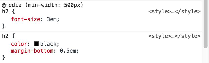
h2 {
  color: black;
  font-size: 2em;
  margin-bottom: 0.5em;
  padding-bottom: 0.5em;
  border-bottom: 1px solid #ccc;

  @media (min-width: 500px) {
    padding-bottom: 0;
    border-bottom: none;
    font-size: 3em;
  }
}
In this pattern, all styles outside of media queries are either mobile or common styles. We override some of these styles for wider breakpoints.
Prior to mobile-first, desktop-first was a common pattern: style for desktop and override styles for smaller breakpoints. The mobile-first pattern succeeded this because it meant less overrides, as mobile tends to require less styles than desktop.
Another reason this pattern emerged as preferable was because browsers that didn't support media queries could fallback to the mobile styles. This isn't really a concern anymore, now we have good support for media queries in all browsers.
h2 {
  color: black;
  margin-bottom: 0.5em;

  @media (max-width: 499px) {
    font-size: 2em;
    padding-bottom: 0.5em;
    border-bottom: 1px solid #ccc;
  }

  @media (min-width: 500px) {
    font-size: 3em;
  }
}
In this pattern, all styles outside of media queries are common (shared for all viewport sizes). All viewport specific styles are scoped, either using max-width or min-width media queries.
I think there are numerous benefits to this approach.
With mobile-first CSS, we have to undo any styles that we don't want on wider breakpoints.
By scoping viewport specific styles using max-width or min-width media queries, we won't have to undo styles for any breakpoints.
This is already the best practice for switching styles outside of media queries, e.g. if we have different versions of a component. I don't see any reason why we shouldn't apply the same principle with responsive components.
As you go down a stylesheet you should only ever be adding styles, not taking away.
— https://csswizardry.com/2012/11/code-smells-in-css/#undoing-styles
For example, compare:
h2 {
  color: black;
  font-size: 2em;
  margin-bottom: 0.5em;
  padding-bottom: 0.5em;
  border-bottom: 1px solid #ccc;

  @media (min-width: 500px) {
    /* Override: undo */
    padding-bottom: 0;
    /* Override: undo */
    border-bottom: none;
    /* Override: change */
    font-size: 3em;
  }
}
with:
h2 {
  color: black;
  margin-bottom: 0.5em;

  @media (max-width: 499px) {
    font-size: 2em;
    padding-bottom: 0.5em;
    border-bottom: 1px solid #ccc;
  }

  @media (min-width: 500px) {
    font-size: 3em;
  }
}
Because we have less undoing of styles, the code is also easier to read. We can easily distinguish between common and viewport specific styles:
- "These styles are shared" (no media query)
- "These styles are for mobile" (
max-widthmedia query) - "These styles are for desktop" (
min-widthmedia query)
For example, compare:

with:
The second example is much easier to look at and understand what the final computed styles will be. You don't have to compute the overrides in your head.
Very often in CSS I come across orphan styles that were probably required at some point, but a refactor elsewhere made them redundant.
For example, with the mobile-first approach, if we later decided not to give h2 a border-bottom on mobile, we might forget to remove the override which undoes it.
If the border-bottom style on our h2 was scoped, there would be no override to remove.
Orphan styles make CSS more difficult to maintain, because it's not clear anymore whether styles are or aren't needed.
If we can write less styles in the first place, e.g. by avoiding overrides, we can reduce the risk of these things happening during refactors.
Thanks for the tips !