This is the Final Report for the work done to add Greek glyphs to the Google font Arima Madurai. https://github.com/eellak/gsoc2018-arimamadurai
Student :
GSoC Mentors:
Organization:
Open Technologies Alliance - GFOSS
Source
Deliverables
Process
The Project took place during the Google Summer of Code 2018.
This project aimed to add Greek script to the Google Font Arima Madurai. You can see the original proposal for GSOC here.
Arima Madurai is a font created by Natanael Gana and Joana Correia of NDISCOVER — a Portuguese type foundry. It is a multiscripts display font with 8 weights from thin to black and have a strong calligraphic influence. It has a lot of personality so it can be recognisable in headlines or brand names uses.
Arima Madurai already supported Tamil, Malayalam and Latin scripts and with this project, Greek script was added to the glyphset. The fact that the font already supported multi scripts was a real benefit to the project: Arima Madurai already acted in a non latin typographic environment and therefore displayed a large set of shapes that were used to match the Greek glyphs with the other ones.
You can find the repository on which I worked to add the Greek script here.
You can find the Journal of the process here and take a look at the design process. You can also find the different feedbacks from my mentor Emilios Theofanous.
The original timeline of the project can be found here.

I had to design the two extreme weights in order to interpolate the 6 other. Those two extreme weights (Thin and Bold) represented two very different works because the thin weight was almost monolinear and the bold had very high contrasts. While the thin weight was easy to design and very stable, the bold weight was hard to balance and difficult to match with the latin.
The first phase was to find a stress for the Greek letterform which would provide a good match with the latin while keeping that style proper to Greek script. So we kept a vertical axe as in the Latin but we broke the vertical stems of the Bold to make it dance a bit more.
From the monoliear thin to the high constrated bold, the font varies from steady to playful letterforms.
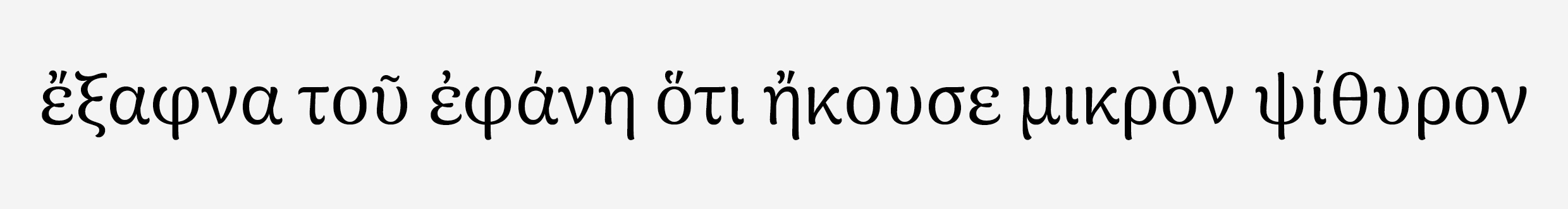
At the end, over 300 glyphs were added per weight. That is for full coverage of monotonic & polytonic. This is polytonic in use :
You can find here a PDF of the Greek character sets that was added to Arima Madurai.
A small pangram animation, from Thin to Bold and back, demonstrating the changes of the final design that occur as weight is added:

The fonts and related code are licensed under Open Font License. See LICENSE.txt for licensing information.