R is a software environment for statistical computing and graphics. The kinds of things people do in R are:
- Plot charts,
- Create and evaluate statistical models (linear, nonlinear),
- Perform statistical analyses (tests, classification, clustering).
I'm only going to talk about charts.
R supports Windows, Linux, and Mac OS X.
sudo yum install R
See: http://cran.r-project.org/bin/linux/ubuntu/README
See: http://cran.r-project.org/bin/macosx/
Now we're going to install the 'ggplot2' package. From the command-line start the R terminal using 'R':
╭─[2013-10-11 16:38:27] asim.ihsan@wll1p00288  /home ‹›
╰─$ R

R version 3.0.1 (2013-05-16) -- "Good Sport"
Copyright (C) 2013 The R Foundation for Statistical Computing
Platform: x86_64-redhat-linux-gnu (64-bit)

R is free software and comes with ABSOLUTELY NO WARRANTY.
You are welcome to redistribute it under certain conditions.
Type 'license()' or 'licence()' for distribution details.

  Natural language support but running in an English locale

R is a collaborative project with many contributors.
Type 'contributors()' for more information and
'citation()' on how to cite R or R packages in publications.

Type 'demo()' for some demos, 'help()' for on-line help, or
'help.start()' for an HTML browser interface to help.
Type 'q()' to quit R.
Now install ggplot2. This will open a GUI dropdown prompting you to select a mirror:
> install.packages('ggplot2')
Installing package into ‘/home/asim.ihsan/R/x86_64-redhat-linux-gnu-library/3.0’
(as ‘lib’ is unspecified)
--- Please select a CRAN mirror for use in this session ---
trying URL 'http://cran.stat.unipd.it/src/contrib/ggplot2_0.9.3.1.tar.gz'
Content type 'application/octet-stream' length 2330942 bytes (2.2 Mb)

<snip>

** building package indices
** testing if installed package can be loaded
* DONE (ggplot2)
Similarly install the package 'scales'.
Quit the R REPL by pressing CTRL-D and saying 'n' to not save the workspace:
>
Save workspace image? [y/n/c]: n
╭─[2013-10-11 16:43:17] asim.ihsan@wll1p00288  /home ‹›
╰─$
You can also install R packages from the command line by running
R CMD INSTALL <source package path>, but you need to have the source
package already downloaded to do this. You do not need to sudo install because
R packages are installed on a per-user basis. For example:
╭─[2013-10-11 20:35:00] ai@Mill  ~/temp
╰─$ wget http://cran.stat.unipd.it/src/contrib/ggplot2_0.9.3.1.tar.gz
--2013-10-11 20:35:01--  http://cran.stat.unipd.it/src/contrib/ggplot2_0.9.3.1.tar.gz
Resolving cran.stat.unipd.it... 147.162.35.231
Connecting to cran.stat.unipd.it|147.162.35.231|:80... connected.
HTTP request sent, awaiting response... 200 OK
Length: 2330942 (2.2M) [application/octet-stream]
Saving to: ‘ggplot2_0.9.3.1.tar.gz’

2013-10-11 20:35:03 (1.26 MB/s) - ‘ggplot2_0.9.3.1.tar.gz’ saved [2330942/2330942]

╭─[2013-10-11 20:35:03] ai@Mill  ~/temp
╰─$ R CMD INSTALL ggplot2_0.9.3.1.tar.gz
* installing to library ‘/Users/ai/Library/R/2.15/library’
* installing *source* package ‘ggplot2’ ...
** package ‘ggplot2’ successfully unpacked and MD5 sums checked
** R
** data
**  moving datasets to lazyload DB
** inst
** preparing package for lazy loading
** help
*** installing help indices
** building package indices
** testing if installed package can be loaded
*** arch - i386
*** arch - x86_64

* DONE (ggplot2)
╭─[2013-10-11 20:35:17] ai@Mill  ~/temp
╰─$
And similarly install scales; in order to get a package source URL install it via the REPL on your target platform, e.g. Linux.
Let's plot two variables as a scatterplot chart.
vim/emacs open a text file and enter in the following:
x,y
1,1
2,2
3,3
4,4
5,5
Save it as foobar1.csv.
vim/emacs open another text file and enter in the following:
#!/usr/bin/env Rscript

library(ggplot2)

data <- read.csv('foobar1.csv')
png('foobar1.png', width=400, height=400)
ggplot(data, aes(x=x,y=y)) + geom_point()
dev.off()
Save this as scatterplot.r. Make it executable:
chmod a+x scatterplot.r
Run it:
./scatterplot.r
Open the image:
xdg-open foobar1.png
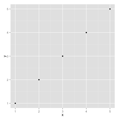
Great! Let's move on.
Of course time series are popular requests. The main challenge with R is "how the hell do I get it to understand dates?". Here's an example, assuming that you have datetimes values formatted as ISO 8601.
Here's our data:
timestamp,delay
"2013-10-11 11:10:10",100
"2013-10-11 11:10:11",50
"2013-10-11 11:10:12",25
"2013-10-11 11:10:13",20
"2013-10-11 11:10:14",200
"2013-10-11 11:10:15",50
Save it as time_series.csv.
I'm only going to give the Rscript; refer above to how to execute it.
#!/usr/bin/env Rscript

library(ggplot2)
library(scales)

data <- read.csv('time_series.csv')
data$timestamp_obj <- as.POSIXct(data$timestamp, format="%Y-%m-%d %H:%M:%S")
svg('time_series.svg', width=8, height=5)
ggplot(data, aes(x=timestamp_obj,y=delay)) + geom_line() +
  xlab("Timestamp") +
  ylab("Delay (ms)") +
  scale_x_datetime(breaks=pretty_breaks(), labels=date_format("%H:%M:%S"))
dev.off()
As before chmod, run, but this time via the output in a browser.

Why did we use SVG? Scalar Vector Graphics (SVG) is a W3C standard for vector graphics. The output will be arbitrarily sizable to whatever size you need and, as it is XML, it is easily compressible. Both are ideal attributes for environments where many charts are required and need to be stored for long periods of time. However, note that sometimes complex charts can get very large.
Although what a time-varying values at particular times is a great start we also often want to know what ranges of values it takes overall. Histograms are popular, and have the advantage that it they are easy to read. However their discreteness can be misleading.
Kernel density estimates (KDEs) are superior when you have a large number of values where you are more interested in determining its distribution rather than exactly how many occurred at what values. The types of questions they help you answer are e.g. "how many modes (peaks) does the data have? is it symmetric or is it skewed? does data tend to concentrate around one centre or is it more evenly distributed?". When intrepreting the y-axis note that a KDE is an estimate of the probability density function (PDF); see [9] for more details.
With ggplot2 they are exceptionally easy to plot. Taking our existing
time_series.csv output above:
#!/usr/bin/env Rscript

library(ggplot2)

data <- read.csv('time_series.csv')
svg('time_series_kde.svg', width=8, height=5)
ggplot(data, aes(x=delay)) + geom_line(stat='density', adjust=1/2) +
  xlab("Delay (ms)")
dev.off()

Where lower values for 'adjust' reduces the smoothness of the KDE but makes it less likely that you're looking at the true underlying PDF.For more options on configuring KDEs in ggplot2 see [8].
A few customers have started to complain that your web service sometimes takes a bit long to complete requests. In your service component A and component B must work in parallel and when both are finished a result is returned. Using some shell/scripting language kung-foo you've converted your prodcution logs for the past two hours into the following CSV file.
You'll notice that it has the following format:
timestamp,component,delay
<time1>,A,<delay_A_1>
<time1>,B,<delay_B_1>
<time2>,A,<delay_A_2>
<time2>,B,<delay_B_2>
...
With R and ggplot2 your goal is to use your choice of language to transform many log files into a single CSV file, using categorical variables in columns. A categorical variable is one that takes on a fixed set of values; in our case "component" is our categorical variable. It may be that the underlying logs on the filesystem for components A and B are different, but your first goal is always to bring all the data together into one CSV file. You'll soon see why.
After getting your hands on a CSV file the first step is always to just "take a look". What does the time series look like? We use this:
library(ggplot2)

data <- read.csv('/Users/ai/temp/practical.csv')
data$timestamp_obj <- as.POSIXct(data$timestamp, format="%Y-%m-%d %H:%M:%S")
ggplot(data, aes(x=timestamp_obj, y=delay, colour=component, group=component)) + geom_point(size=1)
To get this:
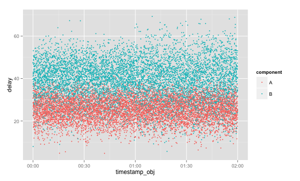
Looking at this it although it's obvious that B takes longer to process requests than A it's not clear that anything has changed over the past two hours. This plot would be ideal for identifying obvious spikes in service time or complete blank areas, indicating an outage. Note, however, how easy this chart was to draw with access to the 'component' categorical variable.
Is this the end? Hardly. Let's take a look at the KDEs for the delays of A and B, but this time differentiate by hour. Let's draw four KDEs: one for each component for each hour.
Use this code:
library(ggplot2)

data <- read.csv('/Users/ai/temp/practical.csv')
data$timestamp_obj <- as.POSIXct(data$timestamp, format="%Y-%m-%d %H:%M:%S")
data$hour = as.factor(format(data$timestamp_obj, format="%H"))
ggplot(data, aes(x=delay, colour=component, group=component)) + geom_line(stat='density') +
  facet_grid(hour ~ .)
To get this:

(Note how we've created a new categorical variable called 'hour', and then used it to create 'facets').
Looking at the KDEs it's clear that something odd is going on with B. Although its value of central tendency hasn't changed the "tails" of the distribution have become fatter in the past hour. But when exactly did the delay values of B become more variable?
Rather than only have KDEs per hour it would be good to see measures of dispersion every 15 minutes. In order to do this we'll have to write some actual R to create a new categorical variable that correponds to "once every 15 minutes". Moreover, just to switch things up let's use boxplots.
Use this code:
library(ggplot2)

get_factor <- function()
{
  strings <- format(data$timestamp_obj, format="%H:%M")
  split_strings <- lapply(strings, function(x) strsplit(x, ':')[[1]])
  minutes <- lapply(split_strings, function(x) as.integer(x[2]))
  rounded_minutes <- lapply(minutes, function(x) (x %/% 15) * 15)
  rounded_minutes_strings <- lapply(rounded_minutes, function(x) sprintf("%02d", x))
  group <- mapply(function(e1, e2) paste(e1[1], ':', e2, sep=''), split_strings, rounded_minutes_strings)
  as.factor(group)
}

data <- read.csv('/Users/ai/temp/practical.csv')
data$timestamp_obj <- as.POSIXct(data$timestamp, format="%Y-%m-%d %H:%M:%S")
data$group <- get_factor()
ggplot(data, aes(x=group, y=delay, group=group)) + geom_boxplot() +
  facet_grid(. ~ component) +
  scale_y_continuous(breaks=seq(round(min(data$delay)/5)*5,
                                round(max(data$delay)/5)*5,
                                5))
To get this:

With this chart it's becoming clear that the variability in the response times of B have increased at around 01:00.
- You can output as PDF, SVG, WMF, PNG, or TIFF. See [1] Chapter 14.
- You can plot a lot of different kinds of charts. See [1] Chapters 1, 2, 3, 4, 5.
The command-line works but sometimes you want a GUI to deal with complex data or experiment rapidly with plots without having to save images all the time.
You want RStudio:
sudo yum install rstudio
[1] The O'Reilly book "R Graphics Cookbook" is decent:
I'd suggest following it in RStudio rather than the command-line REPL.
[2] We've been using the ggplot2 package. It is the canonical way to draw charts in R. However, sometimes you'll ask yourself "but how can I change the axis tick marks?" or "what's up with the font sizes? I need them bigger" or "can I draw arbitrary shapes that are dependent on the data?". The answer to all of them is yes...and although StackOverflow is your friend you may want to refer to the "ggplot2 - Elegant Graphics for Data Analysis" book:
[3] Cheat sheet: http://matpalm.com/blog/2012/03/18/ggplot_posix_cheat_sheet/
(but note that you'll want to use "breaks = pretty_breaks()", as I show in this tutorial; this is a new ggplot2 function).
[4] Lattice plotting: http://learnr.files.wordpress.com/2009/08/latbook.pdf
[5] Increase number of axis ticks in ggplot2? http://stackoverflow.com/questions/11335836/increase-number-of-axis-ticks-in-ggplot2
[6] Box plots using ggplot2 http://www.ats.ucla.edu/stat/r/gbe/ggplot_boxplot.htm
[7] Plotting distributions (ggplot2) http://www.cookbook-r.com/Graphs/Plotting_distributions_(ggplot2)
[8] ggplot2 - stat_density http://docs.ggplot2.org/current/stat_density.html
[9] Kernel density estimation https://en.wikipedia.org/wiki/Kernel_density_estimation