###SVA-DSI ###Metrics and Data Visualiation I October 18th, 2016
Find this document here:
- Time Series Basics
- What is time-series?
- Types of Visualizations
- Time-Series Data
- Data + Date Formats
- Tools for Converting your Data
- Charting Tools
- Time-Series Libraries
- D3 - Drawing with Data
- Diagram a Time-series Project
- Building A Narrative
- Case Study 1: NYC 311 Graffiti (Highcharts)
- Case Study 2: Task Calendar (D3)
- Bl.ocks for Time-series display
- Resources
Time Series Data is a series of data points ordered in time, or data that has a timestamp associated with it (this can include date and time information). Often, time-series data is most interesting for journalism, because it illustrates change, and difference from precedent.
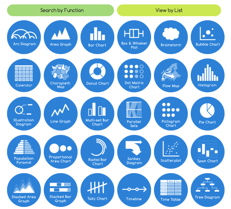
Data Visualization Catalogue is a great place to get started to define the type of visualization that is most appropriate for your data.
Take a look at it, and spend some time deciding which visualizations are most appropriate for the data you would like to work with in this course. You can sort by format and the function you desire in your resulting visualization.
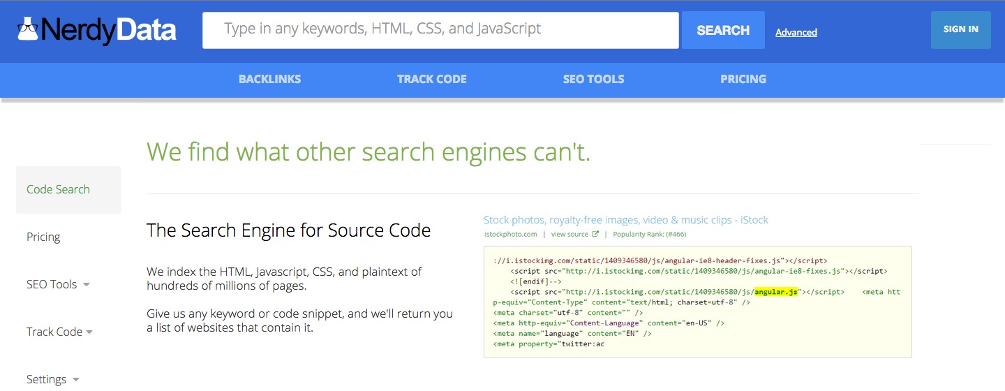
If you want to see how something is implemented, you might search for a library or language in Nerdy Data, a search engine for source code. You can also use it to find out how your favorite technologies where built.
Time series data comes in various formats.
It also comes from a variety of sources, and often you will have to process it (change it to the format you need for your visualization library to understand it). Sometimes, you might want to convert all of your date formats to the same format and then reconvert when you visualize, if so you can convert to unix time, which is a series of numbers that the computer will read as a date that a human might recognize.
so the following are the same date/time, with different codes
09/20/2015 8:25PM(UTC)1443644745(Unix/Epoch)2015-09-30T20:25:45+00:00(ISO 8601)
- JSON - Javascript Object Notation, data objects made of attribute-value pairs
- CSV - Comma-Separated Values, tabular data delimted by
,s to suggest different fields, you can convert excel spreadsheets to this easily, and it can be read into your code - TSV - Tab-Separated Values, same as above, but
tabis the delimiting - XML - eXtensible Markup Language
You can tell the format of a file by its extension, or the letters that follow the . after the file name.
- aurelia.txt would be a text file
- aurelia.csv would be a CSV file
- aurelia.xml would be an XML file
- aurelia.json might look like this...
{
  "id": 1,
  "name": "Aurelia",
  "height": 123,
  "tags": [
    "Teacher",
    "Nerd"
  ],
  "students": {
    "onsite": 16,
    "remote": 4
  }
}
- Dates | "Friday, September 24th, 2004" or
- Integers/Numbers (int/num) | "1"
- Booleans | "TRUE"
- Characters (char) | "a"
- Floats | "1.2435"
- Strings (str) - alphanumeric collection of characters | "aurelia"
#####Considerations
- What do you want it to look like?
- What do you want to happen when the user interacts with it?
- Type of dataset and date format?
- Type of visualization?
If you're wanting to get started with a dataset that is not your own, you can follow the tutorial from Michelle Minkoff at ForJournalism: http://forjournalism.github.io/courses/charting-and-visualization/
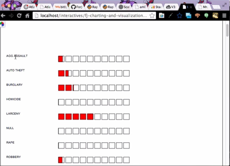
It provides a great overview of the process of coding, complete with debugging, working with dirty datasets (in this case, crime data for Georgia), and visualizing them with Raphael.JS, a Javascript library for visualizations.
- Quandl - the "wikipedia" of time-series data, they provide datasets and format parsers for conversion to what you need
- Data.gov - almost every government/city has an "open data portal" intiative where you can download data of interest to you, and search through for differnt formats
- Federal Data Listing
- Enigma.io - loads more open data, larger datasets, and tools for correlating multple datasets
- Exversion - similar data catalog, they also have a fabulous newsletter (subscribe for cool datasets in your inbox)
- NYC Open Data - loads of cities have "socrata" portals where you can download data
- NASA Data
- IRE Database Library - IRE also provides a lot of open data to investigative journos, along with data dictionaries telling you how to read it
For more complex datasets, there are guides online like the Journalists' Guide to datsets which help you parse and read commonly used but pretty obscure data releases from an investigative perspective.
Likewise, some time-series data is not easy to find, and you have to request it from government agencies. If you would like to explore this, check out FOIA Machine. For the purposes of this class though, you might opt for something that's easier to find.
- Mr. Data Converter - an online tool for converting data from excel to other formats (HTML/JSON/XML)
- Open Refine - not unlike excel but way more powerful for large datasets, you can also convert formats in refine (ie. from JSON to CSV or vice-versa)
- DSV - a parser and formatter for delimiter-separated values
- Tabula - a tool for extracting data from PDFs
Since this is not a class for data cleaning, but almost every dataset requires it, take a look at some examples for the data visualization you might want to build, and try to make your data match that style. If you're dealing with a large dataset that would take too long to manually edit, come chat with me and I can help, you can also take a look at the Data Wrangling Handbook which features nice tutorials on how to deal with data.
There are loads of time-series data libraries, you can google for your language of preference and "time-series" to discover them. Most of the popular ones are frameworks built for D3.
Here are a few:
All are pretty customizable with CSS, so don't feel bound to their default designs.
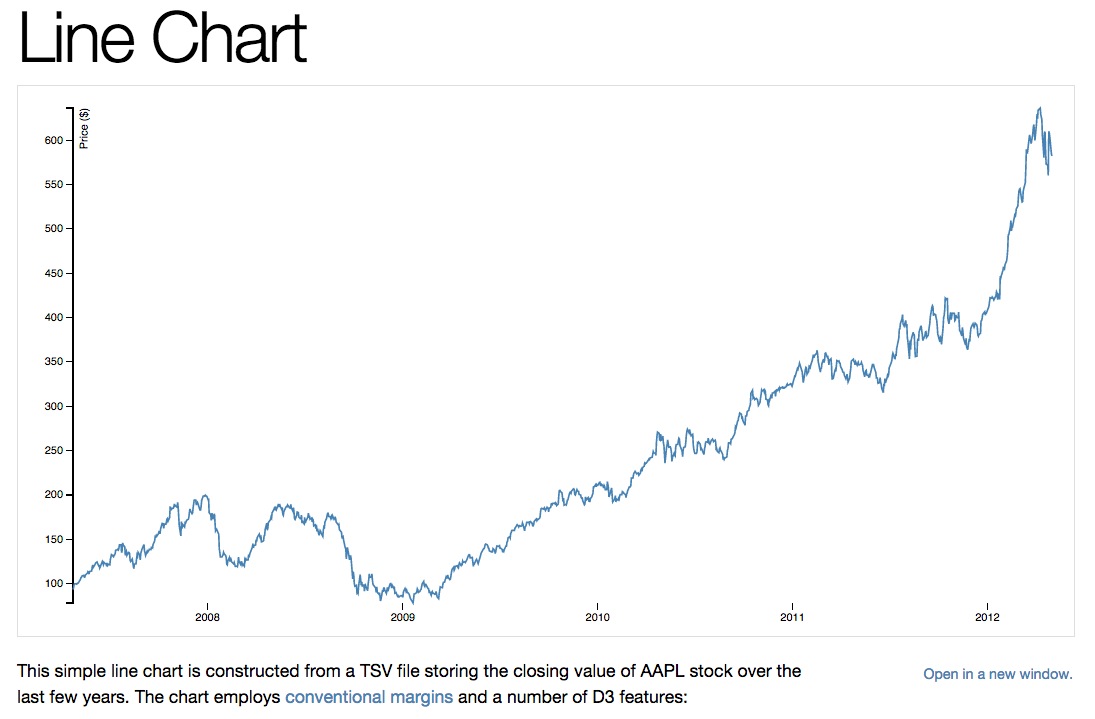
D3.js is a physics based animation library for drawing with data. It is incredibly flexible, but has a non-trivial syntax and math prerequisite, and can is not supported by all browsers (like I.E.). It's great for dynamism and very popular so I encourage you to check it out.
Here is an example D3 project, we'll go through it together:
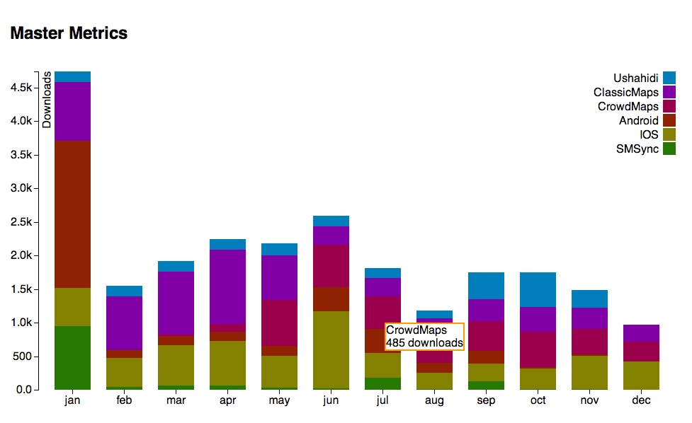
Code: https://github.com/auremoser/ushaverse Demo: http://auremoser.github.io/ushaverse/
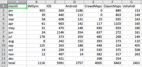
Here is what the data looked like:
What if I wanted to make it more dynamic/complex? I could try adapting it to this. Usually when I want to try something new, I search through Mike Bostock's blocks for inspiration.
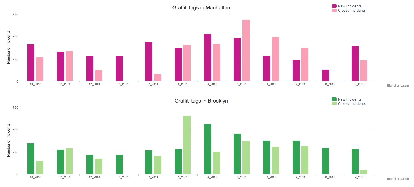
Graffiti Chart: http://auremoser.github.io/graphitiTime/
This project used a CSV to create small Bar Charts using HighCharts, from data about NYC cleanup rates for Graffiti 311 complaints.
Github Repo Here: https://github.com/auremoser/graphitiTime
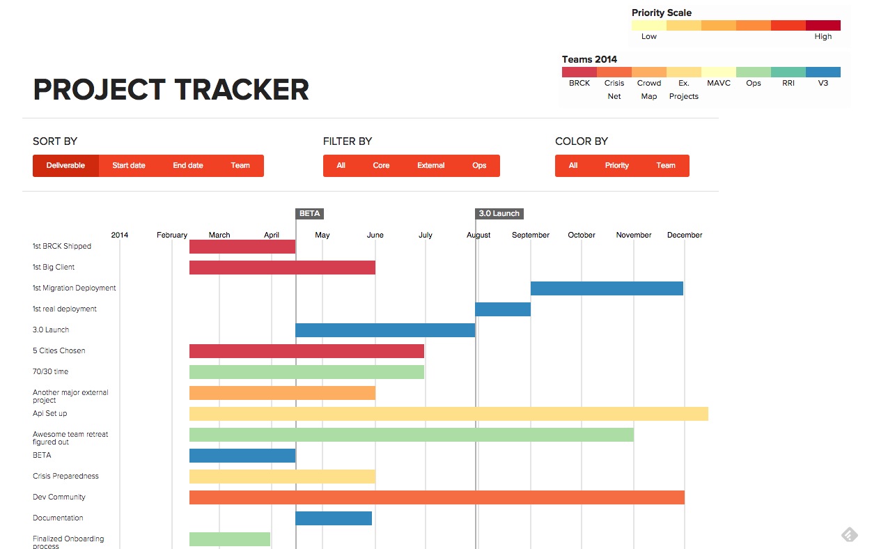
Project Tracker: <auremoser.github.io/pirateplotr/>
This project made project management data into a Gantt Chart using D3.js, a kind of timeseries graph updated every few minutes, using Google Sheets as a data store.
There are lots of ways you can approache a time-series visualization, and most libraries will have examples/demos that you can modify.
bl.ocks are also a fantastic resource for other examples and demos, so search through those to learn how code creates visualizations. Mike Bostock has some great examples.
Here are some other charts and graphs that you can take a look at, not specificially time-series, but temporal and chart-related:
| Type | Title | Link/Demo | BlogPost |
|---|---|---|---|
| Chart.js Bar Graph | Traffic Data | Aurelia's Block | |
| Highcharts | Sensor Data | Github / Demo | MOW Post |
| Highcharts | Weather Data | Aurelia's Block | Tutorial |
| Chart.js Line Graph | Tornado Data | Andrew's Block | |
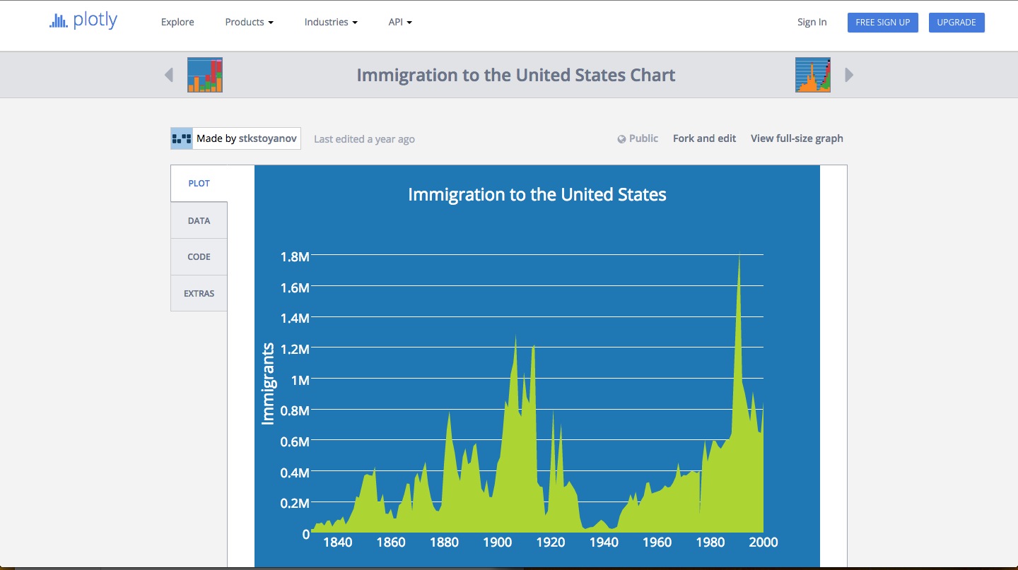
| Plot.ly | Earthquake Data | Plotly Tutorial | CartoDB Blog |
###Resources
