-
-
Save cdesante/4252133 to your computer and use it in GitHub Desktop.
| doInstall <- TRUE | |
| toInstall <- c("maps", "ggplot2") | |
| if(doInstall){install.packages(toInstall, repos = "http://cran.us.r-project.org")} | |
| lapply(toInstall, library, character.only = TRUE) | |
| library(ggplot2) | |
| library(maps) | |
| Prison <- read.csv("http://www.oberlin.edu/faculty/cdesante/assets/downloads/prison.csv") | |
| head(Prison) | |
| all_states <- map_data("state") | |
| all_states | |
| head(all_states) | |
| Prison$region <- Prison$stateName | |
| Total <- merge(all_states, Prison, by="region") | |
| head(Total) | |
| Total <- Total[Total$region!="district of columbia",] | |
| p <- ggplot() | |
| p <- p + geom_polygon(data=Total, aes(x=long, y=lat, group = group, fill=Total$bwRatio),colour="white" | |
| ) + scale_fill_continuous(low = "thistle2", high = "darkred", guide="colorbar") | |
| P1 <- p + theme_bw() + labs(fill = "Black to White Incarceration Rates \n Weighted by Relative Population" | |
| ,title = "State Incarceration Rates by Race, 2010", x="", y="") | |
| P1 + scale_y_continuous(breaks=c()) + scale_x_continuous(breaks=c()) + theme(panel.border = element_blank()) |
Great!
Thanks!
Thank you!Really nice example. I would suggest that first remove the 'district of columbia' and later merge the data. Remove after merging in some datasets give some anomalies to the visualization.
I had to make a few tweaks to my code to get this to work. (I also forked this gist to show my new code.)
For example, instead of:
Total <- merge(all_states, Prison, by="region")
I had to do:
Total <- merge(all_states, Prison, all=TRUE)
However, after doing that, my map had a bunch of lines running through it. To fix it, I found the following to be helpful (tweaked from http://stackoverflow.com/questions/23714052/ggplot-mapping-us-counties-problems-with-visualization-shapes-in-r):
*****************
loading packages
*****************
for maps
library(maps)
help(package="maps") #help files if needed
for plotting data
library(ggplot2)
help(package="ggplot2") #help files if needed
this package loads tables faster than merge
library(data.table)
help(package="data.table") #if you need help with the package later
to get fancy colors for graphing
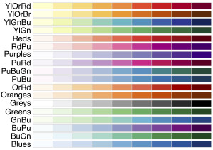
can see some color palettes here: http://moderndata.plot.ly/wp-content/uploads/2015/04/seq-300x211.jpg
library(RColorBrewer)
help(package="RColorBrewer") #if you need help with the package later
******************
Matching state map data frame to Prison data frame
********************
setting keys to match the two data frames (all_states and Prison)
all_states <- data.table(map_data('state'))
setkey(all_states,region)
Prison <- data.table(Prison)
setkey(Prison,stateName)
now merging the two data frames together based on those keys
map.df <- all_states[Prison]
*************************
now creating the state map
**************************
ggplot(map.df, aes(x=long, y=lat, group=group, fill=bwRatio)) +
scale_fill_gradientn("",colours=brewer.pal(9,"GnBu"))+
geom_polygon()+coord_map()+
labs(fill="Black to White Incarceration Rates \n Weighted by Relative Population",
title="State Incarceration Rates by Race, 2010",x="",y="")+theme_bw()
Amanda, where did you find the prison data?
@jmorten - I couldn't find the prison data - but I used the same code concept for some other data that I was working with. I only listed the code using the Prison data here to stay consistent with the original example.
It appears you can fix the "splintered map/random lines in the map" issue simply by ordering your variables by the "order" variable in all_states after your last merger.
I.e. just insert Total <- Total[order(Total$order),] before running the plotting functions. (see http://stackoverflow.com/questions/23714052/ggplot-mapping-us-counties-problems-with-visualization-shapes-in-r, last answer)
The main difference using the "all = TRUE" argument in the initial merger (Total <- merge(all_states, Prison, all=TRUE)) seems to be that if you DON'T set "all = TRUE" and you are missing data for single states they will be shown as opaque, whereas if you do set "all = TRUE" the states will be inserted but not colored.
Thanks @amandamasonsingh for the code revisions, pointing to the stackoverflow thread, and highlighting the "all = TRUE" issue!
Thanx for the write up. FYI, CSV file does not exist anymore. But I got what I was looking for.