#浏览器渲染
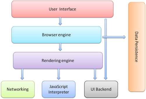
##浏览器组成
-
用户界面- 包括地址栏、后退/前进按钮、书签目录等,也就是你所看到的除了用来显示你所请求页面的主窗口之外的其他部分
-
浏览器引擎- 用来查询及操作渲染引擎的接口
-
渲染引擎- 用来显示请求的内容,例如,如果请求内容为html,它负责解析html及css,并将解析后的结果显示出来
| /** | |
| * The first commented line is your dabblet’s title | |
| */ | |
| .shine{ | |
| height:100px; | |
| width:100px; | |
| background: #f06; | |
| background: linear-gradient(45deg, #f06, yellow); | |
| min-height: 10 |
| (function(window, document, undefined){ | |
| })(this, document) | |
| //anything apart from window and document get passed into it will be treated as undefined; | |
| //this could forbidden the undefined asserssments error |
| var someDate = new Date(); | |
| var numberOfDaysToAdd = 6; | |
| someDate.setDate(someDate.getDate() + numberOfDaysToAdd); |
| /* | |
| Base.js, version 1.1a | |
| Copyright 2006-2010, Dean Edwards | |
| License: http://www.opensource.org/licenses/mit-license.php | |
| */ | |
| var Base = function() { | |
| // dummy | |
| }; |
#浏览器渲染
##浏览器组成
用户界面- 包括地址栏、后退/前进按钮、书签目录等,也就是你所看到的除了用来显示你所请求页面的主窗口之外的其他部分
浏览器引擎- 用来查询及操作渲染引擎的接口
渲染引擎- 用来显示请求的内容,例如,如果请求内容为html,它负责解析html及css,并将解析后的结果显示出来
#Browser Internal
##浏览器组成
用户界面- 包括地址栏、后退/前进按钮、书签目录等,也就是你所看到的除了用来显示你所请求页面的主窗口之外的其他部分
浏览器引擎- 用来查询及操作渲染引擎的接口
渲染引擎- 用来显示请求的内容,例如,如果请求内容为html,它负责解析html及css,并将解析后的结果显示出来
####本文编译自Rendering: repaint, reflow/relayout, restyle 所有权利保留为原作者所有
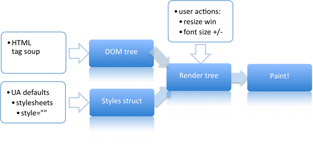
##渲染: 重绘,回流/重布局,重设样式 ###渲染过程
不同的浏览器实现不同,但下面图表所示过程基本都足以表示各个浏览器一旦下载完毕代码,接下来做了些什么。
###device Pixel & CSS Pixel
物理像素指显示设备上的物理像素点,比如HTC G11宽是480px,这的480是用物理像素衡量的。 CSS像素的话则指我们写页面时理解的那个像素单位。可以理解为是设备自己做了一层缩放,让2个物理像素代表一个我们css里说的像素,也就是dp(设备独立像素)的概念。行业内有个约定俗成的规范,即一般这个数值是320。 有的很高密度的手机略作了调整。
想知道设备的物理像素的话,一般去取 screen.width 就可以。
但苹果只会给你dp的数值,也就是320。这个时候就得用实际上的虚拟像素数(即dp个数)乘以设备像素和css像素的比值计算出来设备像素值。
screen.width * devicePiexlRation
| (function () { | |
| var a = window.a = { | |
| name : 'a' | |
| }; | |
| var aStr = window.aStr = 'stringA'; | |
| window.a.name = 'b'; | |
| window.aStr = 'stringB'; | |