After implementing Sugar & James' jump method and exploring its application to Fisher's iris data in Part One of this series, we're now ready to apply the jumps-in-distortions test to some other sample data sets. Pure Clojure source here.
Remember these functions from earlier? We'll be using them again.
(defn assoc-distortions
  "Given a number `transformation-power-y` and a seq of maps
  `clusterers`, where each map describes a k-means clusterer, return a
  seq of maps describing the same clusterers, now with key :distortion
  mapped to the value of the cluster analysis' squared error raised to
  the negative `transformation-power-y`.

  Based on Sugar & James' paper at
  http://www-bcf.usc.edu/~gareth/research/ratedist.pdf which defines
  distortion (denoted d[hat][sub k]) for a given k as the mean squared error when covariance
  is the identity matrix. This distortion is then transformed by
  raising it to the negative of the transformation power y, which is
  generally set to the number of attributes divided by two."
  [clusterers transformation-power-y]
  (map #(assoc % :distortion (Math/pow (:squared-error %) (- transformation-power-y)))
       clusterers))

(defn assoc-jumps
  "Given a seq of maps `clusterers` each describing a k-means analysis
  including the transformed :distortion of that analysis, returns a
  sequence of maps 'updated' with the calculated jumps in transformed
  distortions.

  Based on Sugar & James' paper at
  http://www-bcf.usc.edu/~gareth/research/ratedist.pdf which defines
  the jump for a given k (denoted J[sub k]) as simply the transformed distortion for k
  minus the transformed distortion for k-1."
  [clusterers]
  (map (fn [[a b]] (assoc b :jump (- (:distortion b) (:distortion a))))
(partition 2 1 (conj clusterers {:distortion 0}))))First, let's see what happens when we run k-means on what should be a single point, and compare Sugar & James' method to other approaches. Per section 3.1 of the paper, we create a single Gaussian distribution of 300 points and p=5, that is, a normal distribution, centered in one spot, with 5 attributes:
(def one-gaussian
  (apply map vector (repeatedly 5 #(incs/sample-normal 300 :mean 1 :sd 1))))

(take 3 one-gaussian)

=> ([2.1894611555080523 1.6394161877889428 1.3582374448871808 -0.08095121743438449 0.6793043945998889]
    [2.1428990110400745 -0.6523728676023808 0.4293267826072493 -0.3003276635383867 -0.06746710573797632]
    [0.7918462457252511 0.9044823208334045 1.3989112216400152 1.5277502151287292 0.7346989459617229])
Again we perform PCA so we can graph our 5-dimensional data onto a coordinate graph. Note that this time I elide the definitions of pc1 and pc2, and (let) rather than (def) the X-matrix and components. Intermediary values should be trimmed wherever possible to conserve mental resources and clarify scope.
(let [X-g (i/sel (i/to-matrix (i/to-dataset one-gaussian)) :cols (range 5))
      components-g (:rotation (incs/principal-components X-g))]
  (i/view (incc/scatter-plot (i/mmult X-g (i/sel components-g :cols 0))
                             (i/mmult X-g (i/sel components-g :cols 1))
                             :x-label "PC1"
                             :y-label "PC2"
                             :title "Single-Gaussian PCA")))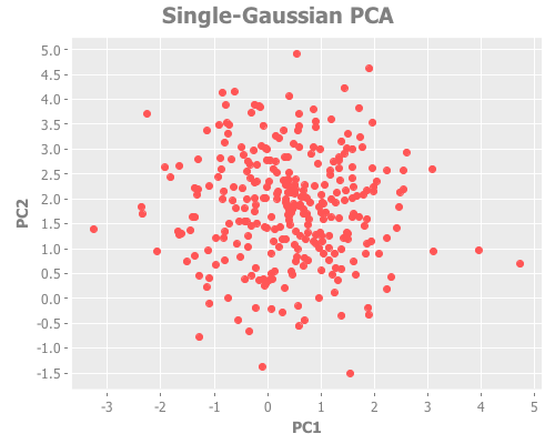
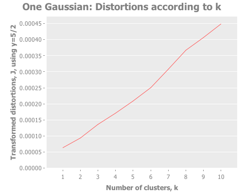
Looks good. Let's take a look at the squared error and the distortions. This will correspond roughly to Figure 2ai and 2aii in the paper.
(let [clusterers (map #(mlc/clusterer-info
                        (doto (mlc/make-clusterer :k-means {:number-clusters %})
                          (.buildClusterer (mld/make-dataset "One Gaussian"
                                                             [:a :b :c :d :e]
                                                             one-gaussian))))
                      (range 1 11))
      y 5/2
      clusterer-distortions (assoc-distortions clusterers y)]
  (i/view (incc/line-chart (map :number-clusters clusterer-distortions)
                           (map :squared-error clusterer-distortions)
                           :title "One Gaussian: Distortions according to k [Figure 2ai]"
                           :x-label "Number of clusters, k"
                           :y-label "Distortions"))
  (i/view (incc/line-chart (map :number-clusters clusterer-distortions)
                           (map :distortion clusterer-distortions)
                           :title "One Gaussian: Transformed distortions according to k [Figure 2aii]"
                           :x-label "Number of clusters, k"
                           :y-label "Transformed distortions (using y=" y ")")))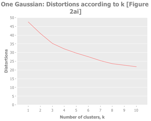
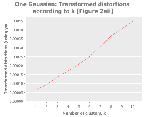
Notice how, even when we don't have any real clusters, we get a steady decrease in the distortion and transformed distortion as we increase k. Therefore we can't take a simple decrease in these metrics as indication that k+1 is any better than k. Further, the elbow method doesn't have much to say. Is that an elbow at k=3, or k=8? It's only a few degrees more obtuse than when we have clear instances of clustering. These facts reinforce Sugar & James' thesis that those are the wrong measurements. So, obvious question, what do the jumps look like for this one-clustered data? I could rewrite half the (let) I just wrote to graph the jumps too, but charting the jumps and distortions is something we're going to do a lot, so I made a function to avoid repeating myself.
First, a few helper functions. I just want to avoid writing [:a :b :c...] over and over.
(def abc-keys
  "Returns a function that, given integer `n`, returns a seq of
  alphabetic keys. Only valid for n<=26."
  (let [ls (mapv (comp keyword str) "abcdefghikjlmnopqrstuvwxyz")]
    (fn [n] (take n ls))))
...and let's make a function for when we need to build a clusterer for each of a bunch of potential choices of K. We'll be doing that a lot. First, for reasons I'll explain later, we need to handle a new parameter that tells WEKA how to initialize the cluster centroids. For that, we'll need a decoder ring:
(def init-codes
  {:random 0
   :k-means++ 1
   :canopy 2
   :farthest-first 3})
...and a function that uses that decoder ring to build a clusterer:
(defn clusterer-over-k
  "Returns a k-means clusterer built over the `dataset` (which we call
  `ds-name`), using `k` number of clusters."
  [dataset ds-name k init-method]
  (mlc/clusterer-info
   (doto (mlc/make-clusterer :k-means
                             {:number-clusters k
                              :initialization-method (init-codes init-method)})
     (.buildClusterer (mld/make-dataset ds-name
                                        (abc-keys (count (first dataset)))
                                        dataset)))))
...and a function to build a bunch of clusterers all at once:
(defn clusterers-over-ks
  "Returns a seq of k-means clusterer objects that have been built on
  the given `dataset` that we call `ds-name`, where for each k in
  0<k<`max-k` one clusterer attempts to fit that number of clusters to
  the data. Optionally takes a map of `options` according to clj-ml's
  `make-clusterer`."
  [dataset ds-name max-k init-method]
  (map #(clusterer-over-k dataset ds-name % init-method)
       (range 1 (inc max-k))))
...finally, with those in our utility belt, we can write a function that graphs our cluster attempts over a range of k choices. This function is a bit more verbose and parameter-laden than I might write in a production context, but for pedagogical purposes in this series it's the right tool.
(defn graph-k-analysis
  "Performs cluster analyses using k=1 to max-k, graphs a selection of
  comparisons between those choices of k, and returns a JFree chart
  object. Requires the `dataset` as a vector of vectors, the name of
  the data set `ds-name`, the greatest k desired for analysis `max-k`,
  the transformation power to use `y`, the desired initial centroid
  placement method `init-method` as a keyword from the set
  #{:random :k-means++ :canopy :farthest-first}, and a vector of keys
  describing the `analyses` desired, which must be among the set
  #{:squared-errors, :distortions, :jumps}."
  [dataset ds-name max-k y init-method analyses]
  {:pre (seq (init-codes init-method))}
  (let [clusterers (clusterers-over-ks dataset ds-name max-k init-method)
        clusterer-distortions (assoc-distortions clusterers y)]
    (when (some #{:squared-errors} analyses)
      (i/view (incc/line-chart (map :number-clusters clusterers)
                               (map :squared-error clusterers)
                               :title (str ds-name ": SSE according to selection of k")
                               :x-label "Number of clusters, k"
                               :y-label "Within-cluster sum of squared errors")))
    (when (some #{:distortions} analyses)
      (i/view (incc/line-chart (map :number-clusters clusterer-distortions)
                               (map :distortion clusterer-distortions)
                               :title (str ds-name ": Distortions according to k")
                               :x-label "Number of clusters, k"
                               :y-label (str "Transformed distortions, J, using y=" y))))
    (when (some #{:jumps} analyses)
      (i/view (incc/line-chart (map :number-clusters (assoc-jumps clusterer-distortions))
                               (map :jump (assoc-jumps clusterer-distortions))
                               :title (str ds-name ": Jumps according to k")
                               :x-label "Number of clusters, k"
                               :y-label (str "Jumps in transformed distortions, J, using y=" y))))))
We always want some combination of the same analyses: the sums of squared errors, the transformed distortions, or the jumps. So this function I just defined delivers those in a concise calling form. (Don't worry about the initialization-method parameter for now. We'll explore it later.) Let's give it a shot. COMPUTER! Chart me all the analytic methods we've used so far on the one-gaussian data set!
(graph-k-analysis one-gaussian "One Gaussian" 10 (/ 5 2)
                  :random [:squared-errors :distortions :jumps])
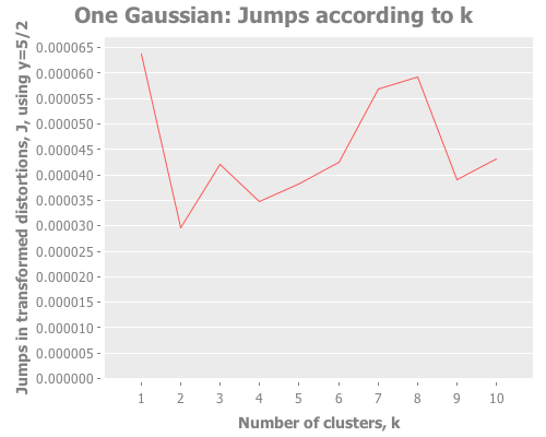
The computer is obedient. And how interesting that third graph is! The squared errors and distortions are basically straight lines, difficult to interpret anything from. But the jump graph is all over the place! A peak here! A maximum there! A sub-peak yonder! We have a lot more to work with.
So, every time we evaluate one-gaussian we get a different distribution, with the attendant random sub-groupings of points. But for several def's of one-gaussian I get a maximum jump at k=1. Every few runs, we see k=1 lose to another value of k. For instance, here in this run we see a strong second and third place showing by k=8 and k=7. This should remind us of the perils of trusting a single test run, especially with random data. We'll come back to this idea later. For the moment, how does the jump metric fare against more than one gaussian distribution?
Let's now create a sample data set with six Gaussian distributions, arbitrarily located in the xy plane. This will correspond to Figure 2 in Sugar & James.
(defn gaussian-point
  [[x y] sd]
  [(incs/sample-normal 1 :mean x :sd sd)
   (incs/sample-normal 1 :mean y :sd sd)])

(def coordinates [[-3 3] [-2 -2] [-1 0] [1 1] [2 -1] [3 -3]])

(def six-gaussians
  (mapcat (fn [coords] (repeatedly 25 #(gaussian-point coords 0.1)))
          coordinates))

(take 3 six-gaussians)
=> ([-3.0517221511333528 3.030792042166119]
    [-2.9584570012966935 3.089599219985786]
    [-2.732994394168219 2.9510381832549224])

(i/view (incc/scatter-plot (map first six-gaussians)
                           (map second six-gaussians)
                           :title "Six Gaussians"))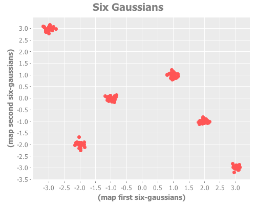
The distortion and jump analysis of this sample data correspond to Figures 2bi and 2bii, respectively.
(graph-k-analysis six-gaussians "Six Gaussians" 10 1 :random
                  [:distortions :jumps])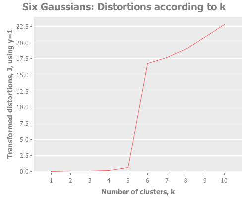
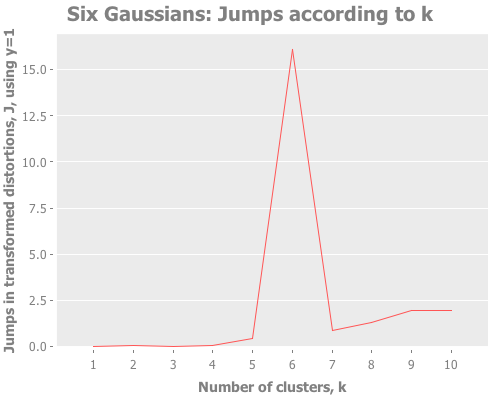
As clearly as could ever be asked for, we see a sharp slope in the distortions and a clear spike in the jumps, both at k=6. Sugar & James explain this behavior on page 7 of their paper:
Intuitively this jump occurs because of the sharp increase in performance that results from not having to summarize two disparate groups using the same representative. Adding subsequent cluster centers reduces the within group rather than the between group distortion and thus has a smaller impact.
In German: sehr gut! This is the kind of spectacular result the jump method can give us. If a particular k outperforms the rest, there will be absolutely no mistake about it.
Let's now switch back to real-world data sets; I grow weary of contrived Gaussian distributions.
The Wisconsin breast cancer data set (Wolberg and Mangasarian, 1990)...consists of measurements of nine variables for each of 683 patients. Biopsies for 444 of these patients were benign, while those of the remaining 239 were malignant.
This is a great real-data test of a clustering algorithm, because there are clearly two classes that are at least fairly well-differentiated.
This breast cancer data was obtained from the University of Wisconsin Hospitals, Madison from Dr. William H. Wolberg. Citation: O. L. Mangasarian and W. H. Wolberg: "Cancer diagnosis via linear programming", SIAM News, Volume 23, Number 5, September 1990, pp 1 & 18. Via Lichman, M. (2013). From UCI Machine Learning Repository. Irvine, CA: University of California, School of Information and Computer Science. Specifically, the raw data was acquired via the project page.
We now need to excise all rows with missing attributes ("?") to get the same number of rows (683) that Sugar & James used. See part 8 of breast-cancer-wisconsin.names.
(def wbcd (->> "data/breast-cancer-wisconsin-no-missing-attributes.data"
               slurp
               s/split-lines
               (map #(s/split % #","))
               i/to-dataset
               i/to-matrix))
Step one of getting a handle on a data set: if possible, just look at some simple version of it. Ergo, graph the principal components:
(defn graph-pca
  "Given `data` as a matrix, a seq containing indices of data columns
  in the data `cols`, and optionally the index of the class attribute
  `class-idx`, this function graphs the first principal component of
  the data on the x-axis, the second PCA on the y-axis, and groups the
  data points by class."
  ([data cols]
   (let [attrs (i/sel data :cols cols)
         components (:rotation (incs/principal-components attrs))]
     (i/view (incc/scatter-plot (i/mmult attrs (i/sel components :cols 0))
                                (i/mmult attrs (i/sel components :cols 1))
                                :x-label "PC1"
                                :y-label "PC2"))))
  ([data cols class-idx]
   (let [attrs (i/sel data :cols cols)
         components (:rotation (incs/principal-components attrs))]
     (i/view (incc/scatter-plot (i/mmult attrs (i/sel components :cols 0))
                                (i/mmult attrs (i/sel components :cols 1))
                                :group-by (i/sel data :cols class-idx)
                                :x-label "PC1"
                                :y-label "PC2")))))

(graph-pca wbcd (range 1 10) 10)
So that's the data. Notice the red outliers deep in the field of blue, but also how the red cluster is fairly tightly grouped.
Next, let's point some k-means at that bad boy. Sugar & James use Y=1, for which I did not get the same results:
(graph-k-analysis (i/to-vect (i/sel wbcd :cols (range 1 10)))
                  "Wisconsin Breast Cancer Data Set" 10 1 :random [:jumps])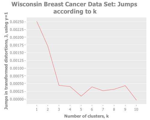
That gives me a strong maximum at k=1. But Y=1 is a strange choice to my mind, given that we have so many attributes, even though the data is not normally distributed and some of those attributes are correlated. For those reasons I tried Y=2, which more closely matches Sugar & James' results:
(graph-k-analysis (i/to-vect (i/sel wbcd :cols (range 1 10)))
                  "Wisconsin Breast Cancer Data Set [Figure 5d]"
                  10 2 :random [:jumps])
That jump graph is great, but I'd like to see what those clusters look like.
(let [data (i/to-vect wbcd)
      x-matrix (i/sel wbcd :cols (range 1 10))
      k-means-clusterer (doto (mlc/make-clusterer :k-means
                                                  {:number-clusters 2
                                                   :random-seed (rand-int 1000)
                                                   :preserve-instances-order true})
                          (.buildClusterer (mld/make-dataset "Cluster Visualization"
                                                             (abc-keys (count (first data))) data)))
      data-clustered (map conj data (.getAssignments k-means-clusterer))
      data-components (:rotation (incs/principal-components x-matrix))]
  (i/view (incc/scatter-plot (i/mmult x-matrix (i/sel data-components :cols 0))
                             (i/mmult x-matrix (i/sel data-components :cols 1))
                             :group-by (map last data-clustered)
                             :x-label "PCA-1"
                             :y-label "PCA-2"
                             :title "Clusters in Breast Cancer Data")))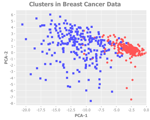
By actually graphing the clusters, it's clear that some (but not all) of what appear in our graph using PCA to be outliers are correctly grouped. Cool.
My concern at my results not matching the paper is allayed by the knowledge that initial centroid placement affects final results significantly. But still, if I were ignorant of the true classes, I'd want to explore some other values of Y.
Trying Y=3 shows two strong peaks at k=2 and k=9:
(graph-k-analysis (i/to-vect (i/sel wbcd :cols (range 1 10)))
                  "Wisconsin Breast Cancer Data Set [Figure 5d]"
                  10 3 :random [:jumps])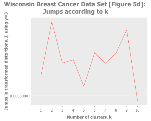
Trying Y=4 gives a basically flat jump graph:
(graph-k-analysis (i/to-vect (i/sel wbcd :cols (range 1 10)))
                  "Wisconsin Breast Cancer Data Set [Figure 5d]"
                  10 4 :random [:jumps])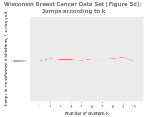
Apparently this is the limit of choosing Y with the jump method when handling non-normal data. (Recall that one should choose a lesser Y in proportion to the non-normality of the data.)
Taken in aggregate, pretending ignorance, these results across Y=1,2,3,4 would suggest to me either no clustering at all, or that k=2, or perhaps (but less likely) that k was relatively large, e.g. 9. Schön.
Let's try another real-life sample data set:
The data concerns city-cycle fuel consumption in miles per gallon, to be predicted in terms of 3 multivalued discrete and 5 continuous attributes.
(Quinlan, 1993)
As Sugar & James state:
The auto data provide a good example of a situation in which the number of groups is possibly large and not known a priori.
So where the breast cancer data gives us a data set good to see if the jump method can confirm the k we know, this auto data set is good to try out the jump method in an exploratory mode, which is quite common in application.
First, credit where credit is due. Citation: Lichman, M. (2013). UCI Machine Learning Repository. Irvine, CA: University of California, School of Information and Computer Science.
Second, links so you can replicate my process: Project page. Raw data. For a description of the data, see auto-mpg.names
Third, I <3 data cleanup!
(def auto-mpg (->> "data/auto-mpg.data"
                   slurp
                   s/split-lines
                   (map #(s/split % #"[\t]"))
                   (map #(apply conj (vector (remove empty? (s/split (first %) #" "))
                                             (s/replace (second %) "\"" ""))))))
...let's grab a random sample:
(rand-nth auto-mpg)
=> ("honda accord" "36.0" "4" "107.0" "75.00" "2205." "14.5" "82" "3")
...and see how this high-dimensional data looks:
(graph-pca (i/to-matrix (i/to-dataset auto-mpg)) (range 9))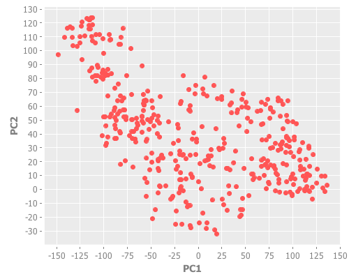
A visual skim of the dimensionality-reduced data suggests several apparent clusters. It turns out that this, not the original high-dimensionality data set, is the form that Sugar & James performed cluster analysis on:
Because of high correlations between some variables, the actual clustering on the auto data was performed on a two-dimensional data set formed using principal components.
So, let's follow their path:
(def auto-mpg-pca
  (let [attrs      (i/sel (i/to-matrix (i/to-dataset auto-mpg))
                          :cols (range 9))
        components (:rotation (incs/principal-components attrs))]
    (map #(conj [%1 %2])
         (i/mmult attrs (i/sel components :cols 0))
         (i/mmult attrs (i/sel components :cols 1)))))

(graph-k-analysis auto-mpg-pca "Auto MPG Data Set [Figure 5e]"
                  10 (/ 2 3) :random [:squared-errors :jumps])
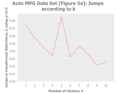
The elbow method is tough to read here: k=2, or 3, or 5? But the jump graph clearly asserts k=5, with k=1 in second place. (This is a far cry from Sugar & James' figure 5e, which asserts k=8.) Using y=1 diminishes k=1 substantially:
(graph-k-analysis auto-mpg-pca "Auto MPG Data Set [Figure 5e]" 10 1 :random [:jumps])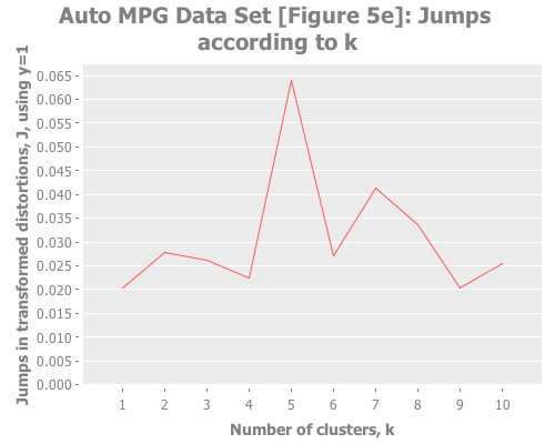
So, our results are clearly divergent from the paper, but what remains clear is the enormous power of the jump method on a wider variety of real data sets.
That's all for now. In our next episode, we'll throw the jump method some clustering curveballs, which will lead us to more complex analysis. Stay tuned.
See Part Three.