|
module powerbi.extensibility.visual { |
|
|
|
export interface CategoryViewModel { |
|
value: string; |
|
identity: string; |
|
} |
|
|
|
export interface ValueViewModel { |
|
values: any[]; |
|
} |
|
|
|
export interface ViewModel { |
|
categories: CategoryViewModel[]; |
|
values: ValueViewModel[]; |
|
} |
|
|
|
export class Visual implements IVisual { |
|
|
|
public static converter(dataView: DataView): ViewModel { |
|
var viewModel: ViewModel = { |
|
categories: [], |
|
values: [] |
|
} |
|
if (dataView) { |
|
var categorical = dataView.categorical; |
|
if (categorical) { |
|
var categories = categorical.categories; |
|
var series = categorical.values; |
|
var formatString = dataView.metadata.columns[0].format; |
|
|
|
if (categories && series && categories.length > 0 && series.length > 0) { |
|
for (var i = 0, catLength = categories[0].values.length; i < catLength; i++) { |
|
viewModel.categories.push({ |
|
value: categories[0].values[i], |
|
identity: '' |
|
}) |
|
|
|
for (var k = 0, seriesLength = series.length; k < seriesLength; k++) { |
|
var value = series[k].values[i]; |
|
if (k == 0) { |
|
viewModel.values.push({ values: [] }); |
|
} |
|
viewModel.values[i].values.push(value); |
|
} |
|
} |
|
} |
|
} |
|
} |
|
|
|
return viewModel; |
|
} |
|
|
|
private target: HTMLElement; |
|
private updateCount: number; |
|
private svg: d3.Selection<SVGAElement>; |
|
private group: d3.Selection<SVGAElement>; |
|
private xAxis: d3.Selection<SVGAElement>; |
|
private yAxis: d3.Selection<SVGAElement>; |
|
|
|
constructor(options: VisualConstructorOptions) { |
|
console.log('Visual constructor', options); |
|
this.target = options.element; |
|
|
|
var svg = this.svg = d3.select(this.target) |
|
.append("svg") |
|
.attr("class", "tutorial-svg"); |
|
|
|
var group = this.group = svg.append("g") |
|
.attr("class", "tutorial-g"); |
|
|
|
var xAxis = this.xAxis = svg.append("g") |
|
.attr("class", "x axis"); |
|
|
|
var yAxis = this.yAxis = svg.append("g") |
|
.attr("class", "y axis"); |
|
} |
|
|
|
public update(options: VisualUpdateOptions) { |
|
console.log('Visual update', options); |
|
|
|
var dataViews = options.dataViews; |
|
if (!dataViews) return; |
|
|
|
var viewModel = Visual.converter(dataViews[0]); |
|
console.log(viewModel); |
|
|
|
var data = []; |
|
for(var i in viewModel.categories){ |
|
var dataPoint = { |
|
cat: viewModel.categories[i].value, |
|
val:viewModel.values[i].values[0] |
|
}; |
|
data.push(dataPoint); |
|
} |
|
|
|
var margin = {top: 20, right: 20, bottom: 30, left: 40}; |
|
var width = options.viewport.width - margin.left - margin.right; |
|
var height = options.viewport.height - margin.top - margin.bottom; |
|
|
|
var x = d3.scale.ordinal() |
|
.domain(data.map(function(d) { return d.cat; })) |
|
.rangeRoundBands([0, width], .1); |
|
|
|
var y = d3.scale.linear() |
|
.domain([0, d3.max(data, function(d) { return d.val; })]) |
|
.range([height, 0]); |
|
|
|
var xAxis = d3.svg.axis() |
|
.scale(x) |
|
.orient("bottom"); |
|
|
|
var yAxis = d3.svg.axis() |
|
.scale(y) |
|
.orient("left") |
|
.ticks(height / 50) |
|
.tickFormat(d3.format(".0s")); |
|
|
|
var svg = this.svg; |
|
var group = this.group; |
|
|
|
svg.attr("width", width + margin.left + margin.right) |
|
.attr("height", height + margin.top + margin.bottom); |
|
|
|
group |
|
.attr("transform", "translate(" + margin.left + "," + margin.top + ")"); |
|
|
|
var yAxisLabel = this.yAxis |
|
.attr("transform", "translate(" + margin.left + ",0)") |
|
.call(yAxis); |
|
|
|
var xAxisLabel = this.xAxis |
|
.attr("transform", "translate(" + margin.left + "," + height + ")") |
|
.call(xAxis); |
|
|
|
var bar = svg.selectAll(".bar") |
|
.data(data); |
|
|
|
bar.enter().append("rect") |
|
.attr("class", "bar") |
|
.attr("x", function(d) { console.log(d.cat); return x(d.cat);}) |
|
.attr("width", x.rangeBand()) |
|
.attr("y", function(d) { return y(d.val);}) |
|
.attr("height", function(d) { return height-y(d.val);}) |
|
.attr("transform", "translate(" + margin.left + ",0)"); |
|
|
|
bar.transition() |
|
.duration(2) |
|
.attr("x", function(d) { console.log(d.cat); return x(d.cat);}) |
|
.attr("width", x.rangeBand()) |
|
.attr("y", function(d) { return y(d.val);}) |
|
.attr("height", function(d) { return height-y(d.val);}); |
|
|
|
bar.exit() |
|
.transition() |
|
.duration(2) |
|
.remove(); |
|
} |
|
|
|
public destroy(): void { |
|
this.svg.remove(); |
|
} |
|
} |
|
} |
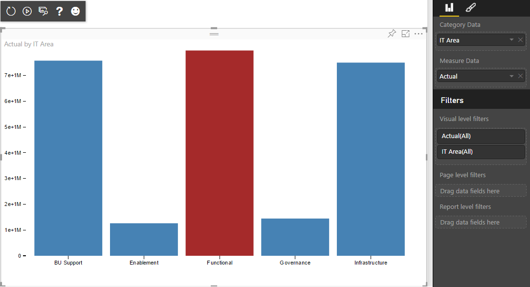
Hello, Is it possible to show several barcharts in a single powerbi custom visual?
I've a requirement that must show several bar graphs in the same visual custom, they are metrics connected to each other.
For example:
Chart A --> Chart B
|
Chart D --> Chart E --> Chart Z
Please let me know your comments. Thank You.