- Describe the benefits of using responsive design
- Describe what it means to go mobile first
- Explain the difference between a responsive website and a mobile-specific website
- Describe how to test responsive layouts while developing
- Use media queries to target viewport sizes
- Explain what the grid system in Bootstrap is and how it works
- Describe the differences when designing for larger screens
- Using responsive images
- Understand the difference between SVG and PNG
- Describe some common responsive design patterns
Responsive web designs adapt their layout according to the screen size of the viewer's device.
To support the huge plethora of screen sizes available today. Every screen size imaginable exists, from large TV/projectors to smart watches.
Start with a mobile optimized website with the most important content/features, then build a more fully featured desktop version on top of that.
Mobile first forces us to focus content and creates a faster experience for mobile users because we are assuming the user is on a mobile phone when we build and not a desktop.

In early 2014, mobile internet usage surpassed PC internet usage for the first time. Most of this is traffic from apps, but easily shows how important designing for mobile is.
Earlier this year (2015), Google stopped displaying websites that are not mobile friendly in mobile search results.
In the US:
- 94% of users search for local information on their phones. Nearby restaurants, directions, etc.
- 77% of all mobile searches are done at home, where the user also has access to their PC
- Figure out the main objectives for the site and make it easy for them to accomplish these objectives
- Use a responsive web design that lays out content optimized for the current screen size
- If the user has to pinch/zoom to view content, then it's not considered mobile friendly
- Keep users in one browser window, it can often be difficult to navigate back
- Even better, keep them on the same page and minimize full page loads when possible
- Do not use fixed width elements
Use google's mobile friendly tester
While developing, most browser's include a mobile phone emulator, this is the quickest way.
OSX also comes with a built in iphone emulator that is more accurate
You can also use safari web browser and plug your iphone into your computer an debug it on your phone from your computer.
More Info: http://phonegap-tips.com/articles/debugging-ios-phonegap-apps-with-safaris-web-inspector.html
Responsive Web Design
Automatically adapts and adjusts itself to the available viewing area
PROS
- One website and codebase for multiple devices - easier to maintain
- One website url, no redirects to something like m.facebook.com
- Lower cost of development - 1 website instead of 2
CONS
- You're trying to optimize the UX for two very different platforms
- Some older devices and browsers won't present the design as you'd expect
Mobile Specific Website
PROS
- User experience is optimized for both platforms. Fully takes into consideration the benefits and downsides of each platform
- Speed - No downloading any unneccessary code, page will load faster
CONS
- Cost - More expensive to maintain two sites
- Multiple URL's. User has to know both URL's or more likely have to wait for a redirect which will delay the process a couple of seconds
The meta viewport tag gives the browser instructions on how to control the page's dimensions and scaling
<meta name="viewport" content="width=device-width, initial-scale=1">width=device-width Mobile browsers will by default render the site at a desktop screen width and then try to make that content look better by increasing font sizes and scaling the content. This setting instructs the browser to set the width to the actual device width and reflow content according to the actual screen size.
initial-scale=1 When changing the orientation of the device, mobile browsers will keep the page width constant and zoom into the content. This attribute instructs the browser to use a 1:1 relationship between CSS pixels and device pixels regardless of orientation.
https://gist.github.com/mdang/3ecbf57445fbb2ad9020
Don't use fixed widths
Media queries are filters that can be applied to CSS styles. They make it easy to change styles based on physical characteristics of the device, like display type, width, height, orientation.
<link rel="stylesheet" href="print.css" media="print">@media print {
/* print style sheets go here */
}@media (query) {
/* CSS Rules used when query matches */
}| Attribute | Example |
|---|---|
| min-width | min-width: 640px |
| max-width | max-width: 640px |
| min-height | min-height: 1000px |
| max-height | max-height: 1000px |
| orientation | e.g. (orientation: portrait), (orientation: landscape) |
<link rel="stylesheet" media="(max-width: 640px)" href="max-640px.css">
<link rel="stylesheet" media="(min-width: 640px)" href="min-640px.css">
<link rel="stylesheet" media="(orientation: portrait)" href="portrait.css">
<link rel="stylesheet" media="(orientation: landscape)" href="landscape.css">
<style>
  @media (min-width: 500px) and (max-width: 600px) {
    h1 {
      color: blue;
    }
  }
</style>Bootstrap is a web framework we use to make creating responsive websites easier.
It also makes our web pages look nicer with premade stylesheets & widgets we can use as necessary.
All we need to do is add the classnames!
Bootstrap allows us to make changes to our layout much faster than what it would take if we did it from scratch.
Many people know how to use bootstrap, so it also makes it easier for multiple people to work on the same project
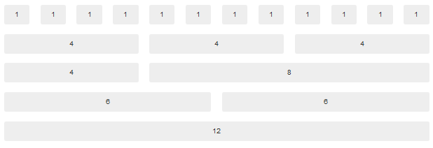
It's when we divide our web page into columns and row's, and then organize our build out content around that.
<!-- We start by giving our most parent container the class name 'container' -->
<div class="container">
<!-- We create a grid row by adding the classname 'row' to each div-->
	<div class="row">
	<!-- We define our columns in here using col-xs-* col-sm-* col-md-* col-lg-* -->

	</div>

	<div class="row">

	</div>
</div>
Class Exercise - 20min
Create a basic grid of your choice with bootstrap & change each box in the grid to it's own color.
[responsive_007 exercise]
#content img {
  max-width:600px;
  height:auto;
}
PictureFill - JavaScript that enables support for the
I Do - 10min Example of using responsive images
Using responsive video
I Do - 5 min
Responsive Web Design Patterns
Common techniques for achieving responsive layouts.
https://bradfrost.github.io/this-is-responsive/patterns.html
Class Exercise - 20min
Browse the repository of repsonsive web layouts and integrate responsive images in them