| title | published | tags | cover_image | description | ||||
|---|---|---|---|---|---|---|---|---|
Minimalistic nav menu wit Vue.js and GSAP - WotW |
false |
|
In this post, I show you the process I took to make an animated simple menu using Vue.js and Green Sock Animation Platform. |
Welcome to the Widget of the Week series, where I take gifs or videos of awesome UI/UX components, and bring them to life with code.
Today we are going to create a minimalistic navigation menu, that animates when hovering an option. The inspiration comes from this submission created by Zhenya Rynzhuk and looks like this:
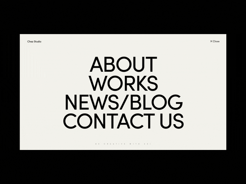
For today's widget, we will be using Vue.js, and for some animations, we'll use TweenMax.
If you want to follow along you can fork this codepen template that already has the dependencies.
The first thing I want to do with this component is to match the design. probably this will be the easiest part since there are no complicated graphics that will need SVG or icons.
Inside our app node, I will start by creating the markup for the menu. Since it is going to be a navigation menu we should use the semantically correct HTML nodes:
https://gist.github.com/f2f449a49309097a7591eb29857ecff9
I'm adding class="menu-item" to style the container and the items of the menu in the next step. Also id="app" will be used later to add functionality and animation with Vue.js.
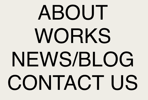
The menu is looking really ugly right now, let's change that:
https://gist.github.com/93027c984d1f78b6e24c07cb7caa858a
Now we should have something like this:
Let me explain the most crucial rules...
list-style: none;is helping to remove the bullets from the list.text-transform: uppercase;is useful when we don't want to explicitly "YELL" at users with screen readers, and we just want to show uppercase characters for design purposes.cursor: pointer;makes the mouse behave like each of the elements was a link.
Before getting into more details let's add Vue.js to the component to be able to render dynamically the menu items.
https://gist.github.com/6ff2b419d4907a95b0288ea45dedfe0e
I'm adding the elements as computed properties of a constant, instead of data inside my component because I need to bind them to my template, but they aren't going to change over time.
Now that we have the items as a list, and they are ready to be used as a computed property, we can simplify our template to render all menu items with a v-for:
https://gist.github.com/367e08c359b7ec96a7dcecd546c0cd81
Right now we should have the same elements, just bound to our Vue.js instance.
The menu animations in the reference can be broken down into two, the first one consists of moving the menu item to the left and the second one is the characters flipping over.
Let's start with the first one, moving the menu below the mouse cursor to the left. For that we will add a @mouseover event to the menu items that will trigger a function called selectedItem() that we haven't declared yet:
https://gist.github.com/af912638bf44c922bddedd5f8e2136e5
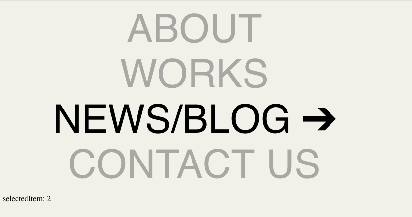
Now for the selectItem() method, we want to keep track of the hovered item so we will add inside the component data a selectedItem variable. This property will start at -1 for no item selected and will change it's value to the index of the selected button when hovered.
https://gist.github.com/fbdc166b5cf49dbcb2f2e5f8ac196840
To see the selectedItem changing you can add in your template the next line:
https://gist.github.com/9e7390fe24e9acaacf4a8d3109b716ce
Knowing which button is currently selected will let us add a class to "move" our button. To do this we can add a selected property to our computed menuItems like this:
https://gist.github.com/21164d513ffb7473eb22fe891c53eceb
and in the HTML make use of that new property:
https://gist.github.com/c6ff119f51b7b463f681049d54e4e199
Notice there are two class attributes, they concatenate instead of overriding each other. When "item.selected" is "true", that menu item will have both the "menu-item" and the "selected" classes.
Let's add the CSS class to handle the movement:
https://gist.github.com/97f9057b1765c029148effb7dd65d748
The transition attribute indicates that any change to that value should be animated.
We are almost done with this part, there's something missing tho. After moving our mouse outside all of the elements, the last one stays selected, and we don't want that. To fix that we can use the @mouseleave event:
https://gist.github.com/4feb5074f8d222c817ced4c97f94efd2
Before getting into the animation of the characters there are still a couple of details, there should be an arrow appearing for the selected item, and also non-selected items should be dimmed or semi-transparent.
Let's quickly add an arrow character to our menu items.
https://gist.github.com/ea9158d5658442c4975f1d3f445cc8e7
The arrow looks a little different from the reference since it is a regular ➔ character instead of a vector that matches exactly the design, but it is good enough for our purposes.
We want to hide all the arrows unless they are a child of a selected item, we can do this with CSS rules similar to what we did before with the selected items:
https://gist.github.com/a34120ab0b0e1594e986aa03fa8000bd
Now that the arrows appear and disappear, let's dim the unselected items. We can compute the dimmed items just as we did with the selected one:
https://gist.github.com/db67522c972fe5fa68ac9d4d9d1ed0f0
... add the .dimmed class to the items in our HTML:
https://gist.github.com/c868f8b7ee4ffbe56650cb85d4c47ad7
... and last but not least, create the .dimmed CSS rule:
https://gist.github.com/14a249df08374a190c2ed39ad58cbef1
We are getting closer to the final product.
Flipping each of the menu item characters is probably the most interesting and complicated part in this widget. We can't just flip over the whole menu, each one of the characters should be individually flipped over horizontally (scaleX: -1).
To be able to "control" each and every character we need to split the menu characters:
https://gist.github.com/91d9b1a9e94166ecf80477dfe87236f6
...with the chars property we can now render each character inside a <span> node:
https://gist.github.com/779040ff96e27a8a175bea450a097aae
Take note of the "ref" attribute, it will help us to "reference" all of those characters using the "index" of the menu item along with the "charIndex".
At this moment nothing should have changed visually, but we should have just separated the menu into characters.
We will add a couple of constants that will help us to read better the next part of our code
https://gist.github.com/3b91ea3dfa75bd0ed13ad2b122fbb775
After that, whenever the selectedItem changes, we want to start animating correctly all of the characters. We will loop through each menuItem and depending on if they're selected or not we will flip them LEFT or RIGHT:
https://gist.github.com/e01d684f2c314f7c6448fb4e6220df98
The animateChars() method is not declared yet, but now it shouldn't be hard to create since we have the index of the item, the number of characters that the item has and the direction to flip the letters:
https://gist.github.com/4bea74d39e95ed59e847fd427e71e0d0
In this method we are basically getting the reference for each of the characters, killing the animation the currently have (if any) and then flipping the character to the direction we previously calculated.
It seems that everything should be looking just like the reference, but it doesn't 😰.
If we look into the console we will see that the characters are being transformed correctly, TweenMax is changing their transform matrix just as I expected:

After scratching my head for a while and looking for any bug I found out that the <span> nodes we are animating, by default have their display property set to inline. Transforms don't seem to work with that type of display property so let's take advantage of the .char class that we added to those elements to fix this:
https://gist.github.com/cf7d4303ef3a757768b9c2bd59a2ea8d
The "min-width" property was added to make the text look correctly, when adding the "inline-block" display property, the characters like spaces lose their width.
And now the final result!
{% codepen https://codepen.io/ederdiaz/pen/KEbOZd %}
I know there is room for improvement, sometimes animations don't run smoothly because of all the different elements rendering. If you have any ideas on how to improve this I'd love to read them in the comments.
And that’s it for this Widget of the Week.
If you're hungry for more you can check other WotW:
looks awesome! I don't know if this would mess anything up but try transitioning transformX instead of margin-left to avoid layout thrashing. It should produce smoother results