Last active
January 11, 2022 06:18
-
-
Save eshrinivasan/b72206c5aba6c8271c7085be28dfe793 to your computer and use it in GitHub Desktop.
react component template
This file contains bidirectional Unicode text that may be interpreted or compiled differently than what appears below. To review, open the file in an editor that reveals hidden Unicode characters.
Learn more about bidirectional Unicode characters
| import React from 'react'; | |
| import { | |
| Box, | |
| Grid, | |
| Typography, | |
| makeStyles, | |
| Button | |
| } from '@material-ui/core'; | |
| import IconButton from '@material-ui/core/IconButton'; | |
| import CloseIcon from '@material-ui/icons/Close'; | |
| import Alert from '@material-ui/lab/Alert'; | |
| import { withStyles } from '@material-ui/core/styles'; | |
| import { getCrawlerData } from '../../services/user.service'; | |
| const useStyles = makeStyles(() => ({ | |
| root: {}, | |
| avatar: { | |
| height: 100, | |
| width: 100 | |
| } | |
| })); | |
| const styles = theme => ({ | |
| extendedIcon: { | |
| marginRight: theme.spacing.unit, | |
| }, | |
| drawer: { | |
| width: "50%" | |
| } | |
| }); | |
| class ProfileUpdateDialog extends React.Component { | |
| constructor(props) { | |
| super(props); | |
| this.state = {} | |
| } | |
| componentDidMount() {} | |
| render() { | |
| const { classes } = this.props; | |
| return ( | |
| <p> | |
| <Alert | |
| action={ | |
| <Button color="inherit" size="small"> | |
| View | |
| </Button> | |
| } | |
| > | |
| New data is available. | |
| </Alert> | |
| </p> | |
| ) | |
| } | |
| } | |
| export default withStyles(styles)(ProfileUpdateDialog); |
How to use spacing with theme:
import React, { useState, useEffect } from 'react';
import {
    Box,
    Container,
    makeStyles,
    Card,
    CardContent,
    TextField,
    InputLabel,
    Button,
    ThemeProvider
} from '@material-ui/core';
import { createMuiTheme } from '@material-ui/core/styles';
import { withStyles } from '@material-ui/core/styles';
import { Label } from '@material-ui/icons';

const theme = createMuiTheme({
    spacing: factor => `${0.25 * factor}rem`,
    palette: {
        text: {
            color: 'red'
        },
    },
    overrides: {

    },
});

const useStyles = (theme) => ({
    root: {
        flexGrow: 1
    },
})

class ConnectionInterface extends React.Component {
    constructor(props) {
        super(props);
    }

    render() {
        const { classes } = this.props;
        return (
            <ThemeProvider theme={theme}>
                <Container maxWidth={false} className={classes.root}>
                <Box m={2}>
                    <Card>
                        <CardContent style={{ padding: 8 }}>
                            <Box m={2}>
                                <TextField id="outlined-basic-systemid" label="System Id" variant="outlined" />
                            </Box>
                            <Box m={2}>
                                <TextField id="outlined-basic" label="Technical User" variant="outlined" />
                            </Box>
                            <Box m={2}>
                                <Button variant="contained" color="primary">
                                    Connect
                                </Button>
                            </Box>
                        </CardContent>
                    </Card>
                </Box>
            </Container>
            </ThemeProvider>

        );
    }
}

export default withStyles(useStyles, { withTheme: true })(ConnectionInterface);
functional approach - latest
import React, { useState, useEffect } from 'react';
import {
Box,
Container,
Paper,
Card,
CardContent,
TextField,
InputLabel,
Button,
ThemeProvider
} from '@material-ui/core';
import { createTheme, withStyles, makeStyles } from '@material-ui/core/styles';
const theme = createTheme({
spacing: factor => `${0.25 * factor}rem`,
palette: {
text: {
color: 'red'
},
background:{
paper:{
background: '#fff'
}
}
},
overrides: {
MuiButton: {
contained: {
backgroundColor: '#354A5F',
color: '#fff',
'&:hover':{
backgroundColor: '#354A5F',
color: '#fff'
}
},
}
},
typography: {
body1: {
}
}
});
const useStyles = makeStyles(theme => ({
root: {
backgroundColor: theme.palette.background.paper,
color:"black",
margin: theme.spacing(2),
width: "auto",
height: "-webkit-fill-available"
},
}))
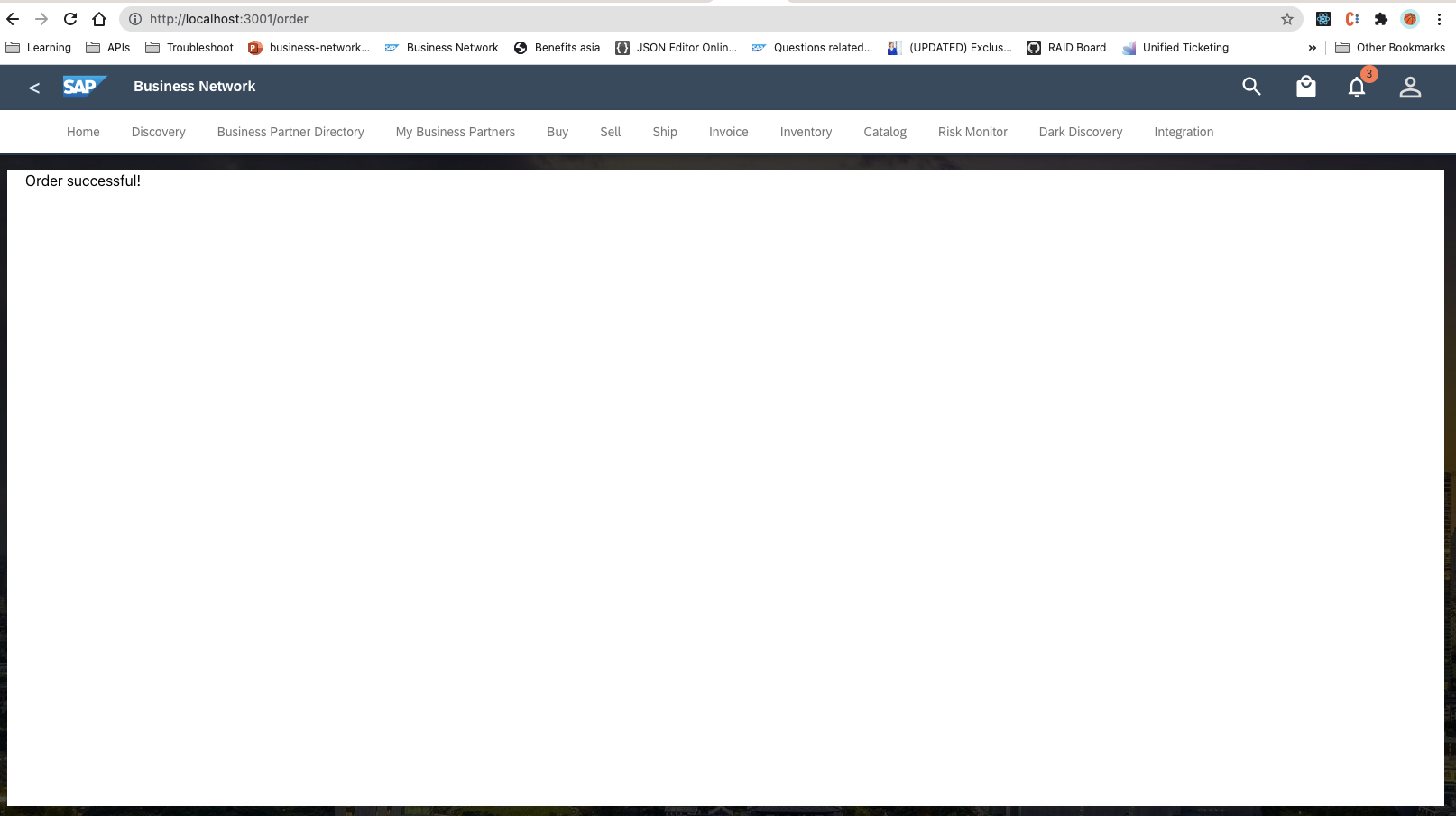
function OrderSuccess() {
const classes = useStyles();
return (
<ThemeProvider theme={theme} >
<Container maxWidth={false} className={classes.root}>
<Box m={2}>
Order successful!
</Box>
</Container>
</ThemeProvider>
);
}
export default OrderSuccess;
Expected output from above code
Sign up for free
to join this conversation on GitHub.
Already have an account?
Sign in to comment
https://stackoverflow.com/questions/56554586/how-to-use-usestyle-to-style-class-component-in-material-ui