Here are a collection of ideas I had been working on waay back in February in a previous world...
I had a bunch of ideas, some of which I thought had merit and some which I thought were garbage. I outlined some here which looked to the aspects of Porter as an intuivtive, smooth service that solves problems for you behind the scenes.
But also wanted to make sure it felt bad ass and not subservient or subordinate in any way. One way of doing this I felt would be to make Porter more contemporary and luxe, to feel like a fancy hotel or lifefstyle assistant that costs $$$ and gets shit done, but doesn't take shit either.

Typography: I usually start here to play around with the feeling of words, before doing any work with pictrues/icons/colors. Looking at old school bookish type, modern clean ones, etc.

Playing around with little 'cards' sections to try out fonts and taglines.

Porter 'wordmark' logo treatments - trying some colors and shapes with some of the font styles I liked to feel like a modern (not-necessarily tech) service.
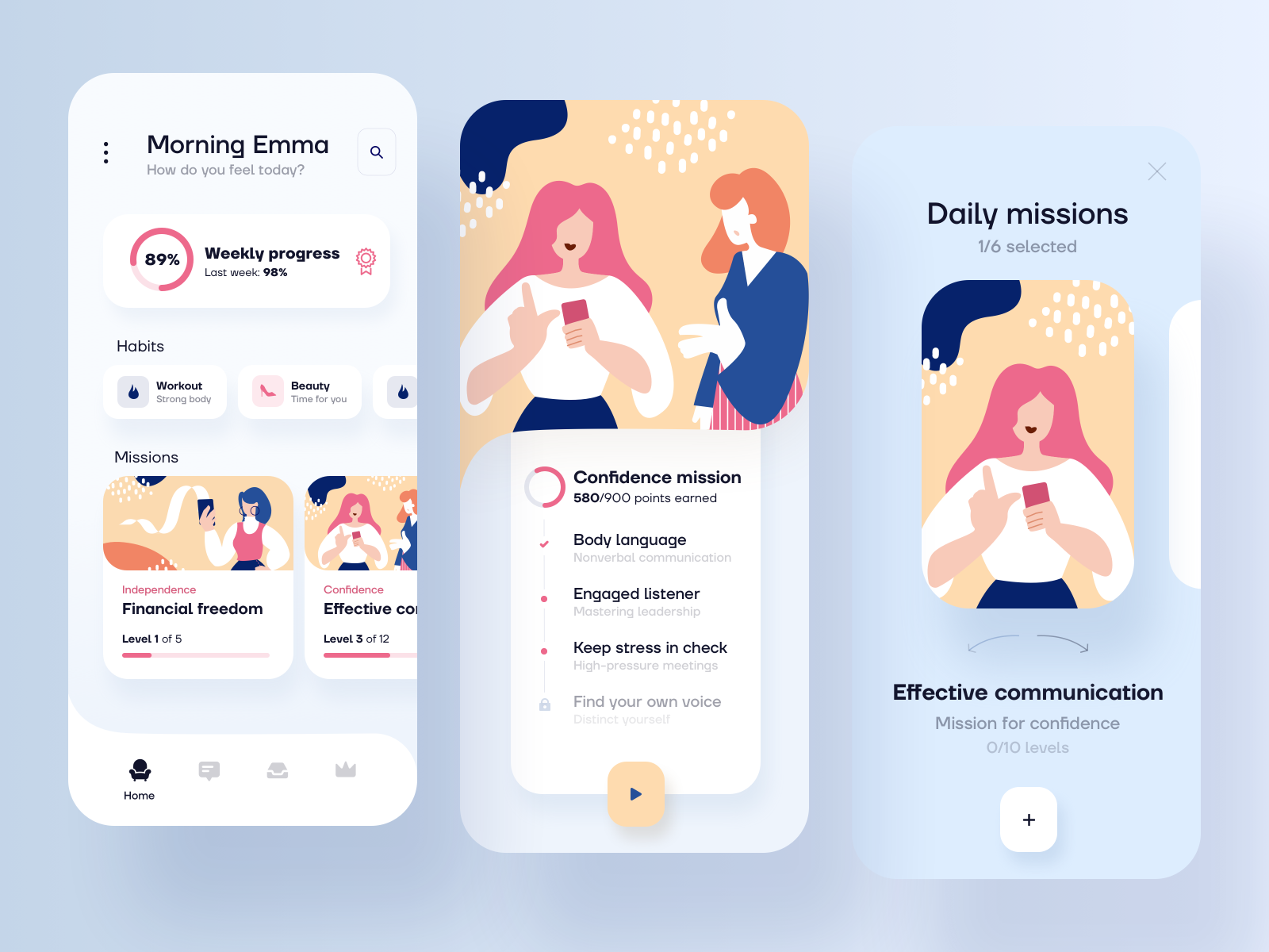
Inspiration 01: Personal Assistant Helper app concept https://cdn.dribbble.com/users/735642/screenshots/8927976/media/18af57ebb0510ecec0eabdab9d1b51e2.png
In addition to the Emoji Logo, I think Porter needs some other elements for it's branding - for small favicons, for decoration and for illustration concepts. I wanted to look at how Porter could feel like part of the CNAB system but not curtailed by it.

Ideas for the CN bundle shapes packed up and handled by the magic touch of Porter.

More illustration stuff.
An important aspect of the project is the emoji I think. As our C.E.O. I think it's important that Carolyn's vision for Porter is front and center. The emoji-ness is fun, playful and stands out. In these ideas I didn't have this aspect, hence I didn't feel like this design direction was true to the project and the people behind it.
There are aspects of the above design work that I like, but it does not feel like the Porter project we know and love. The Porter character needs to be integral, I want to make sure to represent Carolyn and Michelle and the history of the project thus far. I think the work here so far sanitizes that too much.
Trying to capture the essence of Michelle for the Porter brand is a bit tricky for me - a cis white male. It's easy for me to 'design around' the feminine aspects, and to shy away from representing race in any way. Ultimately this is where I ran aground and got lost. I got blocked, I lost my momentum, the Coronavirus hit, and my world fell apart for awhile (most of March was spent dealing with family sickness).
This work stagnated and I didn't think it was good enough to see the light of day. I didn't know where to go with it. I'm glad you are prompting this covnversation now because it's an important time to do so and I need help and a kick into gear to figurue this out.
Here is what I was thinking back in February. How could this project still represent the things we want, and be appealing, positive and engaging? I found some wonderful designers and illustratiors who do this kind of work every day:

I liked the styles this artist uses for their real women series, which feel modern and clean as well as honest and diverse. Women Illustration series
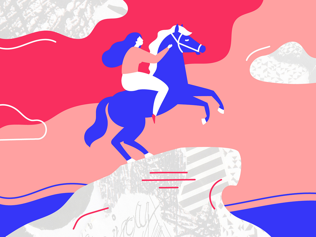
Similar style but totally badass. St Petersburg Womens Rights campaign
Here was my attempt at drawing something like the above, but as a Porter.

I didn't feel like this direction was working though. It isn't (1) Emoji Enough or (2) Michelle Enough. Though moving the logo/mascot away from portraying a person in a role of servitude is a much safer approach, even if we lose some of the project character than the Michelle porter brings. It's much safer if we either abstract the Porter to avoid portraying class and race in anyway.