Skip to content

Instantly share code, notes, and snippets.

@fpigeonjr
Created January 23, 2023 01:12
Show Gist options
  • Star 0 You must be signed in to star a gist
  • Fork 0 You must be signed in to fork a gist
  • Save fpigeonjr/77eb924c17e1052b1c03776b998d73a9 to your computer and use it in GitHub Desktop.
Save fpigeonjr/77eb924c17e1052b1c03776b998d73a9 to your computer and use it in GitHub Desktop.
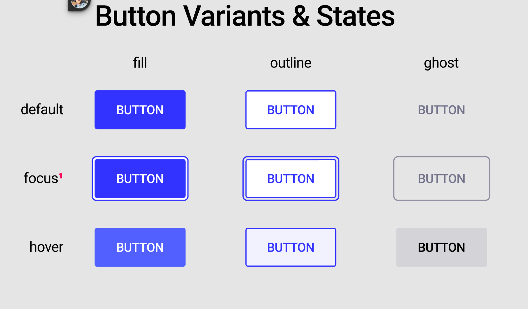
how to add variants to a Button component
import React from "react";
import styled from "styled-components";
import { COLORS } from "./constants";
const SIZES = {
small: {
"--borderRadius": 2 + "px",
"--fontSize": 16 / 16 + "rem",
"--padding": "6px 14px"
},
medium: {
"--borderRadius": 2 + "px",
"--fontSize": 18 / 16 + "rem",
"--padding": "14px 22px"
},
large: {
"--borderRadius": 4 + "px",
"--fontSize": 18 / 16 + "rem",
"--padding": "18px 34px"
}
};
const Button = ({ variant, size, children }) => {
const styles = SIZES[size];
let Component;
if (variant === "fill") {
Component = FillButton;
} else if (variant === "outline") {
Component = OutlineButton;
} else {
Component = GhostButton;
}
return <Component style={styles}>{children.toUpperCase()}</Component>;
};
const ButtonBase = styled.button`
font-size: var(--fontSize);
padding: var(--padding);
border-radius: var(--borderRadius);
border: none;
font-family: "Roboto", sans-serif;
background-color: ${COLORS.primary};
color: ${COLORS.white};
border: 2px solid transparent;
&:focus {
outline-color: ${COLORS.primary};
outline-offset: 4px;
}
&:hover {
background-color: ${COLORS.primaryLight};
}
`;
const FillButton = styled(ButtonBase)`
background-color: ${COLORS.primary};
color: ${COLORS.white};
`;
const OutlineButton = styled(ButtonBase)`
background-color: ${COLORS.white};
color: ${COLORS.primary};
border: 1px solid ${COLORS.primary};
&:hover {
background-color: ${COLORS.offwhite};
}
`;
const GhostButton = styled(ButtonBase)`
background-color: transparent;
color: ${COLORS.gray};
&:focus {
outline-color: ${COLORS.gray};
}
&:hover {
background-color: transparent;
border-color: ${COLORS.gray};
}
`;
export default Button;
<tr>
<td>Medium</td>
<td>
<Button size="medium" variant="fill">
Button
</Button>
</td>
<td>
<Button size="medium" variant="outline">
Button
</Button>
</td>
<td>
<Button size="medium" variant="ghost">
Button
</Button>
</td>
</tr>
@fpigeonjr
Copy link
Author

variants ss:
SCR-20230122-qoz

Sign up for free to join this conversation on GitHub. Already have an account? Sign in to comment