Last active
November 14, 2020 01:02
-
-
Save gatlinbredeson/9bcb4f51fa14f0ce6afd5a6b9d376ce9 to your computer and use it in GitHub Desktop.
Analysis of Insurance Data for US Medical Insurance Costs Portfolio Project
This file contains bidirectional Unicode text that may be interpreted or compiled differently than what appears below. To review, open the file in an editor that reveals hidden Unicode characters.
Learn more about bidirectional Unicode characters
| from sklearn.linear_model import LinearRegression | |
| from sklearn.model_selection import train_test_split | |
| import pandas as pd | |
| from matplotlib import pyplot as plt | |
| def get_stats(dataframe, column): | |
| """ | |
| Prints the average and standard deviation for the data in column | |
| :param dataframe: DataFrame containing the column to be analyzed | |
| :param column: String name of the column on which to report stats | |
| :return: None | |
| """ | |
| stat_avg = round(dataframe[column].mean(), 2) | |
| stat_std = round(dataframe[column].std(), 2) | |
| print(f'{column}--Average: {stat_avg}, Standard Deviation: {stat_std}') | |
| def proportions(dataframe, column): | |
| """ | |
| Prints the proportion of each unique value in column | |
| :param dataframe: DataFrame containing the columns to be analyzed | |
| :param column: Column for which to calculate proportions of unique values | |
| :return: None | |
| """ | |
| print(f'Proportions for {column}') | |
| total = len(dataframe[column]) | |
| for val in dataframe[column].unique(): | |
| num_columns = list(dataframe[column]).count(val) | |
| proportion = num_columns / total * 100 | |
| proportion = round(proportion, 2) | |
| print(f'{val}: {proportion}%') | |
| print('') | |
| def subplot_size(lst=None, num=None): | |
| """ | |
| Function for calculating the dimensions for subplots, | |
| making it as square as possible. Takes either a list | |
| or an int as parameters. If both are given, prefers list. | |
| If none are given, raises an exception. | |
| :param lst: List of columns for which to make subplots. | |
| :param num: Number of subplots to make, if known. | |
| :return: Int number of rows and int number of columns | |
| for the figure of subplots. | |
| """ | |
| if lst: | |
| length = len(lst) | |
| elif num: | |
| length = num | |
| else: | |
| raise ValueError | |
| rows = int(length ** 0.5) | |
| columns = rows | |
| while rows * columns < length: | |
| if columns % 2 == 0: | |
| rows += 1 | |
| else: | |
| columns += 1 | |
| return rows, columns | |
| def graph_histograms(dataframe, *columns): | |
| """ | |
| Makes and shows a figure of subplots, graphing histograms | |
| from any number of columns of data in dataframe. | |
| :param dataframe: The dataframe containing columns | |
| :param columns: String names of any number of columns | |
| :return: None | |
| """ | |
| rows, cols = subplot_size(lst=columns) | |
| plt.figure(num='Histograms', figsize=(rows*4, cols*4)) | |
| for i, col in enumerate(columns): | |
| plt.subplot(rows, cols, i+1) | |
| plt.hist(dataframe[col]) | |
| plt.title(col.capitalize()) | |
| plt.xlabel(f'{col.capitalize()} Values') | |
| plt.ylabel('Count') | |
| plt.subplots_adjust(wspace=0.4, hspace=0.4) | |
| plt.show() | |
| def graph_features(dataframe, x_data, y_data, features_list, x_label_str=None, y_label_str=None): | |
| """ | |
| Makes and shows a figure of subplots. Each graph | |
| is a scatter plot showing only the data for a subgroup | |
| For example, if 'sex' is one of the features, the function | |
| will plot X_data vs Y_data for only men, then only for women. | |
| :param dataframe: The dataframe containing the X_data, Y_data, and features | |
| :param x_data: String name of the column of data for the X-axis | |
| :param y_data: String name of the column of data for the Y-axis | |
| :param features_list: List of string names of the features to plot. E.g. ['Smoker', 'children'] | |
| :param x_label_str: Optional string label for the x-axis data | |
| :param y_label_str: Optional string label for the y-axis data | |
| :return: None | |
| """ | |
| i = 1 | |
| uniques = 0 | |
| for feature in features_list: | |
| uniques += dataframe[feature].nunique() | |
| x_min, x_max = 0.9 * dataframe[x_data].min(), 1.1 * dataframe[x_data].max() | |
| y_min, y_max = 0.9 * dataframe[y_data].min(), 1.1 * dataframe[y_data].max() | |
| rows, columns = subplot_size(num=uniques) | |
| fig = plt.figure(num='Features', figsize=(rows * 4, columns * 4)) | |
| for feature in features_lst: | |
| featureframe = dataframe[[x_data, y_data, feature]] | |
| for val in dataframe[feature].unique(): | |
| fig.add_subplot(rows, columns, i) | |
| subframe = featureframe[(featureframe[feature] == val)] | |
| plt.scatter(subframe[x_data], subframe[y_data]) | |
| plt.axis([x_min, x_max, y_min, y_max]) | |
| if type(val) is str: | |
| val = val.capitalize() | |
| plt.title(f'{x_data.capitalize()} vs {y_data.capitalize()} for all ' | |
| f'\'{feature.capitalize()} = {val}\'', fontsize=10) | |
| if x_label_str: | |
| plt.xlabel(x_label_str) | |
| else: | |
| plt.xlabel(x_data) | |
| if y_label_str: | |
| plt.ylabel(y_label_str) | |
| else: | |
| plt.ylabel(y_data) | |
| i += 1 | |
| plt.subplots_adjust(wspace=0.4, hspace=0.5) | |
| fig.suptitle(f'{x_data.capitalize()} vs {y_data.capitalize()} for Specific Feature Values') | |
| plt.show() | |
| def lin_reg(dataframe, label=None): | |
| """ | |
| Performs multiple linear regression on a dataframe | |
| with 'charges' as the labels, and the rest of the data | |
| as features. Then prints the resulting R2 value and coefficients. | |
| :param dataframe: The dataframe containing the data to be used. | |
| :param label: String description of the DataFrame, e.g. 'All Data', or 'Non-Smokers' | |
| :return: None | |
| """ | |
| # Separate the data into dataframes for features and labels | |
| labels = dataframe['charges'] | |
| features = dataframe.drop('charges', axis=1) | |
| # Split data into training and test | |
| features_train, features_test, labels_train, labels_test = train_test_split(features, labels, test_size=0.2) | |
| # Data is linear; construct LinearRegression object | |
| linear = LinearRegression() | |
| # Train model | |
| linear.fit(features_train, labels_train) | |
| print('Multiple Linear Regression Insights', end='') | |
| if label: | |
| print(f' for {label}:') | |
| else: | |
| print(':') | |
| # Find R2 value with test data | |
| scr = linear.score(features_test, labels_test) | |
| scr = round(scr, 4) | |
| print(f'R2 value: {scr}') | |
| # Print the coefficients | |
| for feat, coef in zip(features.columns, linear.coef_): | |
| coef = str(round(coef, 3)) | |
| print(f'{feat} coef: {coef}') | |
| print('') | |
| # Import the data | |
| df = pd.read_csv('insurance.csv') | |
| # Get a few stats from the data | |
| print('Stats:') | |
| for feature in ['bmi', 'age', 'children', 'charges']: | |
| get_stats(df, feature) | |
| print('') | |
| for feature in ['sex', 'smoker', 'region']: | |
| proportions(df, feature) | |
| # Make histograms to view the shape of the data | |
| graph_histograms(df, 'bmi', 'age', 'children', 'charges') | |
| # Look at the data as a whole, age vs. charges | |
| plt.figure(num='All Data') | |
| plt.scatter(df.age, df.charges) | |
| plt.title('All Data: Age vs Charges') | |
| plt.xlabel('Age (years)') | |
| plt.ylabel('Charges (USD)') | |
| plt.show() | |
| # Lets graph age vs. charges for each unique feature | |
| features_lst = ['sex', 'children', 'smoker', 'region'] | |
| graph_features(df, 'age', 'charges', features_lst, 'Age (years)', 'Charges (USD)') | |
| # Now for just the non-smokers | |
| nonsmokers = df[(df['smoker'] == 'no')] | |
| graph_features(nonsmokers, 'age', 'charges', features_lst, 'Age (years)', 'Charges (USD)') | |
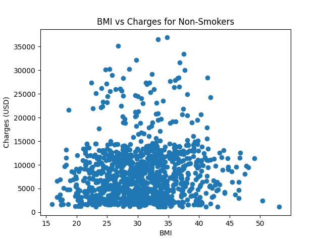
| # Is BMI accounting for it? | |
| plt.figure('BMI vs Charges') | |
| plt.scatter(nonsmokers.bmi, nonsmokers.charges) | |
| plt.title('BMI vs Charges for Non-Smokers') | |
| plt.xlabel('BMI') | |
| plt.ylabel('Charges (USD)') | |
| plt.show() | |
| # Clean the Data for Machine Learning | |
| # Make dummy variables from the categorical region data | |
| for reg in df.region.unique(): | |
| name = 'region_' + reg | |
| df[name] = df.region.apply(lambda row: 1 if row == reg else 0) | |
| # We won't need the region column anymore | |
| df = df.drop('region', axis=1) | |
| # Convert female to 1 and male to 0, as dichotomous data | |
| df['sex'] = df.sex.apply(lambda row: 1 if row == 'female' else 0) | |
| # Convert smoker 'yes' to 1 and 'no' to 0, as dichotomous data | |
| df['smoker'] = df.smoker.apply(lambda row: 1 if row == 'yes' else 0) | |
| lin_reg(df, 'All Data') | |
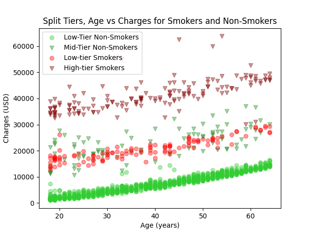
| # Create a new dataframe isolating the tiers to analyze each set separately. | |
| # With (age, charges) being a data point, I used (18, 7500) and (65, 21000) | |
| # to find a line that separates the tiers. The equation is: y = 287.23x + 2329.79 | |
| # Make dummy variables where False is under the line (bottom tier) and True is | |
| # above the line (middle tier). Then select Dataframes for each tier. | |
| # Let's also run it separately for # the highest tier, the smokers. | |
| smokers = df[(df['smoker'] == 1)] | |
| df['tier'] = df.age.apply(lambda x: 287.23 * x + 2329.79) | |
| df['tier'] = df.charges > df.tier | |
| low_df = df[(df['smoker'] == 0) & (df['tier'] == False)] | |
| mid_df = df[(df['smoker'] == 0) & (df['tier'] == True)] | |
| low_df = low_df.drop('tier', axis=1) | |
| mid_df = mid_df.drop('tier', axis=1) | |
| # Visualize the separated data on a scatter plot | |
| plt.figure('Tiered Data Separated') | |
| plt.scatter(low_df.age, low_df.charges, label='Low-Tier Non-Smokers', c='limegreen', alpha=0.4) | |
| plt.scatter(mid_df.age, mid_df.charges, label='Mid-Tier Non-Smokers', c='forestgreen', marker='v', alpha=0.4) | |
| smokers_low = smokers[(smokers['charges'] < 30000)] | |
| smokers_high = smokers[(smokers['charges'] >= 30000)] | |
| plt.scatter(smokers_low.age, smokers_low.charges, label='Low-tier Smokers', c='red', alpha=0.4) | |
| plt.scatter(smokers_high.age, smokers_high.charges, label='High-tier Smokers', c='maroon', marker='v', alpha=0.4) | |
| plt.legend() | |
| plt.title('Split Tiers, Age vs Charges for Smokers and Non-Smokers') | |
| plt.xlabel('Age (years)') | |
| plt.ylabel('Charges (USD)') | |
| plt.show() | |
| # Now lets run Regression on each to see if we can find any | |
| # significant difference between the sets' coefficients. | |
| lin_reg(smokers_high, 'High-tier Smoker Data') | |
| lin_reg(smokers_low, 'Low-tier Smoker Data') | |
| lin_reg(mid_df, 'High-tier Non-smoker Data') | |
| lin_reg(low_df, 'Low-tier Non-smoker Data') |
Sign up for free
to join this conversation on GitHub.
Already have an account?
Sign in to comment
The data set ('insurance.csv') can be found on Kaggle here.
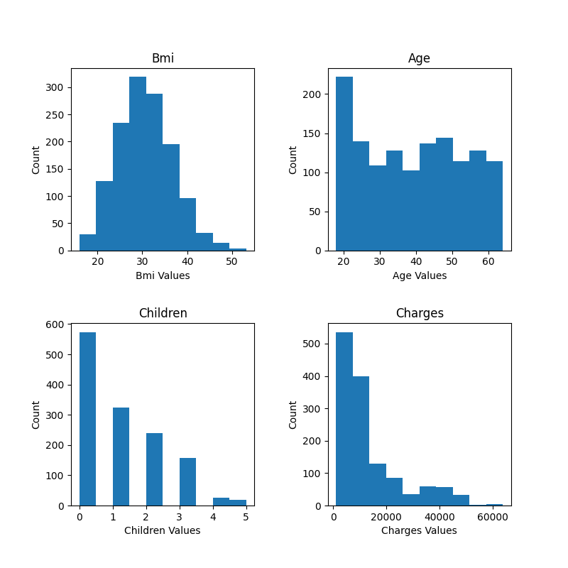
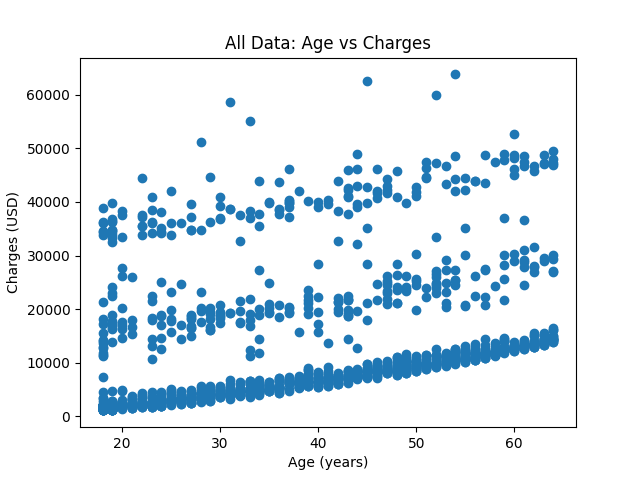
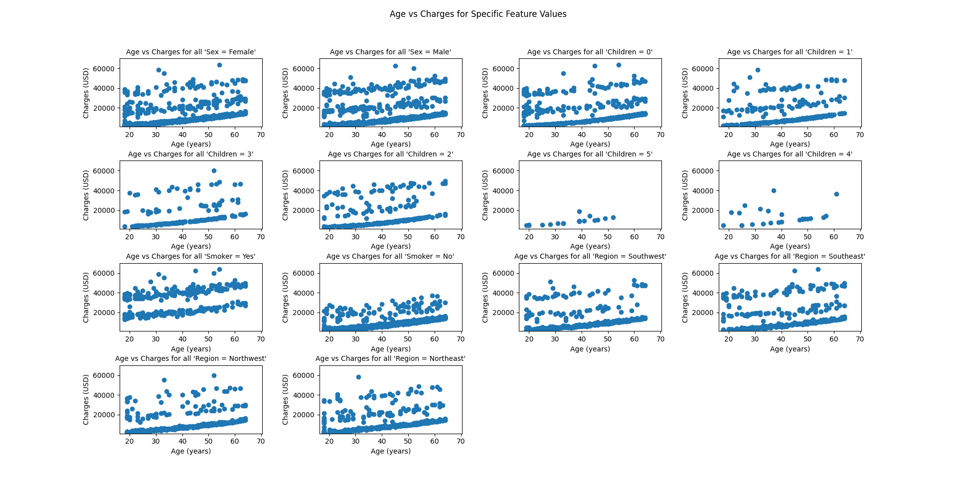
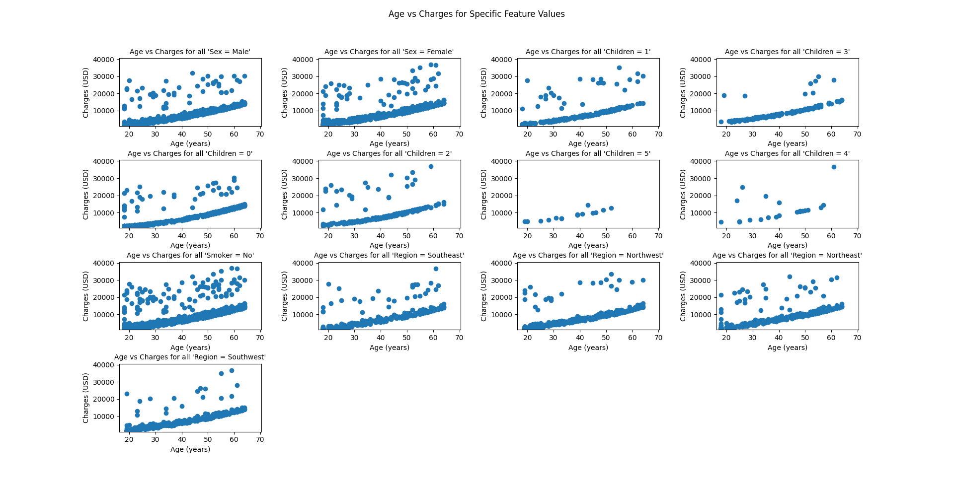
Here are the graphs produced by the script.