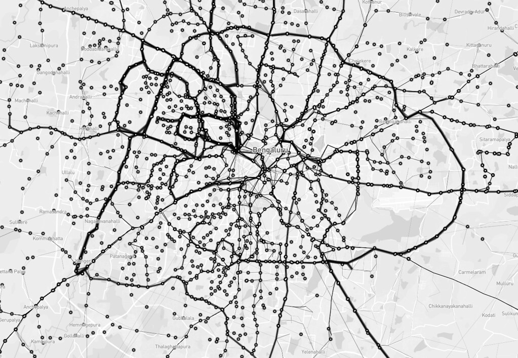
Open Bangalore has been pioneering making several data sets open - including the network of Bangalore Metropolitan Transport Corporation. The BMTC operates over 2000 routes in Bangalore and is the only practical public transit system in the city. Some of us at DataMeet took to time understand this network better by performing some basic analysis.
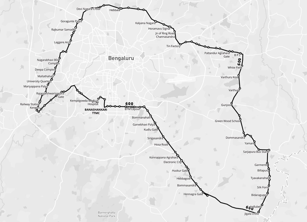
BMTC is known for its many long routes. Route 600 is the longest, making a roundtrip around the city, covering 117 km in about 5 hours. There are 5 trips a day, and these buses are packed throughout.
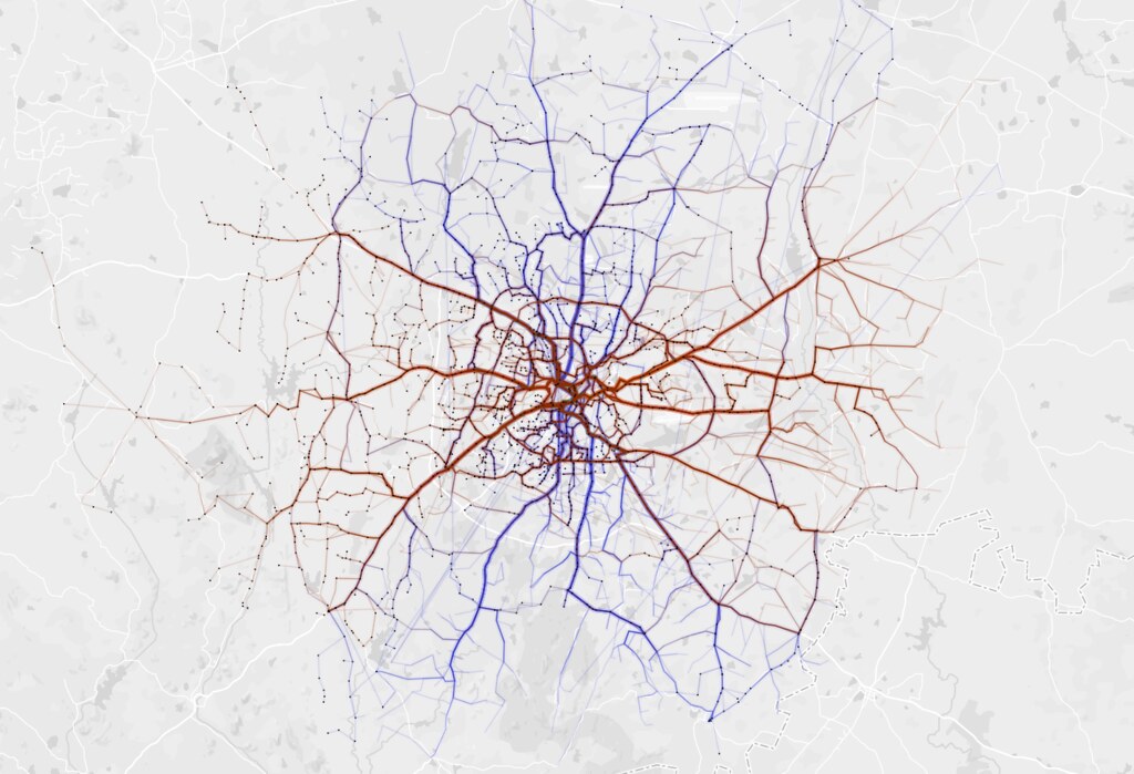
Next, I wanted to look at the frequency of different routes. In the image below, stroke thickness indicates how many trips each route makes. You can see north Bangalore has fewer, but more frequent routes, whereas the south has more routes with less frequency. You can also see the Outer Ring Road, which circles the entire city.
I tried to define reachability as destinations one can get to from a stop without transferring buses. The BMTC network operates long but direct routes covering the entire city. The map shows straight lines between bus stops that are connected by a single route. The furthest you can get is from Krishnarajendra Market to the eastward town of Biskuru: roughly 49 km as the crow flies.

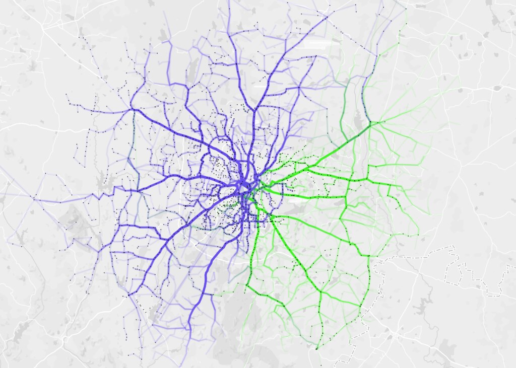
Which directions does BMTC run? It is interesting that BMTC covers the city North - South (blue) and East - West (brown) with almost equal distribution.
BMTC routes are classified into different series. Starting from 1 - 9 and A - W. I analysed coverage based on series 2 (blue) and 3 (green) and they make up almost 76% of the entire network.
Tejas and I tried a naive approach to finding redundancy - scoring based on bus stops each routes hit. The southern corridor of Majestic - Bannerghatta - Anekal is more redundant than rest of the network. View interactive map.

This map by Aruna shows node strength - number of routes passing through a stop. You can see that the strength decreases as we move away from the city center with the exception of depots. View interactive map

Just like the data, our code and approach are open on Github. Let us know what you think and do reach out if you have questions!