Often times when working with data in R, you find yourself needing to summarise a data.frame by a column, a
SELECT SUM(..) or SELECT COUNT(..) in MySQL if you will.
For instance, you may have a lot of page-visits to analyse and you aren't quite certain how to summarise some
of that data using R.
Let's consider the following (trivial) dataset:
user, created.at, pages.visited
julie, 2011-11-16 03:31:56 GMT, 3
julie, 2011-11-16 04:22:33 GMT, 5
jack, 2011-11-16 07:19:13 GMT, 8
jack, 2011-11-16 12:39:02 GMT, 9
julie, 2011-11-17 12:39:02 GMT, 3
Let's load this csv file into R using a package called Hmisc:
require(Hmisc)
require(plyr)
require(ggplot2)

data <- csv.get('path/to/csv-file.csv', header=TRUE)
By using csv.get we essentially create a data variable of type data.frame on which we can start operating.
The first thing we'll want to do is format the created.at field so that it is parsable and formattable.
For the purpose of this analysis, let's assume that we are based in Los Angeles. If we look closely at the data we have loaded, we
notice the timezone of the data$created.at field being GMT.
Considering we are in Los Angeles, visualising GMT data will not be as intuitive for our team, therefore we are
going to start by changing the timezone (and values) of the data$created.at to "Los Angeles" times.
data$created.at <- as.POSIXct(
    format(data$created.at, tz="America/Los_Angeles" usetz=TRUE)
)
We now have data that is ready to be parsed, and that is represented with local Los Angeles times. We decide we want to see how people are using the data per hour of the day.
R data.frames are fairly versatile and allow us to add the hour for each entry as easily as:
data$hour <- format(data$created.at, '%H')Our data now contains the hour column and looks like:
user          created.at pages.visited hour
1 julie 2011-11-16 03:31:56            3   03
2 julie 2011-11-16 04:22:33            5   04
3 jack 2011-11-16 07:19:13             8   07
4 jack 2011-11-16 12:39:02             9   12
5 julie 2011-11-17 12:39:02            3   12
At this point we want to count the number of pages visited per hour, per user. If we were using an SQL based solution, we could simply do something like:
SELECT SUM(pages.visited) as countPerHour, user, hour FROM data GROUP BY user, hour
The only problem, is we aren't using an SQL-based solution, therefore we need to learn how to
manipulate and summarise data from within R.
The plyr package in R allows us to manipulate lists, dataframes, etc. very easily. In this
instance, it also allows ut to summarise as if we were using and SQL-based query.
byHour <- ddply(data, .(user, hour), summarise, countPerHour=sum(pages.visited))We now have a new data.frame byHour which contains the sum of visited page per hour per user.
Now let's say we also want to take a look at the visits by weekday instead of by hour. We'll start by adding
the weekday to our original data data.frame and again, we'll use ddply from plyr to sum/count
the number of visits per weekday:
data$weekday <- weekdays(data$created.at)
byWeekday <- ddply(data, .(user, weekday), summarise, countPerDay=sum(pages.visited))
You now have data summarised that is similar to what you would traditionally get with
MySQL by doing SELECT SUM(hour) as countPerHour, user, hour FROM data GROUP BY user, user or even
SELECT SUM(weekday) as countPerDay, user, weekday FROM data GROUP BY user, weekday.
The difference, is that you can start visualising your data a lot faster now that you have a formatted data.frame.
As with most analysis, you will want to visualise this data-set. Preferably, you'll generate a few plots and identify which ones pleases you the most.
Lets see how we can use ggplot2 to visualise this data-set in a few different ways:
ggplot(byHour, aes(x=hour, y=as.numeric(countPerHour))) +
    geom_bar(stat="identity") +
    labs(title="Count per hour for all users") +
    ylab("Visits Per Hour") + xlab("Hour of the day") +
    theme_bw()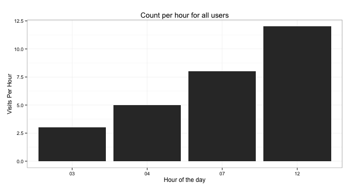
Now this seems to be exhibiting an upward trend however with only 2-different users, our analysis is fairly weak.
What if we decide to put the visited page, per user, as columns but this time we'll put them side-by-side so we can compare the two users:
ggplot(byHour, aes(x=hour, y=as.numeric(countPerHour))) +
  geom_bar(aes(fill=user), position="dodge") +
  labs(title="Dodge per hour per user") +
  ylab("Visits Per Hour") + xlab("Hour of the day") +
  theme_bw()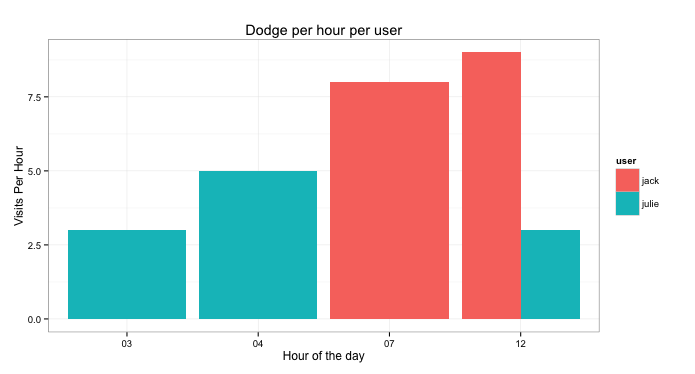
From that we can now see that Julie is the only one that visited pages between 3am and 4am. On the other hand, at 7am, only Jack used the site. At 12pm, both users used the site but Jack used it more.
The interesting part in this is the:
geom_bar(aes(fill=user), position="dodge")
This tells the plotting-engine to fill bars with colours for each user, but then tells the engine to dodge the bars instead of say stacking them.
What this shows is that our upwards trend now shows that only 1 user is using it more as the hours progress and that Julie is in fact using it less.
Another way of visualise this would be to seperate the users into facets as such:
ggplot(byHour, aes(x=hour, y=as.numeric(countPerHour))) +
  geom_bar(aes(fill=user), stat="identity") +
  labs(title="Pages visited per hour of day") +
  ylab("Visits Per Hour") + xlab("Hour of the day") +
  theme_bw() + facet_grid(user~.)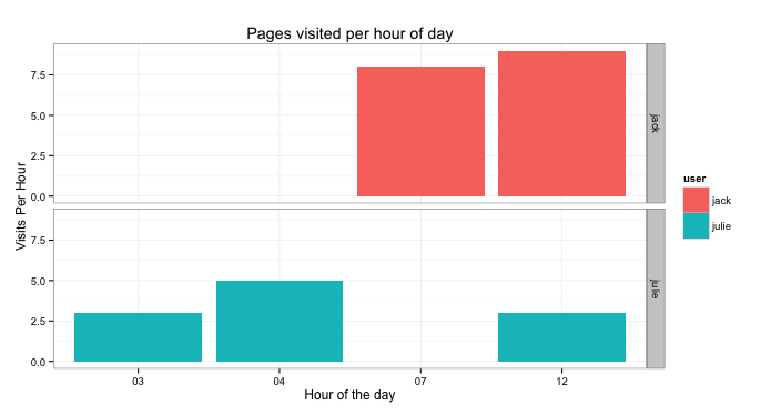
From this, what you need to look at is:
facet_grid(user~.)
which splits the plot into 2 facets, each facet being the user field.
Now considering we don't have much data in our example data-set, this will yield fairly dissapointing results however we'll look at a way to change how the axis is displayed:
ggplot(byWeekday, aes(x=weekday, y=as.numeric(countPerDay))) +
  geom_bar(aes(fill=user), position="dodge") +
  labs(title="Dodge per hour per user") +
  ylab("Visits Per Hour") + xlab("Hour of the day") +
  theme_bw() + coord_flip()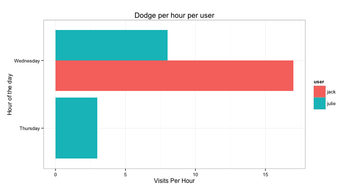
The interesting part from this snippet is:
coord_flip()
Which basically takes the x-axis and flips it on its side. In the case of weekdays, we have a maximum of seven wherein the names can be long ("Wednesday", "Saturday", etc). This makes it a lot easier to read and visualise.
From the previous plot, we can easily see that the only person that visited pages on Thursday was Julie, however on Wednesday, Jack visited a lot more pages than Julie. Should we assume that Jack didn't do any work on Wednesday? I'll make you draw your own conclusions ;-)
There are many different ways of looking at this type of data and I hope I've conveyed the power of R and the rapidity at
which it enables you to prototype. R makes it very easy to load, manipulate and visualise data rapidly.
Now assuming you had many different weekdays and you wanted to visualise the number of pages visited per day per hour. You could do something similar to:
byWeekdayHour <- ddply(data, .(user, hour, weekday), summarise, countPerHour=sum(pages.visited))

byWeekdayHour$weekday <- factor(
    byWeekdayHour$weekday,
    levels=c('Wednesday', 'Thursday')
)

ggplot(byWeekdayHour, aes(x=hour, y=as.numeric(countPerHour))) +
    geom_bar(aes(fill=user), stat="identity") +
    labs(title="Pages visited per hour of day") +
    ylab("Visits Per Hour") + xlab("Hour of the day") +
    theme_bw() + facet_grid(user~weekday)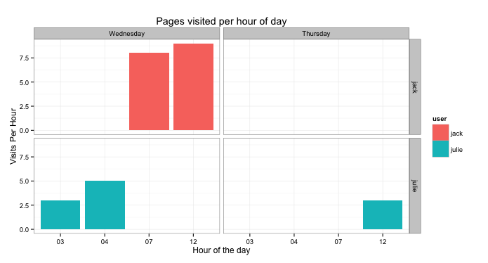
The first thing we do is we select per user, hour and weekday and sum the visited pages. The second part of the
snippet, the part that contains factor(...) is only so we order the weekdays in the proper order... Wednesday
comes before Thursday therefore we re-order it (Otherwise Thursday comes before Wednesday (T vs W)).
For the less experienced R users, keep in mind that load and intensively manipulating data is going to be of
utmost importance when you prototype with R. Visualising is also a very important part of the analysis as it
allows for your cognitive functions to identify patterns before investing time into a deeper analysis.
Now go forth, be crazy.