|
.light-theme{ |
|
--light-gray: var(--chakra-colors-gray-200); |
|
--gray: var(--chakra-colors-gray-300); |
|
--blue700:var(--chakra-colors-blue-600); |
|
--blue600: var(--chakra-colors-blue-500); |
|
--blue500: var(--chakra-colors-gray-400); |
|
--blue400: var(--chakra-colors-gray-300); |
|
--blue300: var(--chakra-colors-gray-200); |
|
--blue200: var(--chakra-colors-gray-200); |
|
--blue100: var(--chakra-colors-gray-100); |
|
--monthBackground: var(--chakra-colors-white); |
|
--text:var(--chakra-colors-black); |
|
--negative-text:var(--chakra-colors-white); |
|
} |
|
.dark-theme{ |
|
--light-gray: var(--chakra-colors-gray-600); |
|
--gray: var(--chakra-colors-gray-500); |
|
--blue700: var(--chakra-colors-blue-600); |
|
--blue600: var(--chakra-colors-blue-300); |
|
--blue500: var(--chakra-colors-gray-500); |
|
--blue400: var(--chakra-colors-gray-600); |
|
--blue300: var(--chakra-colors-gray-700); |
|
--blue200: var(--chakra-colors-gray-600); |
|
--blue100: var(--chakra-colors-gray-800); |
|
--monthBackground: var(--chakra-colors-gray-700); |
|
--text:var(--chakra-colors-gray-200); |
|
--negative-text:var(--chakra-colors-black); |
|
} |
|
|
|
/* if you dont want to use chakra's theme use this class in the wrapping div. These are the exact original values */ |
|
.light-theme-original{ |
|
--light-gray: #cccccc; |
|
--gray: #b3b3b3; |
|
--blue700:#2a69ac; |
|
--blue600: #3182ce; |
|
--blue500: #a0aec0; |
|
--blue400: #cbd5e0; |
|
--blue300: #e2e8f0; |
|
--blue200: #edf2f7; |
|
--blue100: #f7fafc; |
|
} |
|
.react-datepicker { |
|
font-family: unset; |
|
font-size: 0.9rem; |
|
border-color: var(--light-gray); |
|
} |
|
|
|
.react-datepicker-wrapper, |
|
.react-datepicker__input-container { |
|
display: block; |
|
} |
|
|
|
.react-datepicker__input-container { |
|
font-size: 1rem; |
|
padding-left: 1rem; |
|
padding-right: 1rem; |
|
height: 2.5rem; |
|
border-radius: 0.25rem; |
|
border: 1px solid; |
|
border-color: var(--light-gray); |
|
} |
|
.react-datapicker__input-text { |
|
background-color: transparent; |
|
} |
|
|
|
.react-datepicker__input-container:hover { |
|
border-color: var(--gray) |
|
} |
|
.react-datepicker__input-container:focus-within { |
|
z-index: 1; |
|
border-color: var(--blue600); |
|
box-shadow: 0 0 0 1px var(--blue600); |
|
} |
|
|
|
.react-datepicker__input-container > input { |
|
width: 100%; |
|
height: 100%; |
|
outline: 0; |
|
} |
|
|
|
.react-datepicker__navigation--next--with-time:not(.react-datepicker__navigation--next--with-today-button) { |
|
right: 90px; |
|
} |
|
|
|
.react-datepicker__navigation--previous, |
|
.react-datepicker__navigation--next { |
|
height: 8px; |
|
} |
|
|
|
.react-datepicker__navigation--previous { |
|
border-right-color: var(--blue400); |
|
} |
|
|
|
.react-datepicker__navigation--previous:hover { |
|
border-right-color: var(--blue500); |
|
} |
|
|
|
.react-datepicker__navigation--next { |
|
border-left-color: var(--blue400); |
|
|
|
} |
|
|
|
.react-datepicker__navigation--next:hover { |
|
border-left-color: var(--blue500); |
|
} |
|
|
|
.react-datepicker__header { |
|
background-color: var(--blue100); |
|
} |
|
|
|
.react-datepicker__header, |
|
.react-datepicker__time-container { |
|
border-color: var(--blue300); |
|
} |
|
|
|
.react-datepicker__current-month, |
|
.react-datepicker-time__header, |
|
.react-datepicker-year-header { |
|
font-size: inherit; |
|
font-weight: 600; |
|
color: var(--text) |
|
} |
|
|
|
.react-datepicker__month{ |
|
background-color: var(--monthBackground); |
|
margin:0; |
|
padding:0.4rem; |
|
} |
|
|
|
.react-datepicker__time-container .react-datepicker__time .react-datepicker__time-box ul.react-datepicker__time-list li.react-datepicker__time-list-item { |
|
margin: 0 1px 0 0; |
|
height: auto; |
|
padding: 7px 10px; |
|
} |
|
|
|
.react-datepicker__time-container .react-datepicker__time .react-datepicker__time-box ul.react-datepicker__time-list li.react-datepicker__time-list-item:hover { |
|
background: var(--blue200); |
|
} |
|
|
|
.react-datepicker__day { |
|
color: var(--text) |
|
} |
|
|
|
.react-datepicker__day:hover { |
|
background: var(--blue200); |
|
} |
|
|
|
.react-datepicker__day-name { |
|
color:var(--text) |
|
} |
|
|
|
.react-datepicker__day--selected, |
|
.react-datepicker__day--in-selecting-range, |
|
.react-datepicker__day--in-range, |
|
.react-datepicker__month-text--selected, |
|
.react-datepicker__month-text--in-selecting-range, |
|
.react-datepicker__month-text--in-range, |
|
.react-datepicker__time-container .react-datepicker__time .react-datepicker__time-box ul.react-datepicker__time-list li.react-datepicker__time-list-item--selected { |
|
background: var(--blue600); |
|
font-weight: normal; |
|
color:var(--negative-text); |
|
} |
|
|
|
.react-datepicker__time-container .react-datepicker__time .react-datepicker__time-box ul.react-datepicker__time-list li.react-datepicker__time-list-item--selected:hover { |
|
background: var(--blue700); |
|
} |
|
|
|
.react-datepicker__close-icon::after { |
|
background-color: unset; |
|
border-radius: unset; |
|
font-size: 1.5rem; |
|
font-weight: bold; |
|
color: var(--light-gray); |
|
height: 20px; |
|
width: 20px; |
|
} |
|
|
|
.react-datepicker__close-icon::after:hover { |
|
color: var(--gray) |
|
} |


Hey, cool upgrade on this implementation.


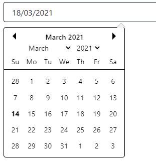
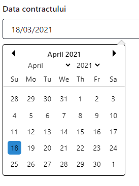
I noticed and can't yet figure out why, when you select the date and the dropdown appears, the selected date is not "selected".
When I move to another month, the date gets "selected".
What do you think could be the issue?