This is an introduction to working with nflscrapR data in Python. This is inspired by this guide by Ben Baldwin.
Using Jupyter Notebooks which comes pre-installed with Anaconda is typically the best way to work with data in Python. This guide assumes you are using the Ananconda distribution and therefore already have the required packages installed. If you are not using the Anaconda distribution, install both Pandas and Matplotlib.
Ben Baldwin again has provided a great tutorial, so follow this to get season or game data into a csv.
Note: scraping a whole season's worth of data took at least two hours for me, you may be better off going here to get a full season of data.
Now that you have play-by-play data, open up a new Jupyter Notebook and import Pandas.
import pandas as pdPandas is now known as pd so we don't have to type out Pandas everytime.
Pandas has a read_csv() function to turn csv files into a dataframe. Find the csv file path and paste that in quotes where it says PATH below, don't forget the file extension (.csv).
data = pd.read_csv(PATH)Our play by play data is now in the dataframe named data (use whatever name you like). You may see a DtypeWarning due to different data types being used in the same column, don't worry, the data is all there.
Pandas can be finicky about making changes to a dataframe and still using the same variable name. If you don't want to see warnings about this enter the following or make sure to create a new variable/dataframe when slicing the data and making changes. The warnings will not affect changes but can be somewhat annonying.
pd.options.mode.chained_assignment = NoneThe following lines removes quarters ending, kickoffs, etc. from the play data.
data = data.loc[
    (data['epa'].notnull()) &
    ((data['play_type'] == 'no_play') |
    (data['play_type'] == 'pass') |
    (data['play_type'] == 'run'))
]
The loc function is a way to get data that meets a certain requirement, in this case, the EPA must be a value (not null) and the play must be a no_play, pass, or run.
Next we'll remove timeouts using the drop function. This is accomplished by finding where a timeout takes place and it is not a challenge. The plays description is found in the 'desc' column.
data.drop(data[(data['replay_or_challenge'] == 0) & (data['desc'].str.contains('Timeout'))].index, inplace=True)The inplace=True makes it so we don't have to reassign the dataframe to itself. Most Pandas functions do not happen inplace by default, instead creating a copy.
Anytime you want to use multiple filters (like above) use parantheses around each condition and use & for and, | for or. Column names can be accessed two ways, either with ['column_name'] or dataframe_name.column_name. We'll use the second way to remove kneels and spikes below.
data = data.loc[data.desc.str.contains('kneels|spiked') == False]That will remove any play that has a description (desc) containing kneels or spiked.
Plays with penalties are still plays and therefore should be classified as a run or pass, not no_play. To classify plays we can search the description of plays that are marked as no_play.
data['desc'].loc[data['play_type'] == 'no_play']Run plays contain directional categories such as:
- left end
- left tackle
- left guard
- up the middle
- right guard
- right tackle
- right end
- rushes
Pass plays include:
- pass
- scrambles
- sacked
Here we will classify runs with penalties as runs and classify scrambles, sacks, and passes with penalties as passes.
data.loc[data.desc.str.contains('left end|left tackle|left guard|up the middle|right guard|right tackle|right end|rushes'),
'play_type'] = 'run'

data.loc[data.desc.str.contains('scrambles|sacked|pass'), 'play_type'] = 'pass'
Now that we're done removing plays from the dataset, it's good to reset the index for easier searching.
data.reset_index(drop=True, inplace=True)Each row in a Pandas dataframe will have an index. A specific row can be found via its index with the following, entering a number where index is.
data.iloc[index]
Plays with penalties most of the time will be null for the player that ran, passed, or caught the ball. These categories are rusher_player_name, passer_player_name, and receiver_player_name.
Looking through the description on running plays will show that the player name is found right before the direction they ran it (right, up the middle, left). We can parse this description to find who ran the ball to fill in rusher_player_name for that play. Read the comments here to get a grasp on how this is done.
#Create a smaller dataframe with plays where rusher_player_name is null
rusher_nan = data.loc[(data['play_type'] == 'run') &
         (data['rusher_player_name'].isnull())]

#Create a list of the indexes/indices for the plays where rusher_player_name is null
rusher_nan_indices = list(rusher_nan.index)

for i in rusher_nan_indices:
    #Split the description on the blank spaces, isolating each word
    desc = data['desc'].iloc[i].split()
    #For each word in the play description
    for j in range(0,len(desc)):
        #If a word is right, up, or left
        if desc[j] == 'right' or desc[j] == 'up' or desc[j] == 'left':
            #Set rusher_player_name for that play to the word just before the direction
            data['rusher_player_name'].iloc[i] = desc[j-1]
        else:
            pass
Repeat the process for finding the passers.
#Create a smaller dataframe with plays where passer_player_name is null
passer_nan = data.loc[(data['play_type'] == 'pass') &
         (data['passer_player_name'].isnull())]
#Create a list of the indexes/indices for the plays where passer_player_name is null
passer_nan_indices = list(passer_nan.index)

for i in passer_nan_indices:
    #Split the description on the blank spaces, isolating each word
    desc = data['desc'].iloc[i].split()
    #For each word in the play description
    for j in range(0,len(desc)):
        #If a word is pass
        if desc[j] == 'pass':
            data['passer_player_name'].iloc[i] = desc[j-1]
        else:
            pass
#Change any backwards passes that incorrectly labeled passer_player_name as Backward
data.loc[data['passer_player_name'] == 'Backward', 'passer_player_name'] == float('NaN')
Repeat the process for finding receivers.
receiver_nan = data.loc[(data['play_type'] == 'pass') &
                        (data['receiver_player_name'].isnull()) &
                        (data['desc'].str.contains('scrambles|sacked|incomplete')==False)]

receiver_nan_indices = list(receiver_nan.index)

for i in receiver_nan_indices:
    desc = data['desc'].iloc[i].split()

    for j in range(0,len(desc)):
        if (desc[j]=='left' or desc[j]=='right' or desc[j]=='middle') and (desc[j] != desc[-1]):
            if desc[j+1]=='to':
                data['receiver_player_name'].iloc[i] = desc[j+2]
        else:
passNow we'll add in a success column, if a play had positive EPA, it's a success. The insert function requires a position to insert the new column, a name, and value.
data.insert(69, 'success', 0)The 69th column puts success right after EPA, and the default value is 0.
data.loc[data['epa'] > 0, 'success'] = 1This will make success equal to 1 where the play generated positive EPA.
This doesn't guarantee that all plays will be filled in but it does a good job for the most part. By now the data is filtered and filled, ready for analysis.
The following is similar to part 1 in Ben's guide, but in Python. We'll look at how the Rams' running backs performed in 2018. A simple lookup for the average EPA by player:
data.loc[(data['posteam']=='LA') & (data['play_type']=='run') & (data['down']<=4)].groupby(by='rusher_player_name')[['epa','success','yards_gained']].mean()This will return slightly different results than found in Ben's guide because we filled in missing rusher_player_name.
That is useful for a quick lookup of data but doesn't allow more advanced sorting or filtering. Let's create a new dataframe with that and then fill in other columns. Repeat the above but set it to a new variable.
rams_rbs = data.loc[(data['posteam']=='LA') & (data['play_type']=='run') & (data['down']<=4)].groupby(by='rusher_player_name')[['epa', 'success','yards_gained']].mean()Now add in attempts, sort by mean epa, and filter by count. Another way to add a new column is just to specify the name and set it equal to a value.
#Add new column
rams_rbs['attempts'] = data.loc[(data['posteam']=='LA') & (data['play_type']=='run') & (data['down']<=4)].groupby(by='rusher_player_name')['epa'].count()

#Sort by mean epa
rams_rbs.sort_values('epa', ascending=False, inplace=True)

#Filter by attempts
rams_rbs = rams_rbs.loc[rams_rbs['attempts'] > 40]
Now we have a similar dataframe as in part 1 of Ben's guide. Some last tips.
To round numbers to a specific number of decimals
rams_rbs = rams_rbs.round({'epa':3, 'success':2, 'yards_gained':1})
Export a dataframe to a csv, fill in PATH and filename with your desired path and filename in quotes, don't forget .csv!
rams_rbs.to_csv(PATH/filename.csv)Python has many libraries to create graphs, including one built into Pandas.
data['epa'].plot.hist(bins=50)
This gives us a histogram of EPA for all plays in 2018. The bins=50 specifies how many buckets there are in the histogram, feel free to change that number.
The built in library is a little barebones so this guide is going to use Matplotlib, also checkout Seaborn.
Import Matplotlib
import matplotlib.pyplot as plt
Like with Pandas we'll shorten the full name to save time.
There are several ways to construct charts using Matplotlib and the simplest way will be shown here.
This figure will show separate histograms for running plays and passing plays.
#Create figure and give it a number, enter in a figsize to modify size
plt.figure(1, figsize=(10,6))
#Place a histogram on the figure with the EPA of all pass plays, assign a label, choose a color
plt.hist(data['epa'].loc[data['play_type']=='pass'], bins=50, label='Pass', color='dodgerblue')
#Place a second histogram this time for rush plays, the alpha < 1 will make this somewhat transparent
plt.hist(data['epa'].loc[data['play_type']=='run'], bins=50, label='Run', alpha=.7, color='darkblue')
plt.xlabel('Expected Points Added')
plt.ylabel('Number of Plays')
plt.title('EPA Distribution Based on Play Type - 2018')
plt.text(6,50,'Data from nflscrapR', fontsize=10, alpha=.7)
#Will show the colors and labels of each histogram
plt.legend()
#Save the figure as a png
plt.savefig('epa_dist.png', dpi=400)
plt.show()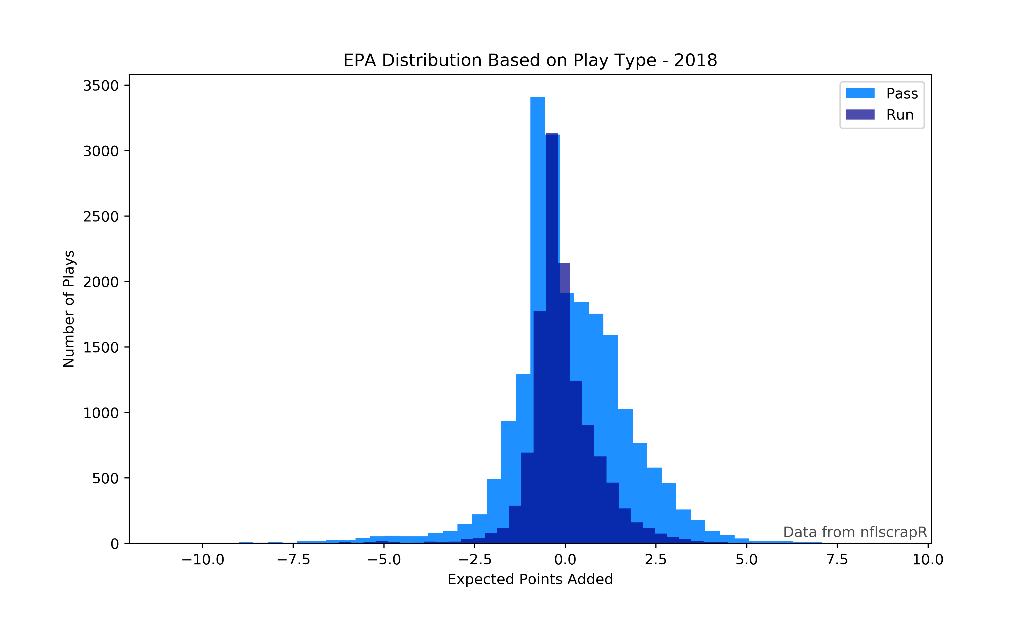
Note that plt.show() will only work within a Jupyter Notebook. Figures can be saved in several formats including PDF, PNG, and JPG. Also note that the data was selected on the same line as inserting the histogram, this works with simple selections but more complex selections should be assigned to new variables and then used in making the graph.
Before going any further, a few more imports are required for gathering and using team logos:
import os
import urllib.request
from matplotlib.offsetbox import OffsetImage, AnnotationBbox
OS comes with Python, but you may not have urllib installed, simply go to your terminal and enter:
pip install urllib or conda install urllib if your're using Anaconda.
With that out of the way we can now download the logos. These few lines will get each team's logo downloaded for you to use on charts.
Note where it says FOLDER in the last line, make a new folder in your current working directory with whatever name you choose and replace FOLDER with the name of your new folder.
urls = pd.read_csv('https://raw.githubusercontent.com/statsbylopez/BlogPosts/master/nfl_teamlogos.csv')
for i in range(0,len(urls)):
    urllib.request.urlretrieve(urls['url'].iloc[i], os.getcwd() + '\\FOLDER\\' + urls['team'].iloc[i] + '.png')
IMPORTANT
The logo names are the full names of teams, not abbreviations like in nflscrapR data. When alphabatized, the logos and nflscrapR abbreviations do not match! I recommend changing the logo names to the abbreviations to avoid this error in charting.
Python doesn't easily allow for images to be used on charts as you'll see below, but luckily jezlax has us covered.
Create this function to be able to put images onto a chart. Feel free to change the zoom level as you see fit.
def getImage(path):
    return OffsetImage(plt.imread(path), zoom=.5)
Now we'll store the required information to use the logos, replace FOLDER with the name of your folder with the logos in it.
logos = os.listdir(os.getcwd() + '\\FOLDER')

logo_paths = []

for i in logos:
logo_paths.append(os.getcwd() + '\\FOLDER\\' + str(i))Now we can finally do so more plotting. This will show you the second way to build charts in Matplotlib, it takes some getting used to but ultimately allows for more flexibility.
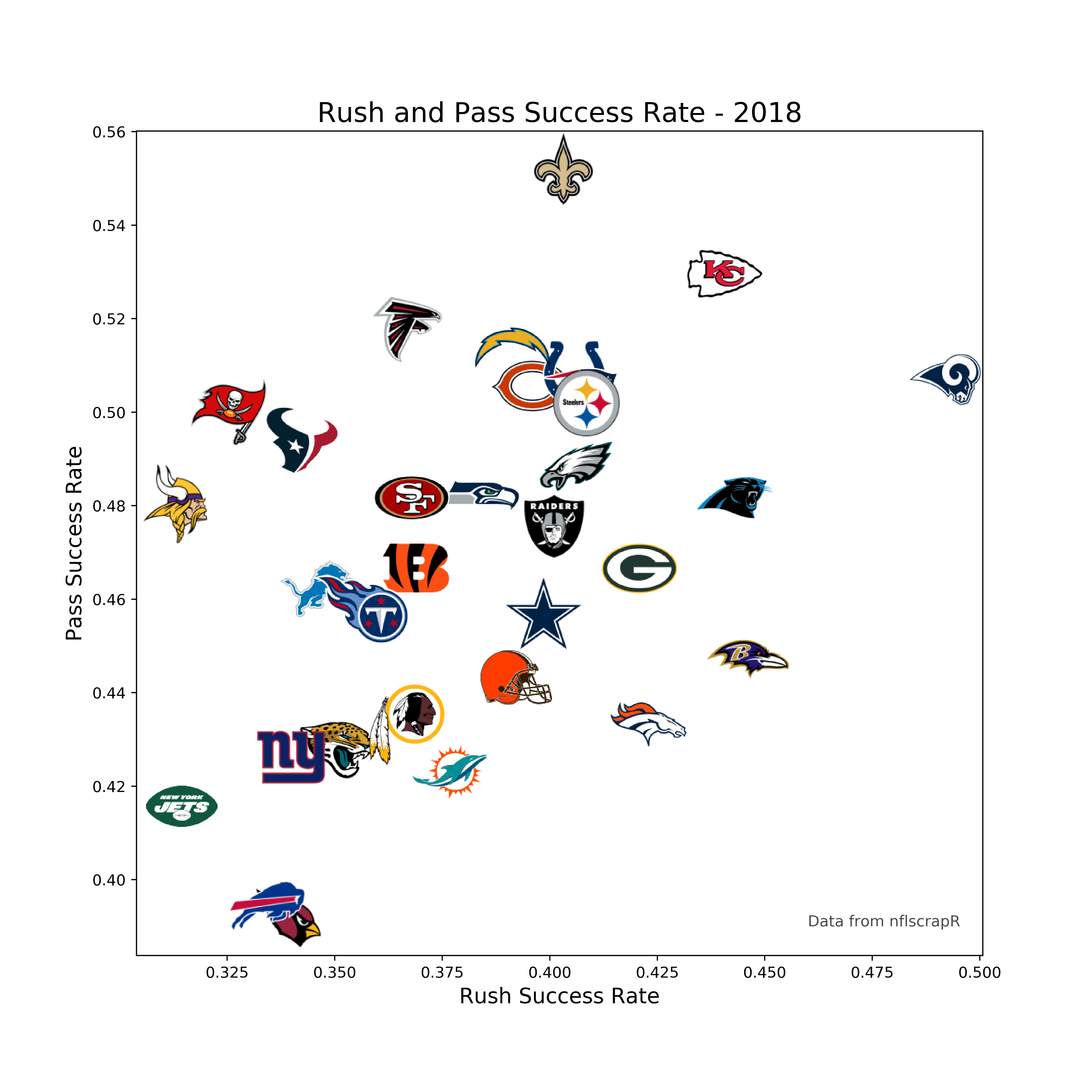
Start by building our success rate dataframe
#Make a new dataframe that contains pass success rate, grouped by team
success_rates = data.loc[data['play_type']=='pass'].groupby(by='posteam')[['success']].mean()

#Add in rushing success
success_rates['run_success'] = data.loc[data['play_type']=='run'].groupby(by='posteam')[['success']].mean()

#Relabel the columns
success_rates.columns = [['pass_success','run_success']]
Time to chart this data.
#Make x and y variables for success rate data
x = success_rates['run_success'].values
y = success_rates['pass_success'].values

#Create a figure with size 10x10
fig, ax = plt.subplots(figsize=(10,10))

#Make a scatter plot with success rate data
ax.scatter(x, y, s=.001)

#Adding logos to the chart
for x0, y0, path in zip(x, y, logo_paths):
    ab = AnnotationBbox(getImage(path), (x0, y0), frameon=False, fontsize=4)
    ax.add_artist(ab)

#Adding labels and text
ax.set_xlabel('Rush Success Rate', fontsize=14)
ax.set_ylabel('Pass Success Rate', fontsize=14)
ax.set_title('Rush and Pass Success Rate - 2018', fontsize=18)
ax.text(.46, .39, 'Data from nflscrapR', fontsize=10, alpha=.7)

#Save the figure as a png
plt.savefig('rush-pass-success.png', dpi=400)
When making the scatter plot, s=.001 will make the markers nearly invisible so that we don't see them when overlayed by the logos.
Leave feedback, follow me on twitter @deryck_g1, use Python.