A web component for display simple pie charts.
The component accepts four attributes:
backcolor: a string indicating the color of the background (by default light gray).forecolor: a string indicating the color of the slide (by default dark gray).size: a number indicating the size, in pixels, of the chart (by default the chart takes all available space).value: a number between 0 and 100 indicating the size of the foreground slide (by default 35).
class PieChart extends HTMLElement {
  static get observedAttributes() {
    return ['backcolor', 'forecolor', 'size', 'value'];
  }

  attributeChangedCallback(property, oldValue, newValue) {
    if (oldValue === newValue) return;

    if (property === 'value') {
      const numberValue = parseInt(newValue);
      if(isNaN(numberValue)) return;
      else if(numberValue < 0) numberValue = 0;
      else if(numberValue > 100) numberValue = 100;
      this[property] = numberValue;
    } else {
      this[property] = newValue;
    }
  }

  connectedCallback() {
    const shadow = this.attachShadow({ mode: 'closed' });
    const sizeAttrs = this.size ? `height="${this.size}" width="${this.size}"` : '';
    const foreColor = this.forecolor || '#444';
    const backColor = this.backcolor || '#bbb';
    const value = this.value || 35;

    shadow.innerHTML = `
      <svg ${sizeAttrs} viewBox="0 0 20 20">
        <circle
          r="10"
          cx="10"
          cy="10"
          fill="${backColor}"
        />
        <circle
          r="5"
          cx="10"
          cy="10"
          fill="transparent"
          stroke="${foreColor}"
          stroke-width="10"
          stroke-dasharray="calc(${value} * 31.4 / 100) 31.4"
          transform="rotate(-90) translate(-20)" />
      </svg>
    `;
  }
}

customElements.define('pie-chart', PieChart);<pie-chart
size="50"
value="25"
></pie-chart>
<pie-chart
size="65"
forecolor="darkgreen"
backcolor="lightgreen"
value="50"
></pie-chart>
<div
style="display:inline-block; width: 80px; height: 80px;"
>
<pie-chart
forecolor="#008"
backcolor="#aaf"
value="75"
></pie-chart>
</div>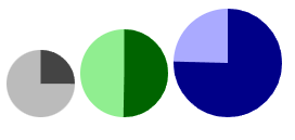
Live examples on https://codepen.io/jfmdev/pen/ZEVOweG